How To Arrange Furniture: The Basics
The placement of furniture in any given room has a huge impact on how the room feels, regardless of your decorating style. The spacing between pieces, how they relate to one another and even their positions within a room determine whether the place feels awkward and cramped or peaceful and inviting. Ultimately, it's all about flow, which becomes most obvious when walking through the room.
Before the Heavy Lifting Begins
Before enlisting a few friends to help rearrange any room, start your planning on paper. Draw the basic room design, including doorways, on graph paper. Your sketch can be as simple or elaborate as you like; simple works fine in this case. Cut out smaller shapes of paper, somewhat to scale, to represent each piece of furniture in the room. If an area rug and floor lamps are part of the room's layout, include those as well. Experiment by arranging the paper shapes atop the simple floor plan in several ways until you're fairly certain of the placement of at least the largest furnishings. This will cut down on time spent shuffling the actual furniture around the room.
Basic Rules for Living Rooms
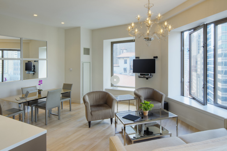
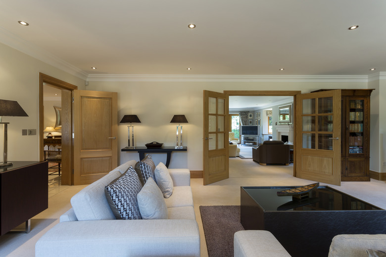
It's all about conversation and comfort when it comes to living-room furniture layout. This is one of the key gathering places in the home, whether it's for family binge-watching night or an evening conversing with friends. When plotting the perfect arrangement, pick a focal point for the room, such as a fireplace or the TV wall. The largest piece of furniture, typically the sofa, should face this from a comfortable distance, without blocking the path to other rooms or the front door. If space allows, keep that sofa or any seat at least a few inches from the wall behind it, as this makes the room more appealing and less cramped visually.
The most important "rule" for living-room layouts is to ensure a straight walking path from one room or area to the next. No one wants to weave through a maze of furniture to get from room to room. A poorly planned layout can also make the room feel more cramped or cluttered than it really is, when the goal is peace of mind and coziness. All seated guests should also be able to leave their seats without having to step over or around furniture, or even over other people's legs.
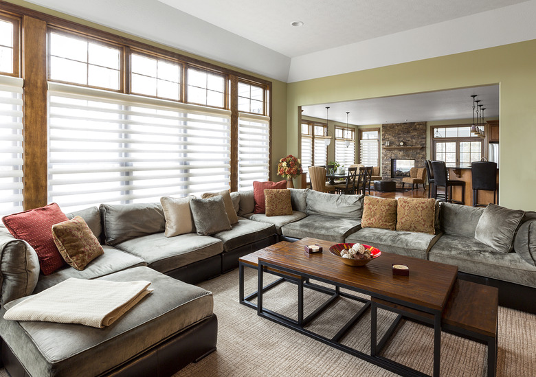
Arrange armchairs and other seating in a U shape that includes the sofa, as if to accommodate a group of friends all seated facing one another. In this main conversational group, keep the distance from one seat to another at eight feet or less, so no one has to shout to be heard.
Tip
If the room has an area rug, position it so each piece of furniture is partially on it or equidistant from it. The rug centers the conversational space.
For an unusual room shape such as a long rectangle, there may be a lot of space left outside of the conversational grouping. Treat these empty spaces as areas of their own, adding, for instance a recliner, side table and table lamp, or a storage bench that serves as an extra seat when needed. Aesthetics are important here and in any room; go with what looks good from afar. If one area of a room looks too empty or too cluttered, it probably is.
Placing Those Extra Elements
The living room also needs ample table space for drinks, plates, the remote—you name it. Position the coffee table in front of the sofa, approximately 18 inches away so it's within reach, yet not so close you can't walk around it easily. Each armchair and either end of the sofa should have a side table within reach, unless the coffee table is large enough for all seated guests to use it at once. If the room is small or you don't have enough side tables, don't worru about it. Work with what you have, so that a guest sitting anywhere in the room has a place to set a drink.
- Nesting tables are an excellent choice, as spare tables can be pulled out from beneath the largest one, as needed.
Place table lamps on side tables near the sofa, or on a sofa table behind the sofa. Floor lamps belong in dark corners and near recliners or armchairs destined as reading areas.
Dining Room Dynamics
In the dining room, the goal is to allow ample walking space around the table, even with guests in every seat. A full three feet of space around the dining table ensures that a guest can walk past a seated guest to enter or exit the dining room. Position other furnishings, such as storage cabinets or even a small desk, along walls, out of the way of dining chairs.
Those corners and unused wall spaces in the dining room are ideal for bookshelves or any other furnishings geared toward storage. Pick furnishings of similar style or color for the most cohesive look.
Arranging the Eat-In Kitchen
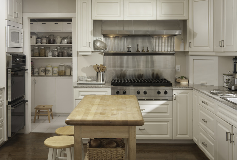
For an eat-in kitchen, the dining area may be a bit more compact than in the typical dining room. This may call for the table and chair arrangement to be completely different, such as a bench seat on one side of the table, or a kitchen island with bar stools serving in place of a dining set. In a corner, a bench seat makes sense, offering a comfy space to read a book or work on craft projects. Plot the dining area according to the space available in the kitchen. An island that doubles as dining area might make sense in a large kitchen, while a retro dining table and chair set work well in a smaller space or square kitchen.
Bedroom Furniture Fundamentals
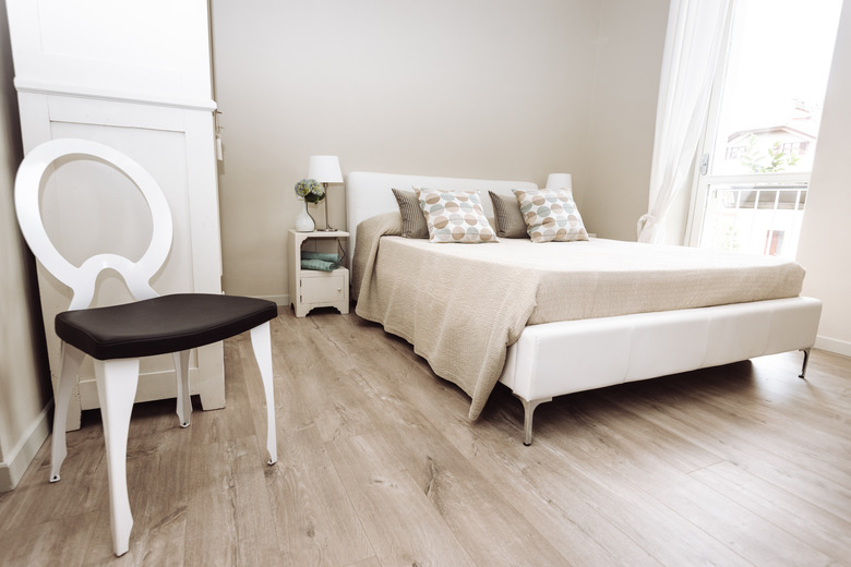
In the bedroom, a clear path to the doorway is the most important factor of the furniture layout. Those late-night trips in the dark to the bathroom should be free of obstructions that could cause you to stumble or stub your toe.
Center the bed's headboard along the wall opposite the door, or wherever the bed looks best as a focal point, depending upon the floor plan. With two beds, space them evenly along the same wall, allowing ample walking room on each side of both beds. Two to three feet on either side of the bed is ideal. In a small-room scenario with a door that swings into the room, make sure the foot of the bed has at least three feet of clearance between it and the door.
Your own sleeping style matters as well. If positioning your bed on the largest wall means your bed is in full view of an open doorway and you don't like this option, choose another spot for the bed. Early morning light from the windows could also be a factor influencing bed placement, as could noise from the other side of a neighboring wall. Feel free to completely change the room's layout again if you aren't happy with it after a week or so.
As for nightstands, one on each side of a bed is ideal in a room with only one bed, or one nightstand per bed in a shared room, as space allows. Dressers should be placed along walls in an area that allows the drawers to be opened completely while standing in front of them. Three feet of clearance should be ample in most cases.
Tip
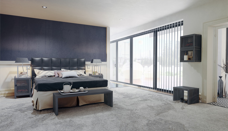
A large or lengthy bedroom follows the same furniture-arrangement rules as a living room: Consider extra space in the room as its own area, adding a chair and table for a reading nook, a desk and chair for work area, or whatever furniture best suits your needs for the space.
