2020's Fall Paint Trends Are All About Comfort At Home

As we make our way through summer, we're excited to see what the upcoming fall season holds in terms of color. Unsurprisingly, the pandemic may have a little influence on trend forecasts — including paint hues.
We chatted with designers and color experts to find out what colors will be big in fall 2020: here's what they're predicting.
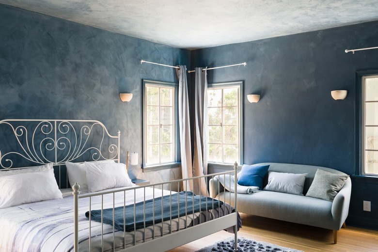
Nature-Inspired Greens and Blues

"A common theme that we've seen for 2020 is homeowners craving feelings of comfort throughout their homes, and bringing the great outdoors indoors through nature-inspired color palettes," Erika Woelfel, Behr Paint's VP of Color and Creative Services, tells Hunker.
Since things are so hectic because of the pandemic, people are going to gravitate to more soothing tones, perhaps those on the cooler side of the spectrum.
"With green and blue-toned hues, homeowners can integrate hints of the outdoors into their home, offering serenity and stillness during an unsettling time," Dee Schlotter, PPG senior color marketing manager, tells Hunker. Schlotter anticipates that consumers will favor colors like the greenish-blue Copenhagen, the pale blue Zen, and the calming green Paradise Found.
Dark and Moody Hues
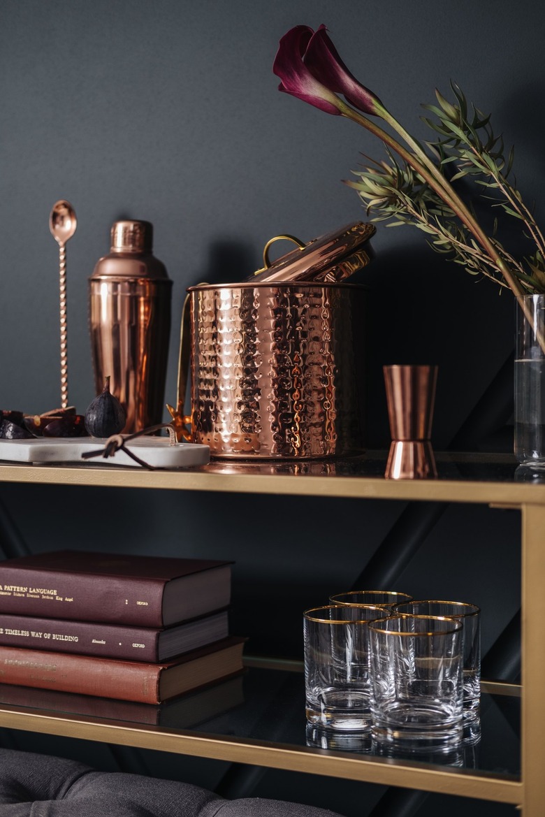
Designer Nicole Gibbons, founder of paint brand Clare, has noticed customers and social media followers trending towards rich, dramatic tones.
"While the idea of a dark color may sound intimidating, we're seeing our customers become a lot more adventurous when it comes to color, opting for darker, moodier colors with a lot of personality," Gibbons tells Hunker.
Two of the most popular colors at Clare right now prove this: Current Mood, a bold dark green that Gibbons says is "perfect for bringing drama to a small space such as a powder room or even a bedroom," and Goodnight Moon, a midnight blue.
Laurie Pressman, vice president of the Pantone Color Institute, also predicts some dark and moody hues to be popular this fall — specifically ones that balance making a statement with timelessness.
"The trending colors for Fall 2020 reflect the mindset of today's consumer, who is prioritizing value and longevity over something that is 'here today, gone tomorrow,'" Pressman says. In her forecast are colors like Magenta Purple (PANTONE 19-2428), a warm eggplant; Fired Brick (PANTONE 19-1337), a dark rust; and Blue Depths (PANTONE 19-3940), an inky navy.
Warm, Earthy Neutrals
Given all the uncertainty in the world, opting for cozy neutrals that provide autumn warmth — without too much drama — seems like a natural choice.
"Recently, many DIYers have been shifting away from the previously popular grays and whites in favor of warm neutrals," says Schlotter. "Beiges and cozy alternatives to grays continue to trend, such as beiges like PPG's Garlic Clove and Crushed Silk, as consumers continue to shift away from the stark, cool grays of recent years."
For a slightly bolder take, Woelfel suggests Behr's Cider Spice and Charismatic. "Cider Spice is an earthy and approachable orange, perfect for the living room or entryway or a smaller, seasonal DIY decor project," she says.
There are also practical reasons to gravitate towards neutrals, especially for those of us working from home. "People are also paying attention to the colors on their walls more, especially in their home offices, as now they act as a backdrop to video call after video call and are seen by more than just family and close friends," Sue Wadden, director of color marketing at Sherwin-Williams, tells Hunker.
Mood Boosters
Thanks in part to the pandemic, which has us all spending a lot more time at home than normal, we're looking at colors not just in terms of what looks good, but what makes us feel good — and that's something that will vary per person.
"Some may turn to brighter orange and yellows for an infusion of energy, while others might turn to calmer pastel pinks or refreshing aqua tones," says Pressman. "Nature's watery blues and fertile greens may have appeal, as well as empowering dynamic reds or warming terracottas."
Something to consider when refreshing the color in your home this fall is how each color makes you feel — and how you can use that emotional guidance in a room.
"Think bold, bright colors for your workout spot, maybe more soothing and serene colors in your bedroom for quality rest, and a palette that lights you up for your art studio," Justina Blakeney, founder of home brand Jungalow, tells Hunker. "Choose colors that feel serene to you, not just what should feel serene by definition. If a tomato red is what calms you down, go for it!"