One Natural Element Is The Defining Feature Of This Restored Montreal Home
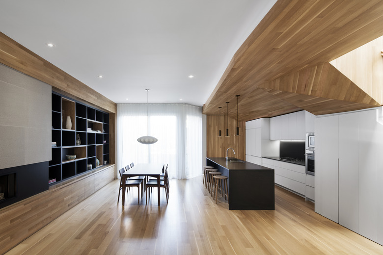
When a general contractor from Montreal and a writer from Italy decided to buy a place where they could raise their two young children, they wanted to restore a property in his hometown. Although they had chosen his Canadian city as their primary base, the two had spent plenty of time in her home country where they had studied the merits of design and architecture. But unlike the ornate buildings of the Old World, the couple wanted a minimalist house where a few choice materials comprised its overall personality. And when they stumbled upon a 1906 duplex near the verdant La Fontaine Park, the pair hired Maxime Moreau and his firm, MXMA, to renovate the location with a calm, uncluttered eye. "The idea became this design that is representative of the structure of the trees and branches, which are in view from the living space," Moreau noted. He and his team relied on white oak throughout most of the interiors — and most strikingly on the kitchen's ceiling — to anchor the new open layout to one textural element. Custom built-ins were integral to the look's unobstructed appearance, while muted colors and skylights allow the wood's grain to shine. It may not seem like a lot, but to a couple who simply wanted to appreciate the details, the finished home is everything.
1. Kitchen
White oak was used as the primary feature on the floors and ceiling of the property's ground floor. Its meticulous design was cut and installed Bois Franc Lavallée.
2. Kitchen
"The use of the oak wood throughout the living space gives the home a homogeneous, natural, and lively feeling," Moreau said.
3. Kitchen
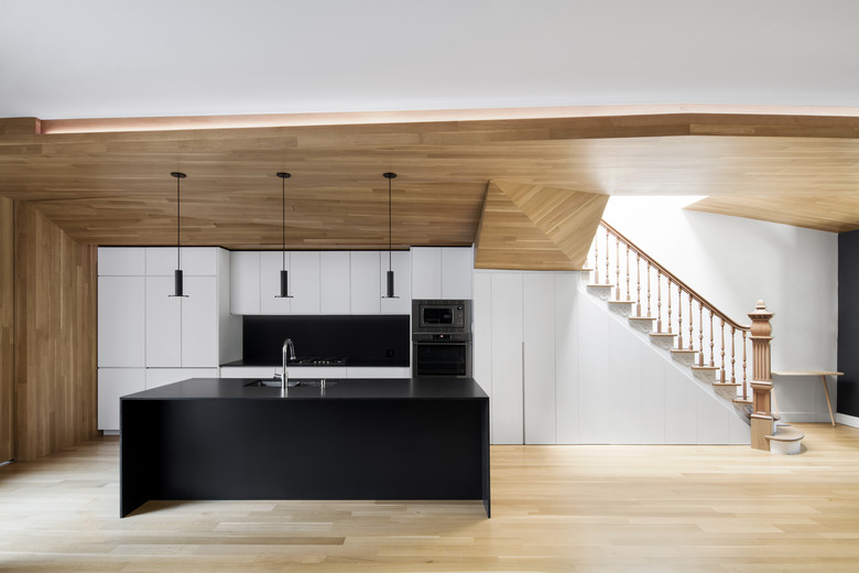
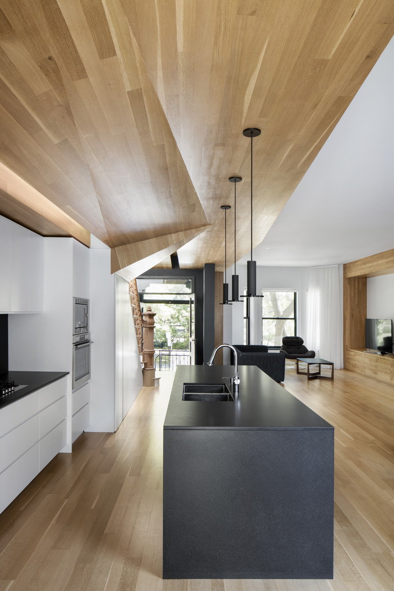
"The wood form running throughout the house organized the living spaces and all of the aspects of the design, while creating an elegant hand-crafted artwork," Moreau noted. The home's existing stairs, spindles, and posts were preserved.
4. Kitchen
Have you ever seen a kitchen this minimalist? The owners asked to have a very streamlined culinary space, which Moreau achieved with an abundance of built-ins. His team wanted to keep the sight lines consistent, so the grain of the wood appears to complement the other straight lines in the area.
5. Dining Room
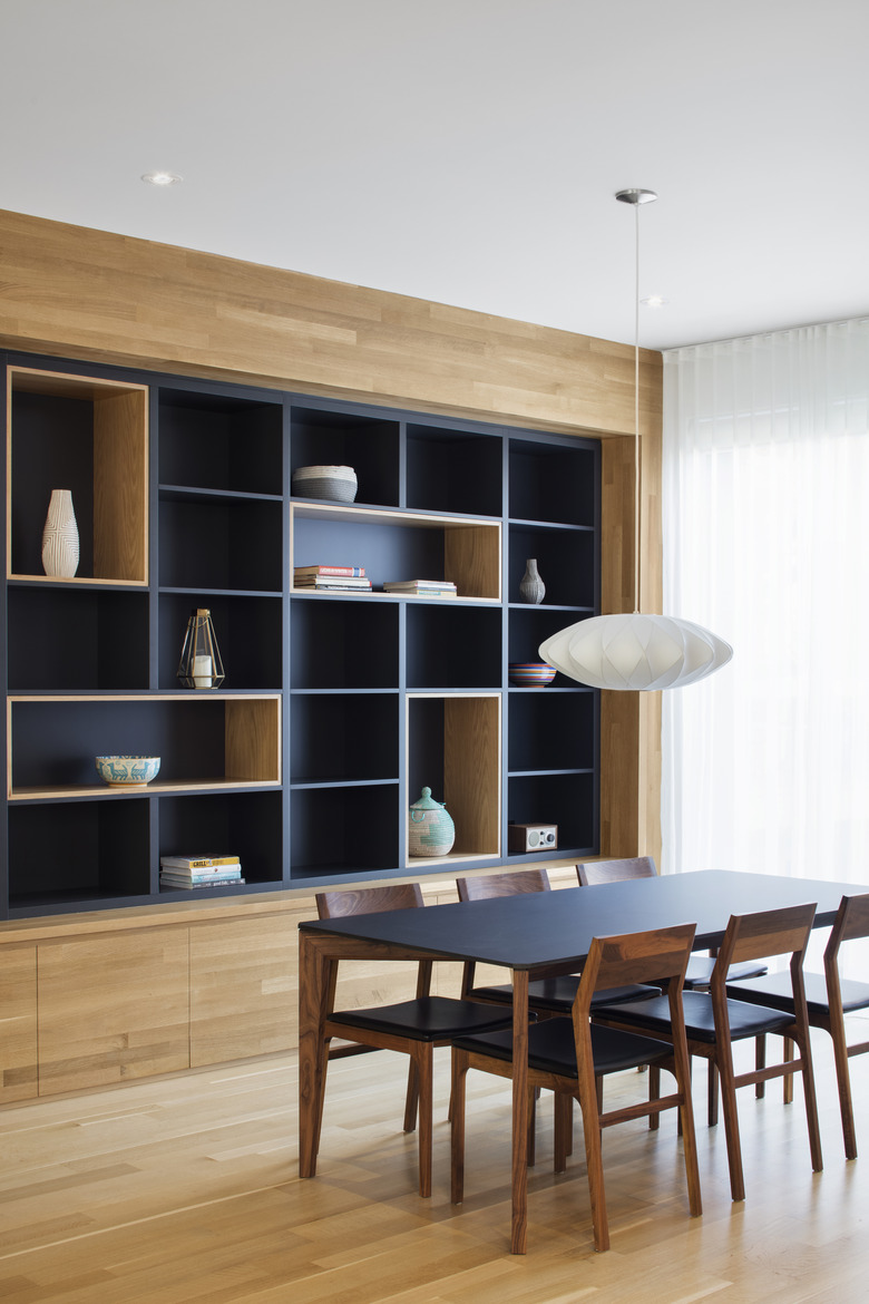
Storage was key to the design's clean, minimalist aesthetic. In the dining area, a full wall of storage — offset from the oak in a black matte paint — was built to keep the room bare.
6. Hallway
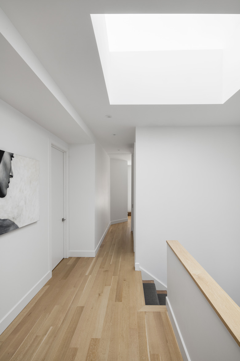
Although it's not as prominent a feature as it is on the ground level, white oak was used as the flooring throughout the upper level. A skylight brings sunshine into the stairwell.
7. Bedroom
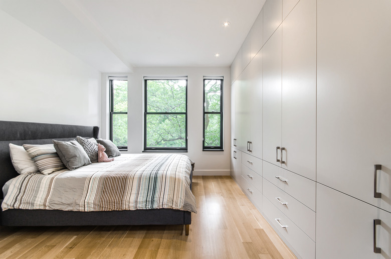
Three bedrooms and three bathrooms can be found throughout the home, and all are unified by the same white oak detail found in the kitchen and dining space.
8. Bathroom
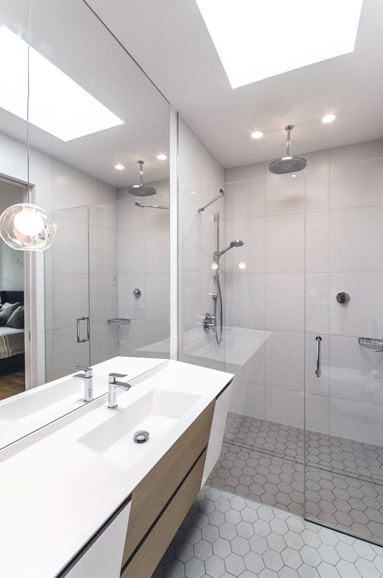
Texture is a defining feature of this home: by keeping the spaces minimal, detail becomes all the more important. White characterizes the bathroom, but honeycomb tiles and glass fixtures give the space the definition it needs to have layers.
