Let's Take A Minute To Appreciate The Serenity Of This Stylish NYC Restaurant
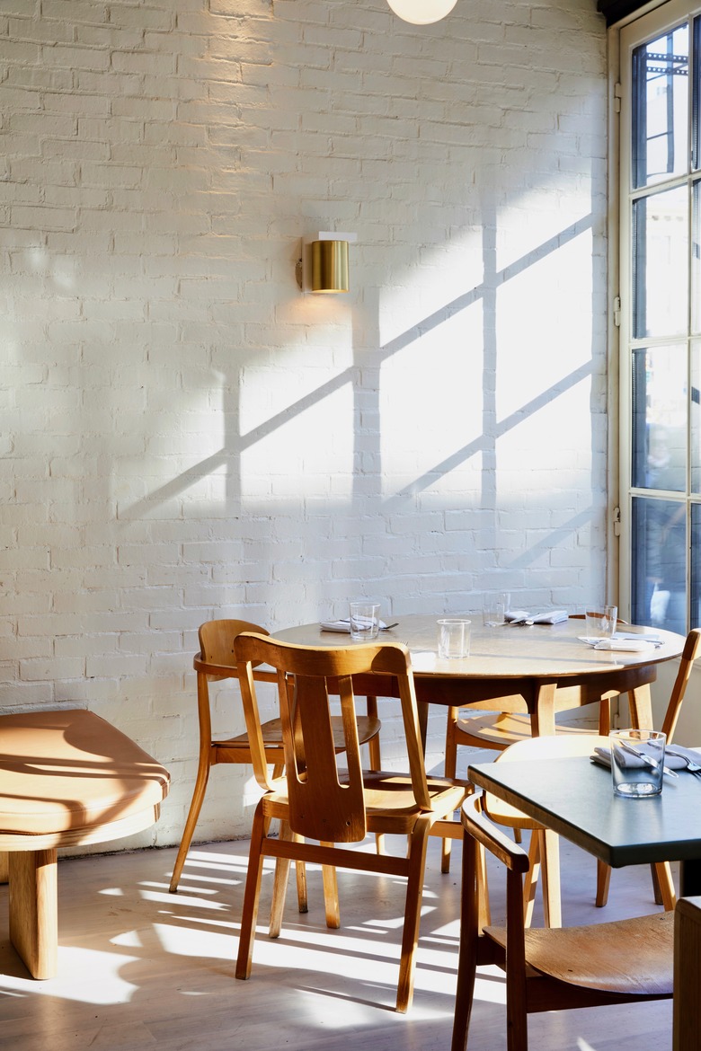
Calm and ultra-chic can be used to describe De Maria, an upscale restaurant in New York City, which is a good thing — those adjectives are exactly what co-owners Camille Becerra and Grace Lee hoped to achieve when they set out to open this space. The pair knew that their location in the trendy Nolita neighborhood had to be stylish, so they partnered with Amy Morris and Anna Polonsky of the MP Shift to figure out a design that fit into the area but still felt distinctive. How did they land on a look? Well, they agreed on a natural color palette with just the right amount of primary colors, and made their own artistic mark by reinterpreting murals and modifying the lighting. Soft camel-colored leather booths complement light wood accents and white walls, and muted grays and arches add a soft dimension. The graphic artwork and colorful tiles get attention, sure, but their presence only heightens the scheme's soothing minimalism. While this would be the ideal place for drinks and dinner, it's also an approachable atmosphere to replicate back home.
1. Dining Room
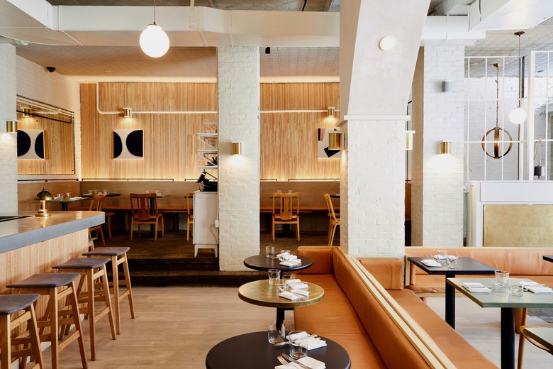
When dreaming up the interior design, the team wanted a laid-back environment that still felt artistic. Pops of color come through the space through artwork and metallic details.
2. Bar
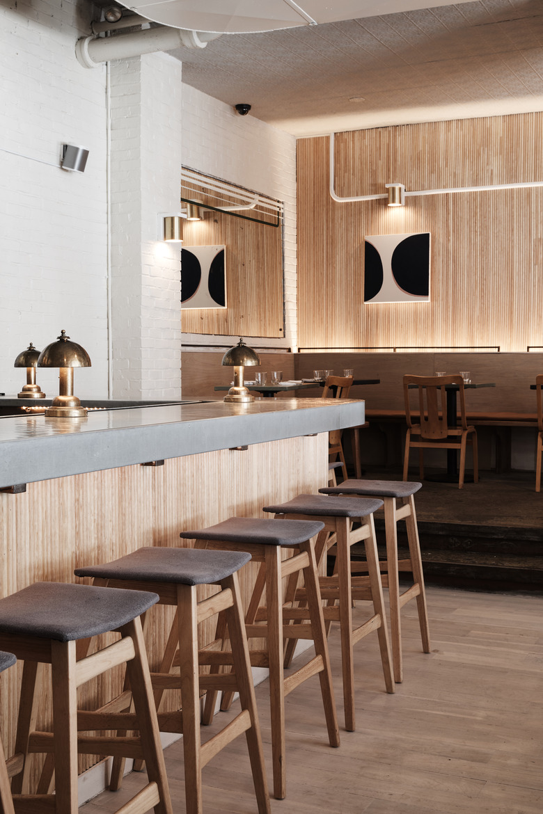
Here's how to add intrigue to a minimalist space: graphic art. Dylan Dylan, a Brooklyn-based custom painter, created that piece that hangs in the corner of the dining room. The barstools are by GDF Studio.
3. Dining Room
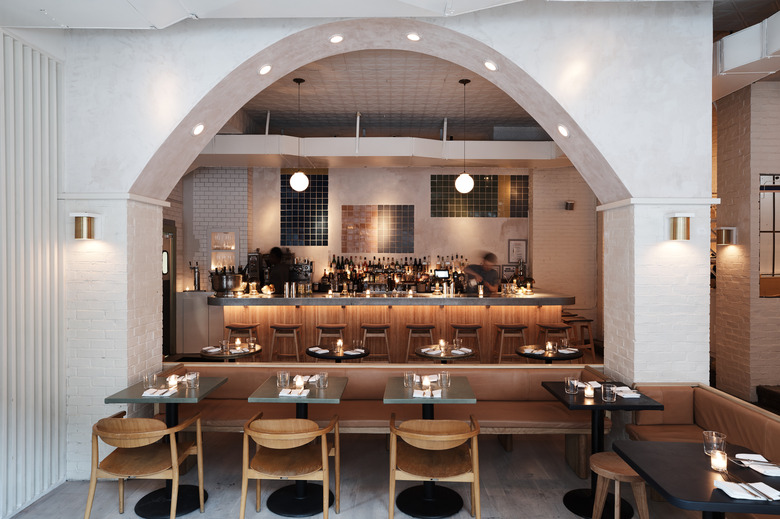
The arch between the bar and main dining room separates the two areas while still making the restaurant feel open. Plus, the lights along the arch add a creative ambiance alongside the sconces.
4. Bar
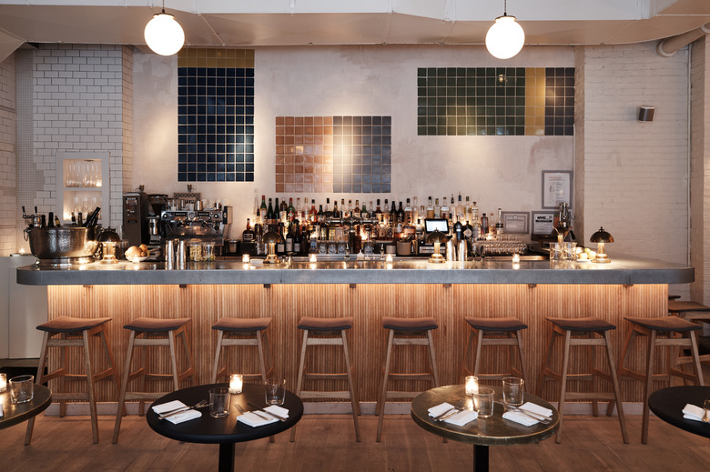
Yes, those tiles at the back of the bar are art, which was inspired by an oil mural by artist David Novros. The imperfect white tile wall on the left side of the bar is MP Shift's favorite element: faced with retiling an entire wall because of a series of cracks, they simply layered in other rough materials to finish the design. The globe pendants came with the space.
5. Seating Area
Brass sconces from Cedar & Moss hang in the dining area. The team added white wood brackets to make the lights face up, proving that the right DIY addition makes a world of difference.

