A Two-Bedroom Manhattan Apartment Receives A Mindful Renovation
When a family of three sought to bring cohesion to their post-war apartment on Manhattan's Lower East Side, they called on architect Anjie Cho to give the two-bedroom address a more modern look. But when Cho answered their request to streamline the property, she also set out to do so from a thoughtful perspective — she also happens to be a feng shui expert. The owners and Cho decided that a simple design for their home was best, and they made it a priority to maximize the layout with a calm aesthetic. And since the site views the East River, Cho looked at that vantage point's natural light as an architectural prize that also serves a mindful purpose. "It's so important," she said. "Every living thing grows toward the light." Once the framework was established, Cho then moved on to a second challenge: clutter. "Some clutter is perfectly fine," she noted. "[But] if you've thought of tossing it more than nine times, then it's time to let it go." Now that the property has been updated and cleared of all unnecessary things, the family finally has a place to peacefully come together.
1. Entrance
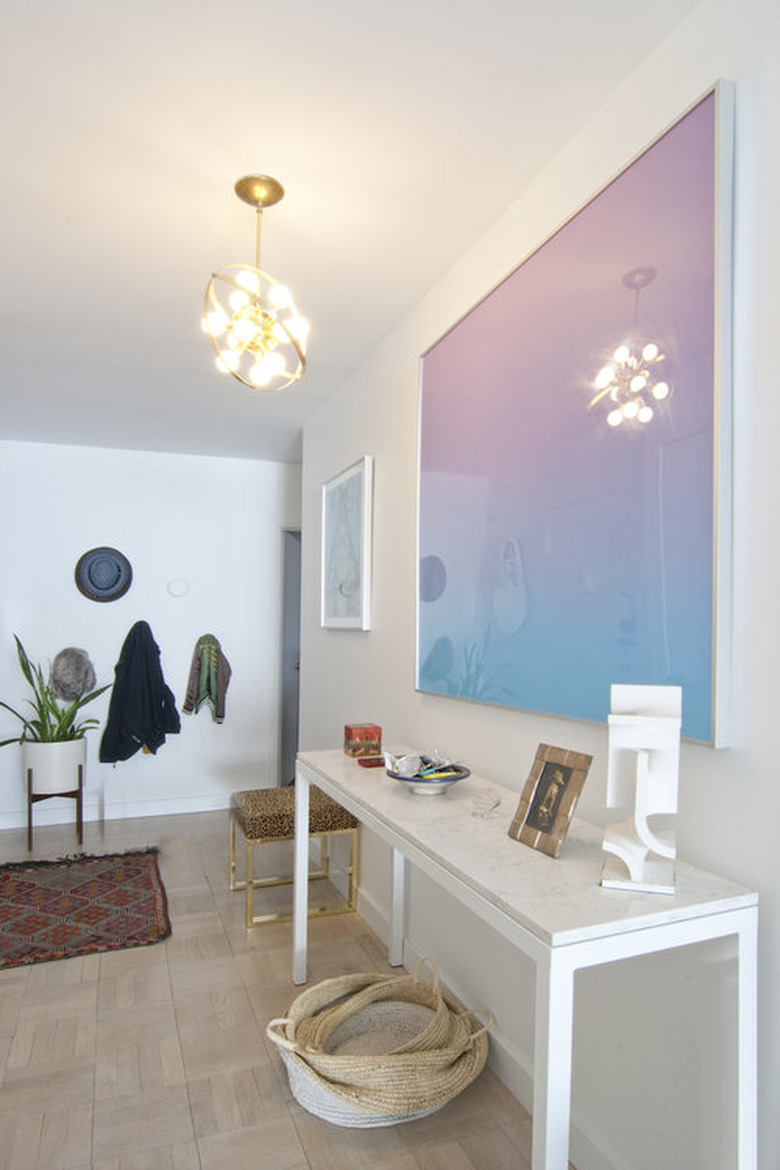
A light that was left by the original owners was repurposed over the entryway. Calico wallpaper was made into art by adding a frame, and a custom-made table from Room and Board completes the look.
2. Entrance
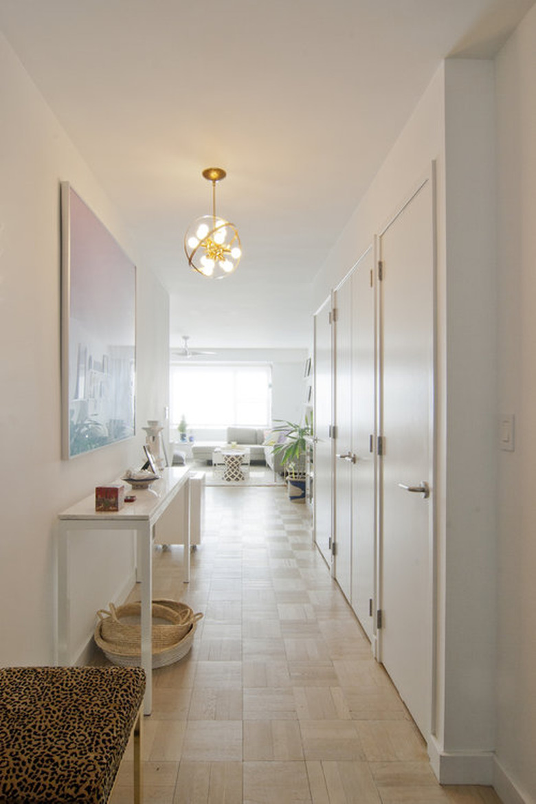
The owners wanted a more sustainable option for the floors, so Cho decided to save the existing wood parquet by refinishing the grain. To brighten the hallway, a white paint was used throughout.
3. Living Room
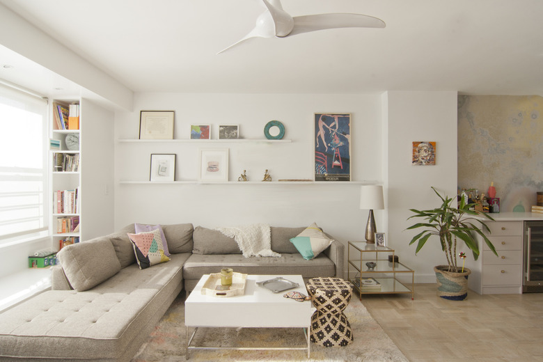
To many, minimalism constitutes having less stuff. But to Cho, not all clutter is created equal. "Take an honest look and ask yourself if this clutter is something that is holding you back," she said. In the living room, each item was carefully curated against "Chantilly Lace" by Benjamin Moore.
4. Living Room
Built-in shelves and a window seat add depth to the sunny living room, as picture ledges from Ikea display personal items above a sectional from Blu Dot. A coffee table and end table by West Elm sit nearby.
5. Living Room
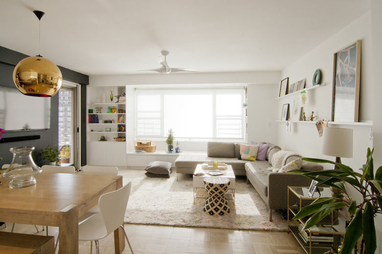
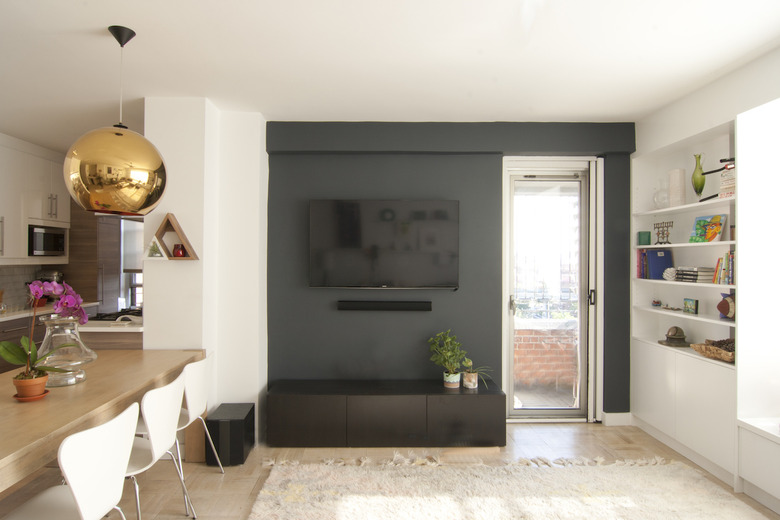
On the opposite wall, a television is set against "Baby Seal Black" by Benjamin Moore to allow it to blend in when not in use. A light-colored rug from West Elm provides a bright contrast.
6. Bar Area
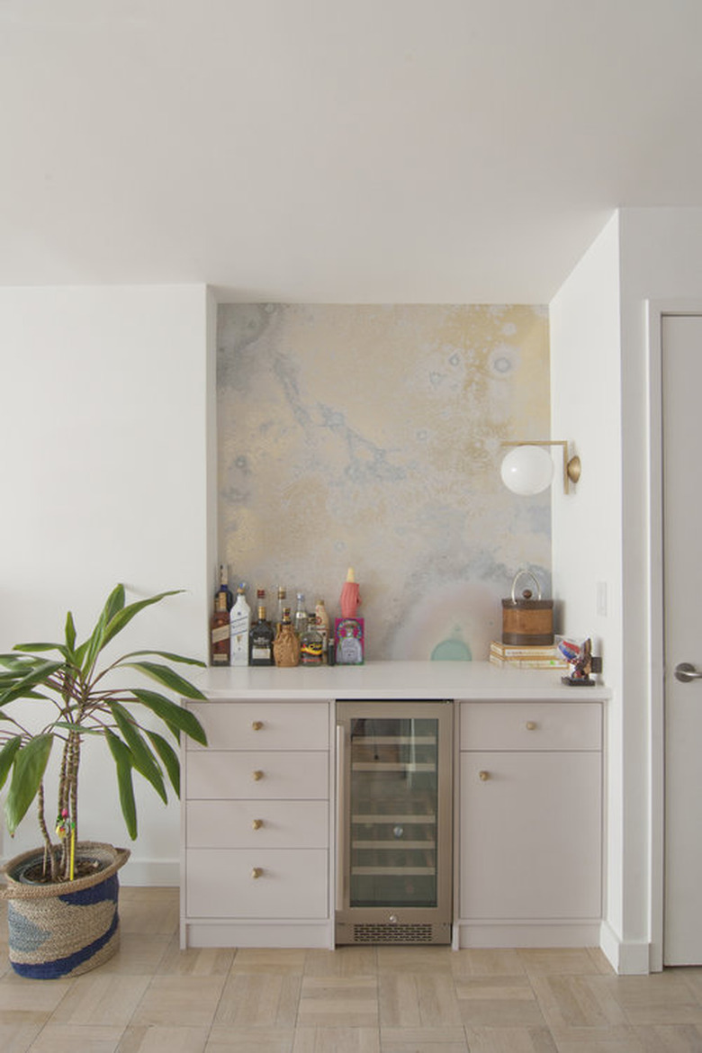
Calico wallpaper brings in soft colors to the custom bar area, adding a bit of fun to the convivial atmosphere. A fridge by Avallon is useful and discreet.
7. Dining Room
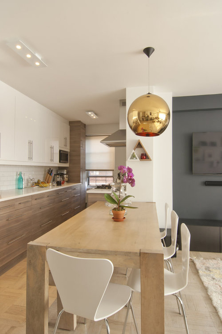
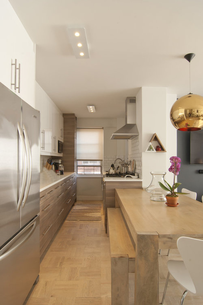
A round hanging light by Tom Dixon illuminates the refreshingly simple West Elm dining table and Room and Board chairs.
8. Dining Room and Kitchen
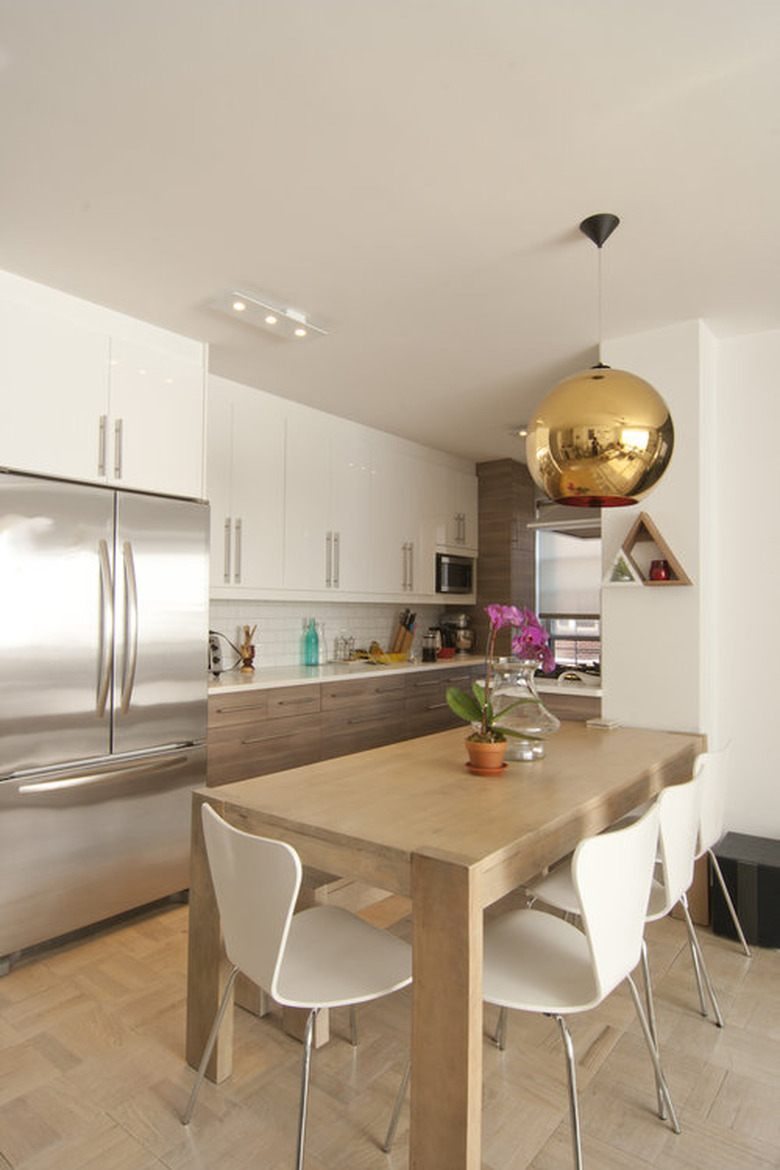
The light-wood dining table coordinates with the floors and cabinetry, while a stove by Verona is carefully tucked away behind a wall.
9. Kitchen
A stainless steel KitchenAid fridge corresponds with the sleek cabinet pulls in the kitchen.
10. Bedroom
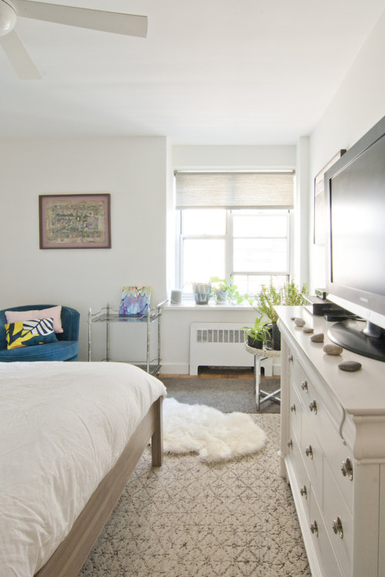
An Ikea bed keeps the room simple, while Shade Store window dressings bring in just enough natural light. A rug by Flor stretches across the room.
