A Steakhouse In Poland Is Renovated With The Sensibilities Of A Private Home
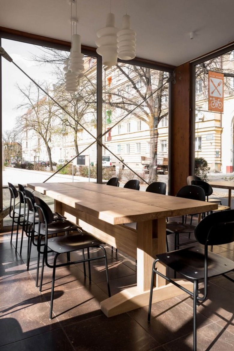
For a firm that specializes in minimalist, light-filled renovations of private properties, taking on the upgrade of a 1,500-square-foot steakhouse in Poland was a unique challenge. After all, thinking of a residential site meeting the needs of a select few is quite different than anticipating the eye of any hungry guest who happens to walk through the door. But Loft Kolasinski went for it with a refreshing solution, blending the airy sophistication of a modern residence with the communal energy of an of-the-moment restaurant. To start, the team focused on the impact of floor-to-ceiling windows along the facade of the restaurant, which draw in light and minimize the requirement of artwork along the walls. The palette was then outfitted to complement the bright dining area with furnishings and fixtures that would also work in a personal address: simple white walls match rows of smooth chandeliers, natural wood tables and a custom counter resemble at-home eating spaces, and vintage furnishings in neutral shades give the appearance of a midcentury living space. The line between public and private is blurred here, making for an eating experience that feels artfully homespun.
1. Entrance
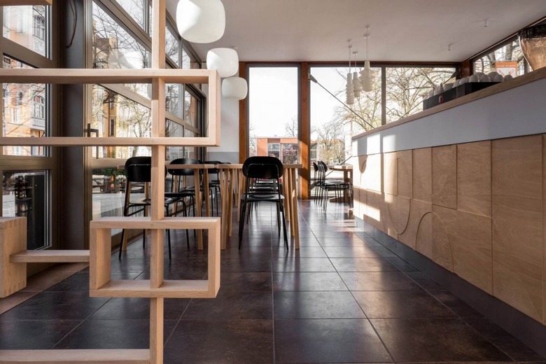
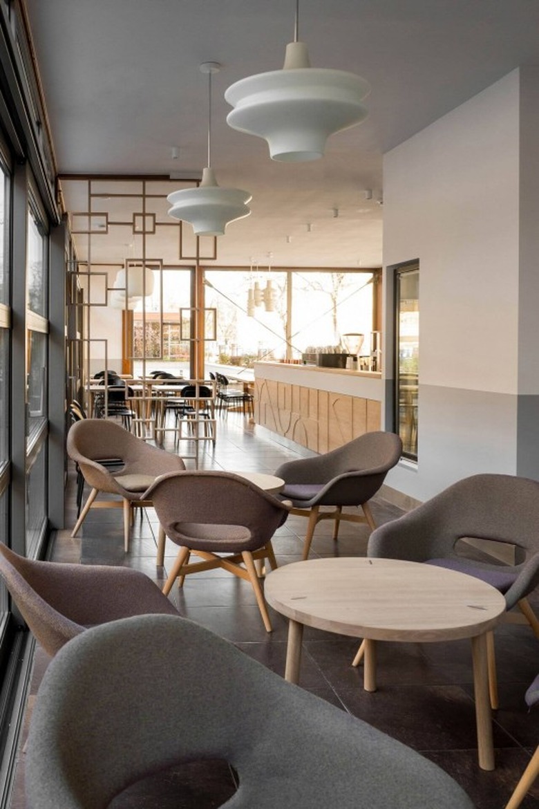
Floor-to-ceiling windows view the streets outside, and provide natural light to radiate an open-air feel. A wooden counter space with a custom-made mosaic was designed by the firm, and a wooden partition provides dimension without disrupting visibility.
2. Dining Area
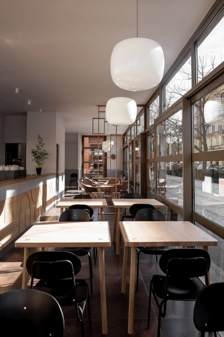
By combining vintage midcentury chairs with minimalist wooden tables, the restaurant's environment looks simultaneously classic and modern.
3. Light Fixtures
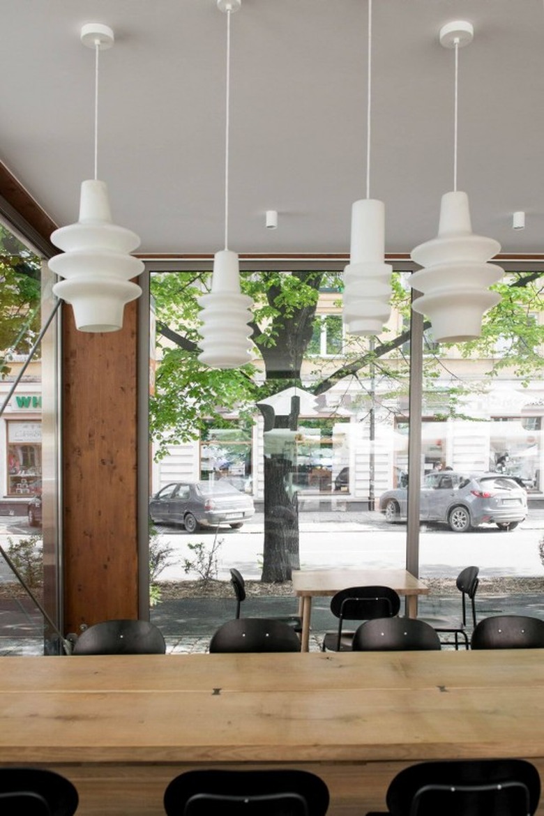
Loft Kolasinski conceived and designed the accordion-like white hanging lights above the tables.
4. Dining Area
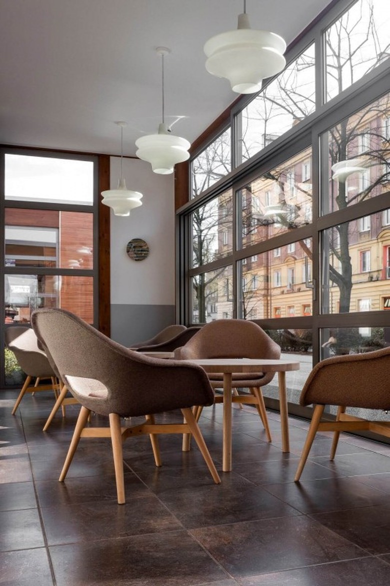
Featuring different types of chairs in a restaurant is a risky move, but by highlighting a specific design era — midcentury — the designers were able to create a unified space that emphasizes form and function. Many chairs were designed in the 1950s and 1960s in the Czech Republic.
5. Dining Area
A large communal dining table and dark-tiled floors provide a balanced contrast with the white-painted ceilings and wood-lined windows.
6. Dining Area
Grey-colored chairs match split gray-painted walls, and circular tables complement the rounded edges of the chairs.

