A Brooklyn Couple Went For The Ultimate Borough Goal: Space And Light
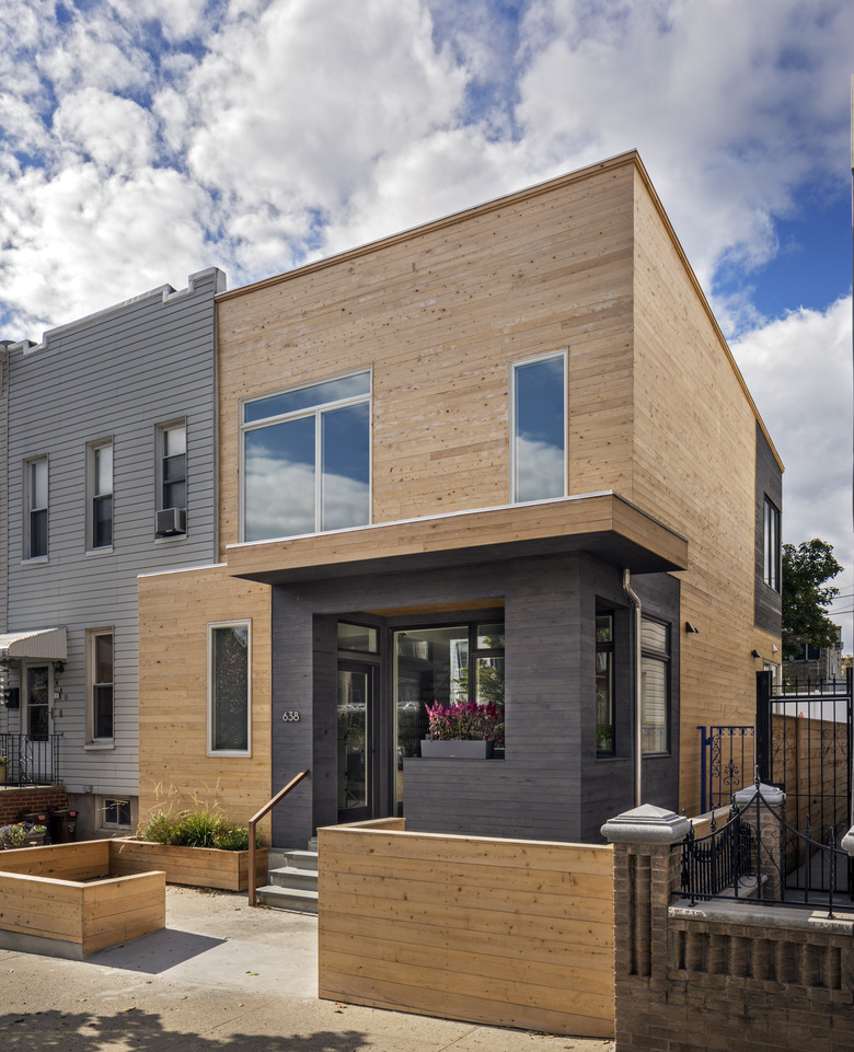
What Brooklyn row houses offer in space, they often lack in light. But when a couple with two young children found a property in the borough's Windsor Terrace neighborhood, they imagined that a renovation would allow them to have both. The pair hired local firm Barker Freeman Design Office Architects with this goal in mind, and asked for the impending changes to take advantage of the fact that the home was only attached to neighboring buildings on one side. "They were interested in large expanses of glass, using natural materials such as wood and cement tile," said principal Alexandra Barker. While an existing front extension needed to be maintained, the rest of the site was fair game. So, the team started transforming the exterior with two-tone cedar paneling and new windows, while creating a covered porch and mudroom in that standing entryway. Then, they expanded the kitchen and added a bedroom above it. Natural sunlight was now streaming through the structure, but the interior finishes took it a step further. White and soft gray shades heighten the effect of the rays from the floor-to-ceiling glass that connects the back porch to the kitchen, and colorful tiles lets the brightness feel even more cheerful. The peaceful surroundings make the modern space feel welcoming and kid-friendly, which is exactly what this couple envisioned when the alterations began.
1. Exterior
The exterior was paneled in knotty white cedar and sections were stained gray. "The covered porch allowed us to orient the front door to create a separate mudroom with lots of storage, while still allowing for large expanses of glass," Barker noted.
2. Living Room
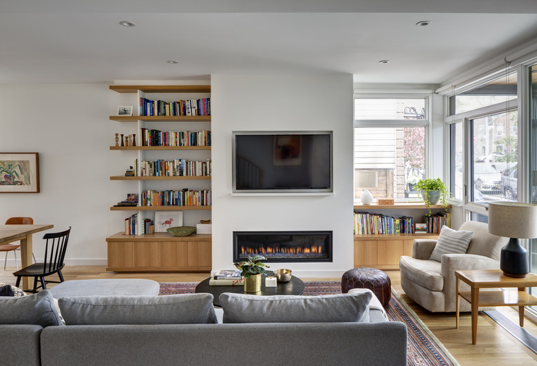
A Heatilator gas fireplace warms up the living area, which is furnished with a sectional by Interior Define.
3. Living Room
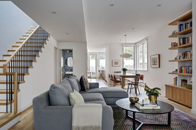
White oak was used for the flooring, handrail, stair treads, and millwork in the living area. The powder room is lined with cement wall tiles by Clé Tile.
4. Dining Room
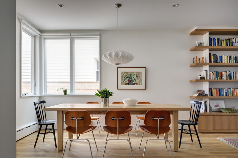
In the dining area, a George Nelson pendant light hangs above a dining table by Lorimer Workshop and a mix of Eames chairs and Salt chairs from DWR.
5. Kitchen
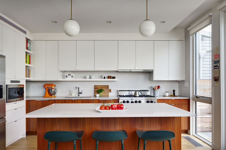
The kitchen pairs Caesarstone counters with a mix of mahogany and matte cabinetry by Semihandmade. Cedar & Moss pendant lights hang above stools by Normann Copenhagen.
6. Office
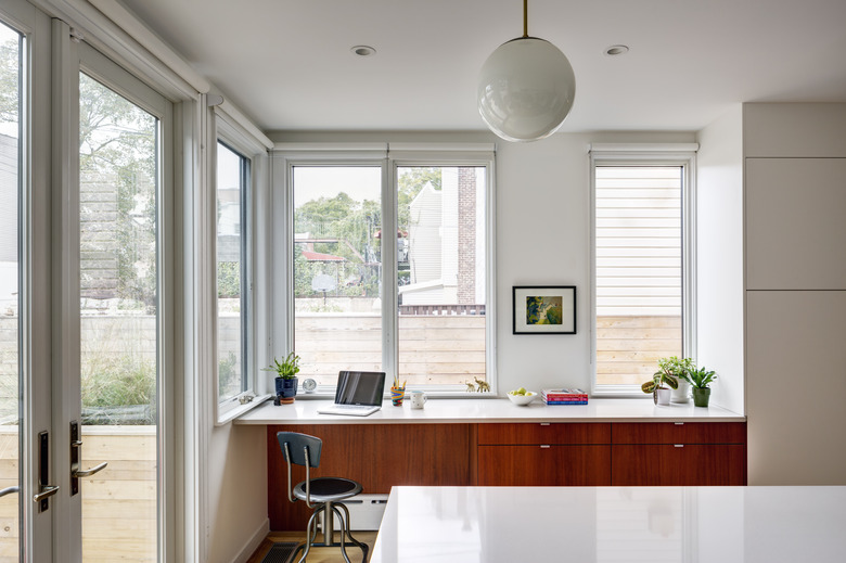
A built-in desk with mahogany cabinets by Semihandmade creates a clever office area in the kitchen.
7. Master Bedroom
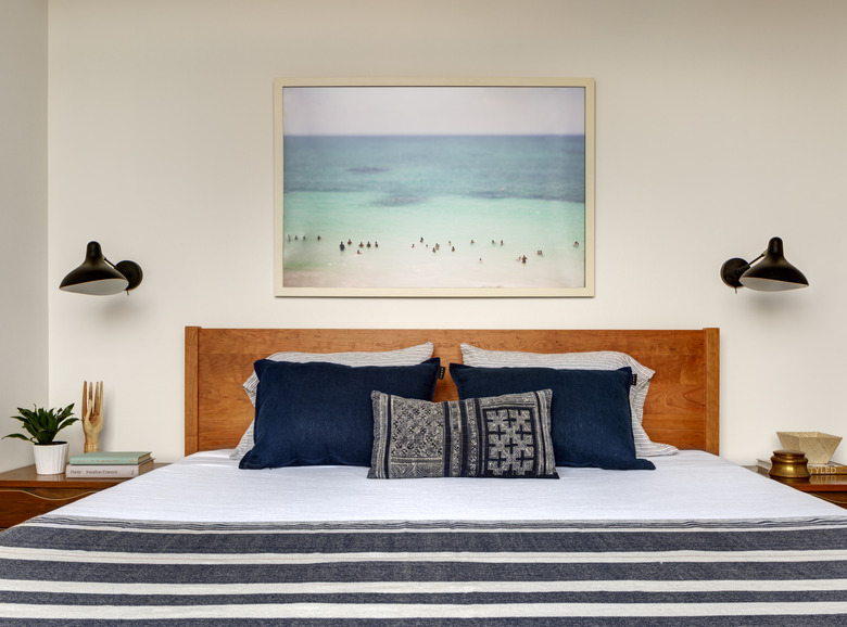
Beachy art and textiles add to the tranquility of the master bedroom, where Mantis sconces by DWR are paired with vintage bedside tables.
8. Master Bathroom
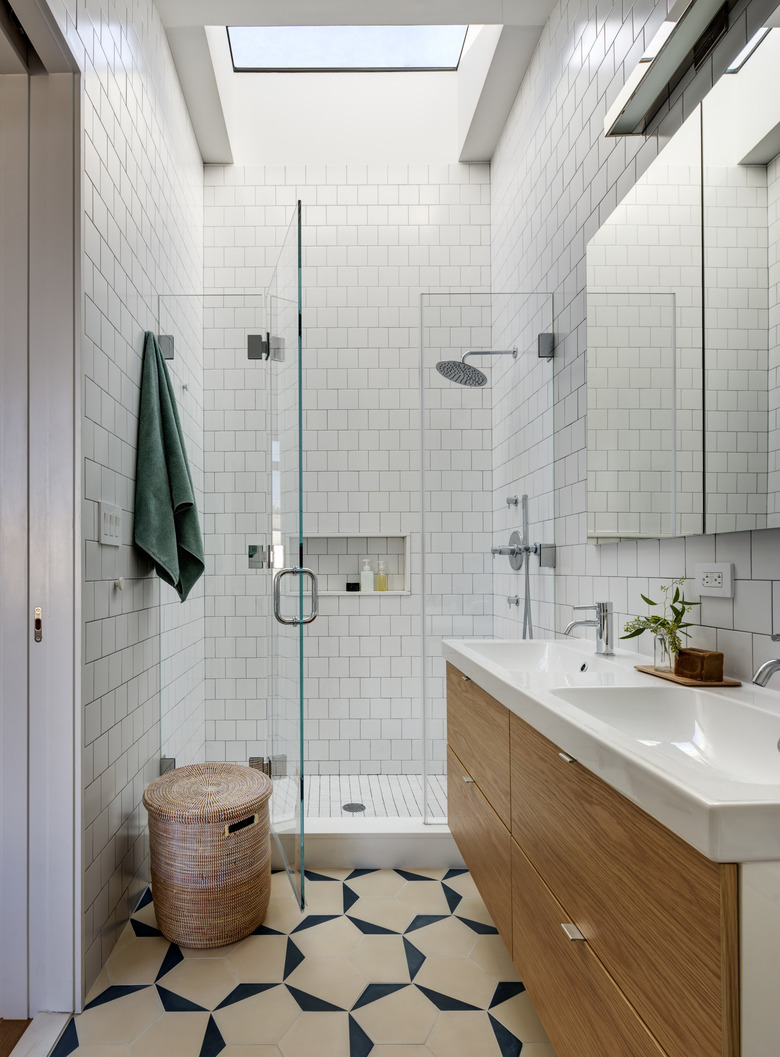
Concrete tiles by Clé Tile and square subway tiles by US Ceramic line the floor and walls of the master bathroom. The Ikea vanity was customized with a white oak front and fixtures by Zuchetti.
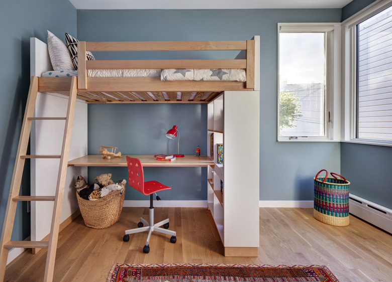
9. Kid's Room
A loft bed by Room & Board is the centerpiece of one of the kid's rooms.
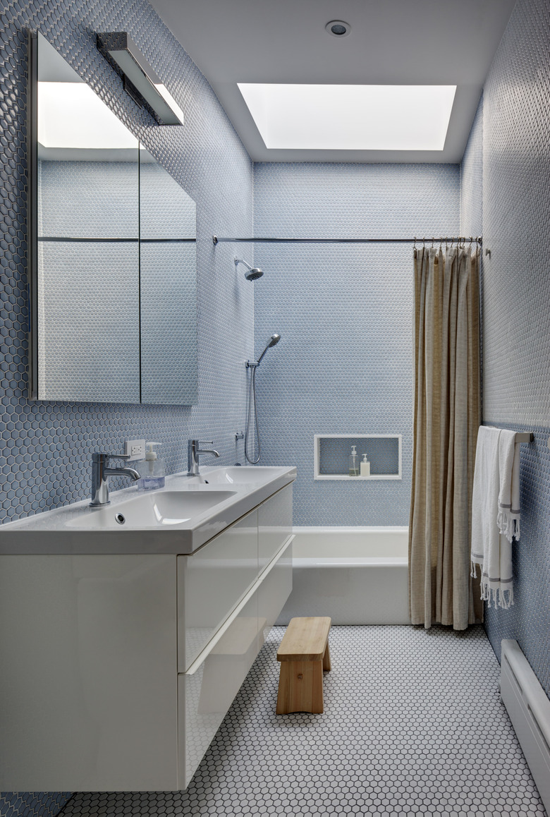
10. Children's Bathroom
The children's bathroom is lined in mosaic tile by Nemo. The Ikea vanity is outfitted with fixtures by California Faucets.
