A Portland Couple Decides To Make A Classic Midcentury Property Their Own
A Portland couple found a charming home in an enclave of brick midcentury properties that seemed to have it all. The only problem? Everything was in the wrong place. The living room was separated from the kitchen and dining area, and the bedroom and bathroom stood in between. The layout needed a complete overhaul, so the couple called on architect Risa Boyer to improve the flow. "We wanted to keep the original character of the house, but make it more user-friendly," Boyer noted. The plan called to remove one wall of the bedroom, which provided space for an open kitchen and dining area. Then, the team made the living room's brick fireplace double-sided, connecting the common spaces and allowing for cozy meals by a crackling hearth. In the rear of the house, Boyer transformed the former dining room into a guest bedroom, and the former kitchen became a den and mudroom. And finally, the team carved out a narrow but functional master bathroom upstairs. It was a project that required some nimble thinking, but in reimagining this midcentury beauty for a modern pair, the renovation brought this home's functionality into the present.
1. Living Room
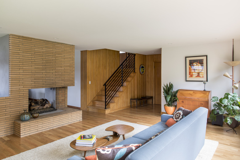
The living room is furnished with vintage pieces that are a nod the the home's midcentury style. A colorful piece by Shepard Fairey hangs above a desk.
2. Living Room
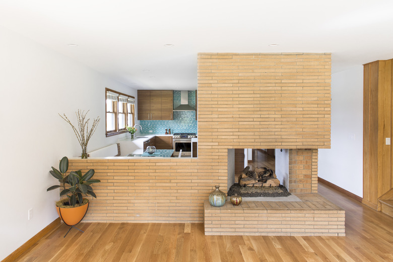
The original fireplace was reworked as an open connection between the dining area and kitchen. Boyer also installed a hidden television in the space. "They wanted to have a TV but didn't want it to be a focal point, this provided them with the option of tucking it away when not in use," Boyer said.
3. Dining Area
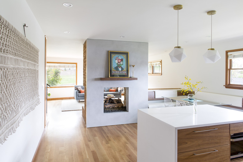
The dining area's built-in bench, which is accompanied by Bend Good chairs, was a must-have for the clients. A macrame by Holly Mueller Home and artwork by Nate Duval add color and texture to the space.
4. Kitchen
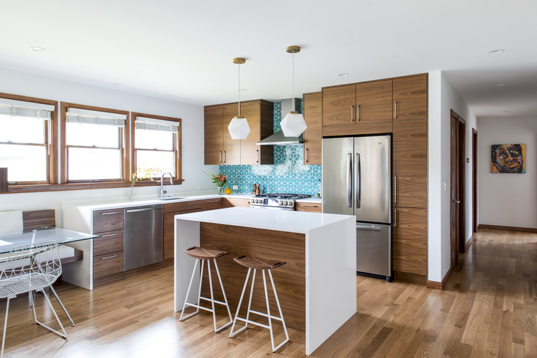
Schoolhouse Electric pendants illuminate the kitchen island, which is clad in Caesarstone and paired with Tronk stools.
5. Kitchen
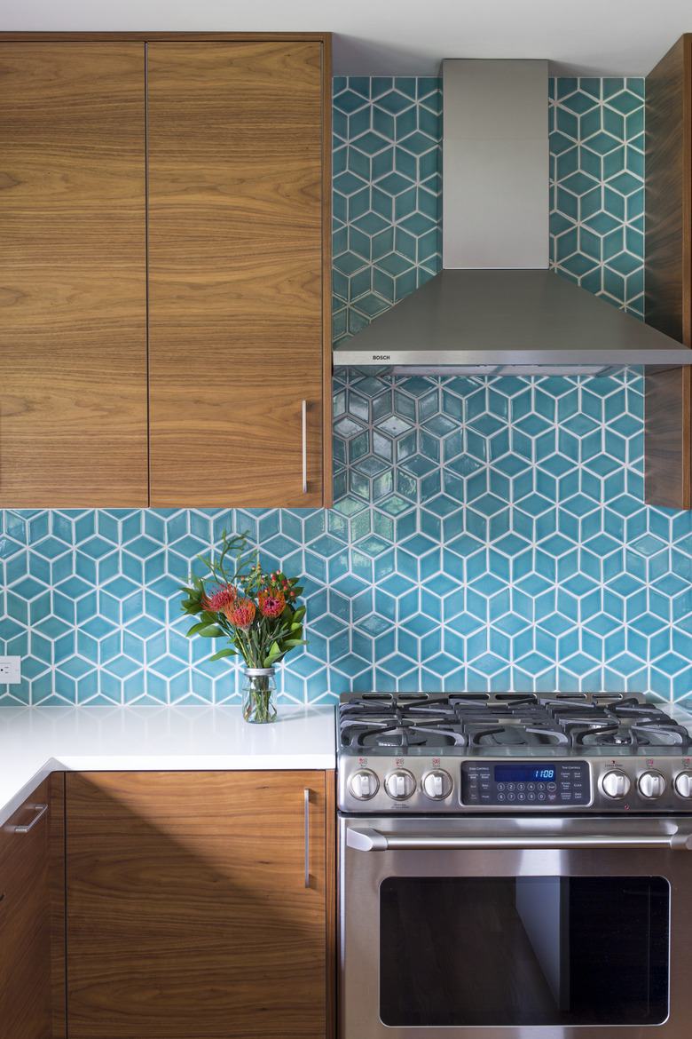
The vibrant backsplash is lined in Fireclay tiles, and the Ikea cabinets feature Semihandmade walnut doors and drawer fronts to draw upon the home's original materials.
6. Den
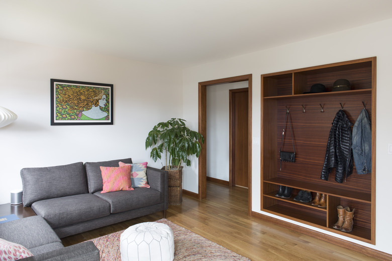
In the den, Boyer created built-in coat and shoe storage that was inspired by an original hutch in the dining room. A piece by rock music illustrator Chuck Sperry hands above a Perch Furniture sofa.
7. Bedroom
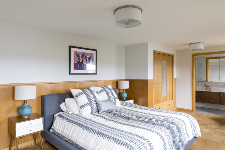
White oak paneling and flooring add warmth to the master bedroom.
8. Master Bathroom
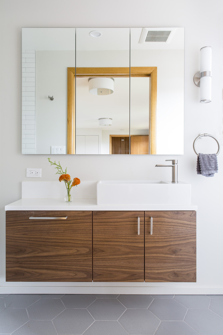
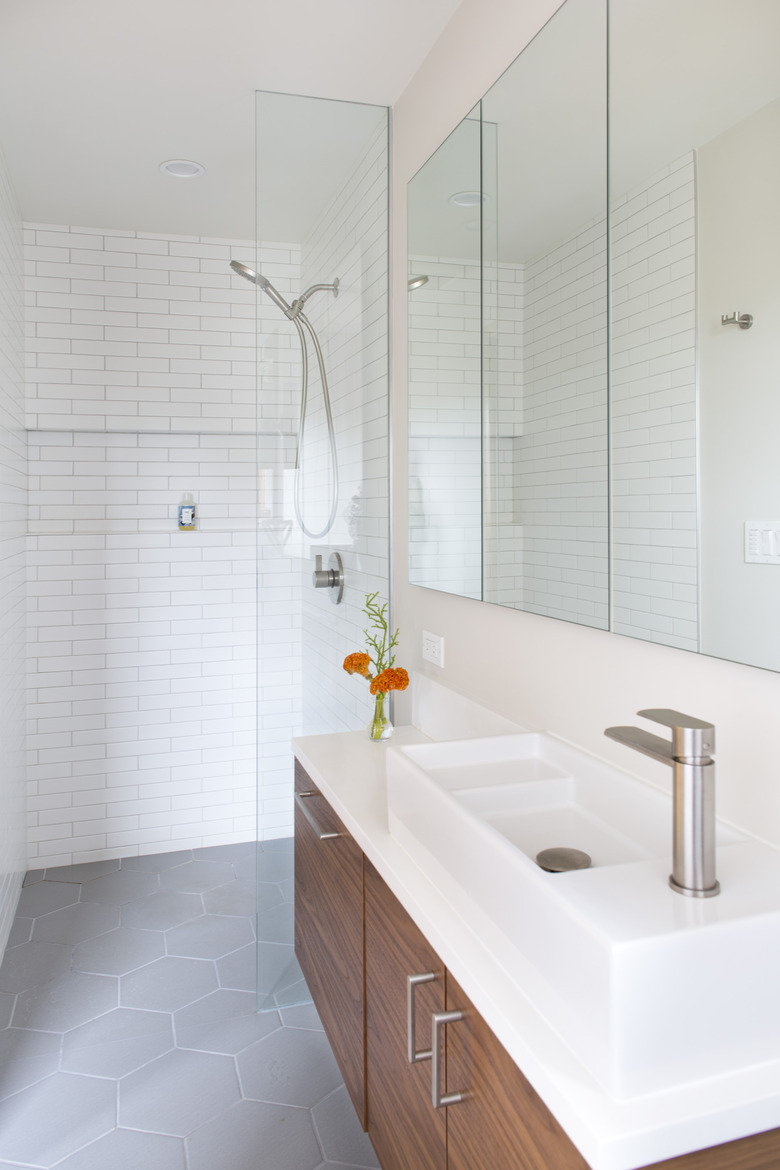
Boyer added a master bathroom to the second floor, which features a walnut vanity topped with a Caesarstone countertop.
9. Master Bath
The walls of the master bathroom are sheathed in tile by Daltile, and ceramic tiles by Ann Sacks were used for the floor.
