A Colorful Tile Mural At L.A.'s Sweetfin Takes Minimalism Up A Notch
When co-founder Brett Nestadt set out to design the fifth location of Sweetfin, a popular Los Angeles poké restaurant, he knew that spending time on creating a cohesive atmosphere was as important as developing a tasty menu. He wanted to interpret Scandinavian and Japanese influences for a casual California setting, which is confined to a small dining space on a well-trafficked city street. The result not only satisfies his objectives, but is a smart example of how to maximize the impact of a minimalist design. For starters, the dining area is centered around a focal point of brightly-colored tiles, and the adjoining materials — like light-colored wood against white seating and fixtures — place the attention on this eye-catching subject. Then, the layout of the furnishings complements the structure of the space itself, curving right alongside its frame. And in keeping with a paired-down aesthetic, the intrigue is in the details: geometric lines throughout the locale provide just enough interplay with the rest of the decor. Its a look that's definitely hip, but approachable enough for everyday meals.
1. Dining Area
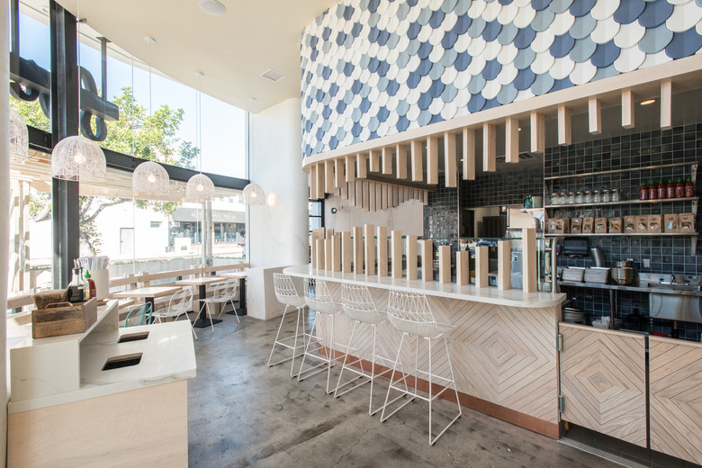
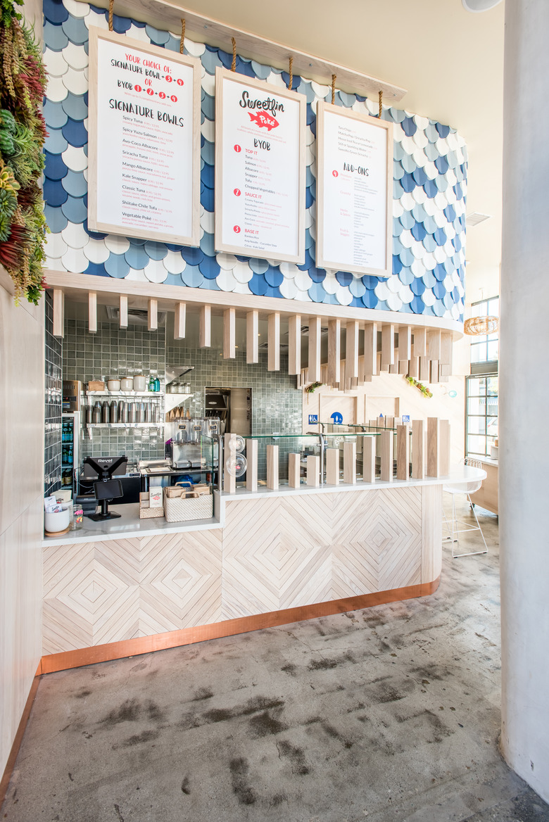
Through lots of research, Nestadt found concrete tiles by Kaza Concrete, a company based in Hungary, and decided to install the 6-inch tiles above the bar. The alternating colors of blues and white are a subtle color choice for this high-impact design element. L.A.-based Bend Goods custom-designed the bar stools.
2. Bar
Nestadt added the wooden elements to the bar to break up the kitchen space from the dining room, and says that visitors tell him it looks like the mouth of a sea creature. Blonde ash wood paneling wraps around the bar and extends into the dining room.
3. Dining Room
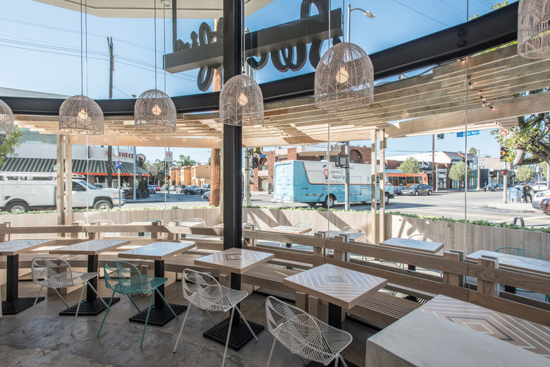
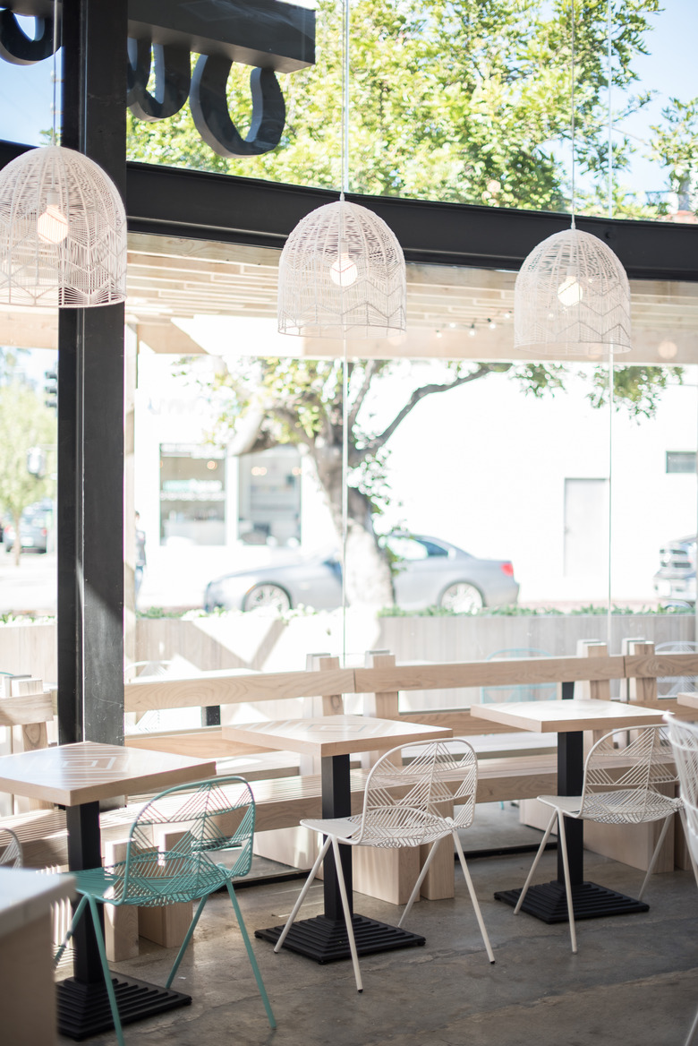
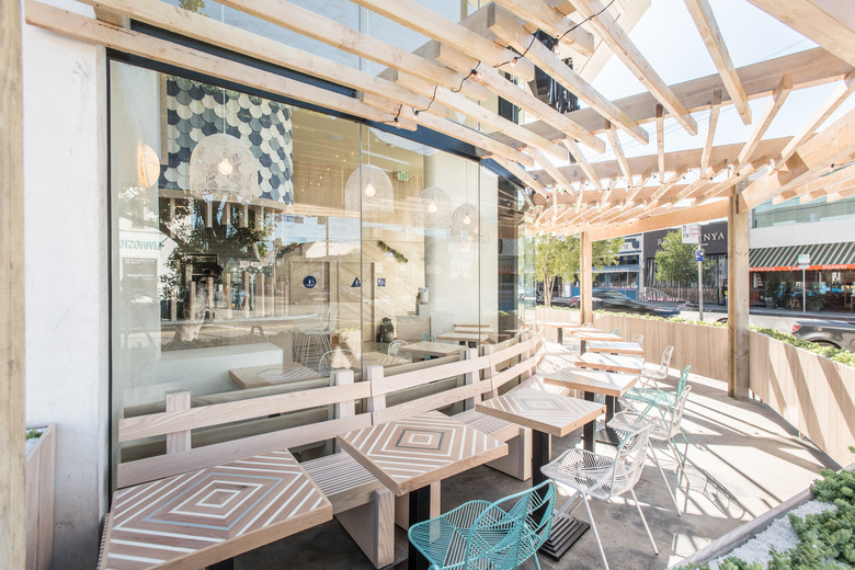
The inside dining area looks out on to the hustle and bustle of L.A. street traffic. Janine Stone of "If You Give a Girl a Saw" designed and made the tables by hand. Geometric lines on the tabletop match those on the chairs.
4. Dining Room
Lace and rattan pendants hang over cozy two-seat tables, and tie into the light color palette better than a metallic option. To maximize the seating space, Nestadt designed an Eames-style bench banquette that curves against the arc of the plate-glass storefront.
5. Patio
The outdoor patio's bench matches the inside seating area — a thoughtful example of design continuity. A wood trellis shades visitors from the elements, and provides the perfect opportunity to enjoy some poke and soak up the LA sun.

