A Family Expands Their Italian Apartment By Reimagining Its Cramped Attic
A growing family of four living outside Milan had a smart solution for their increasingly cramped quarters. They wanted to transform the empty attic above their apartment into more square footage, so they hired Italian design firm Archiplan Studio to put their plans into action. The team agreed that the upstairs area could be put to better use, but the designers concluded that the best way to do so would be by turning it into a living space that's fully equipped with a dining area, living room, and bathroom. They also decided that the renovation wouldn't disrupt the building's original footprint — the bedrooms would simply remain downstairs, and the work would revolve around creating a cohesive open layout that maximizes any available light. To create a unified look with distinct locales for cooking, eating, and entertaining, the designers stuck to woods like birch and durmast that coordinate with a creamy shade of white for the walls. The bright paint, in turn, magnified the sunshine from strategically-placed windows, which also illuminate cozy beams and clever built-ins. Now, the family's 1,000-square-foot home has more than enough space to meet everyone's needs, and does so stylishly.
1. Dining Area
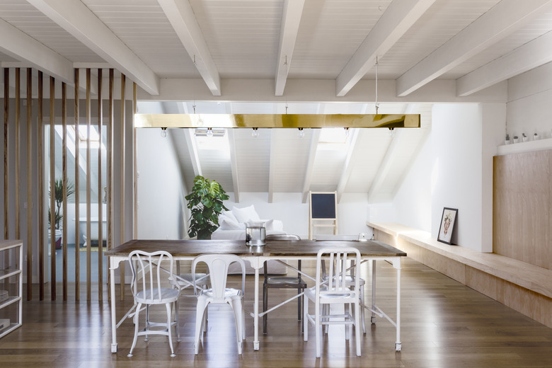
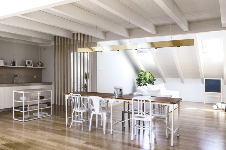
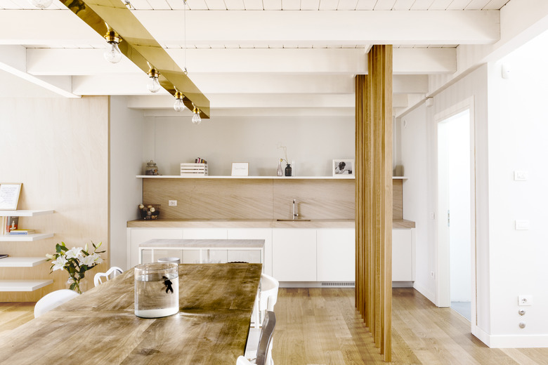
The firm transformed the family's existing dining table by adding durmast oak wood to complement the flooring. There's a mix of chairs around the dining room table, including one from Milano Cargo.
2. Dining Area
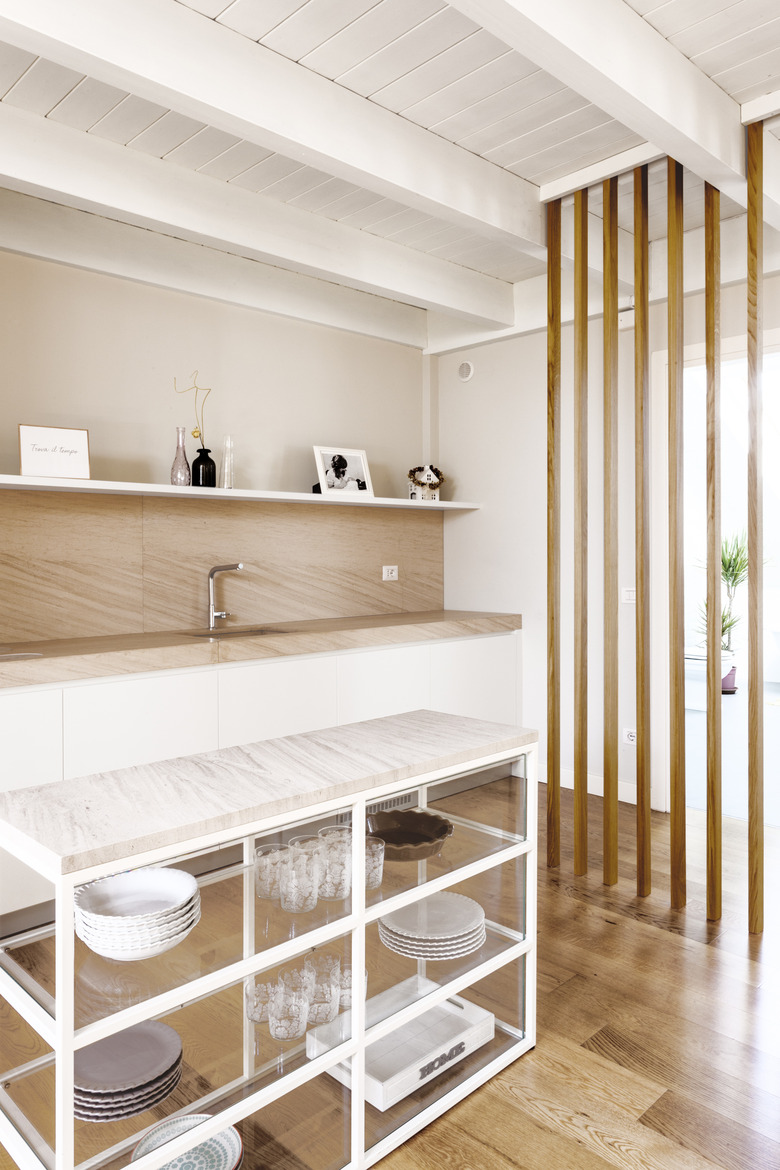
A custom island was created to store dishes near the long dining table. The light fixture above the table is an original Archiplan Studio design.
3. Office Area
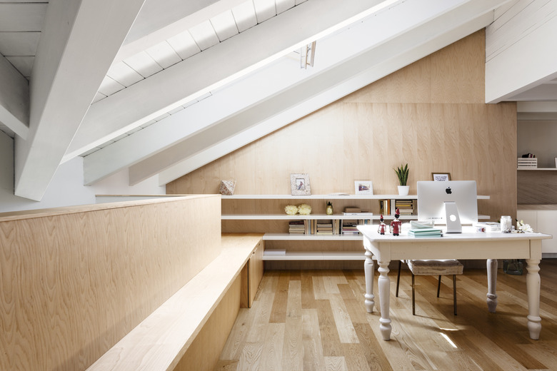
An existing desk was painted white to blend in with the lightness of the apartment. The bench, like much of the wooden furnishings, is made from durmast wood.
4. Living Area
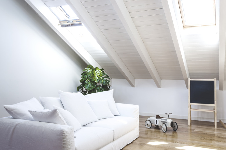
By painting the original ceiling beams a creamy white color, the designers were able to keep light in the apartment and create a comfortable place for the children to play. The sofa is Parigi Divano from Milano Cargo.
5. Living Area
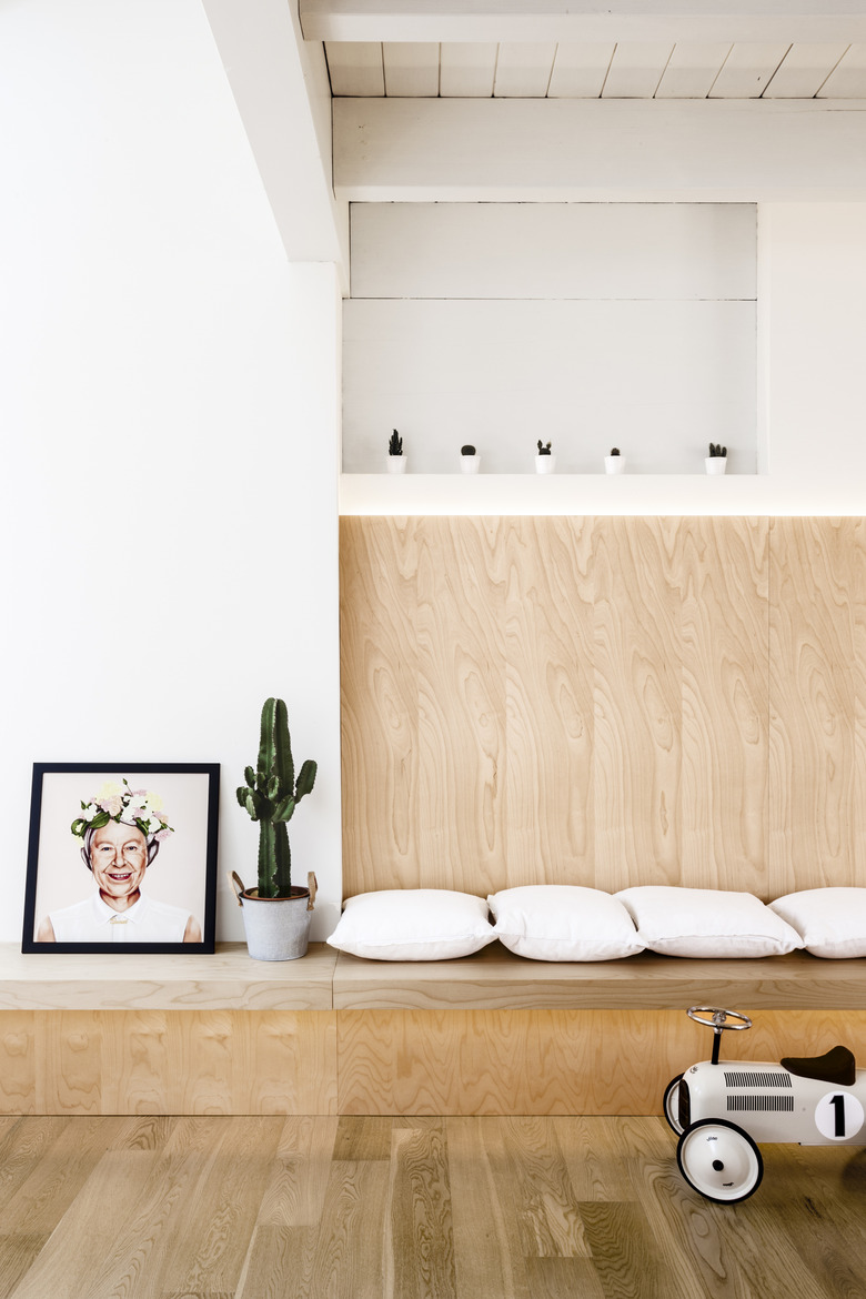
Pillows, art pieces, and toys add a touch of playfulness to the built-in seating.
6. Kitchen
The open dining space is organized around the dining table and complementary lighting design, which also matches the nearby custom-made beams.
7. Kitchen
A state-of-the-art kitchen design is complete with a CEADESIGN faucet.
8. Kitchen
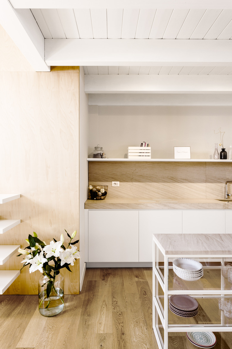
It wouldn't be an Italian home without a bouquet of fresh flowers.
9. Bathroom
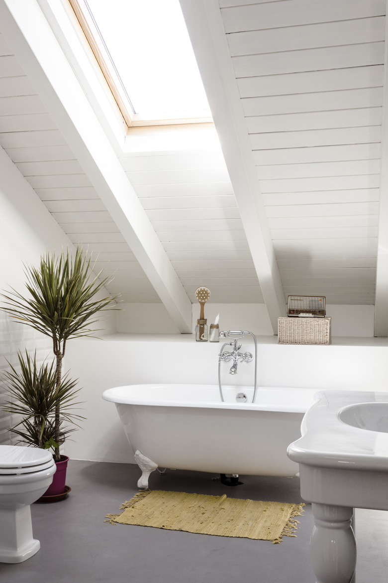
A slanted ceiling provides the perfect place for a window above the clawfoot bathtub and cement floor.

