Ysabel Is An L.A. Restaurant That Has Your Outdoor Patio Goals Covered
When your restaurant is set in a city with a year-round sunny climate, it's only natural that the design would take advantage of the situation. But the breezy, lush atmosphere of Ysabel isn't only a reflection of the weather surrounding its West Hollywood locale. In fact, when partners Phil Howard and Dean McKillen of Laurel Hardware were considering the appearance of this space, they drew inspiration from the equally temperate — albeit, also stylish — destinations of Buenos Aires and the South of France to create a thoroughly cosmopolitan dynamic. For starters, most of the seating options are positioned outside: multi-level patios interspersed with light-wrapped branches and verdant plants are made ever-more casual or luxurious based on the hour of the day. And perhaps even more striking, the sun or shade plays against rich textures and high-contrast colors to make every distinct area unmistakably luxurious. Sometimes, it's quite all right to make a fresh-air backdrop look and feel as upscale as a formal living room. Play with luxe materials and plenty of greenery, and the sun or moonlight will help give all of those elegant elements a soft, approachable finish.
1. Patio
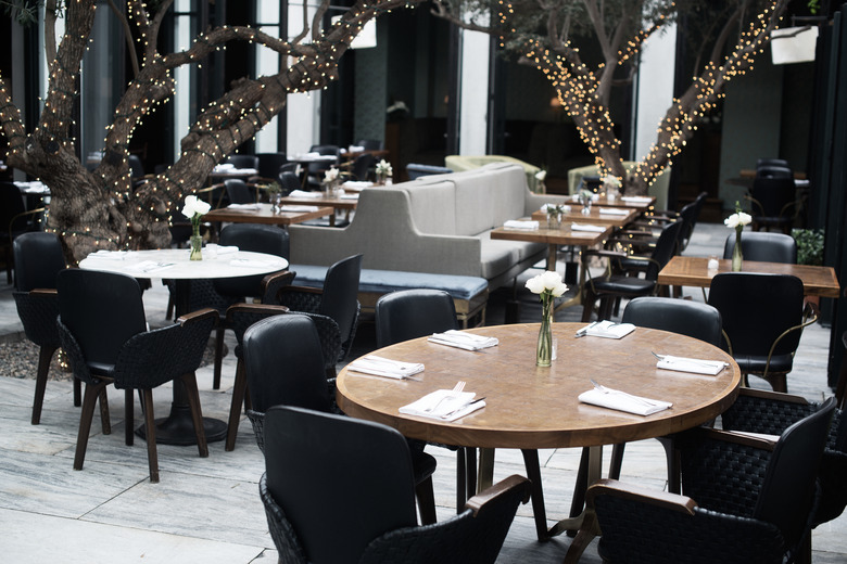
The main patio's color scheme plays with wood elements and inky colors, which contrast brilliantly against the California sunshine. Black-trimmed windows create a portal for restaurant-goers to travel easily between spaces.
2. Patio
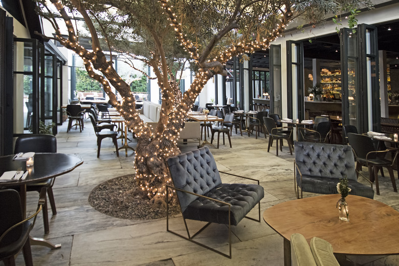
Lights wrapped around the olive trees blur the lines between dining room and garden in the best ways, and play up the details of its Mediterranean inspiration. The mixed seating options fit in seamlessly with the garden atmosphere.
3. Patio
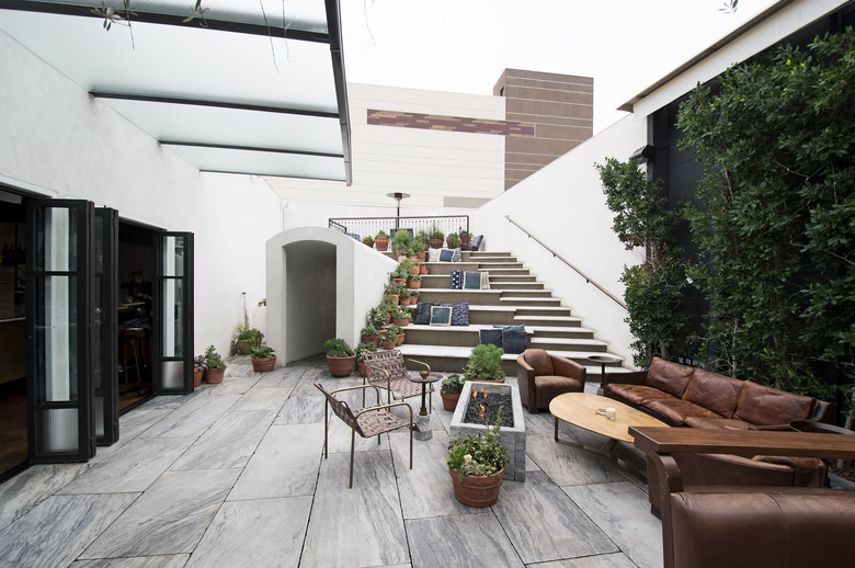
You won't find the light marble flooring throughout the restaurant at any store — it's the last bit of 100-year-old salvaged marble from Independence Hall in Philadelphia, PA. On the smaller, private patio, dark leather couches tucked up against dense hedges make for a perfect photo backdrop.
4. Patio Stairs
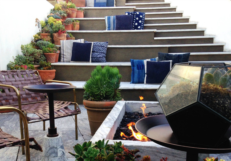
The step seating invites restaurant-goers to get comfortable around a marble fire pit and enjoy a glass of wine. The bright blue pillows pop against the light wash of the concrete, and the mix of textures and textiles match the variety of potted succulents.
5. Bar
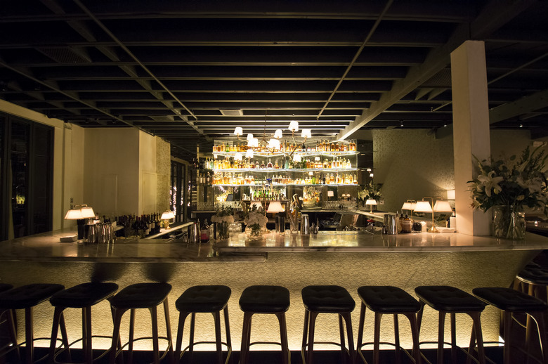
Ysabel's bar is inside the darkened restaurant, a magical ambiance to sidle up for a cocktail. The lighting in this room — underneath the barstools, the reading lamps, and behind the glass bottles and shelves — make for great design drama. The bar brass texture was created by careful painting and grinding.
6. Lounge Area
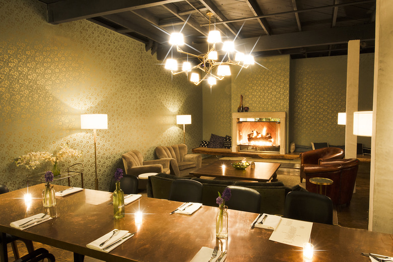
The seating around the fireplace inside the restaurant mimics the same layout outside on the patio, with some of the same materials and textiles. It's another great example that living room comfort and eating space sophistication don't have to be mutually exclusive.

