Wyoming's Anvil Hotel Is Exactly What You Picture A Beautiful, Rugged Hotel To Be
About 30 years ago, Erik Warner took an internship at a hotel in Jackson, Wyoming and soon fell for the area. He returned again and again over the years, and when he heard that a hotel was for sale — coincidentally, the same one where he held a part-time job during that internship — he reached out to Studio Tack to help him bring it up to date. Warner knew that this storied ski region lacked a guest property that wasn't a dated motel or a luxury resort, and he was confident that he could turn this downtrodden 1950-era site into a welcoming retreat. But before anything could be done, Warner moved to the town permanently to fully understand the culture, people, and history. "I lived and breathed Jackson for a year before any changes to the hotel were made," he said. In the end, he came up with a look that's a riff on the locale's many art galleries, outdoor vistas, and "cowboy culture," without relying on what he called "log cabin-y design." Instead, the Anvil Hotel opened this year with 49 rooms that give off a rugged vibe with a chic edge, showcasing stylish-yet-simple furnishings and a palette of colors borrowed from the outdoors.
1. Exterior
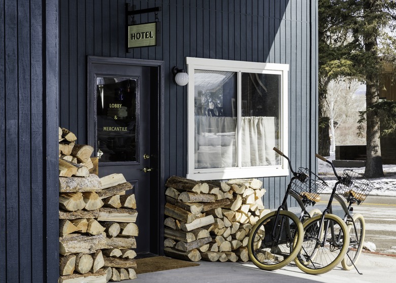
Warner, who is now co-founder of Eagle Point Hotel Partners, used muted, natural shades to comprise the hotel's palette — including this pretty blue painted over the exterior's vertical slats. The gold "lobby and mercantile" sign under the hotel marquee are intentionally timeless details that complement the equally classic stacks of logs.
2. Exterior
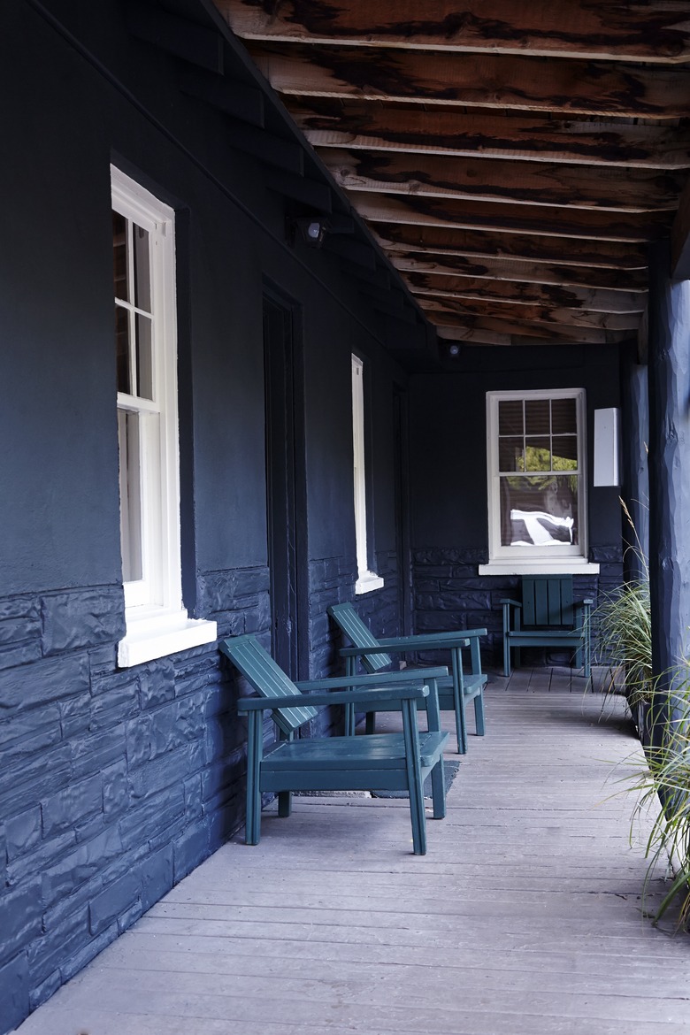
A shaded porch is an exercise in tones: dark navy walls match adirondack chairs, and exposed beams overhead contrast gray flooring.
3. Lobby
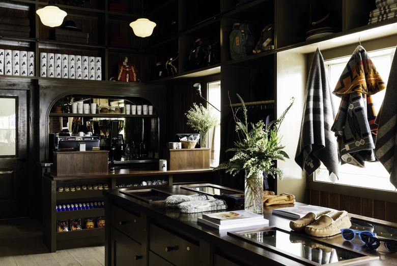
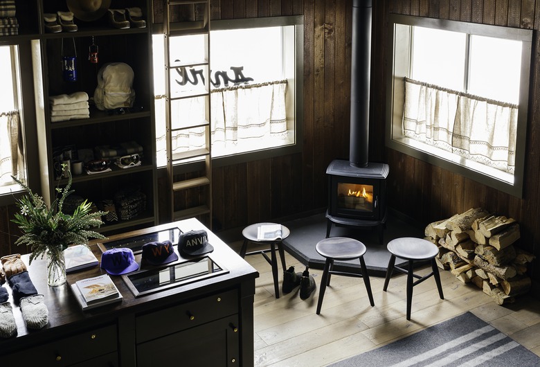
As a lobby and communal space, the mercantile welcomes relaxation with retail items evoking the region, which function as decor and art.
4. Lobby
The throwback wood-burning stove works as a gathering place for guests at the entrance.
5. Dining Room
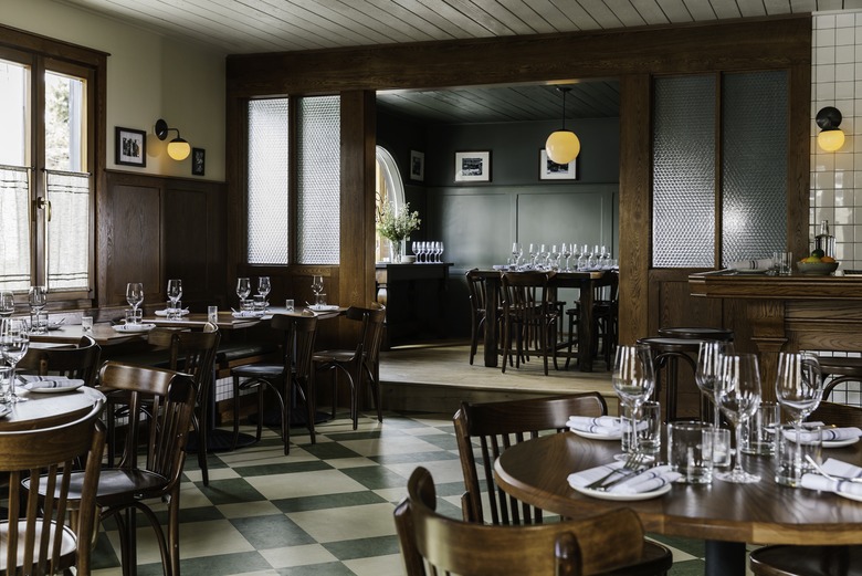
The hotel's restaurant, Glorietta Trattoria, features down-home materials — such as milk-glass pendants for lighting, black-and-white photos above wainscoting, and wooden dining tables — to complement a wood-burning grill in the middle of the room. Sage-colored walls are a nod to the outdoors.
6. Guest Room
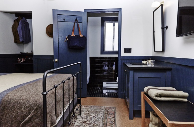
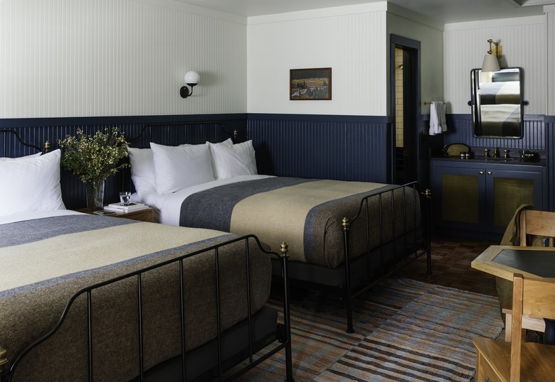
Studio Tack collaborated with Charles P. Rogers — a manufacturer of brass and iron beauties since 1855 — on the design of the custom metal beds, which are anchored by side tables from Hedge House. Custom Woolrich striped blankets, Tretiak Works benches, and Allied Maker lighting complete the space.
7. Guest Room and Bathroom
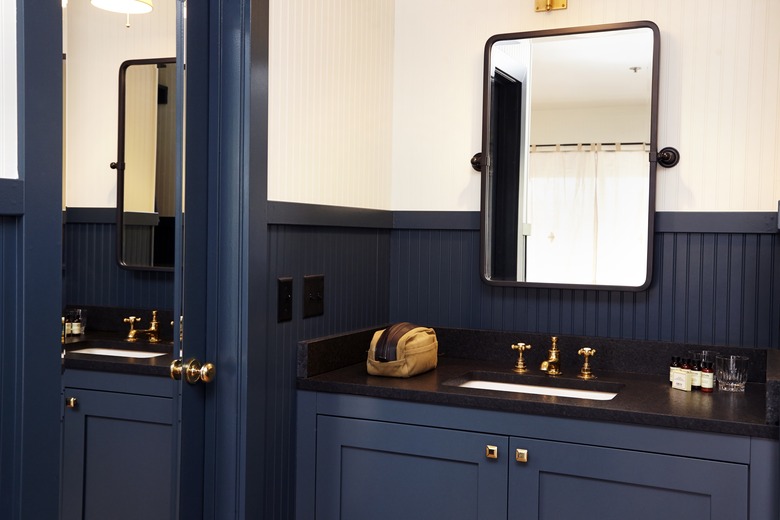
Black subway tile in the bathroom matches other black accents in the guest room — from the bed frame, to the sink countertop, to the mirror — to unify both spaces.
8. Bathroom
An iron-framed rectangular mirror and Waterworks brass fixtures give the vanity a modern twist on timeless style, while the reoccurring blue shade connects this private area to the rest of the property.
