How To Find The Right-Size Picture For Over A Couch
Your artwork's composition, colors and creative value are all but lost if its size and position over the couch make the arrangement appear disproportionate. Sidestep this design faux pas with size and spacing prompts to help you find the right picture or grouping of pictures for this highly focal area.
The Two-Thirds Rule
The Two-Thirds Rule
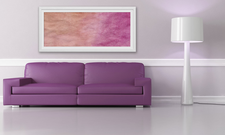
Although your choice in artwork is as personal as your taste for food, music and color, its width matters more than you may realize, making your measuring tape as valuable as your discerning eye for finding the right "masterpiece." The art's width, including its frame, should measure about two-thirds of the couch length. Simply put, if your couch is 87 inches long, your art should measure roughly 58 inches wide.
Making the Height Choice
Making the Height Choice
Keep your picture — or its frame, if it has one — 8 to 10 inches above the couch so that they appear visually connected, rather than too cramped or separated. Typically, you should center pictures at eye level, but in a sitting area, hang them a few inches lower, if possible. In an average-height room, an overly tall picture can dwarf the couch; let the couch appear beefier than the art, so that it grounds the setting. If the artwork seems too low or you're uncomfortable with the void above a squat picture, opt for a slight taller one, or mount directional lighting on the wall to highlight the art and fill in some of the blank space.
Between Frames: Grouping Artwork
Between Frames: Grouping Artwork
An artwork grouping reads as one when the pictures aren't spread too widely apart, but don't bunch them too tightly together just to fit the two-thirds rule. Spacing your pictures 2 to 5 inches apart keeps them from appearing disconnected or cramped. Replicate the grouping with painter's-tape outlines rather than winging it or punching holes in the wall needlessly. Stand back to gauge the faux frames' spacing before committing to an artwork arrangement.
Left, Right and Taller
Left, Right and Taller
Depending on the room's layout, the wall's available space and your taste in sofa style, you may prefer an off-centered picture or grouping. For example, if your sofa partially backs a window, use art to make up the balance of the two-thirds portion. Or, if you gravitate to asymmetrical design, move the art left or right, using a side table's edge as the stopping point. For a high wall, use high frame-less art; without a frame, tall artwork won't overshadow the couch. Getting the arrangement just right can seem tricky, but if the picture's colors, theme, size and position are in sync with the couch and surrounding elements, the setting will appear visually comfortable — trust your eye.
