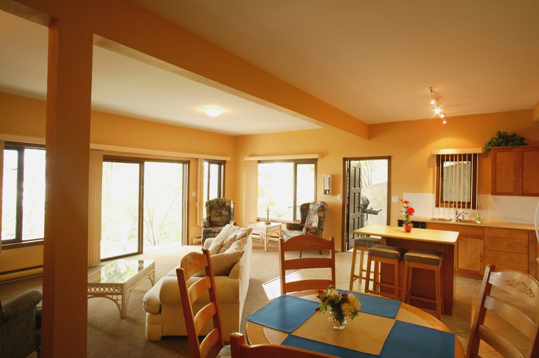
How To Decorate A Living Room-Dining Room Combo
Open plan doesn't always mean spacious, modern, light-filled — all the expansive words to describe the ideal. The real thing can be cavernous, cramped, shadowed and awkward. Choices of colors, textures, furniture scale and storage all affect the use and enjoyment of your one-room-fits-all living-dining space. First, analyze your use of both rooms, and then favor frequent use over occasional when allocating space. You need to link and separate the two halves of your room.
"Tiny" Doesn't Cover It
"Tiny" Doesn't Cover It
Your glorious combo living-dining room is smaller than a shoebox. The minute you move a single piece of furniture into it, you're going to be barking your shins. Get tough and think "stage set" to make this pizza-slice of real estate work for you. Put a bistro table and two chairs directly in front of the fireplace, and flank the fireplace with floor-to-ceiling bookshelves. Underscore the "dining room" space with a large framed piece of art over the mantel, squared exactly behind the table. Two identical wood stools, or upholstered ottomans with hidden storage, sit in front of the bookcases until they're needed for company or dinner guests. Place a sofa or chaise with big plump pillows against the opposite wall, on an area rug large enough to extend past it and under two matching chairs sitting side-by-side, perpendicular to one end of the sofa, to form an L. Tuck a clear acrylic trunk or tiny coffee table into the corner formed by the seating.
Limited Palette
Limited Palette
Monochrome and neutral colors impose a sense of calm over a busy shared living-dining room, but that doesn't mean you must settle for dull. Decorator-white walls and ceiling, white sectional, white leather-covered or upholstered dining chairs, white pendant lamps and marble paver floors pull the room together. Matte black coffee table and dining table, black furniture legs, and a black-and-white contemporary living room carpet link and define the spaces. Square shapes in black and white further blend both areas. Cube-shaped club chairs upholstered in nubby black echo the square black frames around a square grid of wall-mounted black-and-white art prints. White dining chair backs are square over black metal legs. A narrow black border traces the top line of the banks of windows wrapping around the corners of the room.
Sage Advice
Sage Advice
Architectural Digest posed the one-room-fits-all challenge to some of its favorite designers, who had very individual ideas about spacing and decor. Carleton Varney recommended a Coromandel screen, green plants and directed lighting to form a barrier between the two functional areas. Hugh Newell Jacobsen suggested devoting two-thirds of the space to living room seating, with the back of the sofa against a refectory table of the same length. Chairs lined up along the far wall of the dining space turn the long table into a banquet for guests. Ellie Cullman stressed the importance of keeping colors and decor unified, and defining the areas with two carpets. Mitchell Turnbough advised treating the dining area as a library, the table as a library table, and pulling in chairs to use the cleared table for supper or company.
Hiding in Plain Sight
Hiding in Plain Sight
Invest in a wall system that houses your books, media gear and flat screen — and contains a fold-down or fold-up panel that becomes a dining table for six. Furnish the room with Mid-Century Modern finds or good reproductions, including a rainbow array of molded fiberglass Eames chairs. The chairs are colorful art and seating — arranged around the sofa and modest coffee table and lined up along one wall when not in use. Pull the chairs over to the folded-out table for dinner. The table also works as a desk, and the wall system may contain closed cupboards for storing dinnerware and home office equipment and supplies.
