A Renovated Home In The Paris Suburbs Is A Bibliophile's Dream
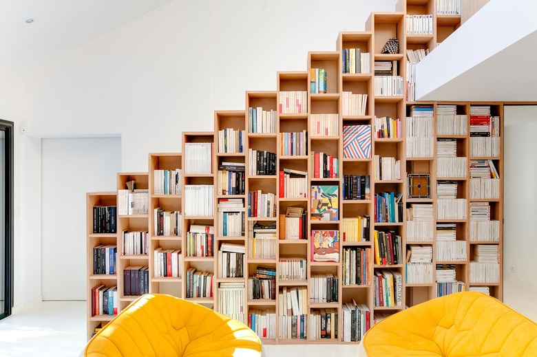
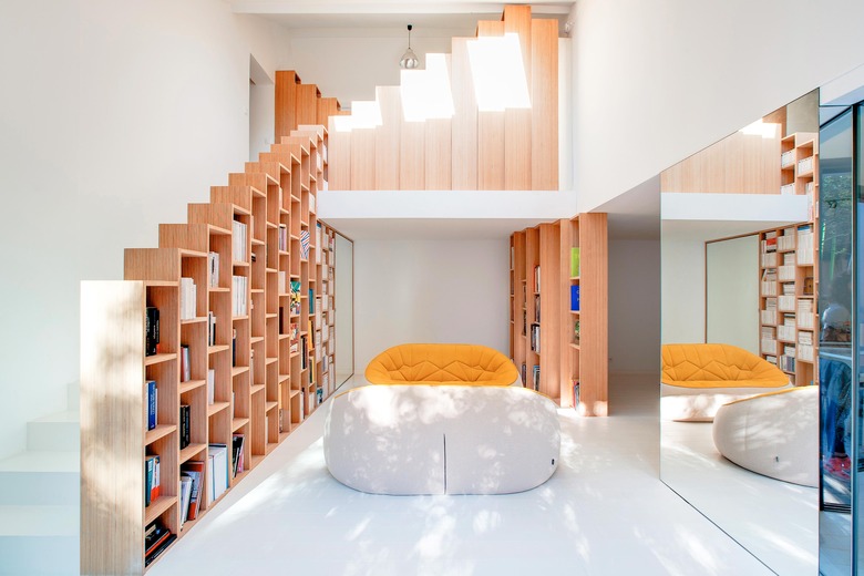
An outdated home in the Paris suburbs was characterized by all the usual pitfalls when Italian architect Andrea Mosca and his team descended on it for a renovation. "When we saw the house's interior for the first time, it was a very cold and unhappy place to be: ceramic grey tiles, old-fashioned stairs with cables, an open stainless steel kitchen," Mosca said. The three-story house was meant for a family of five, who were currently staying at a friend's place during the construction. And while they were there, inspiration struck. The owners fell in love with a wall-length bookshelf at that residence, and they wanted to have one of their own. Mosca agreed, but he didn't simply install typical shelving — he made custom bookshelves a central feature of their light-filled upgrade. "As well as providing a place to display books, the beech wood shelves act as stair bannisters," Mosca explained. "The largest unit extends from the first floor to the mezzanine, serving as the main bookshelf in the living room as well as a bannister on one side of the stairs." The stairs act as screens, too, which divide spaces punctuated by minimalist white floors and fun pops of color. By the time the family moved into their new address, they were welcomed by a 1,700-square-foot haven that's equal parts organized and cunning.
1. Living Room
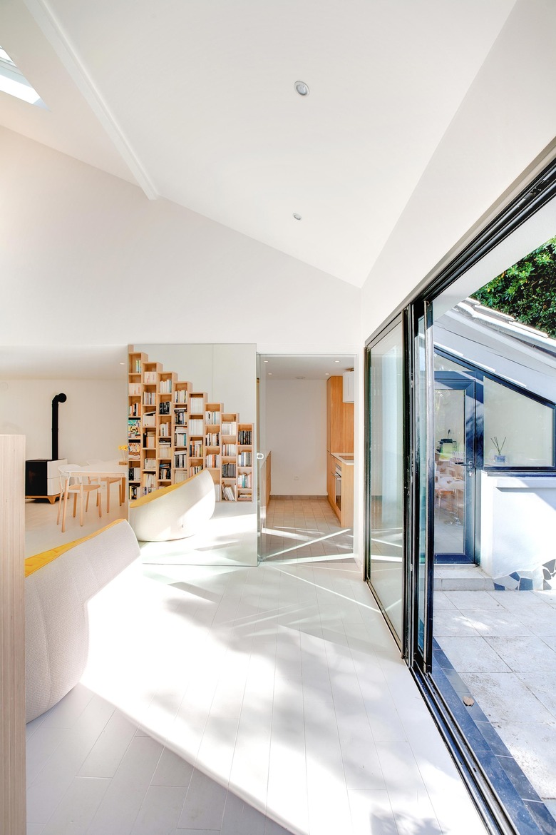
The "bookshelf wall" is the defining feature of the living room, which also is the front facade of the staircase.
2. Living Room
"The single bookshelf element is repeated: it moves around the house as the backbone of the new interior," Mosca said. "We really like this kind of situation — the use of a traditional icon and materials in a new, contemporary way."
3. Living Room
To stay within the budget, the designers chose a material with edges that didn't need to be veneered. No paint or glue were needed, either — the woodworker just cut, sanded, and applied oil to the panels. The panels were delivered straight from a factory in Holland, not too far from the home.
4. Living Room
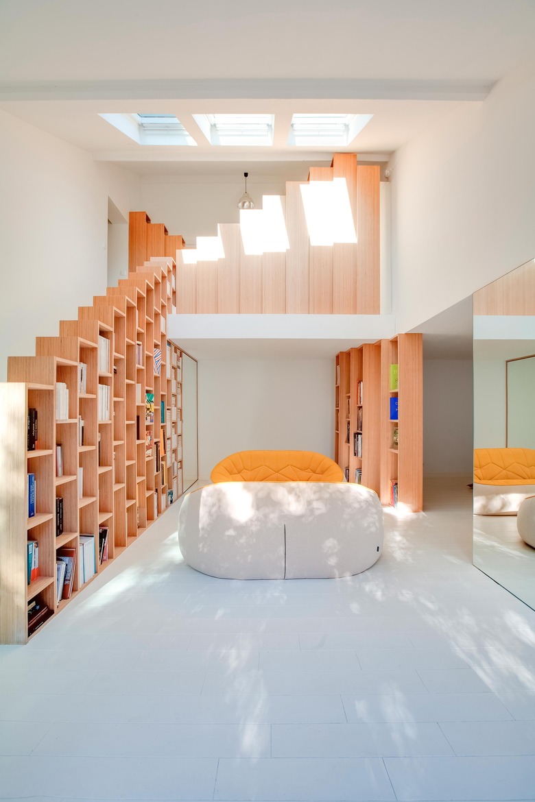
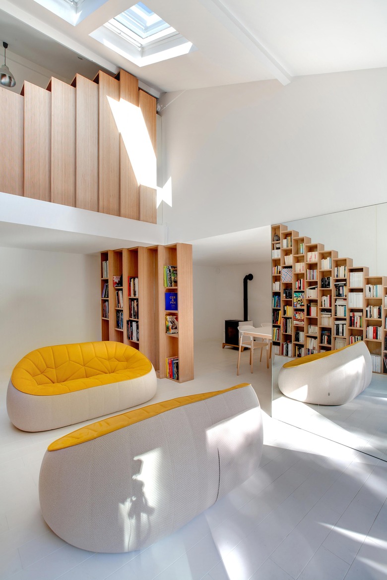
The round ottomans from Cinna balance out the jagged geometric shapes of the bookshelves and shadows from the skylight.
5. Living Room
A sliding glass door and white-painted wood floors allow for an abundance of natural light to flow into the living room.
6. Dining Room
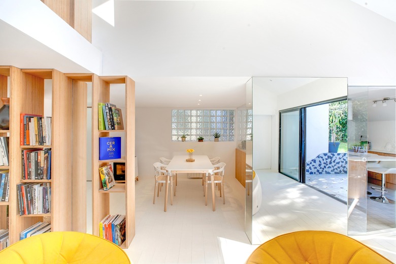
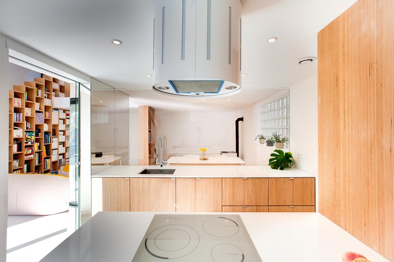
"We enclosed the kitchen within a big glass panel and sliding door to let as much natural light as possible enter the space," Mosca said. By placing a mirror across the glass, the space is open to more natural light.
7. Home Office
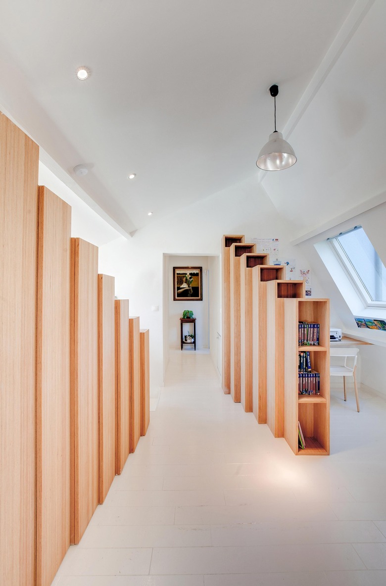
On the mezzanine level, the shelves serve as a screen facing the living room and a storage cabinet on the other side. An enclosed office acts as a quiet space to read.
8. Kitchen
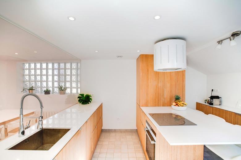
Opting for stronger materials was a priority in the renovation, too. The countertop, a quartz slab from Stone Italiana, is five times stronger than marble.
9. Kitchen
The kitchen is somewhat separated by a large glass panel, providing a view of the books.
10. Storage
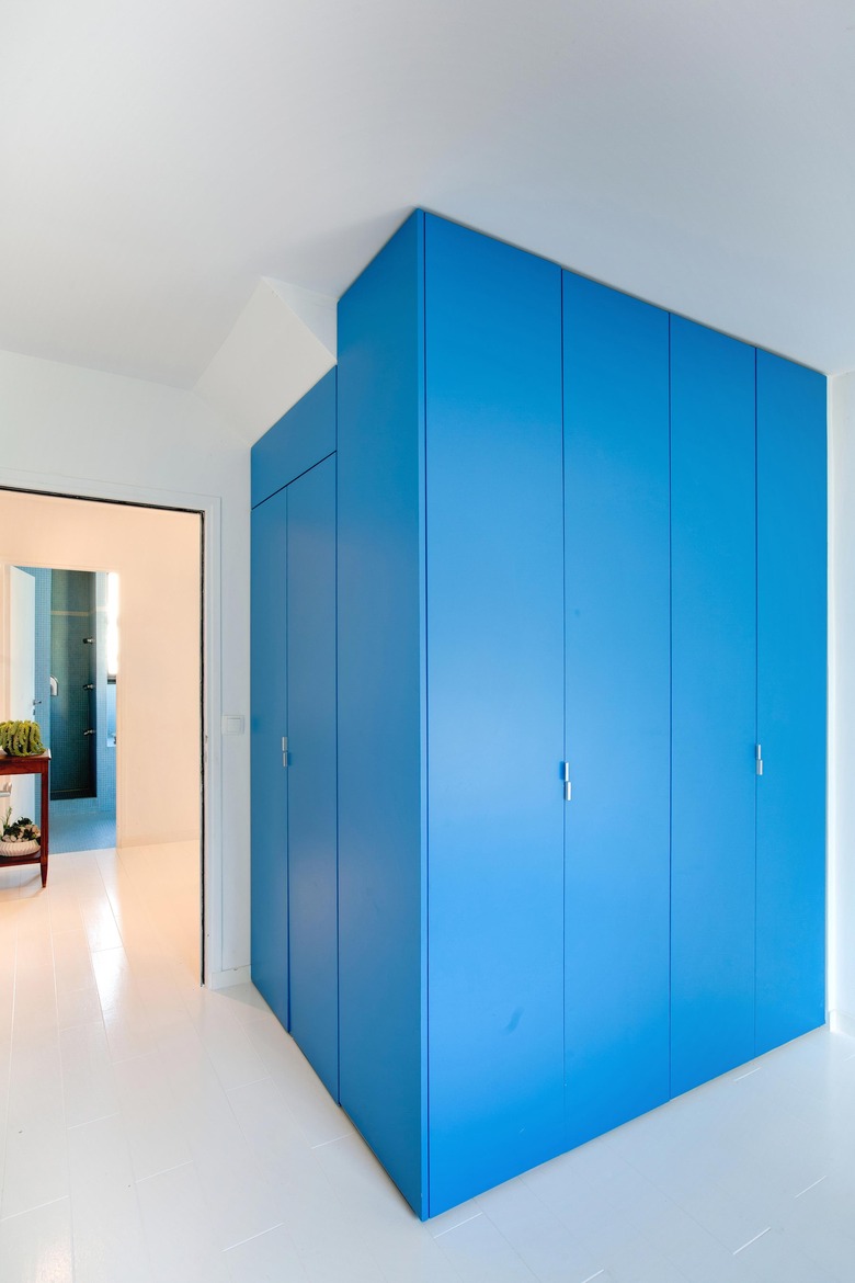
Bright colors don't have to take over a space. By using the same wood material for much of the interior structure, and then pairing it with white paint, bold colors can be used sparingly to add interest to a corner, which is the case for this wall.

