A Belgian Couple Builds A Light-Filled Addition Nearly 10 Feet Below Ground
When a couple in their 40s decided to expand their house in Leuven, Belgium, they saw it as a chance to infuse their passions — sports, travel, and books — into a new space.
But before they could tend to those details, they had to figure out how to deal with the tricky location for the addition, which was situated nearly 10 feet below street level beside their garden. Architect Rob Mols thought that a window-filled extension surrounding the patio would work, and he partnered with Studio K to ensure that the architecture and interiors would be in perfect harmony.
Mols had selected pine for the ceilings and black aluminum–framed panes for much of the walls, which Studio K complemented with light gray polished concrete floors. "It reflects the natural sunlight, gives tranquility to the space, and contrasts beautifully with other materials," Karlien Heremans, the founder of Studio K, said. Then, they outfitted the bright locale — which includes a library and a gym — with plenty of storage opportunities to showcase the owner's many books and souvenirs. It was a creative solution for an unconventional problem, and it's now filled with reminders of the pair's favorite things.
1. Living Room
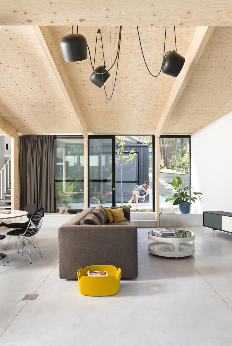
The living room's polished concrete floors extend out on to the patio, creating continuity between the two spaces.
2. Dining Area
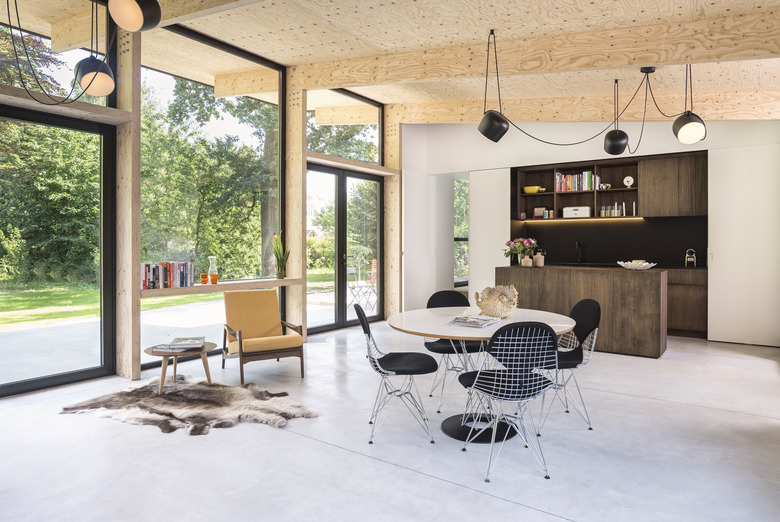
Vintage midcentury furnishings and a hide rug add warmth to the dining area and complement the exposed pine ceiling and beams.
3. Kitchen
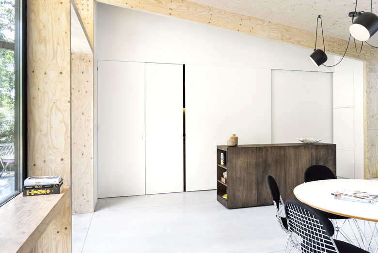
The couple wanted to be able to close off the kitchen, so Haremens added white sliding doors to conceal the section that lines the wall when it's not in use.
4. Library
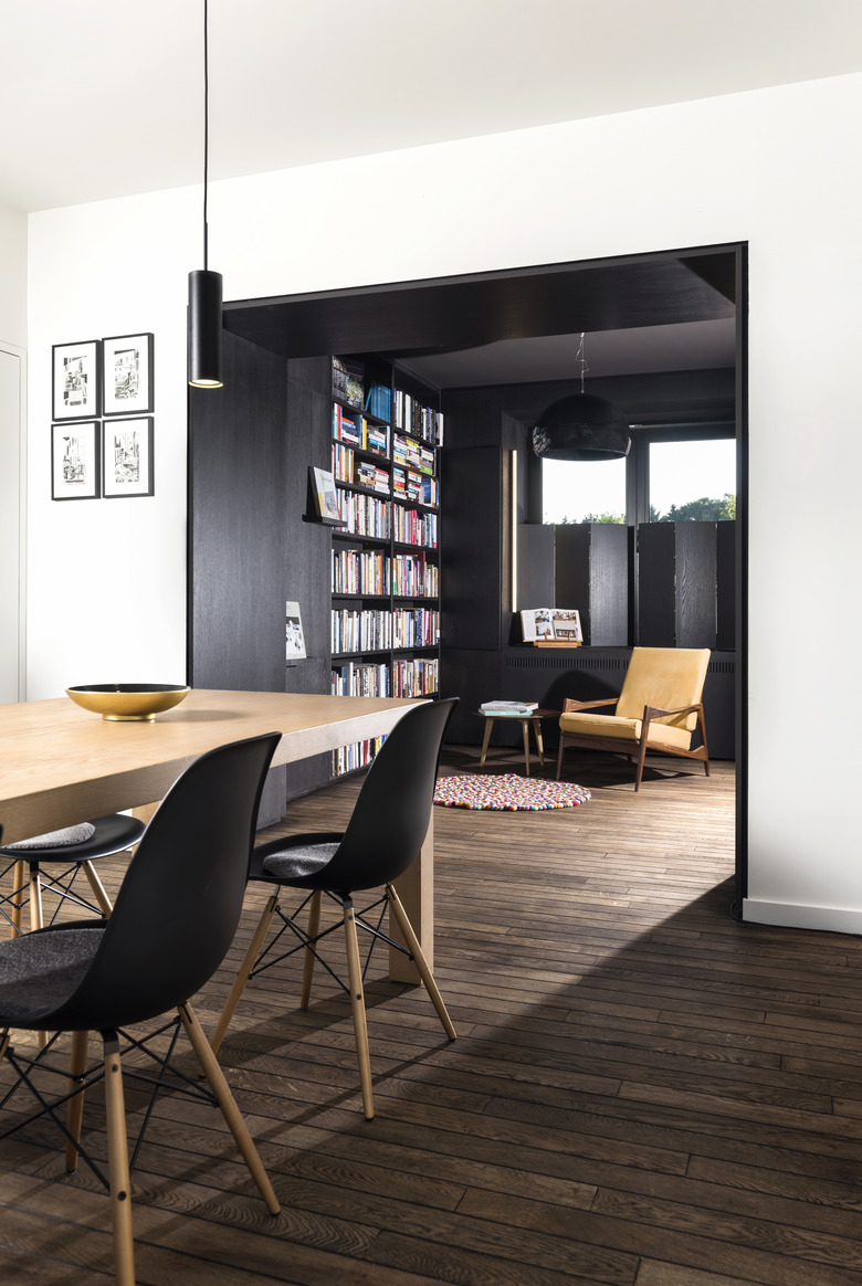
Stained oak shelving provides lots of storage for books in the library. The large table can be used as a desk or for entertaining.
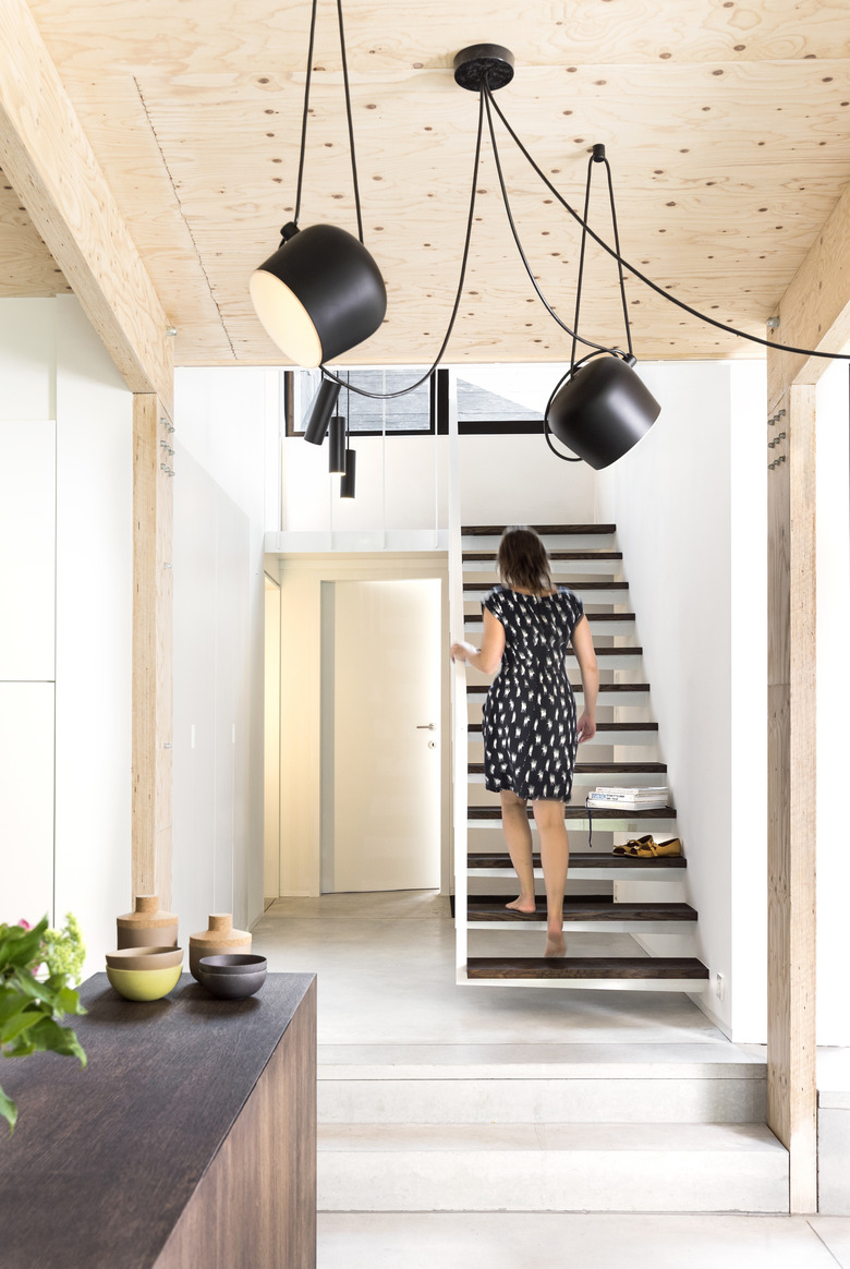
5. Staircase
The floating staircase leads from the library to the garden level, and its open design allows light to pass through to the space below.
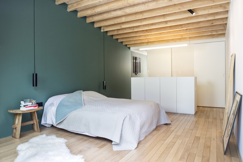
6. Bedroom
"The forms of the ceilings were very present in the interior, so we worked with softer materials and colors," Heremans said. The walls of the bedroom were painted in the same color as the tiles that line the shower.
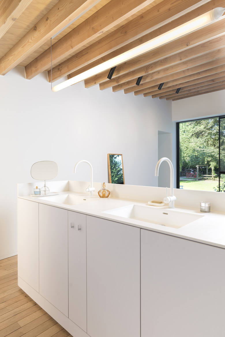
7. Bathroom
The bedroom and bathroom are separated by a sleek white double vanity.
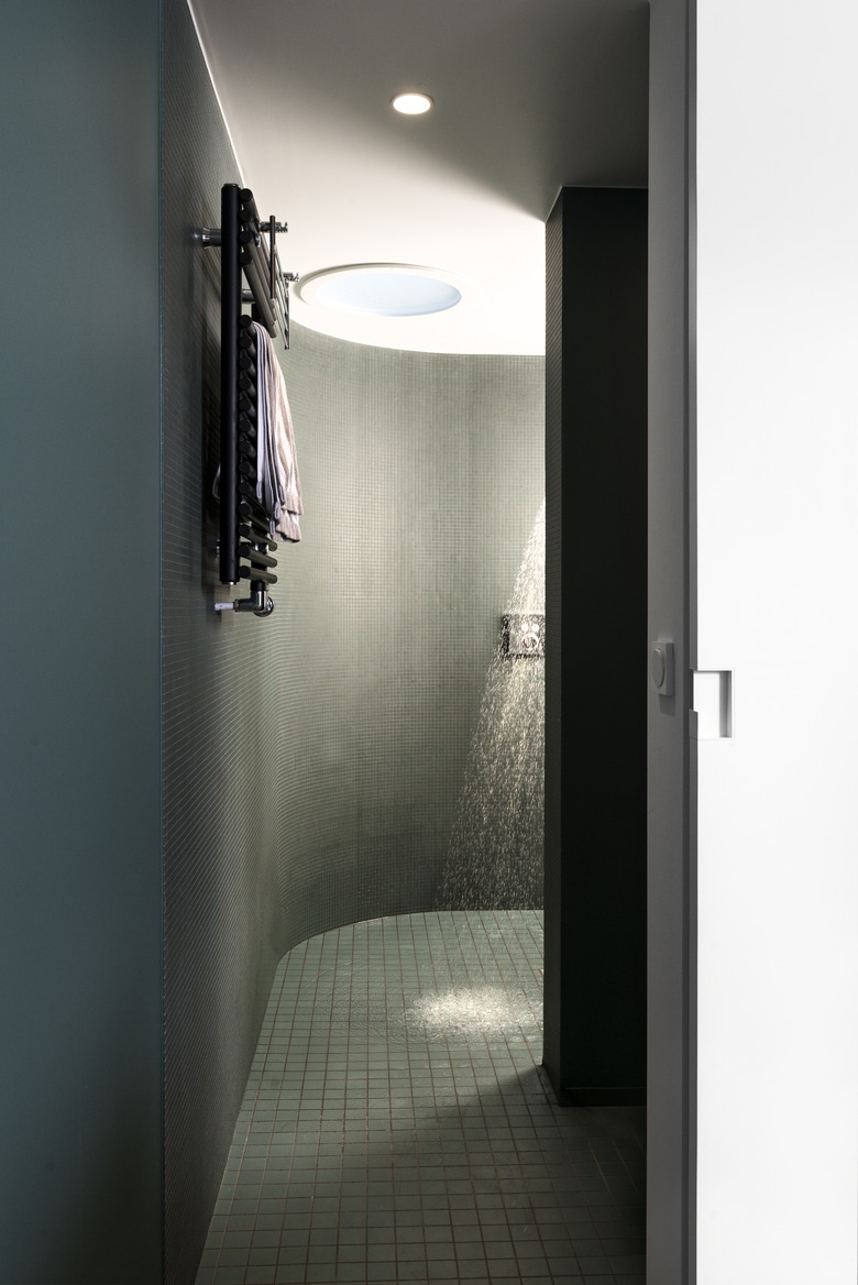
8. Shower
Dark green Winckelmans tiles line the shower. "Its orbicular form creates a little intimate spa retreat with a dome in the ceiling," Heremans noted.
9. Gym
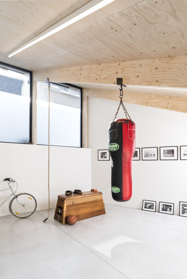
Black-and-white photographs are displayed in the gym, which is located on the other side of the patio.

