A Sydney Property's Original Details Remain Untouched In A Modern Renovation
When Architect Prineas set out to renovate a historic Victorian street terrace in a suburb of Sydney, Australia with a more modern aesthetic, the team faced a common challenge. Once they saw its beautiful original details, they didn't want to touch them.
The property featured intricate crown moldings, aged hardwood floors, and unique patterned tiles that seemed too precious to discard, despite the fact that the owners also sought an environmentally-friendly address fit for the 21st century. So, to satisfy the firm's affinity for the past with the owners' request for the present, the team came up with a compromise. First, the multi-level layout was reoriented toward a private garden that would give every room an abundance of light. Then, a neutral color palette and natural elements would be used to complement those views. That take on the interior design would allow the period details to shine, too.
When the project was finished, Architect Prineas was able to present a modern home with classic attributes — or in other words, the best of both worlds.
1. Living Room
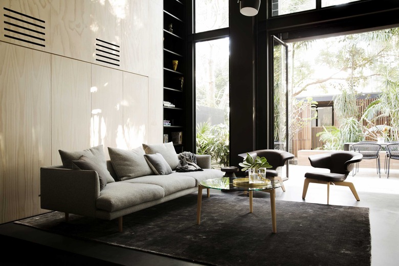
The living space's large windows create an easy indoor-outdoor flow toward the garden. The sofa, which is the Nook model from Jardan, sits next to a pair of Munich lounge chairs by Classicon. Black built-in shelves extend to the ceiling for ample storage.
2. Kitchen
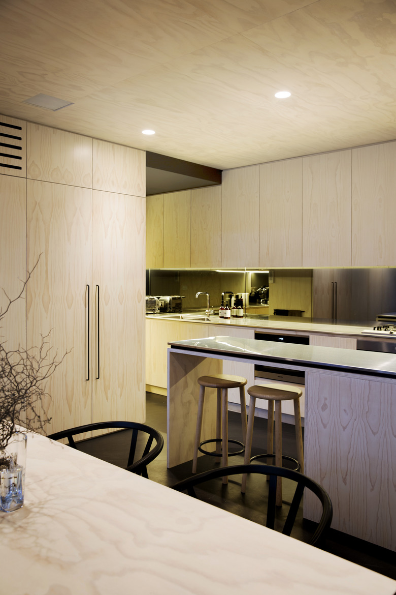
Plywood is a huge component in the home's design, and brings a modern feel to the overall palette. In the kitchen, it covers the cabinetry and extends up to the ceiling.
3. Hallway
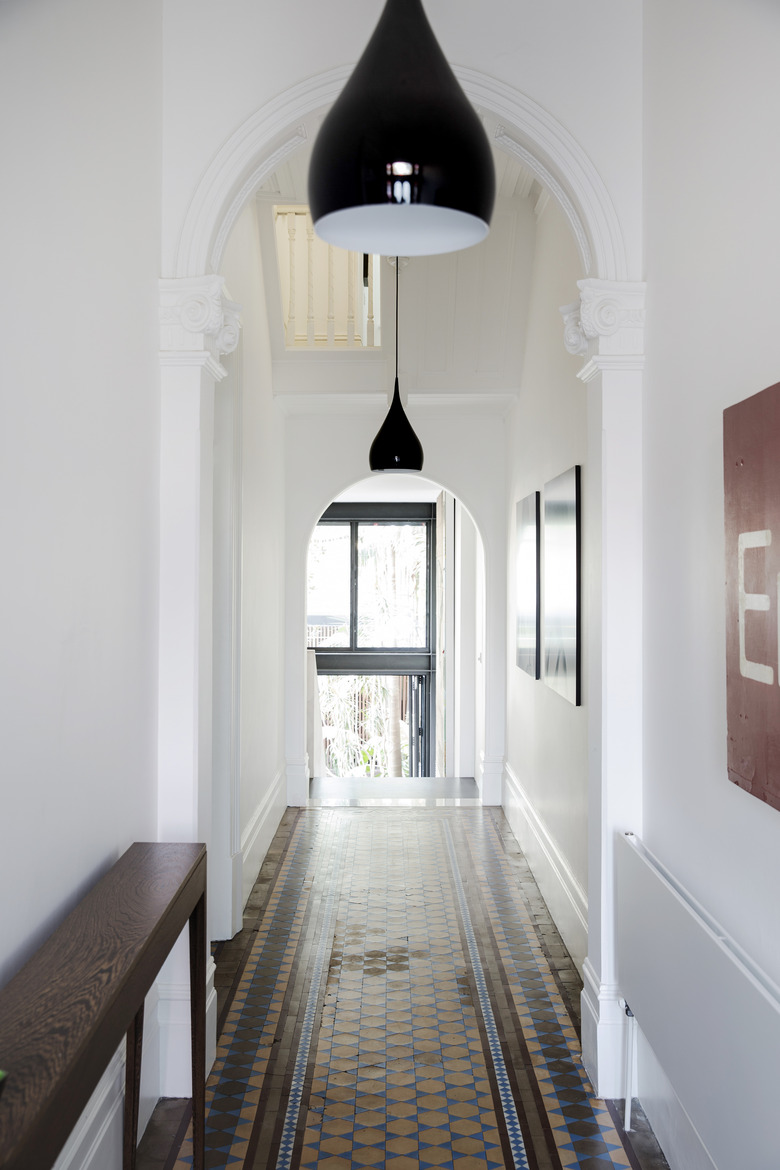
Throughout the home, the design team contrasted contemporary furniture and fixtures against some of the original details. The rounded moulding and a tiled floor in the hallway, for instance, are offset by modern black pendants.
4. Office
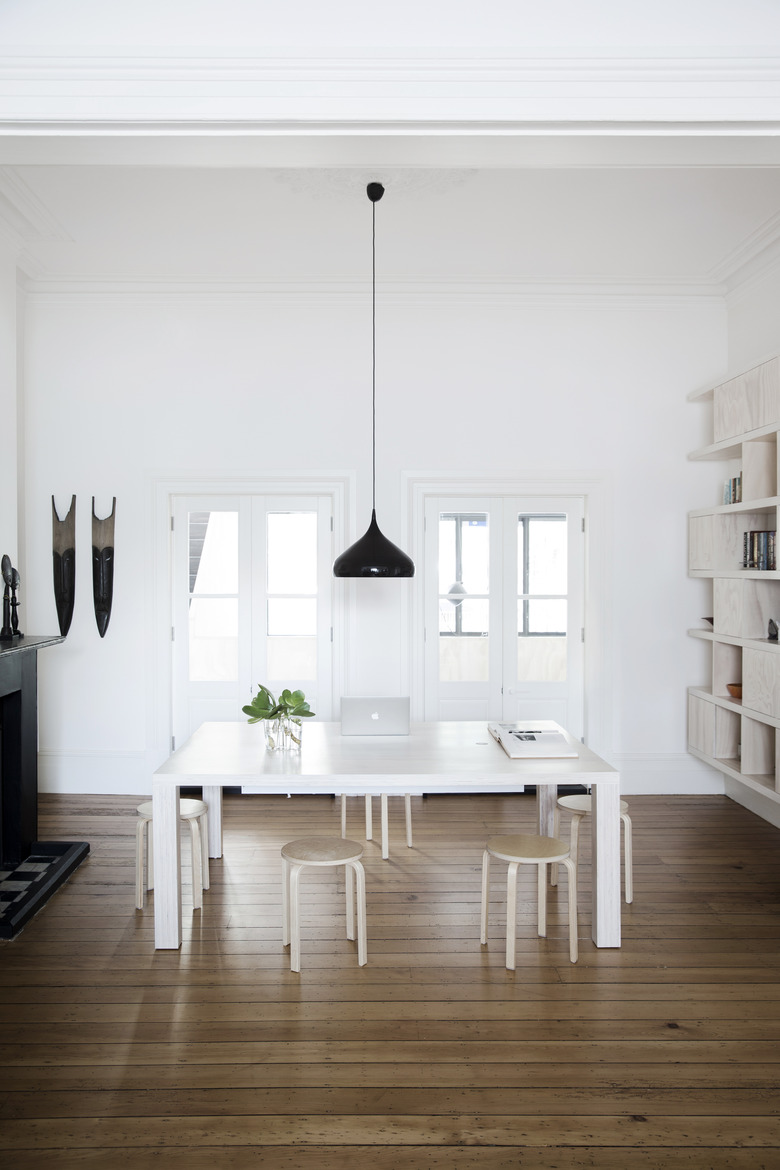
This all-white workspace seems totally modern at first, but details in the space — like the flooring, fireplace, and moulding — bring it back to the home's design story.
5. Bathroom
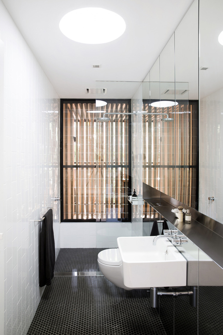
The minimalist palette of white, brown, and black allows the original features to shine. In the bathroom, a mirrored wall faces subway tiles. And outside, a wooden facade covers the terrace's exterior for privacy.
6. Bedroom
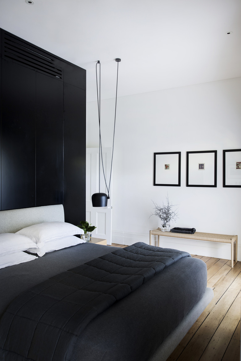
In the bedroom, an all-black accent wall makes for a dramatic entrance but also disguises some vents. The bedside light by Flos adds to the room's relaxed vibe.
7. Bathroom
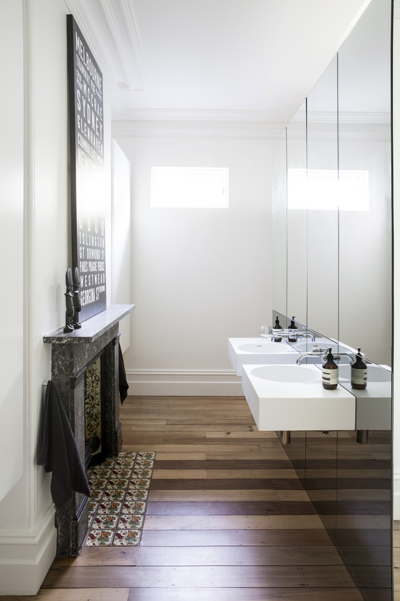
The minimalist approach continues in another bathroom, which features floating vanities above dark wood floors.
8. Patio
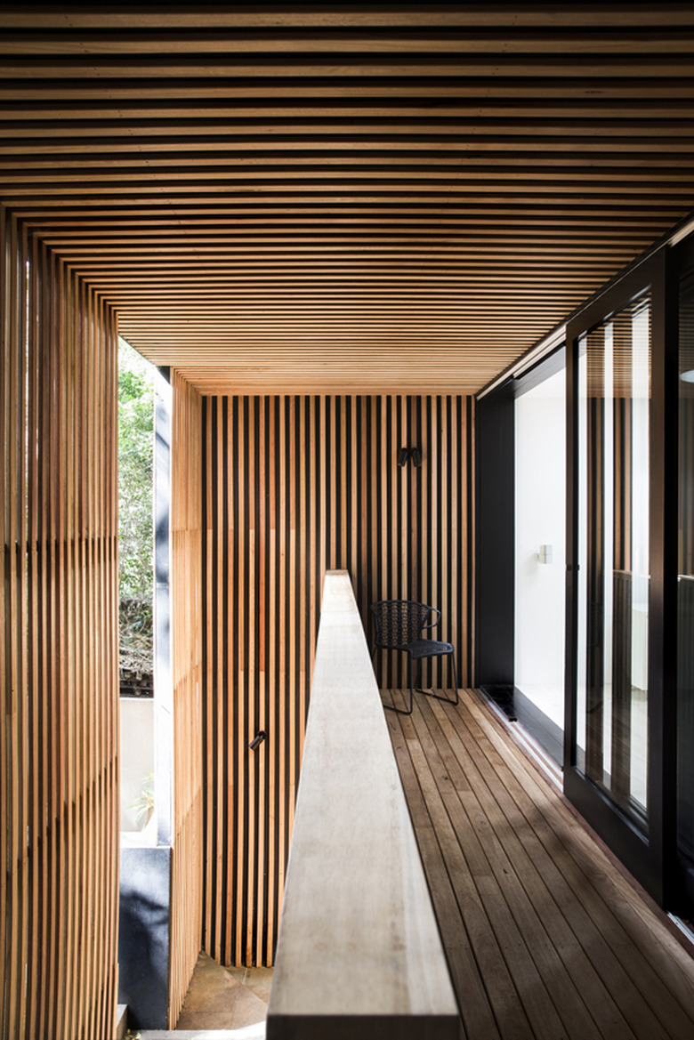
The covered patio features the home's ongoing wood feature as a clean optical illusion.
