Empty-Nesters Upgrade Their New Zealand Home With A 70s Vibe
A couple loved their cedar-clad 1970s home in Auckland, New Zealand, but when their children moved out, they thought it was an ideal chance to bring it up to date.
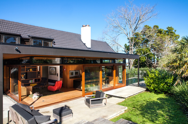
The trick was to maintain some of the original details while opening up the space and connecting it to the outdoors. Architect Tim Dorrington of Dorrington Atcheson Architects came up with a solution that included the addition of a new living pavilion with sliding glass walls that lead to a terrace. The house's labyrinth of rooms was reorganized, and Dorrington upcycled materials when possible to maintain a warm midcentury feel.
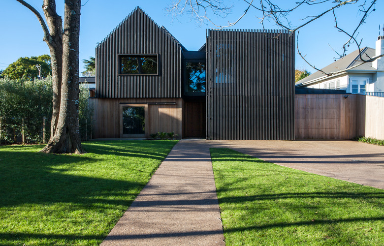
With the inside of the home squared away, he and his team moved on to a new look for the exterior and the construction of a two-story box with a bedroom, ensuite bathroom, and a ground floor garage. "The original architecture is still very evident in the use of materials, and the original house can still be seen — though it's updated with the addition of the pavilion and the timber screen that hides the main gable," Dorrington noted. Thanks to an attention to detail, the 1970s spirit still remains in an address that's tailor-made for life today.
1. Exterior
A stained cedar-batten screen covers the upper level of the original house and the new two-story addition. The cedar cladding on the lower level wraps around and becomes a fence.
2. Living Room
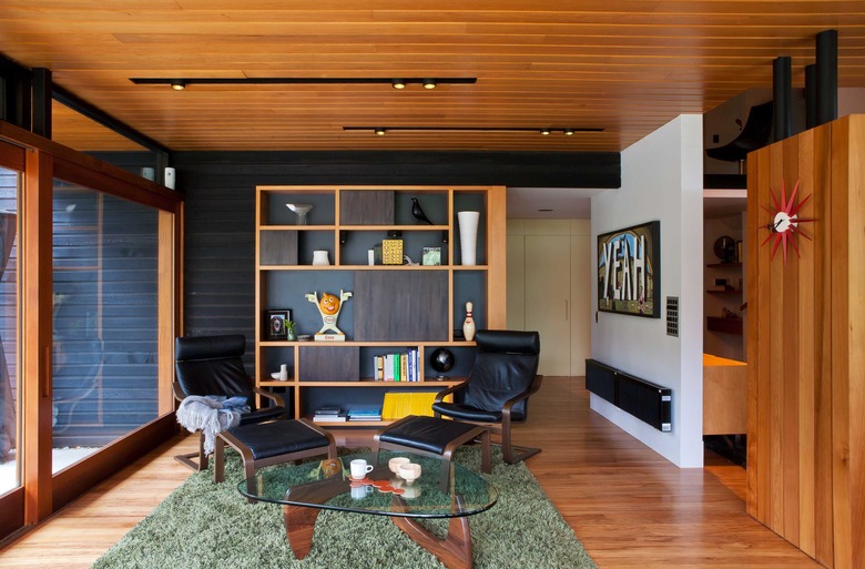
Dorrington used timber for the walls, floors, and ceilings in the living pavilion to create warmth. Meanwhile, the black-stained cedar weatherboards continue from the exterior, adding contrast. The owner's Noguchi table, shag rug, and George Nelson Sunburst Clock highlight the midcentury vibe.
3. Dining Room
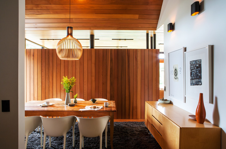
The dining area is nestled behind the kitchen, and is separated by a three-quarter height room divider, which allows natural light to reach the space. The Secto pendant light echoes the lines in the tongue-and-groove paneling.
4. Kitchen
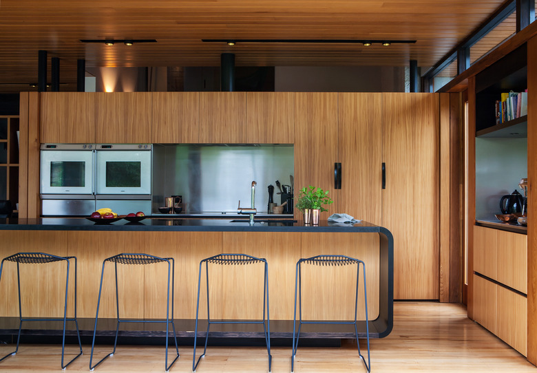
Dorrington chose Rimu veneer cabinetry to blend in with the timber used throughout the living pavilion. The kitchen island is topped with honed black granite.
5. Living Room
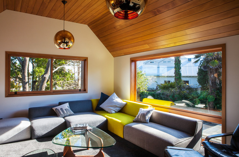
A colorful sectional sofa and bronze pendant lights add a bit of fun to the living room.
6. Living Room
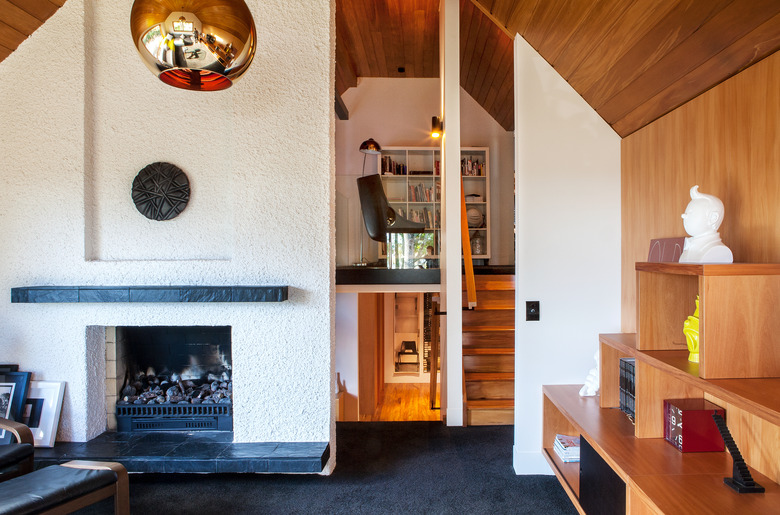
Dorrington kept the living room's original stucco fireplace surround. The stairs lead to a study nook above.
7. Bedroom
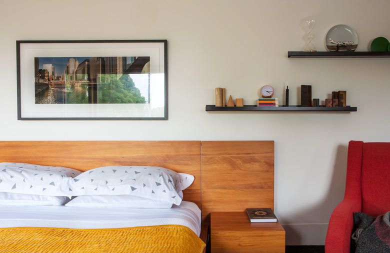
The master bedroom's wood bed gives a nod to the use of timber throughout the house.
8. Bedroom
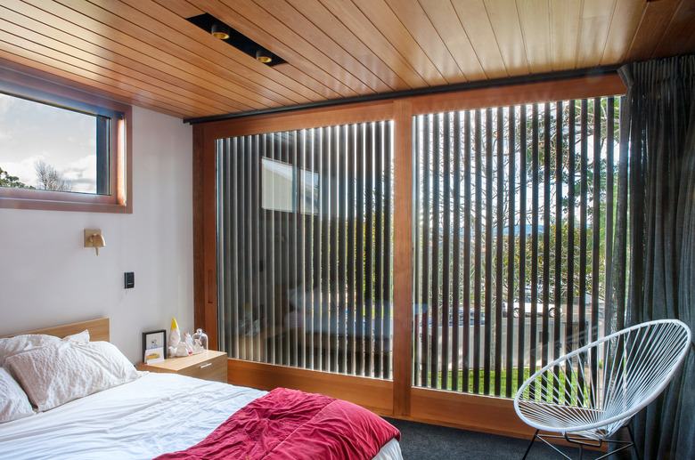
A bedroom in the new addition offers a different perspective on the exterior's cedar-batten screen.
9. Bathroom
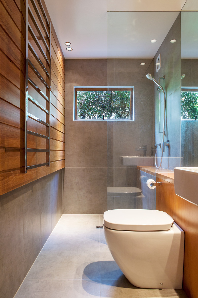
The porcelain tiles in a bathroom have the look of polished concrete.
10. Terrace
"The living pavilion provides the hub of the new design and the sliding doors encourage the indoor-outdoor flow," Dorrington said.
