An Australian Couple Gives Their Home An Airy Renovation Before Retirement
For a couple approaching retirement in Orange, New South Wales, Australia, welcoming the future meant ushering their newly purchased 1980s-era home out of the past. They hired David and Sally Sutherland from Source Architects, along with interior designer Micaela Outtrim, to reimagine the space as a serene, sophisticated haven befitting a soon-to-be-leisurely lifestyle.
While the architects worked within the original home's framework, the transformation was anything but simple. The team removed walls, ripped out flooring, and restructured rooms, creating better-defined spaces and new, shared areas, including a breakfast nook. Replacing the dark slate floors with timber opened the space up and set the tone for a neutral palette throughout. The result is a chic, livable home that perfectly sets the stage for a relaxing retirement.
1. Entrance
The team replaced the dark, slate floors with Flooring Quick Step Vinyl Timber Plank in Drift Oak. By removing the original flooring carefully, the team was able to preserve the preexisting floor-heating system.
2. Dining Room
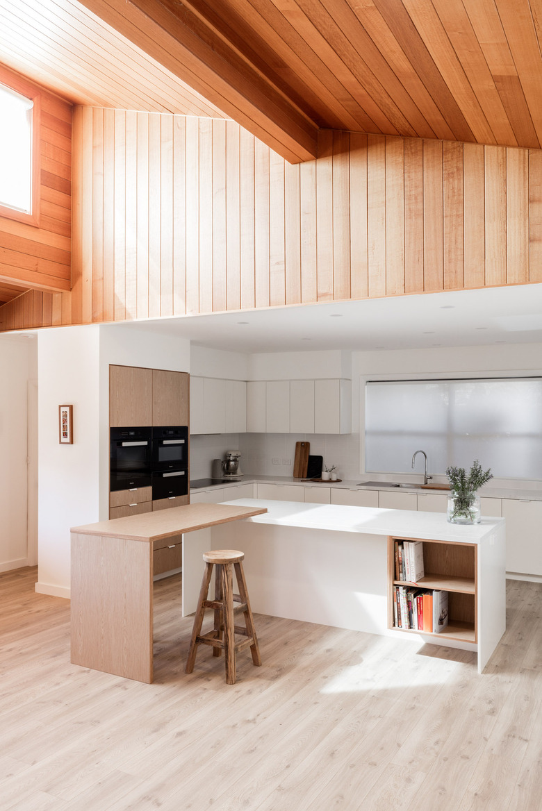
By replacing the floors and painting the walls, the team was able to incorporate the existing ceiling, a Western Red Cedar, into the design. A skylight window fills the room with an abundance of natural light.
3. Kitchen
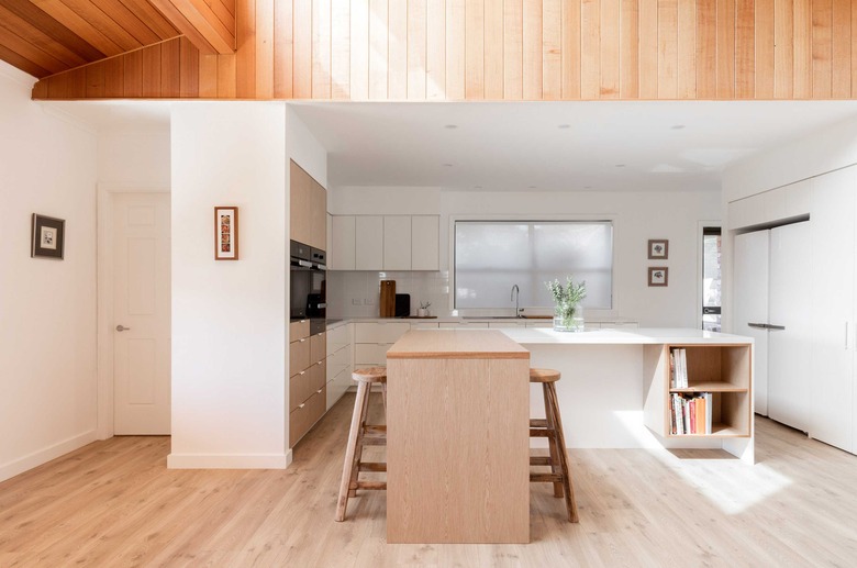
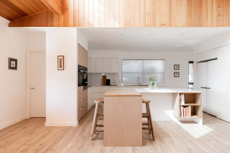
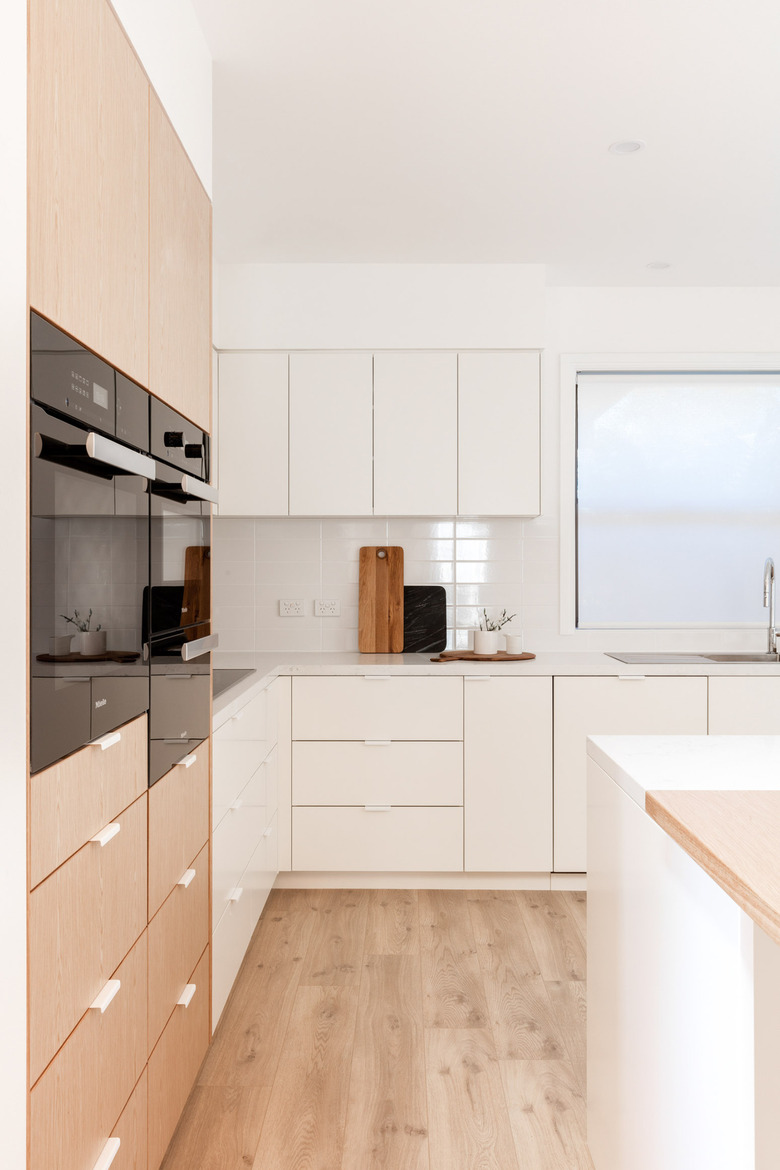
White walls are painted in Dulux Fair Bianca – Half Strength to reflect natural light in the home. The light-colored, well-organized, and open kitchen presents a stark contrast to the cramped and dark feel of the original.
4. Kitchen
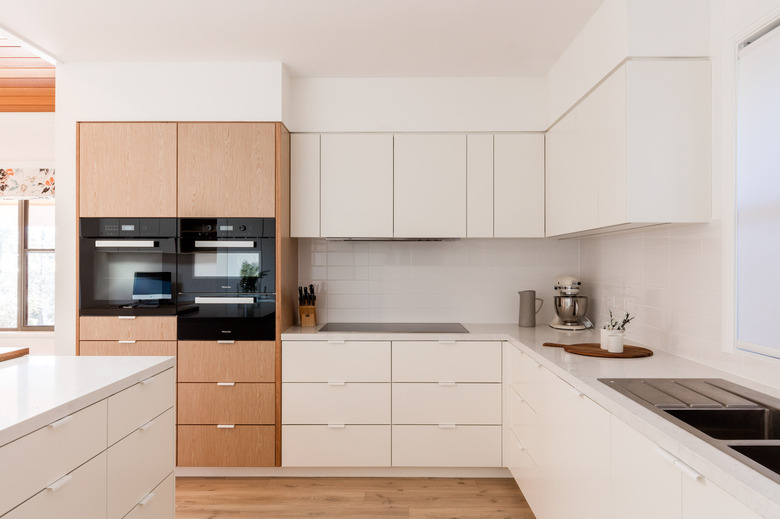
Appliances by Miele give the kitchen a timeless appeal that will last for years to come. A sink by Clarke fits in a minimalist aesthetic.
5. Office
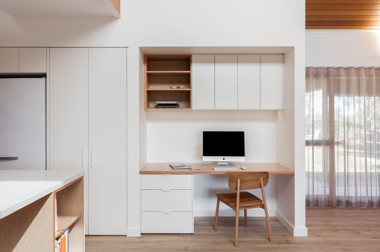
Custom joinery by Zylem uses a combination of steel, timber, and a painted finish to set separate tones for each space. In an open layout that has an ample amount of shared space, it's necessary to dedicate a unique sense of purpose in the different rooms. Curtains by Material World are opaque enough to not block light from pouring in.
6. Fireplace
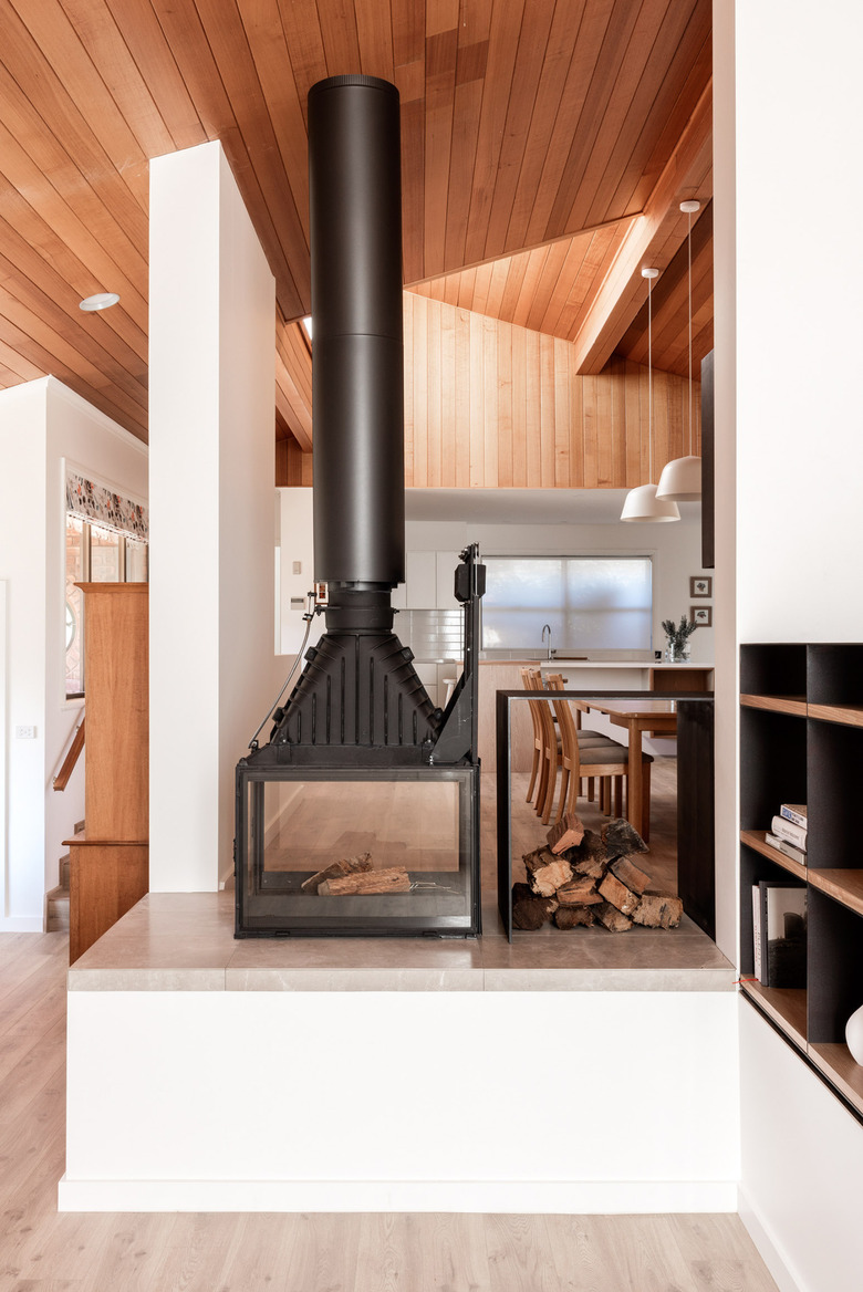
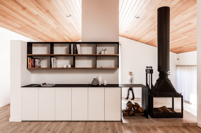
By sticking with three color tones–black, white, and timber–the design can manage big pieces, like this fireplace, without feeling cramped.
7. Fireplace
Existing couches and chairs were updated to complement an updated, neutral and light palette of colors.
