The Renovation Of A Historic London Home Makes The Most Of An Optical Illusion
When Nimtim Architecture was hired by a couple with two children to update their Southeast London property, they thought that the project would center around the already difficult job of adding space to an aging home. But there was another, bigger issue at hand — the site wasn't level.
"The house was six-degrees off square, which was a significant challenge from a building perspective," director Tim O'Callaghan said.
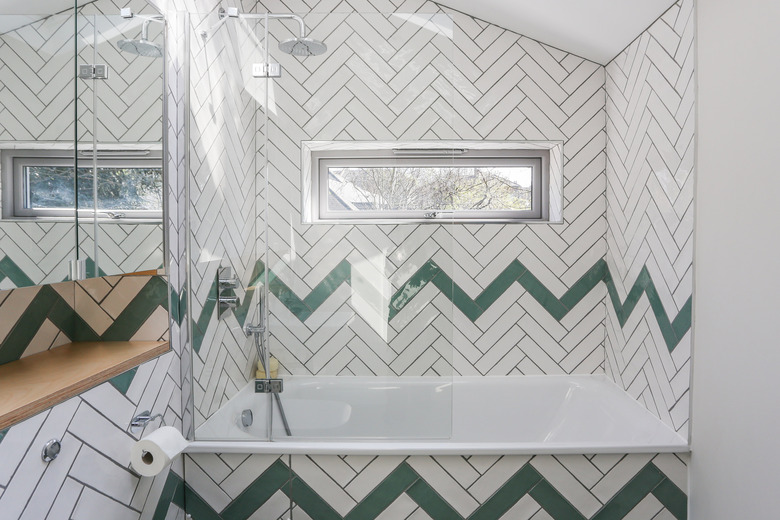
To solve those two dilemmas, O'Callaghan and his team knew that the historic address had to be "almost completely rebuilt," he said. "The existing house had a good skeleton with nice room proportions but was in terrible condition." The team collaborated with Nicholas Pryke to create a new open layout that maximized light, and together they figured out a clever optical illusion for the uneven spaces: chevron.
That simple design trick — paired with a new framework — gives the eye a bold distraction, and also plays into the fun-natured palette of the interiors. In fact, chevron tiles are used throughout the home, and complement the pops of primary colors on everything from lighting fixtures to cabinetry. By the time the two problems were solved, the couple added 700 square feet to their now 2,000-square-foot house, and created a whimsical haven for their family to gather.
1. Exterior
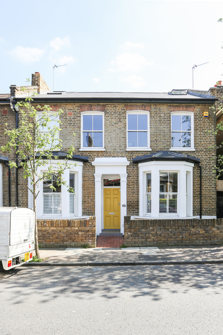
Normandy Grey brick, supplied by Modular Clay products, was used on the exterior.
2. Exterior
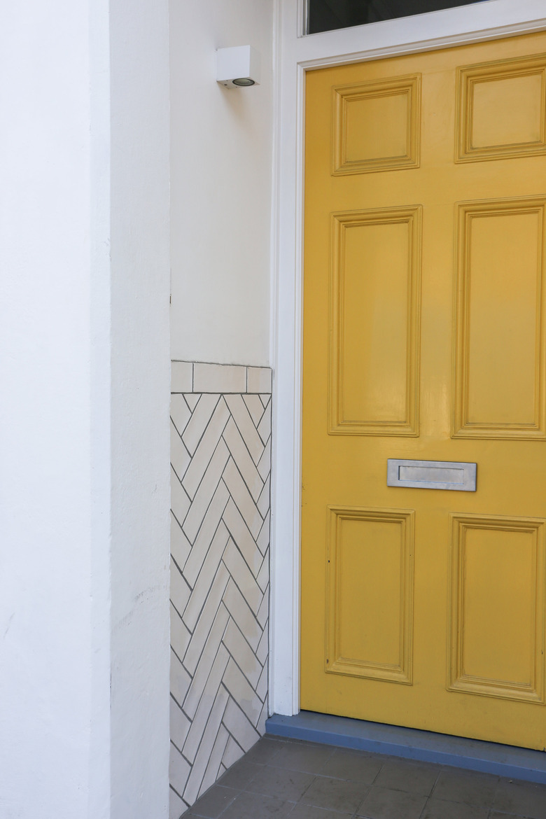
The design for the doorway includes a few features of the interior: chevron-patterned tiles, bright yellow paint, and a simple white outline.
3. Dining Room
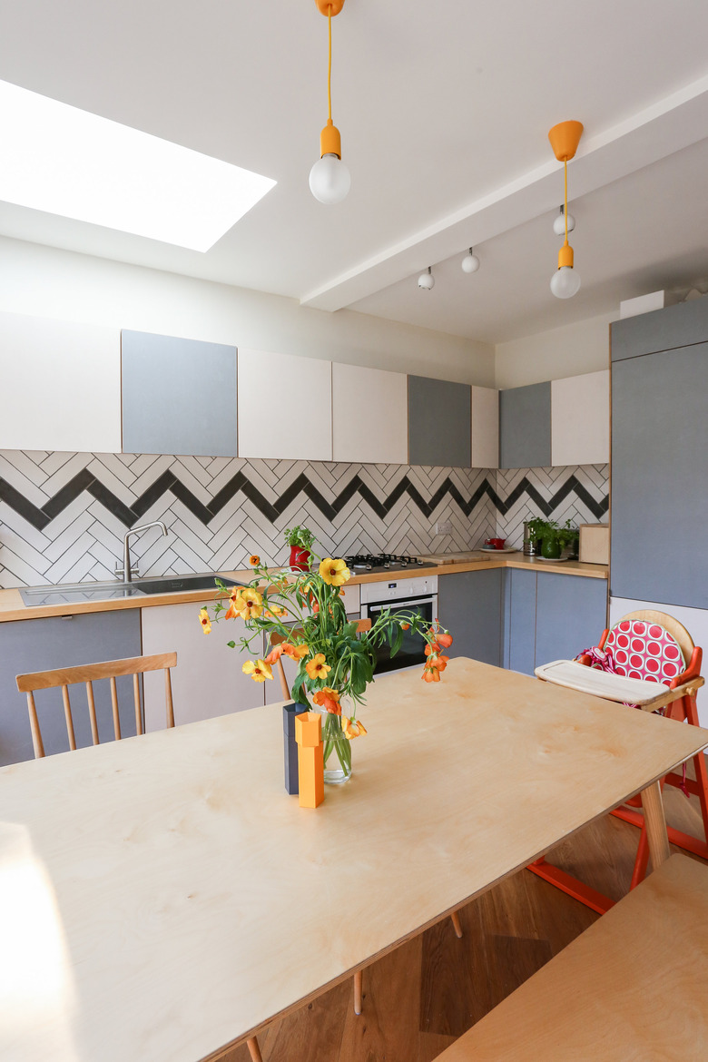
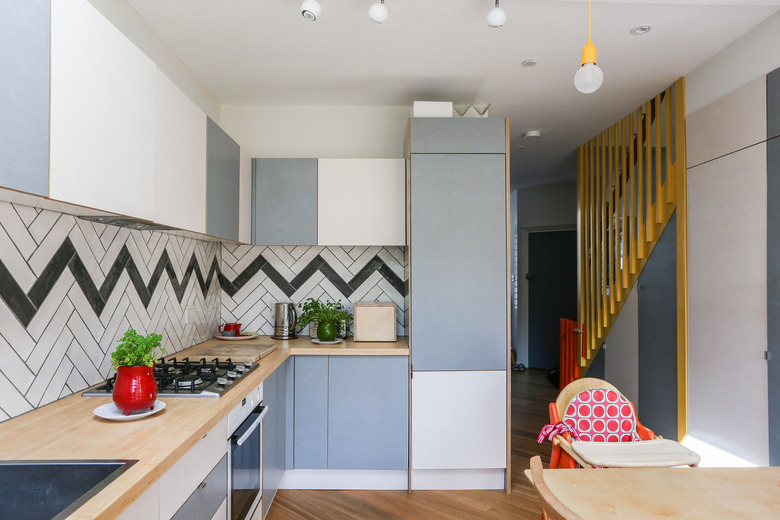
Red, blue, and yellow dominate the kitchen. Each paint tone is a softer take on classic primary colors.
4. Kitchen
Cabinets were built with a decorative birch plywood from Koskisen. The table was designed by the clients.
5. Bathroon
The chevron-patterned glazed ceramic wall tiles that are used throughout the home are "Baker Street" from Johnson Tiles.

