Geometric Details Give One Barcelona Apartment A Cool New Look
When you see the design that interior architect Susanna Cots created for a penthouse apartment in a bustling neighborhood of Barcelona, one word comes to mind: chic. Cots, who is known for her use of white tones, carefully integrated a grayscale color scheme into a geometric layout that is sunlit, spacious, and practical.
But it wasn't always this way. When Cots first met the family with four children who live here, the property was a dark enclosure of mismatched rooms. Cots relied on a few common solutions to brighten the layout — namely, light wood floors, white walls, and steel-lined windows — and installed them in a way that gave each facet a share of attention. But Cots did something unexpected, too: she focused on square shapes to provide character.
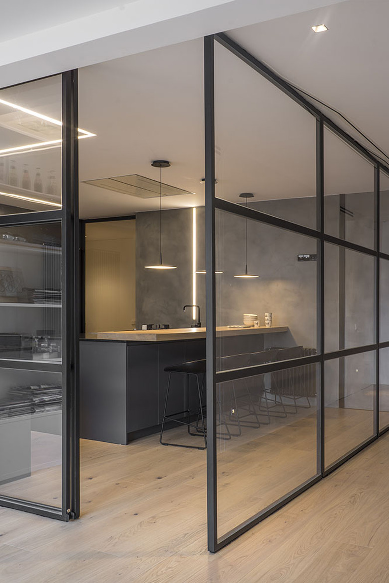
Throughout the home, on larger and smaller details, squares are used to artfully define areas and rooms. For instance, the kitchen is separated in a transparent cube constructed from sliding glass windows, and rectangles define the living space that leads to the patio. Such symmetry creates a calmness that complements the airiness of a minimal palette. And seeing as Cots was always creating for a large family, that's exactly what they need.
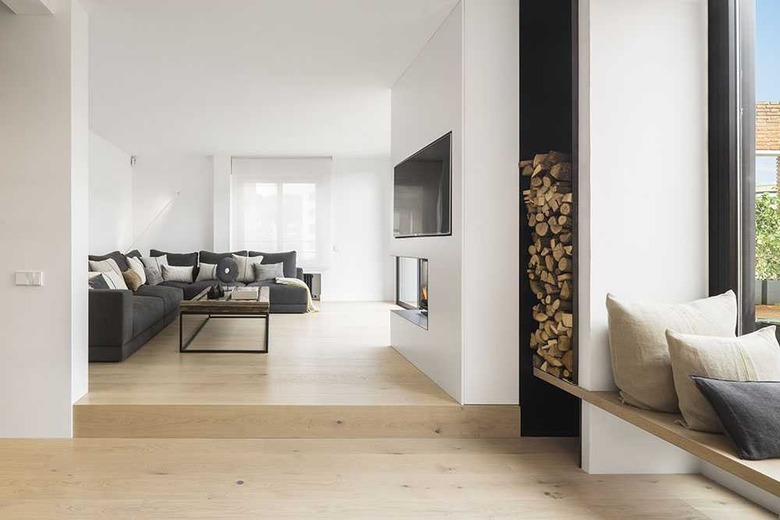
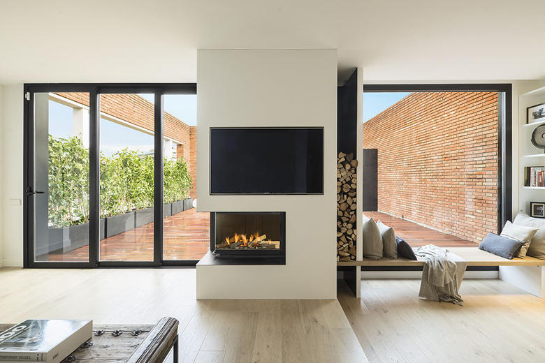
1. Living Room
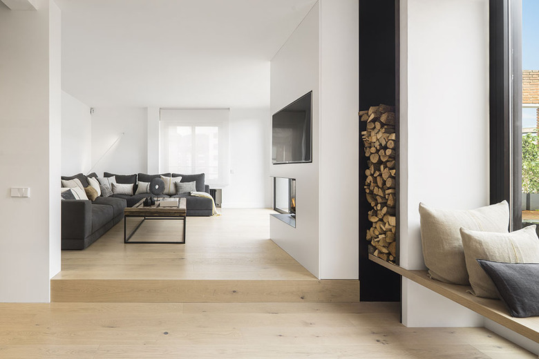
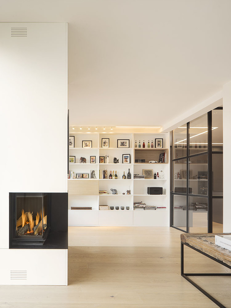
A built-in fireplace by Hergom made out of black steel sets the tone for the rest of the apartment. It's one way that the architect utilized asymmetrical elements to create a cohesive symmetry. The black steel material is repeated in the bordered windows and throughout the kitchen.
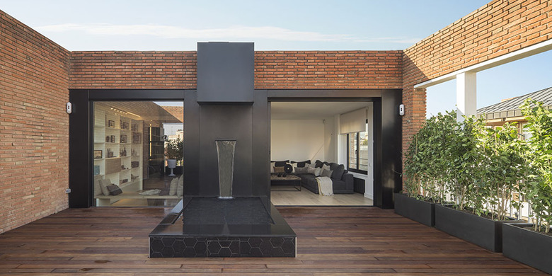
2. Patio
Cots's design features the four classic elements: water, wind, earth and fire. A streaming fountain and garden boxes by Vondom characterize the exterior, which also has a line of potted plants and fresh air.
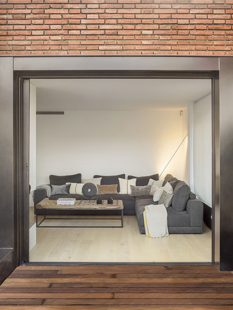
3. Living Room
A sofa by CasaDesús, a local brand in Barcelona, is framed by a sliding door. The quadrilateral is mimicked in an antique coffee table that was restored by Cots.
4. Living Room
By choosing to work with white paint and light-colored floors, sunlight frames the apartment so that the outside is on display.
5. Living Room
The owners chose to display smaller items in white built-in shelves, in keeping with a minimalist look. The shape of the shelves are similar to the steel frame of the windows separating the kitchen.
6. Kitchen
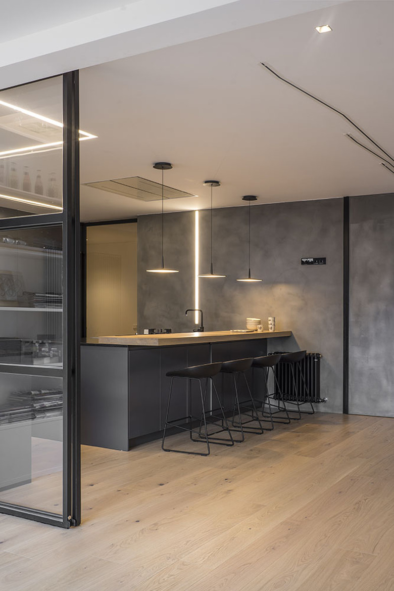
Lighting by Italy-based Artemide and local brand Vibia accompanies a myriad of natural light throughout the home.
7. Kitchen
Much of the carpentry and furniture in the home was designed by Cots's firm and punctuated by innovative designers. In the kitchen, stools by HAY provide seats for the bar.
8. Kitchen
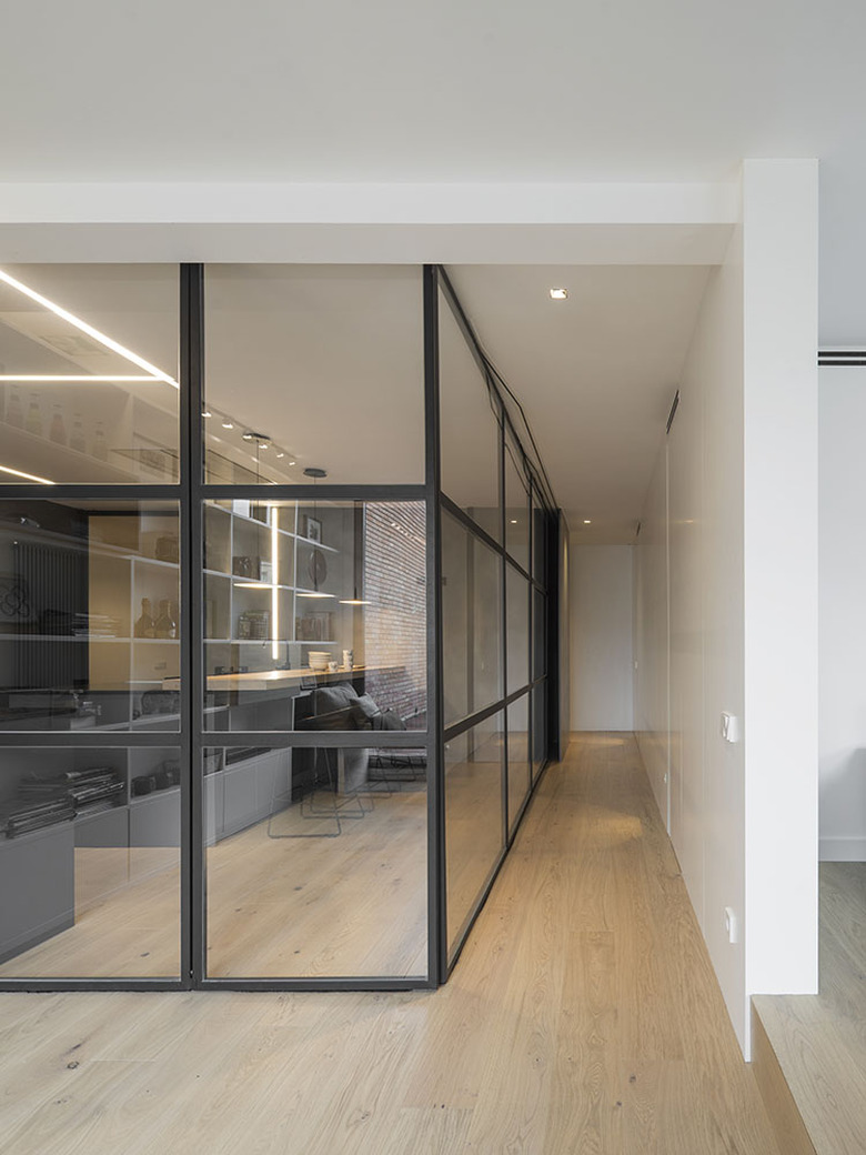
By separating the kitchen in a "floating" box alongside parquet floors by Kährs, a hallway is created. This space gives the family more privacy in the shared rooms.
9. Bedroom
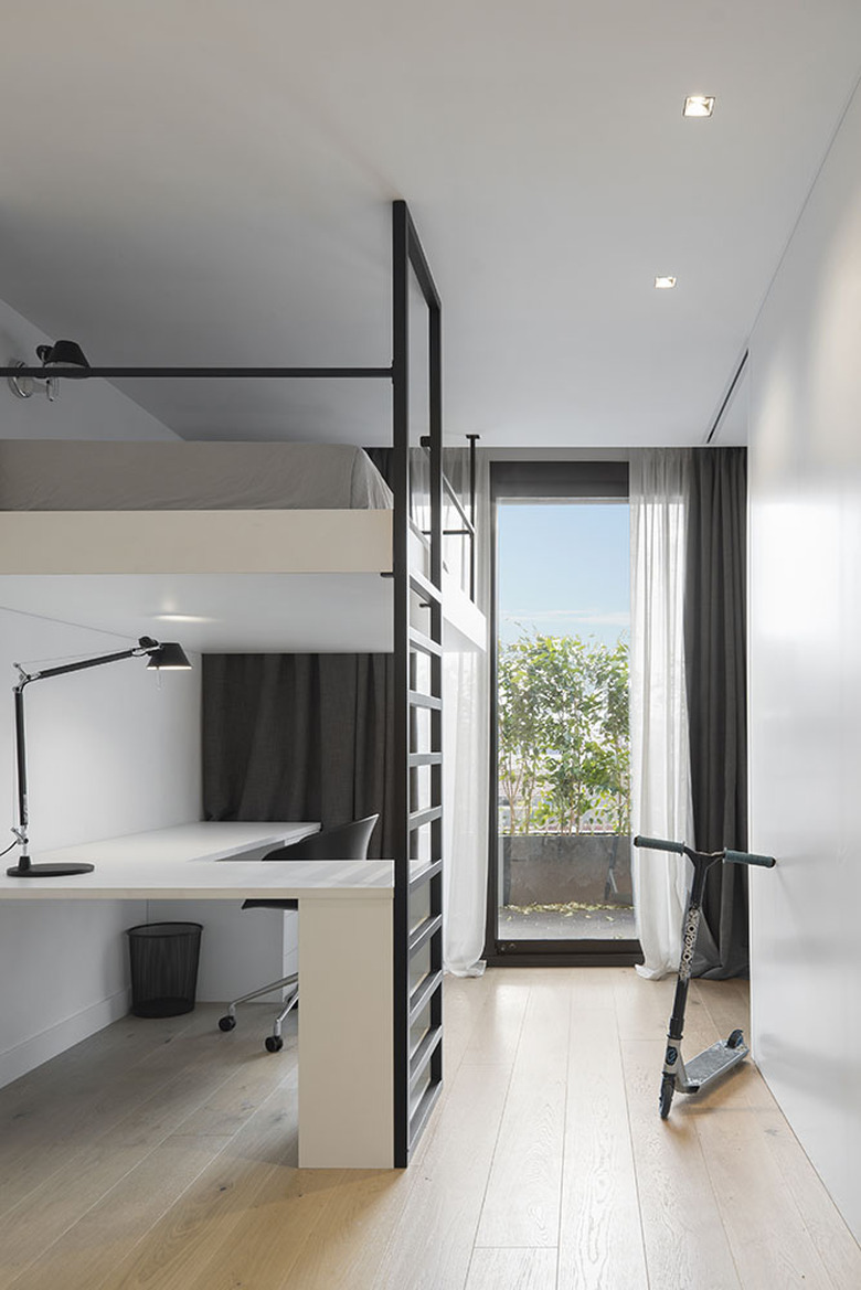
No space is wasted in the bedroom, where a steel-framed loft bed is practical without interrupting the unified design. Curtains frame the view from outside.
10. Bathroom
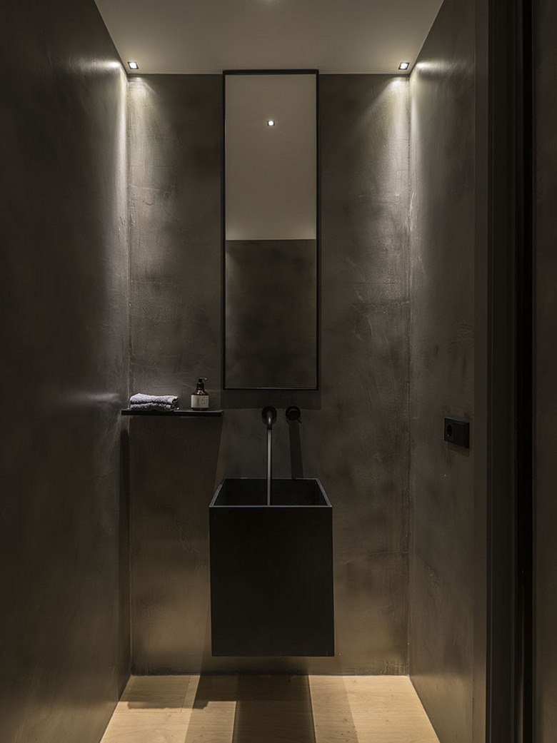
It can be difficult to translate a daring composition into a bathroom design. In order to make sure the bathroom fit the look of the rest of the home, the architect utilized innovative designs from Bossini-Cristina, HansGrohe, and New Road.
