A Toronto Family Overhauls A Property With NYC Style In Mind
A young family wanted to move back to Toronto after more than a decade of living in New York, but they didn't want to leave the feel of that city entirely behind. They found a home in a walkable neighborhood that delivered the space their former apartment lacked — it just had to be updated from its 50-year-old layout.
The property had good bones, but it was broken into many small rooms that closed everything off. The owners desired something sleek, like what they had in New York, so they brought on the help of Studio AC to transform the interior into a more modern and functional address. "It was dark and antiquated — it needed updating," architect Jennifer Kudlats said. "They were looking for an open and cohesive project with storage, light, and space."
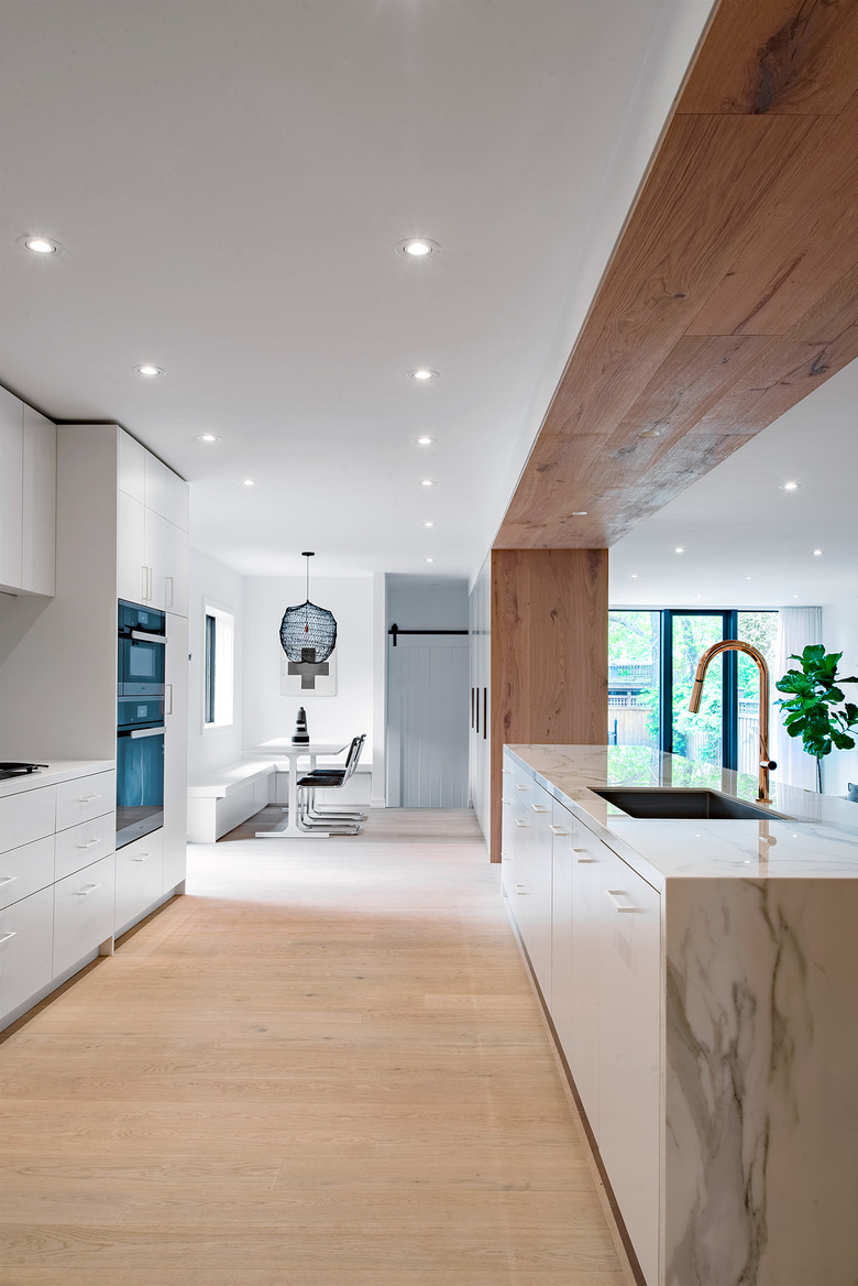
The firm opted to organize the new layout by using a "support spine" that contains plumbing, storage, and mechanical materials. The spine isn't hidden, instead its openings are highlighted with white oak accents that run up the walls and ceilings throughout the 3,000-square-foot site. Now the family can start a new chapter in a familiar place, using a style they picked up along the way.
1. Entryway
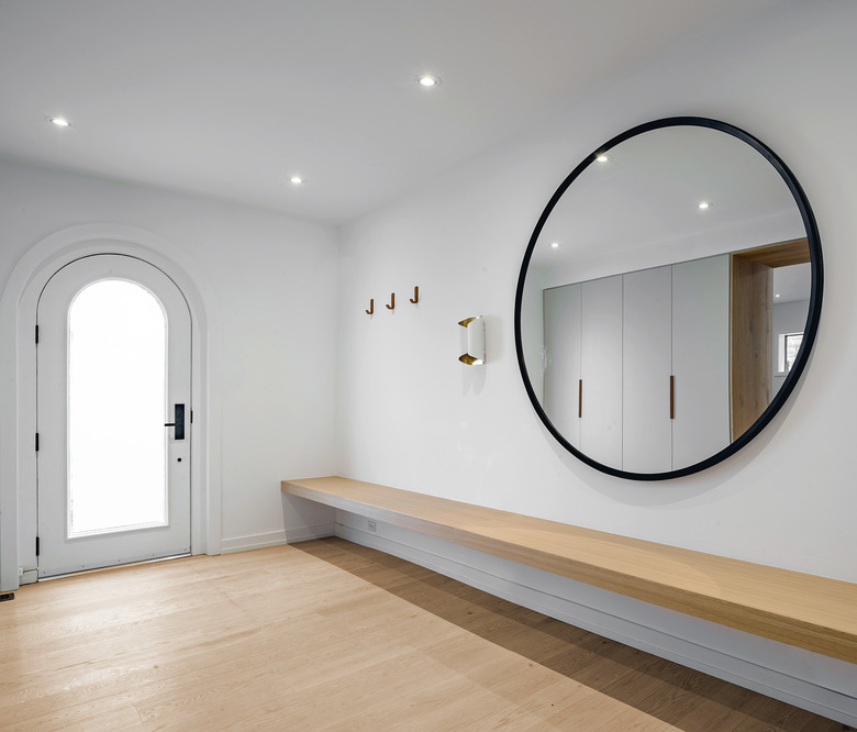
Studio AC kept the home's original arched doorway and added a large door by Grace Windows. A round mirror brings even more light into the room.
2. Living Space
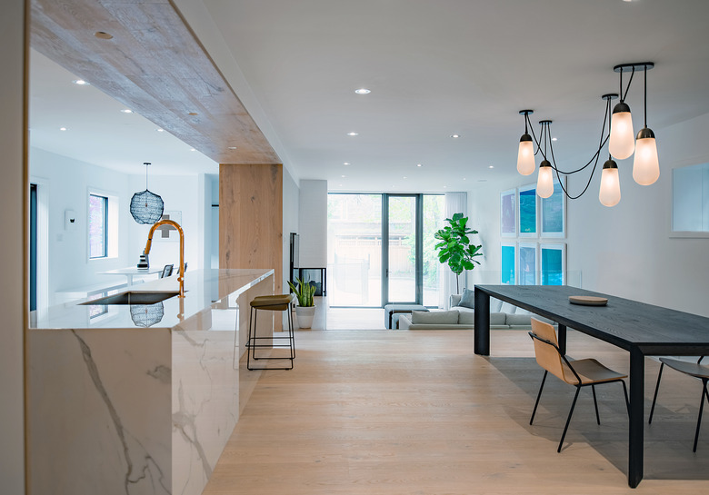
Down the corridor on the ground floor is the heart of the home: the kitchen, dining, and living areas.
3. Kitchen
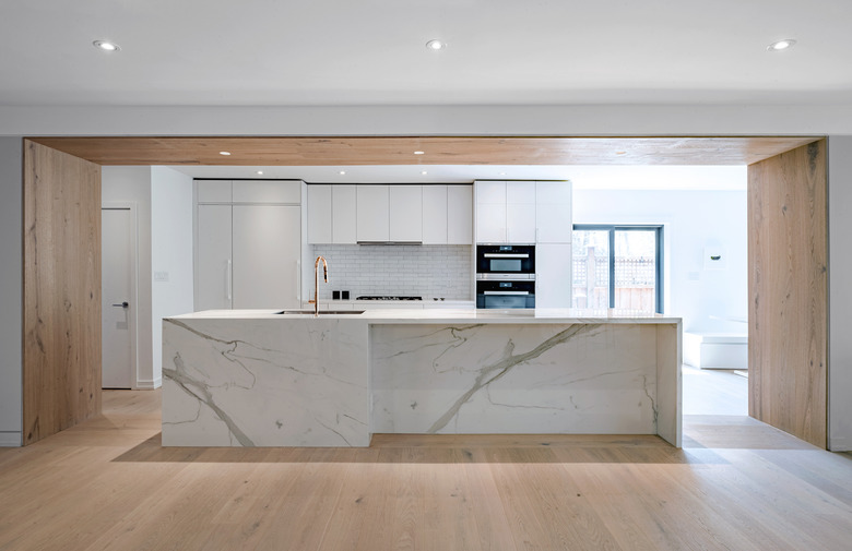
The white kitchen area contrasts against its wooden spine threshold. Cabinetry by Millworx is topped with Caesarstone alongside a subzero fridge and freezer.
4. Dining Area
The kitchen island, imagined as a "functional stone sculpture," stands as the space's centerpiece inside the larger wooden threshold. Moncer Flooring's white oak floors lead to a dining nook.
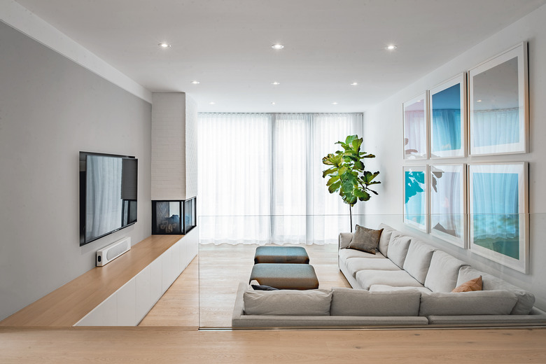
5. Living Area
The living room, while connected to the open space, is sunken to make it more private. A floor-to-ceiling window ushers in natural light and connects the space to the backyard.
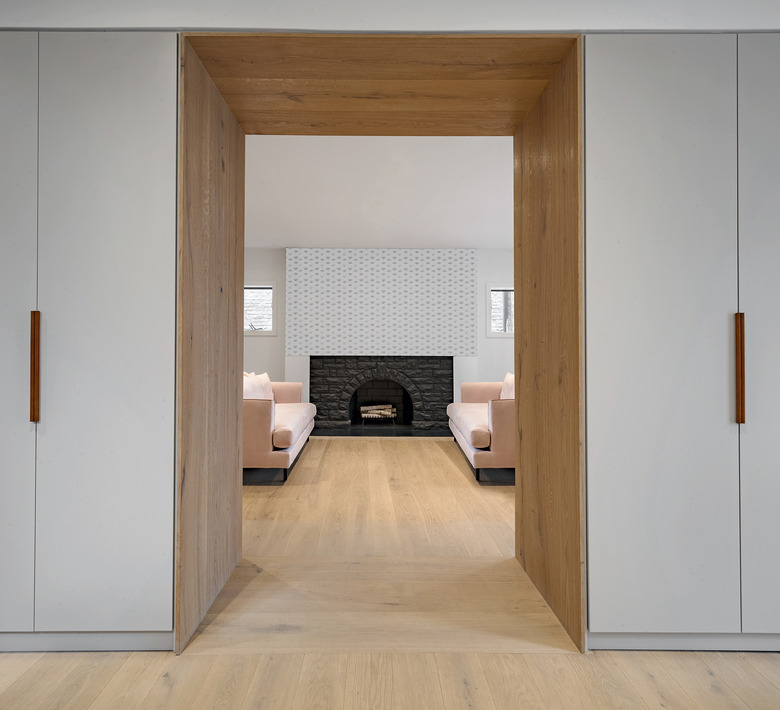
6. Threshold
The spine opens to another sitting area near an original fireplace. Storage was important to the family, so Studio AC incorporated sleek white cabinets along the spine that feature leather handles by MadeMeasure.
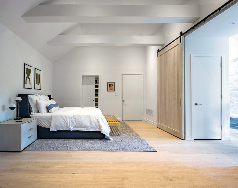
7. Master Bedroom
Upstairs, a sliding barn door separates the master bedroom from the bathroom. The spine separating the spaces houses a gas fireplace, linen storage, and utilities.
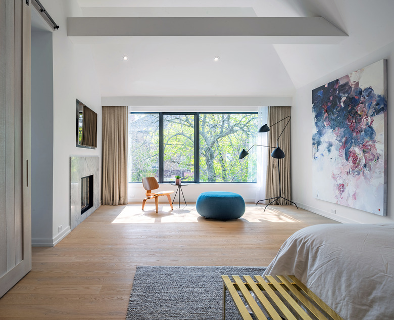
8. Master Bedroom
The master bedroom opens up to the rear of the house. An Eames Molded Plywood Lounge Chair rests near an expansive window that aligns with the floor-to-ceiling opening below.
9. Master Bathroom
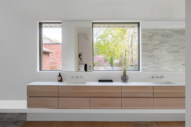
The shower bench extends as a support for the bathroom vanity and culminates as a shelf by the standing tub.
10. Master Bathroom
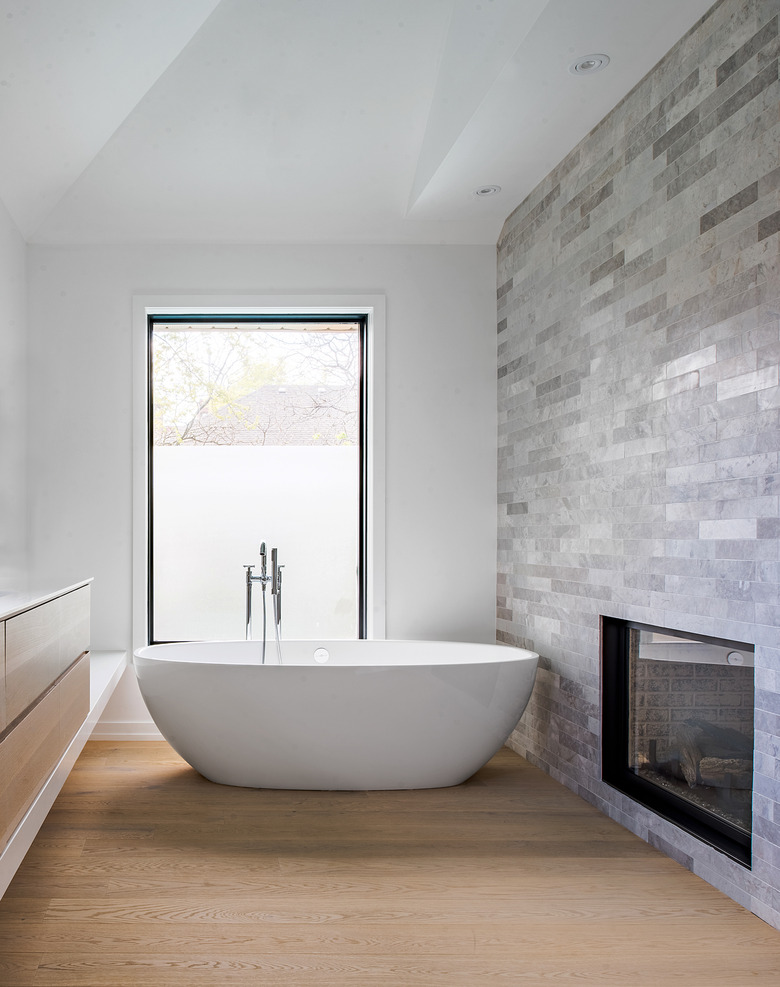
A Victoria + Albert standing tub rests by a gas fireplace.

