A Dated 1960s Quebec City Home Gets A Cool, Contemporary Upgrade
For a family living in Quebec City, their 1960s house had great bones, but it lacked the light and openness they craved in a home. They needed a space that was free-flowing, bright and that matched the energy of their two active young daughters. So the couple brought in architect Luc Bélanger and Geneviève Guimont of PARKA Architecture & Design and designer Guillaume Sasseville of Studio SSSVLL to help them bring the dated space back to life.
The team removed walls to open the space, installed larger windows to let in light, and used a pale palette to highlight the home's natural materials. The crisp interiors also serve as the perfect backdrop for the couple's vibrant art collection. In the end, the team was able to showcase the best parts of the home's original '60s style while updating it for modern family living.
1. Living Room
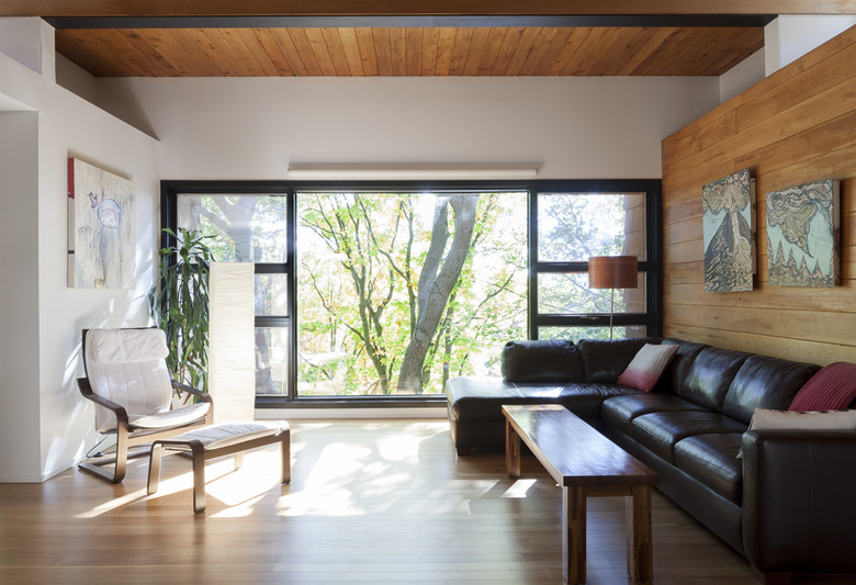
The interior walls were painted in SICO's Whispery White and the rift cut oak floors were stripped. The living room's expansive windows were left uncovered to create a connection to nature.
2. Dining Area
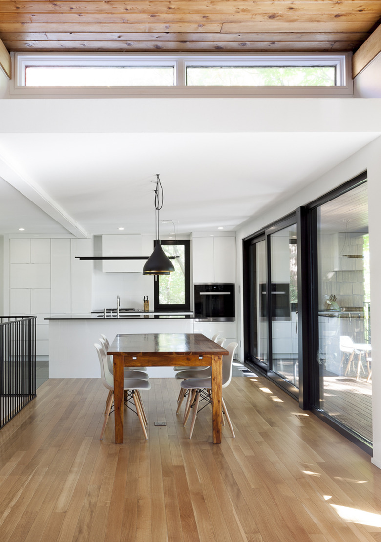
The open dining area is situated between the living room and the kitchen, maintaining an easy flow between the spaces. The warm wood table is illuminated by Pablo Design Swell pendant lights and surrounded by Eames dining chairs from Design Within Reach.
3. Kitchen
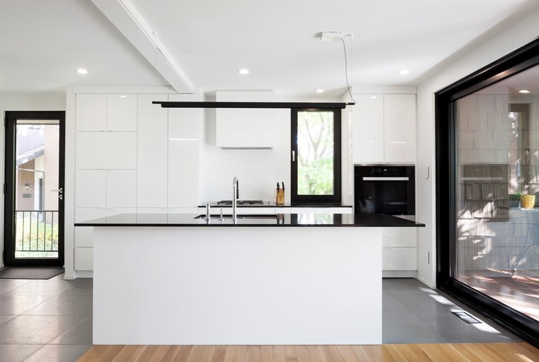
The narrow kitchen was gutted and opened up to the dining and living areas. Dated cabinets and granite countertops were replaced with sleek and streamlined versions in black and white.
4. Staircase
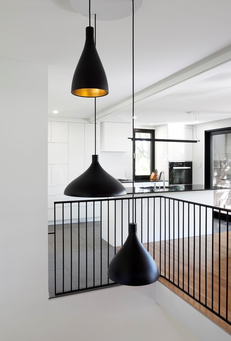
The home's existing handrail — a retro white metal design — didn't fit with the new modern interiors, so Sasseville created a new contemporary piece to frame the staircase.
5. Hallway
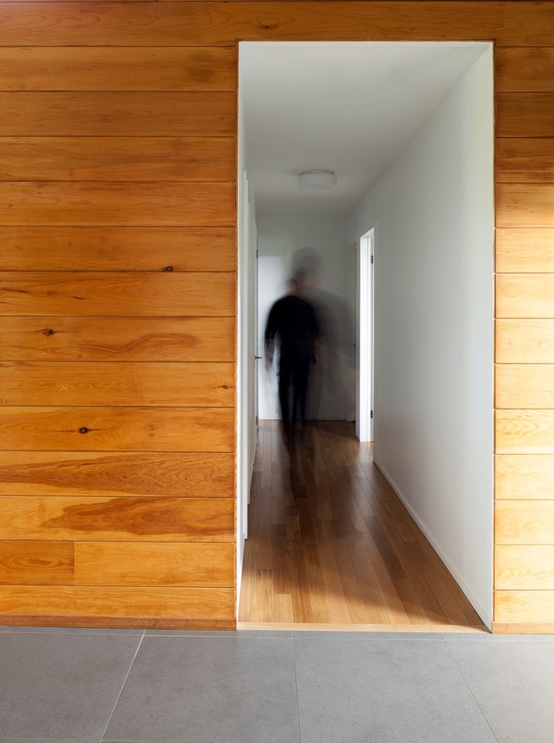
Warm wood walls frame the minimalist hallway. The team kept the interiors uncluttered to highlight the openness of the layout, organic materials, and the natural light.
6. Playroom
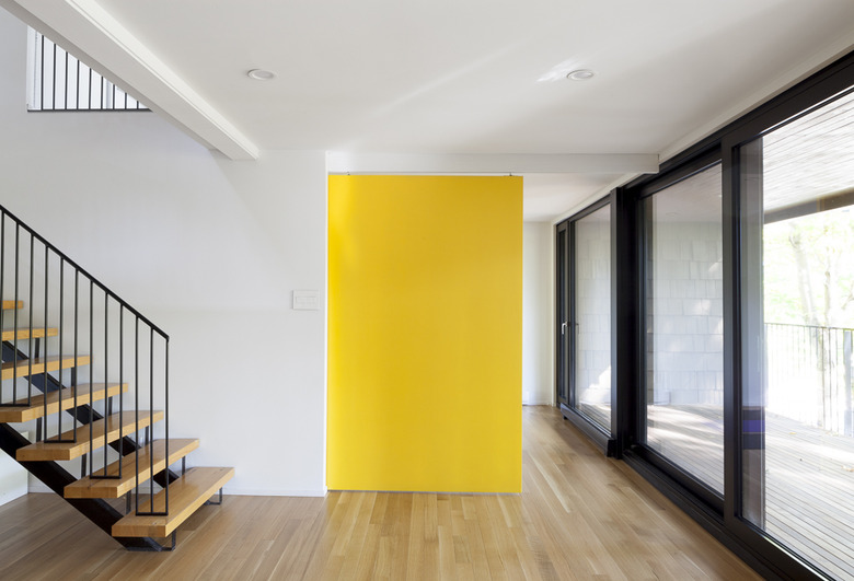
A vibrant yellow sliding door splits the den and playroom into two spaces, giving the family more flexibility in terms of layout and the ability to hide clutter and toys away if needed.
7. Playroom
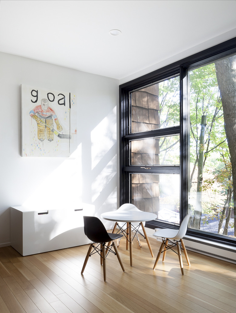
The bright and cheery playroom includes whimsical art and a pint-sized Eames table and chairs.
8. Balcony
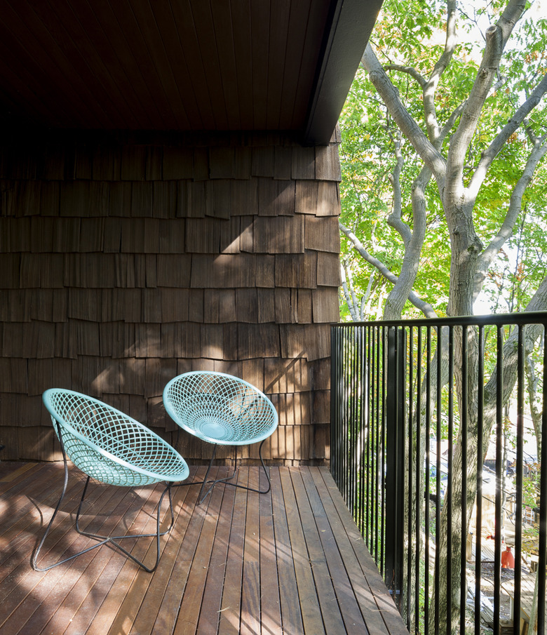
The balcony is the perfect spot to enjoy a morning coffee and take in nature. Colorful chairs occupy one side, while the other is set for outdoor dining.
