An Edwardian Home Plays With Light And Dark
It's hard to believe what Melbourne-based architectural firm Meme Design did with this house. Located in Prahran (an inner suburb of Melbourne), the residence is a compact Edwardian home that was the victim of an unfortunate 1990s renovation. That previous reno didn't accomplish much in terms of opening up the interior, so it was imperative to create a design that would be functional as well as livable.
Beyond utilizing space in the re-design, they also opted for a roomy visual effect. "The principles of the design follow light and shade, shrinking and stretching space with the use of a monochromatic pallet," architect and designer Melanie Beynon said. While the result is ultra-modern, being reliant on dark colors and sharp lines, the structure still feels open thanks to a play with contrasting light colors and natural textures.
1. Kitchen
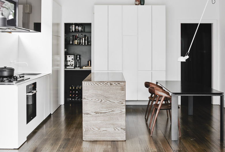
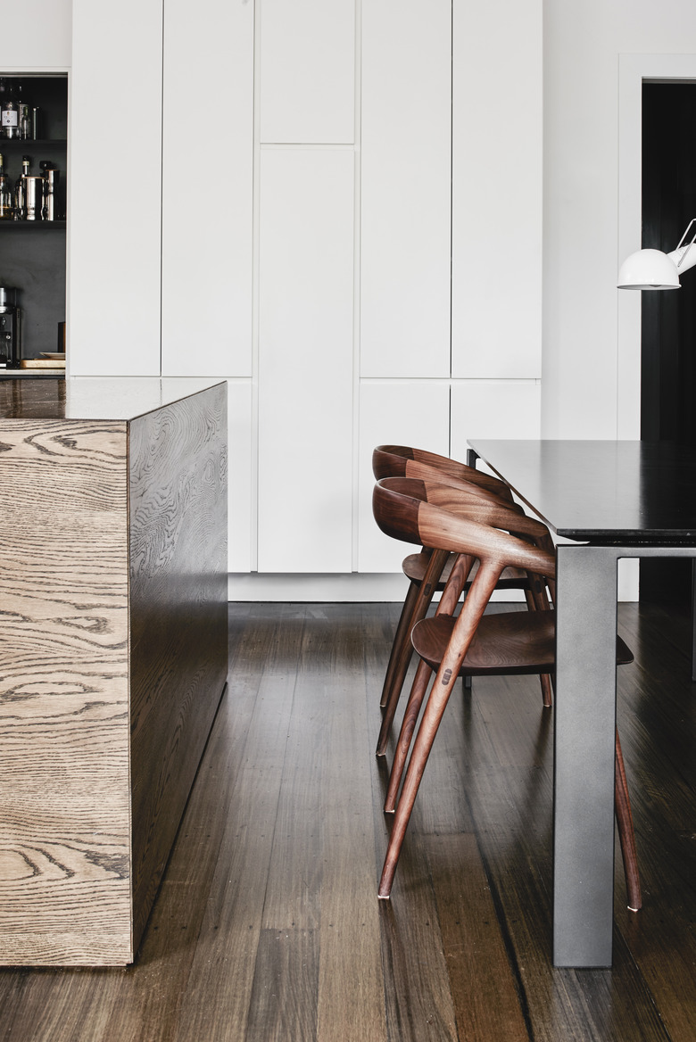
In the kitchen, an island bench in stained solid oak stands as the most striking object in the spacious shared area. Other eye-catching details include the Shoji White backsplash in power-coated aluminum and 90mm board floors in Smoked Victorian Ash.
2. Dining Area
By highlighting windows using a steel-framed awning, the exterior is framed. At the back of the house, the windows double as sliding doors to allow the family to enjoy an outdoor garden.
3. Dining Area
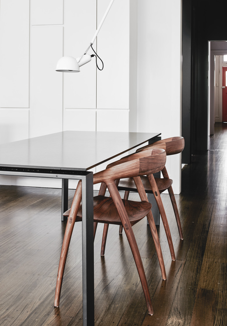
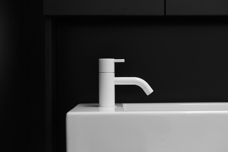
A white backdrop was necessary to give the room a feeling of organized zen. Joinery and walls were painted in Dulux Natural White and a white Vola tap stands out.
4. Bedroom
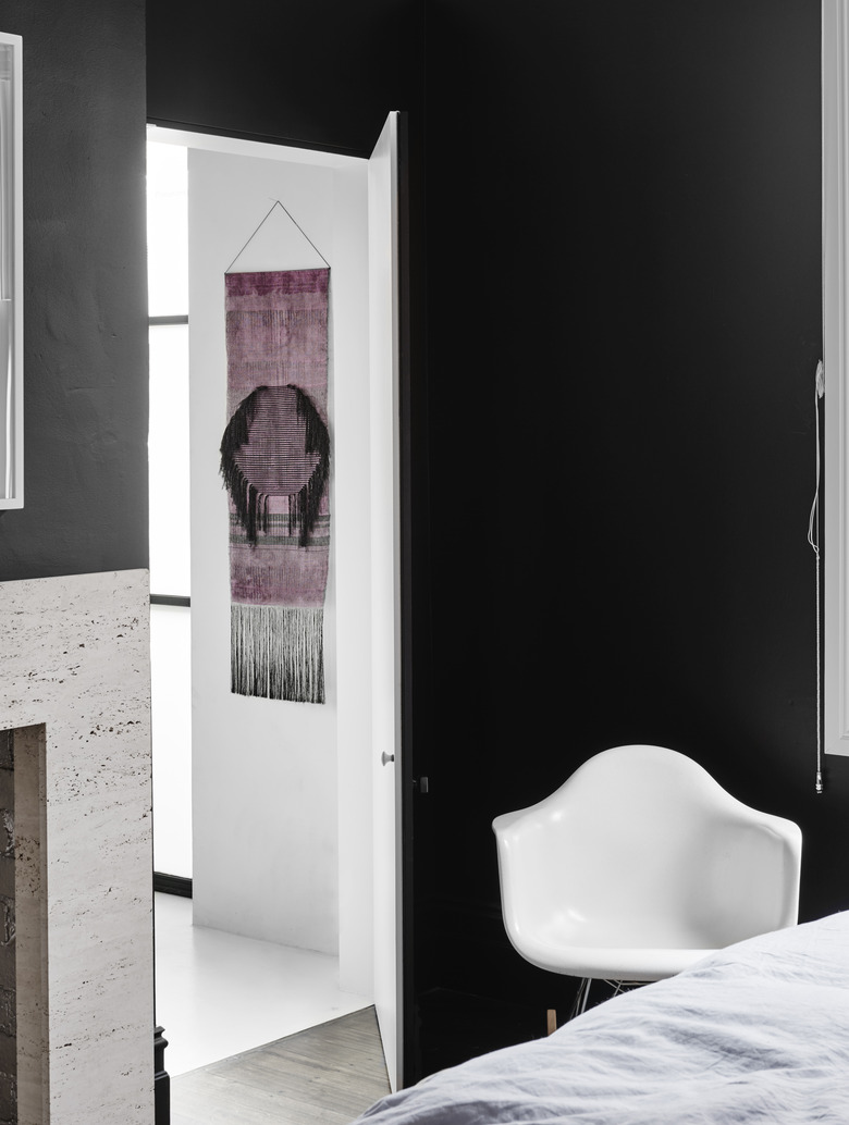
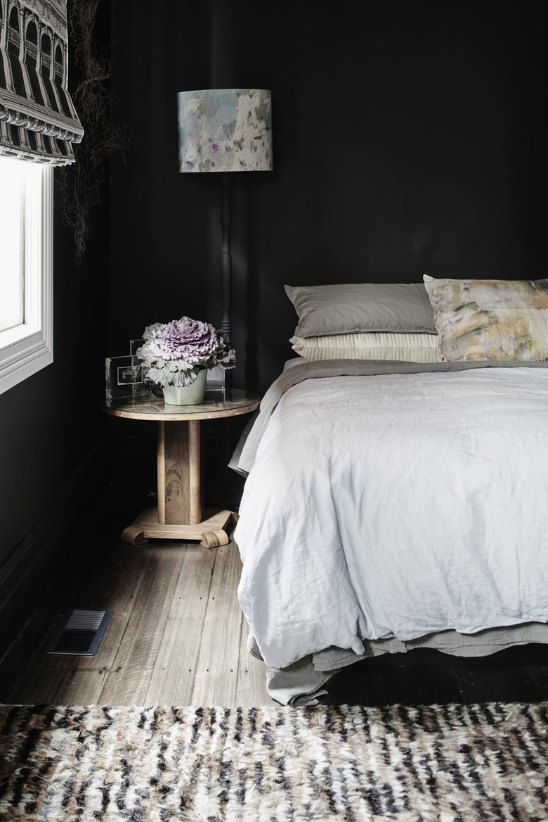
In the private bedroom, darker colors add to a feeling of comfort and sleepiness. A wall piece by Justine Ashbee hangs just opposite the door. An Eames RAR chair provides just the right balance of comfort and simplicity.
5. Bedroom
The Edwardian era in design brought more natural light and clean lines, but still contained a lot of the Victorian influence. Here, it appears that Meme Design paid homage to the Edwardian style by making flowery patterns and soft light key elements in the bedroom.
6. Bathroom
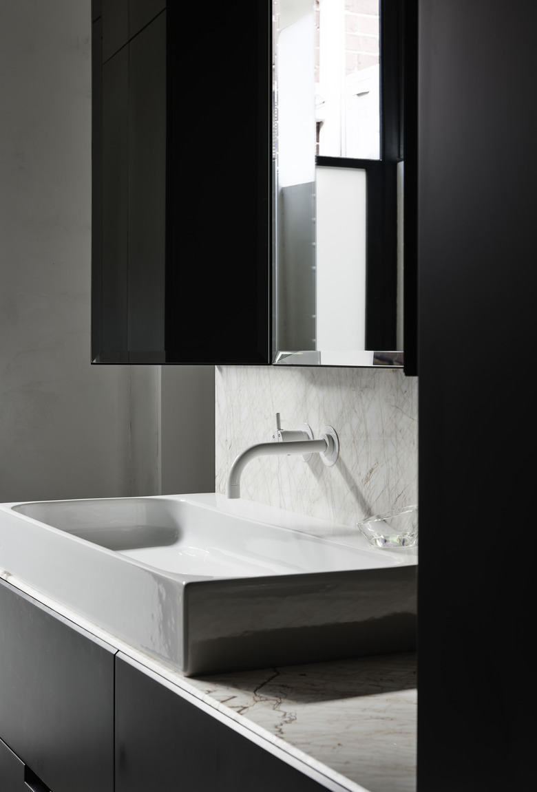
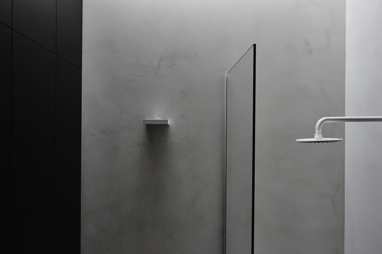
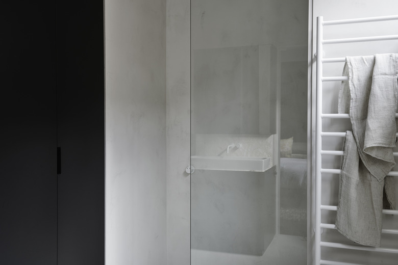
Bathroom walls and floors were done in an Endura Render Finish in Blanco. By choosing white fixtures and sinks, the bathroom feels clean and organized, a desirable luxury in a house with children.
7. Bathroom
Simple lines are used in the bathroom to create a sense of serenity. Strong materials are paired with light-feeling fixtures and details to provide a balanced contrast in weight.
8. Bathroom
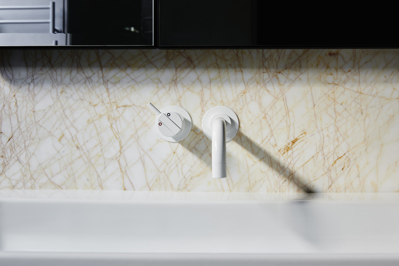
Throughout the home, Vola taps, in a bright white, are signature pieces that stand out. From the kitchen to the bathroom, the taps are one way the designers kept the bathroom style consistent to the rest of the home.
9. Bathroom
Not only did the firm need to carve out enough bedrooms to fit the growing family's needs, they also needed to consider the amount of shared space needed. One of the biggest challenges was creating these shared spaces, including two bathrooms, without compromising spaciousness in other areas.
10. Bathroom
Details, even in the bathroom, cannot be overlooked. Here, a white Vola tap stands out against a stone called Golden Spider.

