26 Midcentury Modern Bathroom Tile Ideas That Are Charming As Can Be
Midcentury design has seen a huge resurgence in the past couple decades, and it's easy to see why. For those favoring a clean-lined, modern aesthetic, midcentury offers that in a way that still feels warm, colorful, and fun. The retro style favors functionality and simplicity over ornamentation but brings in decorative touches with geometric shapes; bold uses of color; and a mix of materials, including dark woods, glass, plastic, and vinyl.
For those looking to experiment with the beloved look, the bathroom is a great place to start, not only due to the fact that it's a smaller, defined space but also because there are a lot of midcentury tile options from which to choose. Designer Erica Bryen enjoys bringing in midcentury flair with the help of tile. The owner and head designer of Erica Bryen Design recommends selecting "geometric shapes and colors in the winter family, shades of red, orange, tan, [and] lime green." She adds that "using wild and geometric patterns helps to communicate this look."
Ready to add a little pizazz to your bath? Ahead, you'll find some truly inspiring ideas that are bursting with retro charm.
26 Midcentury Bathroom Tile Ideas
1. Go bright and blue.
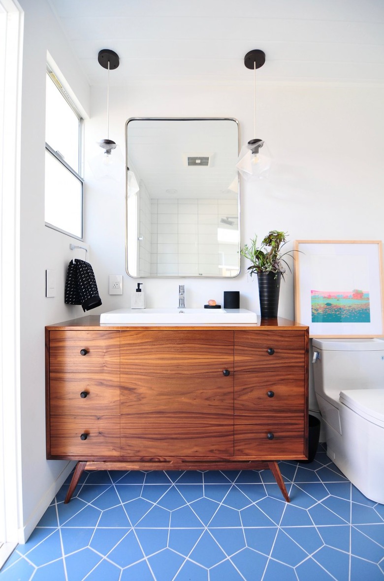
This 56-square-foot Eichler bathroom revival by Urbanism Designs keeps things minimal on the wall, allowing for a big impact with the bright blue geometric floor tile. Small-scale wall art in punchy colors creates a nice counterpoint. The warm wood vanity adds some gravitas.
2. Make a splash with your backsplash.
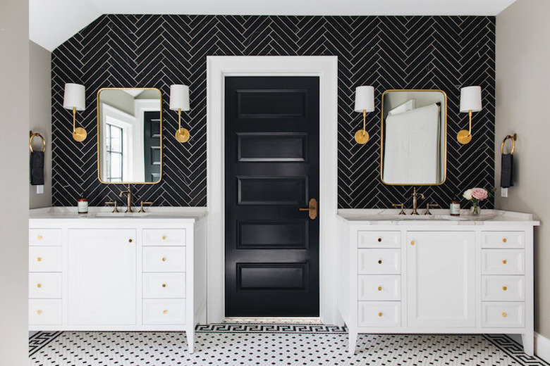
This bathroom designed by Kenowa Builders relies on symmetry and clean lines. In place of one continuous vanity cabinet, the layout of this space accommodates a pair of matching vanity cabinets that flank a black door. The ebony-colored herringbone backsplash creates a focal point and sense of cohesion.
3. Marry midcentury and contemporary styles.
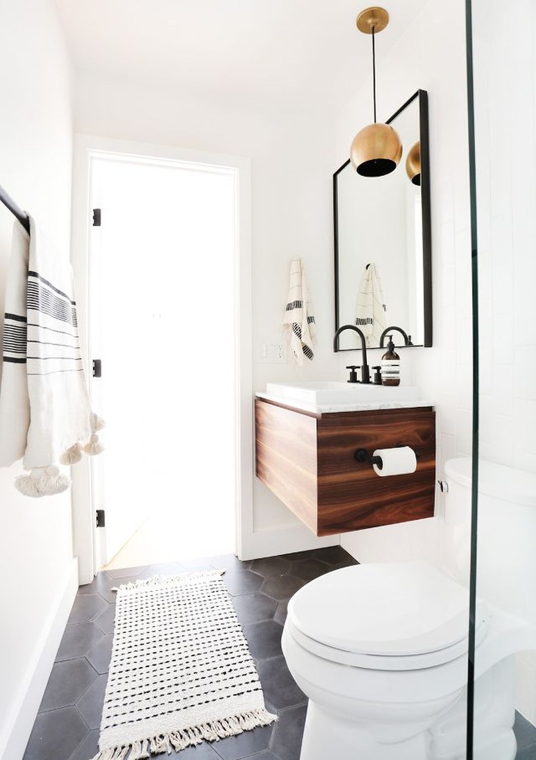
Who wouldn't want to begin (and end) their day in this ultra-chic lavatory by Amber Interiors — a harmonious union of midcentury and contemporary styles. The tassel-fringed bath mat and towels bring in some bohemian whimsy. Meanwhile, the hexagonal charcoal gray floor tile and brass pendant add a little midcentury charm.
4. Choose a graphic patterned tile for the floor.
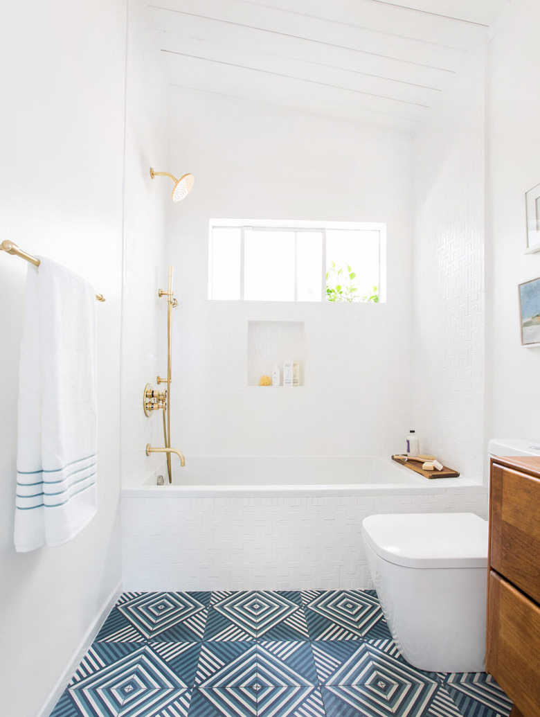
We love all the midcentury character of this guest bathroom remodel by Emily Henderson, so it's hard to pick favorites. The warm wood floating vanity, the rounded square toilet, and the subtle H-shaped bath tiles are all so good. But you really can't deny that scene-stealing graphic cement floor tile. It packs just the right punch in this cool, clean, and sophisticated space.
5. Create visual interest in an all-white bathroom.
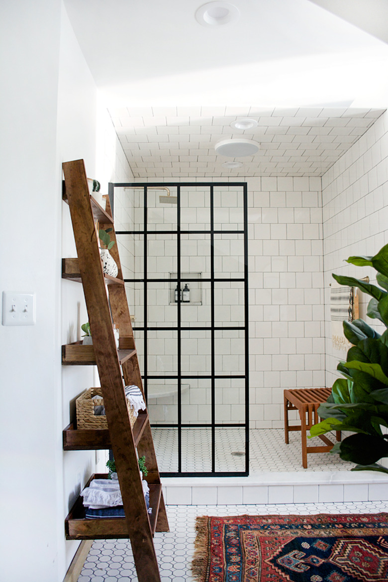
The massive walk-in shower in Bre Bertolini's revamped primary bath is the star of the show. What the space lacks in color it more than makes up for in visual interest due to the tile selection. Honeycomb mosaic tile is featured on the floor, while the walls are clad in 6-inch-by-6-inch white gloss ceramic tile. A rain showerhead and steel-framed shower screen complete the spa-like experience.
6. Try classic gray hexagonal tile.
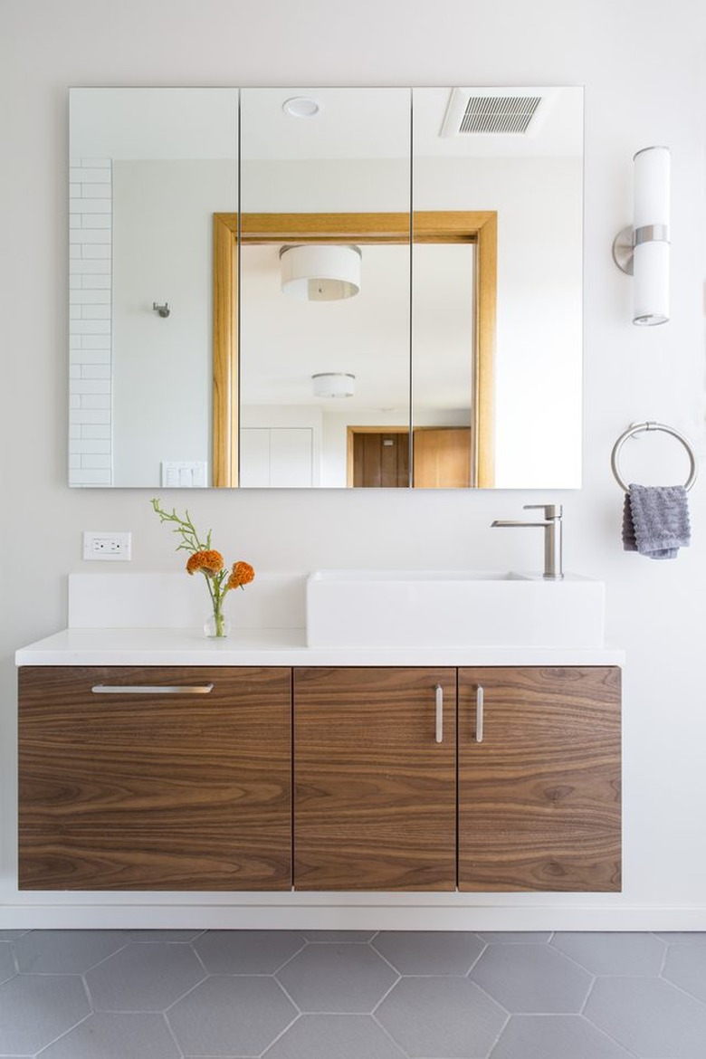
This second-floor primary bath flaunts a wall-mounted walnut vanity topped with a white quartz counter and a matching vessel sink. A frameless mirror (with hidden storage) hovers above. Light gray ceramic floor tile in a classic hexagonal shape ties the whole room together.
7. Add flair with a starburst pattern.
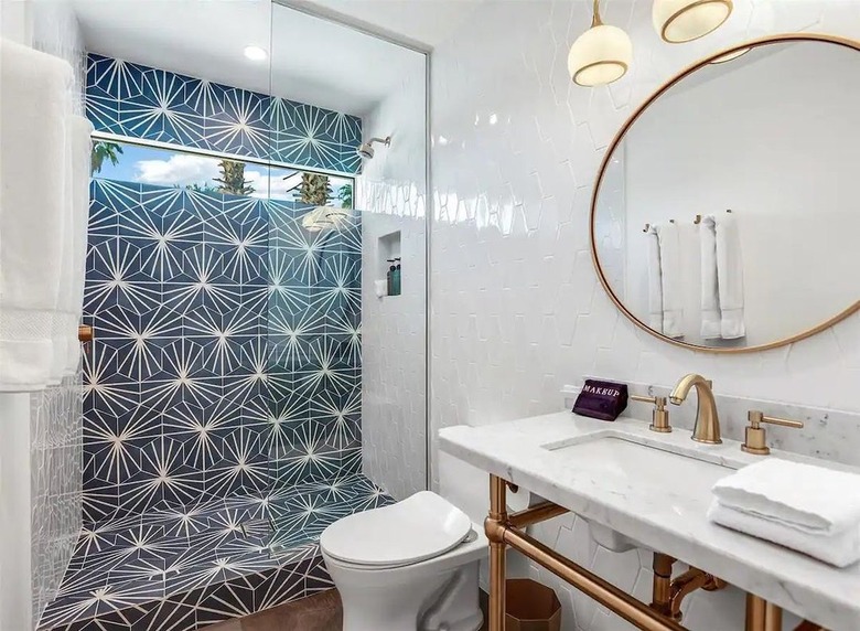
If you love a hex tile but are looking for something a little punchier, this starburst-pattern design provides just that. We love that the owners of this Palm Springs rental paired it with a glossy white hexagonal tile on the adjacent walls. Brass accents add warmth and balance.
8. Pair a wood bathroom vanity with a warm tile color.
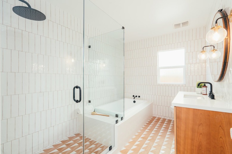
Muted earth tones and clean-lined aesthetics are hallmarks of midcentury design — two characteristics that are hard at work in this space. The orange geometric tile and coordinating wood vanity add beautiful warm tones to the space, while the sleek white bathtub and vertically stacked wall tile feels crisp and modern. Globe-style sconces and a round vanity mirror give the space a luminous glow.
9. Play with variegated pinks.
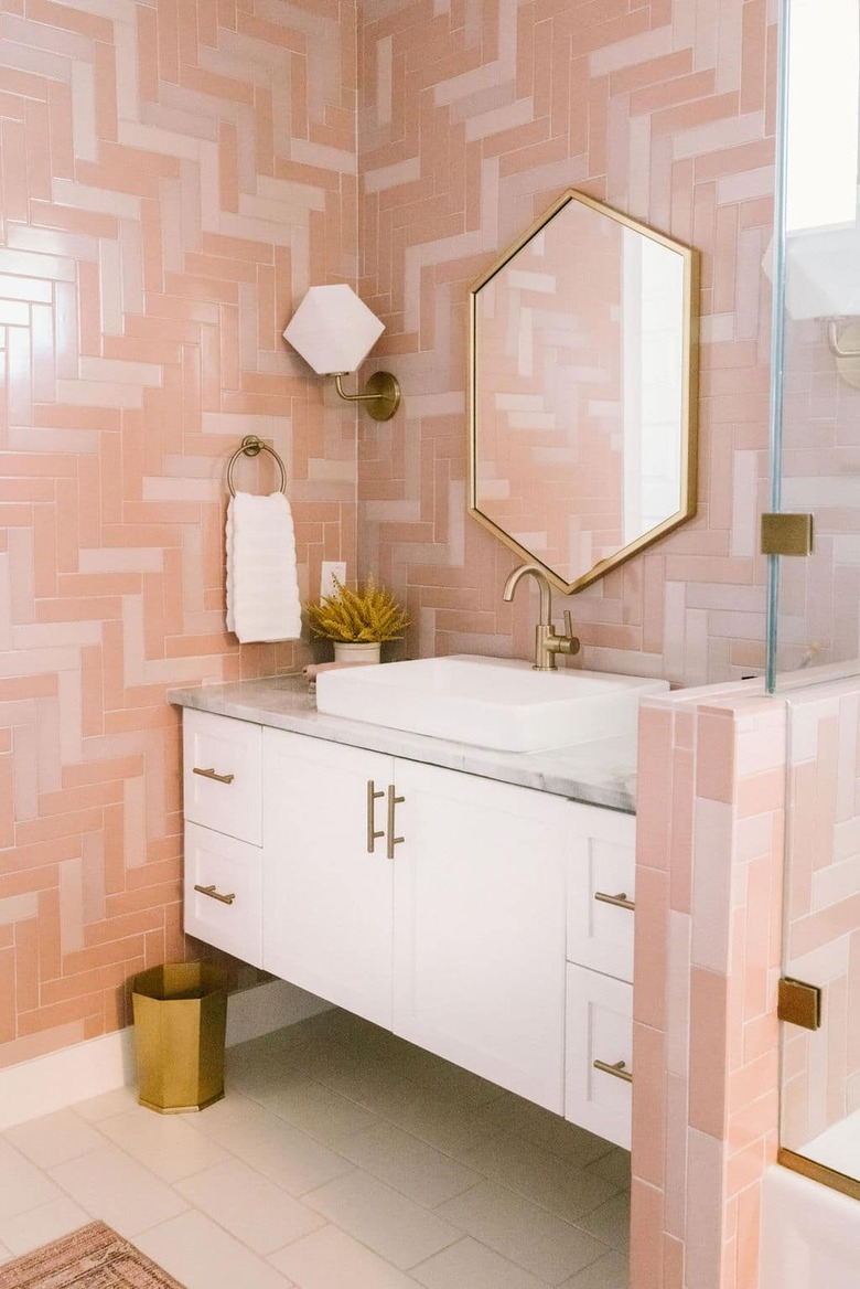
Varying shades of pastel pink are the perfect way to impart a midcentury vibe in your bathroom, especially when glammed up with brass accents. In this bathroom by Jen Pinkston, the walls are clad with geometric mosaic tile in muted pink hues. Thanks to Pinkston's choice of minimal, streamlined decor, the space nods to the past but also feels contemporary.
10. Experiment with subway tile.
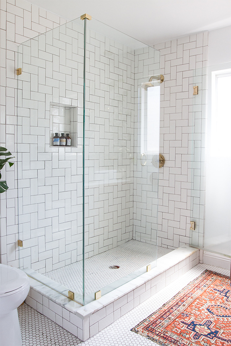
The simple rectangular shape of subway tile offers so many options for a midcentury-inspired space. Here, designer Sarah Sherman Samuel has chosen a diagonal herringbone pattern for the subway tile in the shower. It's a small departure from the more standard running bond pattern but one that makes the shower feel special. The penny tile flooring offers additional visual interest and texture.
11. Stack tiles horizontally.
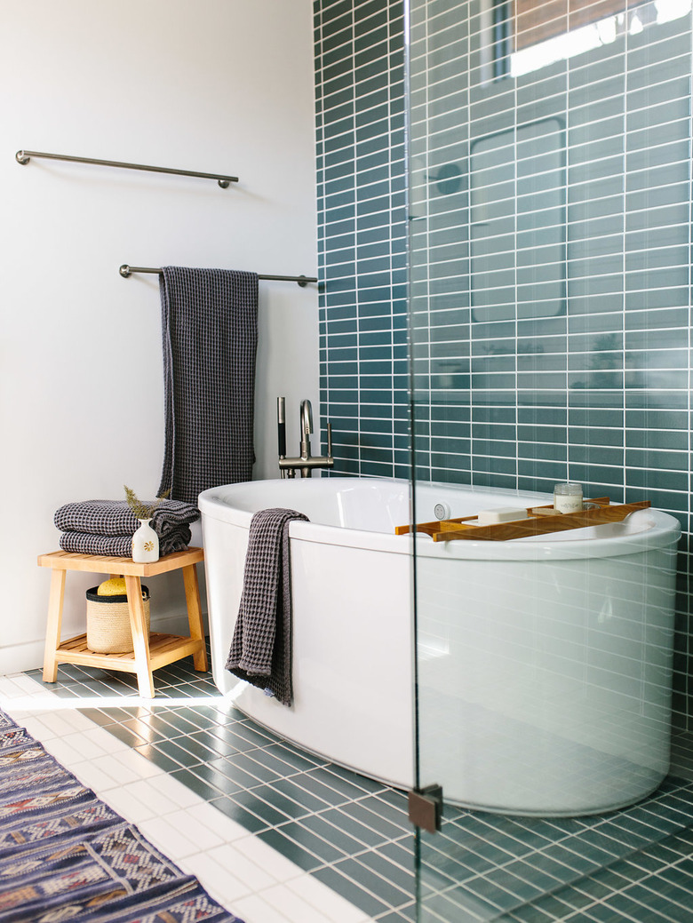
Much like Sarah Sherman Samuel's diagonal herringbone pattern, this horizontal stack takes tried and true subway tile (albeit an elongated version) and makes it feel new. The scale and rich teal color further elevate designer Jen Pinkston's tile choice. An oval tub and thoughtful pieces of bathroom decor complete the vision.
12. Go poppy and glam.
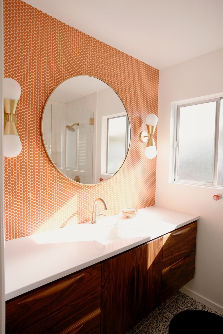
Homeowner Jenny James of Suburban * Pop opted to go all out for her bathroom remodel. Decked out with a bright orange penny tile backsplash, dark wood vanity cabinet, and glam sconces, this setup demonstrates that James has a keen eye for midcentury design.
13. Elevate your tile by pairing it with marble.
Designed by Sarah Sherman Samuel, this bathroom boasts a basketweave tile backsplash and custom marble-topped vanity. It's a look that's eye-catching to be sure but also noteworthy for its potential budget-friendliness. The elongated tile is a more economical choice but gets a high-design treatment due to the alternating pattern. Brass accents and a touch of natural stone imbue the space with a luxurious note.
14. Experiment with color blocking.
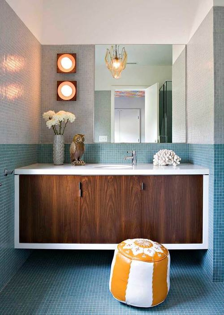
This 1940s Brentwood ranch bath designed by Jamie Bush + Co. is making all of our mid-mod dreams come true. The designer used blue and gray mosaic tile to create a graphic color-blocking effect. A dark wood vanity cabinet and leather pouf balance the cool palette.
15. Take your color cues from nature.
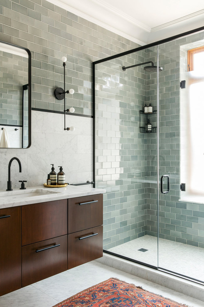
Interior designer Elizabeth Roberts has us swooning over the soft green subway tile used in this Brooklyn bath. Complemented by the dark wood floating vanity, this design has an earthy appeal that's both midcentury and timeless. Black accents punctuate the space and add a modern edge.
16. Highlight a shower/tub combo.
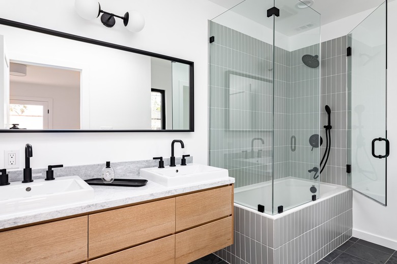
This minimalist-meets-midcentury bathroom design visually separates the shower/tub from the vanity with the help of tile. The gray walls and tub surround define the bathing area and act as a focal point. Note too how the vertical stack plays off the strong horizontal sweep of the vanity and mirror.
17. Balance graphic patterns with matte black tile.
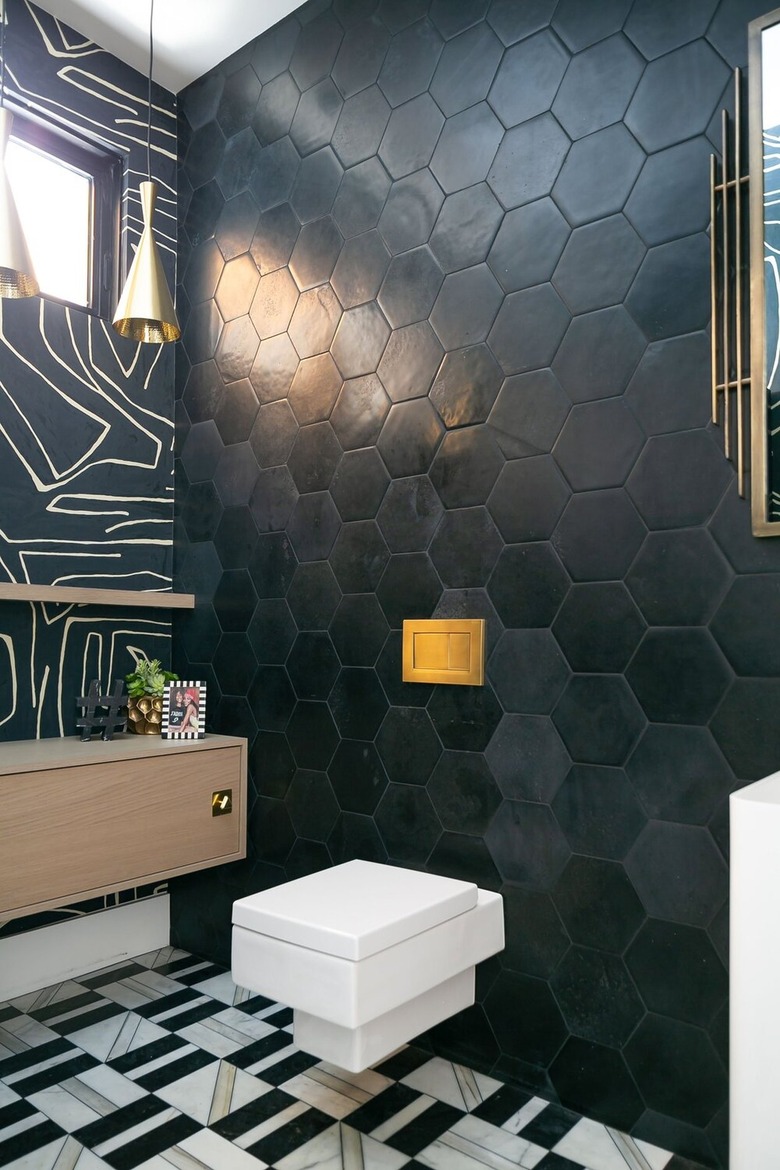
This bathroom by Erica Bryen Design is a combination of midcentury, contemporary, and art deco styles. The secret ingredients? A bold color palette and graphic patterns. The black matte hexagonal wall tile with matching grout serves to ground the room amidst the patterned bathroom floor tile and the wallpapered accent wall.
18. Create a statement with tile.
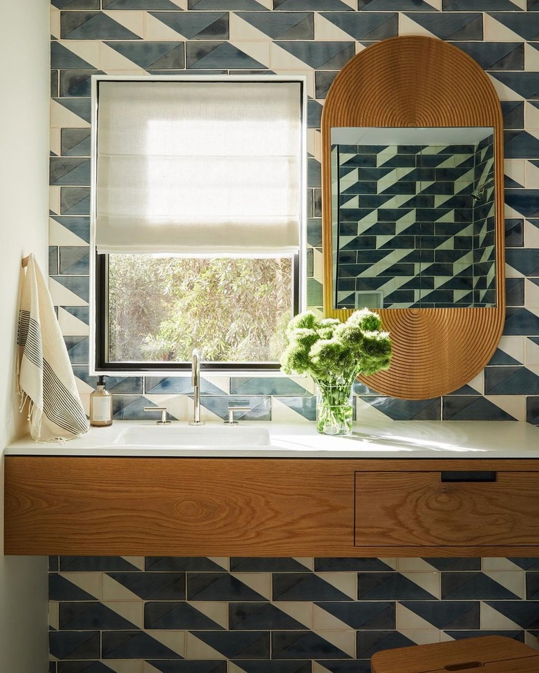
This midcentury modern bathroom by Studio Life/Style goes linear and abstract with its tile accent wall, and we can't argue with the results. The navy blue and white pattern is lively but not overwhelming, which is a fine line to be sure. So, why does it work? The window, the large brass mirror, and the wood vanity all create large swaths of negative space that give the eye a rest.
19. Go glam with marble tile.
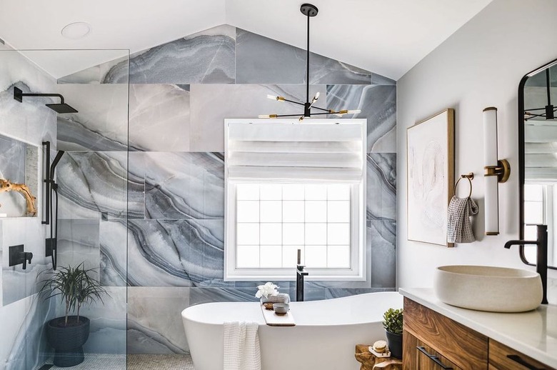
Marble tile may not be the first option that you think of when considering a midcentury modern bathroom design, but this setup by Melissa Rieser Interiors proves that maybe it should be. The veining of the large-scale tiles creates an almost mural effect with lots of movement not to mention a high-end feel. The matte black faucet and sputnik-inspired chandelier blend midcentury and contemporary aesthetics in a way that feels well matched.
20. Mix and match tile patterns.
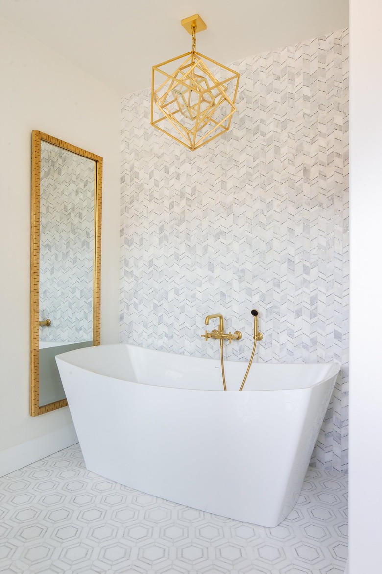
When it comes to midcentury modern tile, there are so many good geometric patterns from which to choose. If you can't narrow it down to just one, try two, as demonstrated in this bathroom by Erica Bryen Design. Here, Bryen mixes a honeycomb pattern on the floor with a sort of broken chevron on the wall. They work together because one is larger-scale than the other and also because they share a cohesive color scheme.
21. Match the grout and tile color.
Midcentury modern style tends to be free of fussy ornamentation, favoring clean lines and functionality. Follow the lead of this bathroom design by Hello Refuge and match the grout and tile colors for a seamless finish.
22. Embrace bold pattern all over.
As tile ideas go, this one by Michelle Boudreau Design is truly bold and beautiful. If you're aiming to pull off a similar look, note the ways in which the designer kept the wall and floor patterns similar as well as the ways they are different. (Answer: The walls and floor are the same color scheme and pattern scale, but each incorporates different shapes.) Then, keep everything else minimal and neutral to allow the tile to be the star.
23. Bring back avocado green.
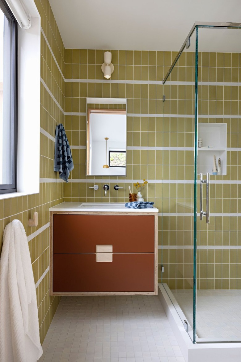
We can't have a discussion about midcentury interior design without mentioning the color avocado green. In this bathroom by Raili CA Design, the wall tile is a veritable time machine back to a groovier era. And yet, the designer still gives it a more current feel thanks to the crisp white stripes and matching floor tile. The frameless glass shower enclosure and abundant natural light keep the setup feeling light and bright.
24. Preserve vintage tile.
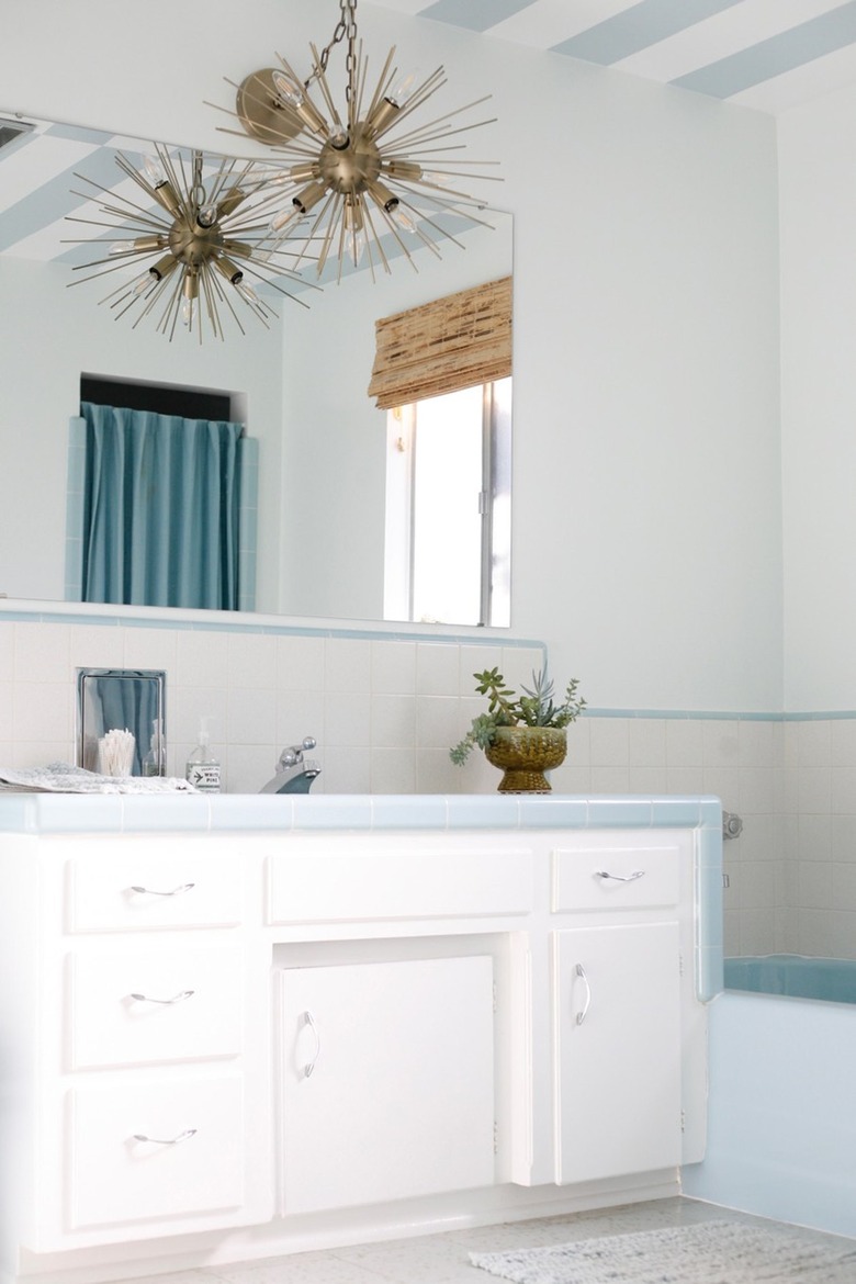
Blogger Jenny James had one goal when it came to this bathroom remodel: preservation. The simple square white and blue tiles are original to the home and have such a great vintage feel. And in a very sweet surprise, when James and her husband removed the '70s orange carpeting that the previous owners had installed, they discovered original 1960s linoleum in baby blue with gold flecks that was remarkably well preserved.
25. Introduce a circle motif.
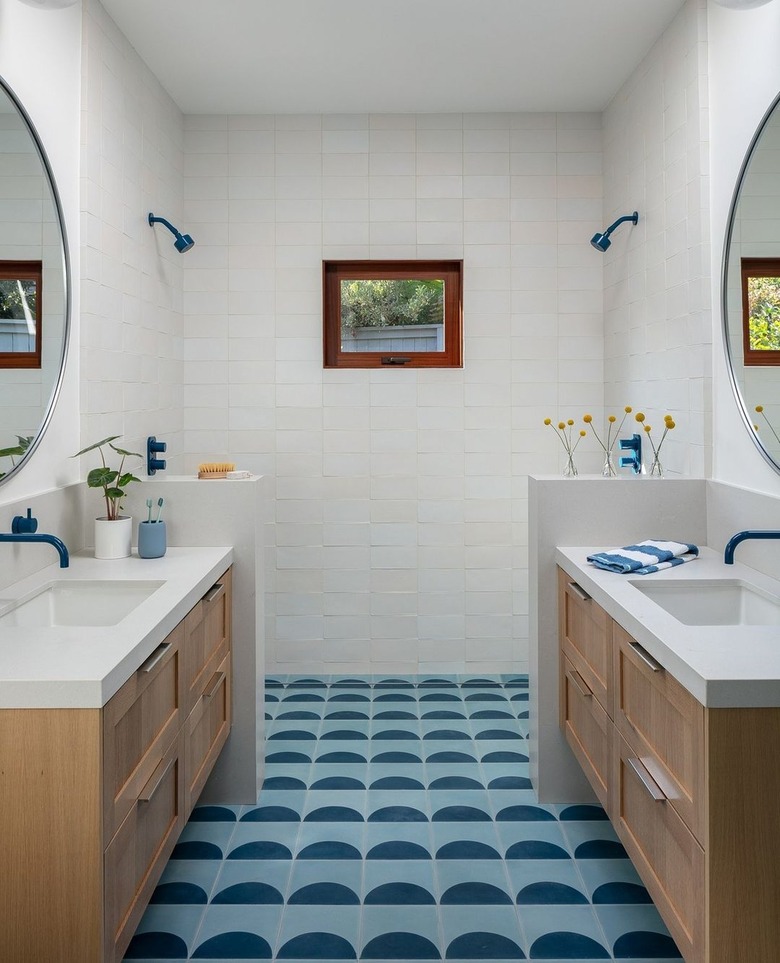
Straight lines get a lot of attention in midcentury design, but rounded elements play a big part as well. In this bathroom by Raili CA Design, bright blue circles and half circles offer playful respite from so many sharp edges. It's a lovely take for a child's bathroom, and we especially love the choice of blue faucets, showerheads, and hardware.
26. Rediscover terrazzo.
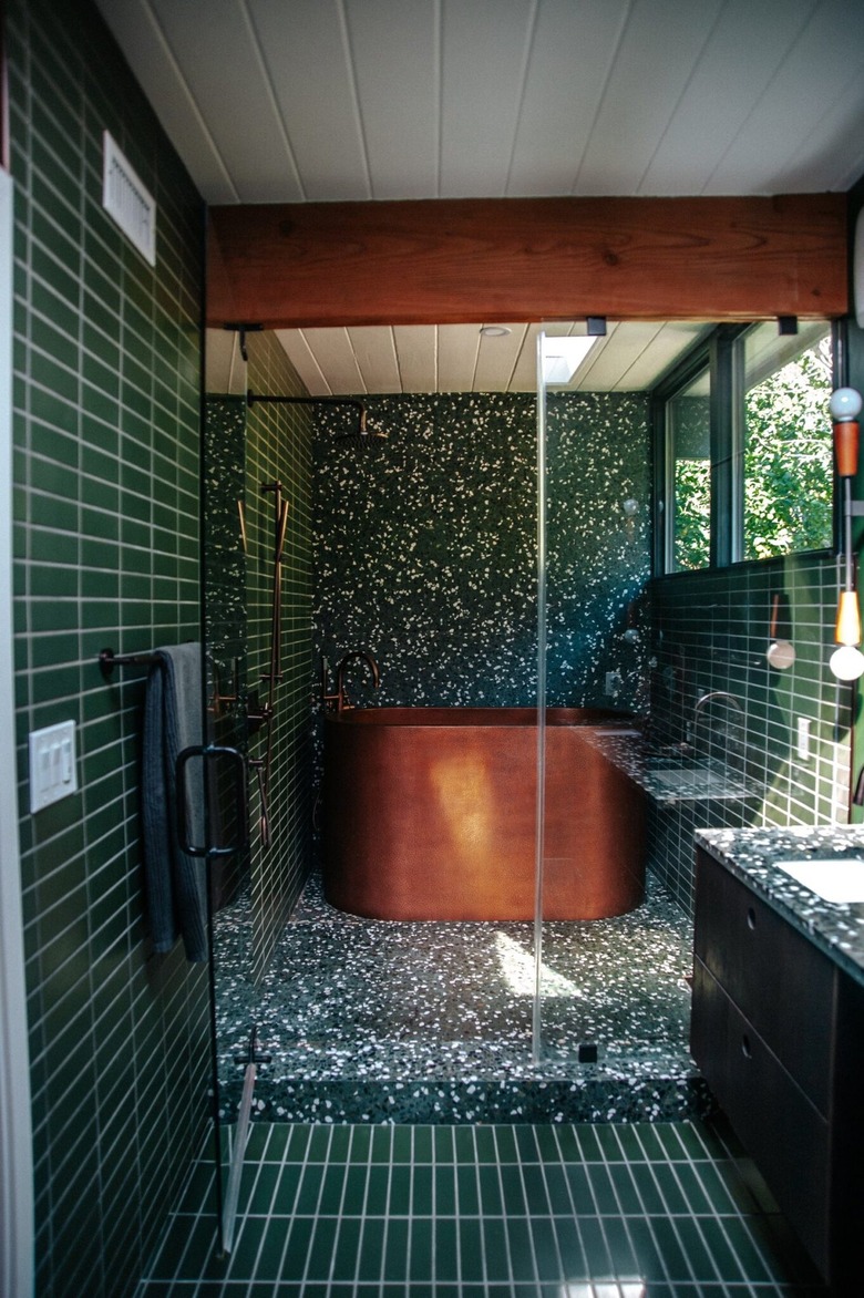
Terrazzo has recently become quite popular, but it actually has ancient roots as a surface material and it enjoyed a boom during the '50s and '60s. Its use in this bathroom by designer Claire Thomas feels like a good blueprint to follow in that it doesn't feel too trendy. Pair it with stacked tile in a similar color to create a cohesive backdrop for the real showstopper: the copper soaking tub.
