23 Midcentury Modern Bathroom Ideas That Are Nothing Short Of Elegant
Looking for a timeless style with a foundation of clean lines, simple shapes, and quality craftsmanship? Sounds like midcentury modern design is the aesthetic you've been searching for. The decor style flourished in the 1950s (mid 20th century, thus the name) after World War II and gained traction as families moved to more urban areas and had smaller dwellings. Advancements in technology allowed for the development of new materials — fiberglass, bentwood, lucite, and laminates, to name a few — which reinvigorated the design scene and generated exciting opportunities for creativity and mass production, making the pieces accessible to everyone.
Midcentury modern architecture emphasized connecting indoor-outdoor living so floor-to- ceiling windows, natural light, open floor plans and exposed beams are featured prominently. Although the aesthetic is functionally-driven and void of ornamentation, a prominence of organic and modern shapes, geometric patterns, and earthy (as well as bright) color palettes kept the look interesting and playful. Even muted pastels found their way into midcentury modern design.
As one of the most utilitarian spaces in a home, the bathroom is an ideal spot to flaunt the form and function, clean lines, and hard-working materials of midcentury modern design. One of the best things about the style is its versatility — it plays nicely with a variety of other aesthetics and it's quite easy to weave into your home. In fact, many people have items influenced by the era in their bathrooms without even realizing it. Decorative elements such as globe-style or sputnik-inspired lighting, wood-paneled walls, and graphic patterns in the form of wallpaper, tile, or textiles all imbue mid-mod flair.
Ready to incorporate a little bit of that retro charm into your bathroom design? Read ahead for some of our favorite ways to bring the look home.
23 Midcentury Modern Bathroom Design Ideas That Shine
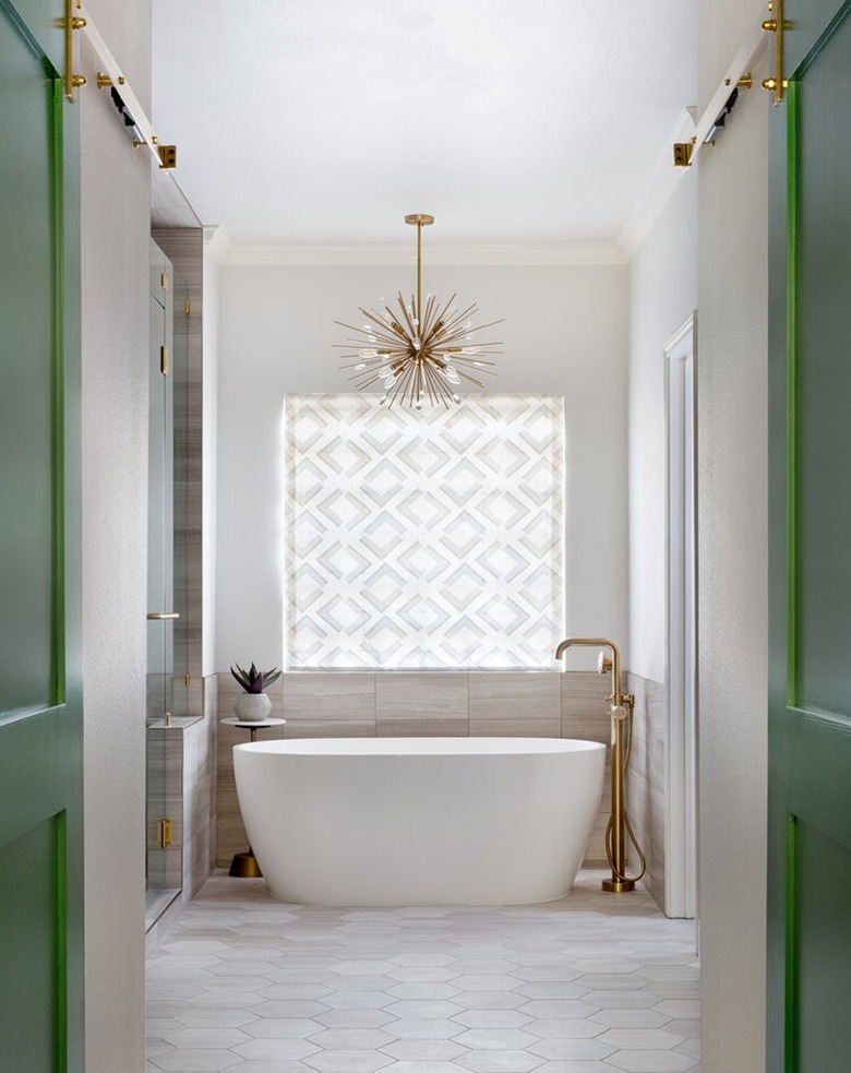
1. Invest in a starburst-style chandelier.
You can't think of midcentury modern design without conjuring images of the iconic atomic starburst. Due to its popularity, it didn't take long before lighting designers began adopting this asymmetrical shape for flush mounts, chandeliers, and pendant lights. Meredith Owen Interiors showcased the eye-catching ceiling fixture above the freestanding tub in this elegant bathroom design for a little retro glam.
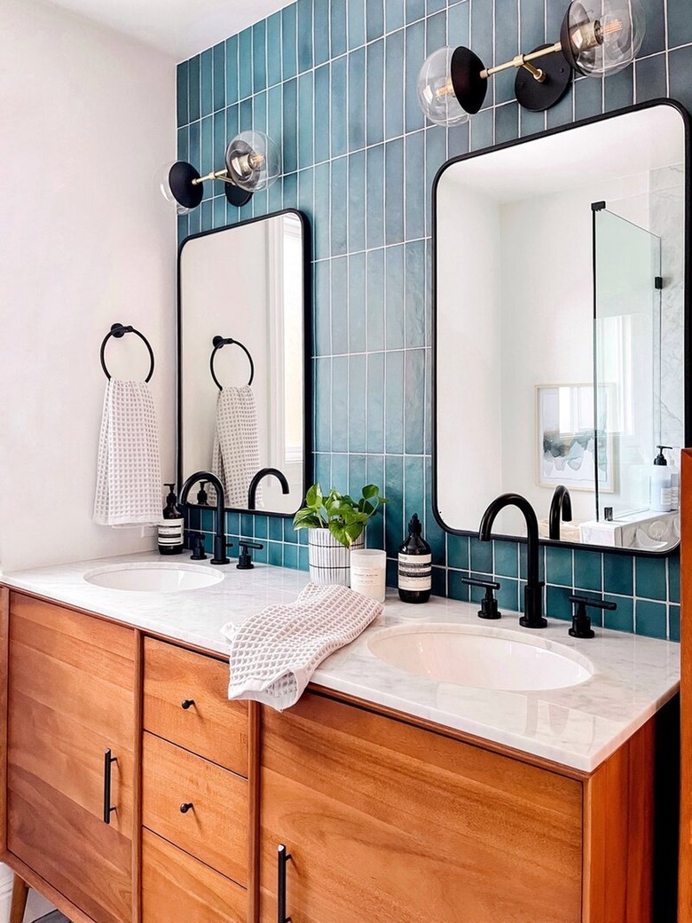
2. Punctuate your space with matte black accents.
If you want a midcentury bathroom design that leans more modern than retro, consider defining your space with black accents. In this setup by Melissa Morgan Interiors, matte black fixtures, decor, and bathroom lighting lend a subtle edge that enhances the vibrant blue tile and rich wood vanity cabinet.
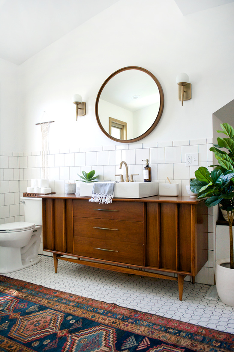
3. Celebrate beautiful wood craftsmanship.
Wood vanity cabinets (especially vintage designs) are a beautiful way to bring midcentury style into your bathroom. Look for options that feature simple lines, tapered legs, and minimal ornamentation like this retro piece that Bre from the blog Brepurposed selected for her space. Complete the setup with a classic white subway tile backdrop and a round mirror above.
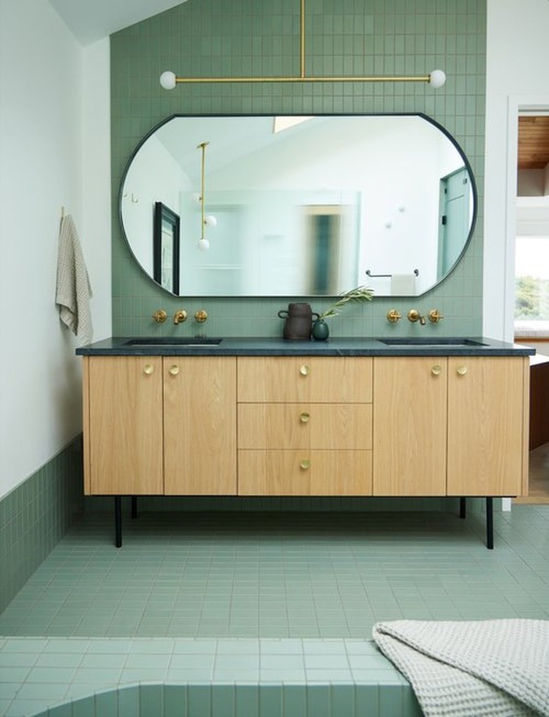
4. Hang an eye-catching chandelier.
Clean lines and the use of honest materials are hallmarks of midcentury design, even when it comes to lighting. Take note of the sculptural, yet very simple, chandelier hanging in this green bathroom by Bright Design Lab. Even though the ceiling light lacks ornamentation, it still makes quite the impact. Complete the scene with brass fixtures and hardware.
5. Introduce abstract shapes.
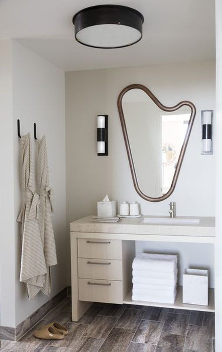
Midcentury design introduced a bevy of curvy, asymmetrical shapes that are commonly associated with the era. In typical bold fashion, designer Kelly Wearstler shows us how it's done in this guest bath with the help of a unique vanity mirror. The organic silhouette is a sculptural element that's not only functional but also provides loads of visual interest.
6. Welcome symmetry.
There is something so visually pleasing about an interior that is symmetrical, especially when you throw in clean lines and minimal decor. For instance, this stunning bathroom by A1000xBetter doesn't need a lot of frills to make an impression — the balanced design and calming palette does all the heavy lifting.
7. Incorporate brass details.
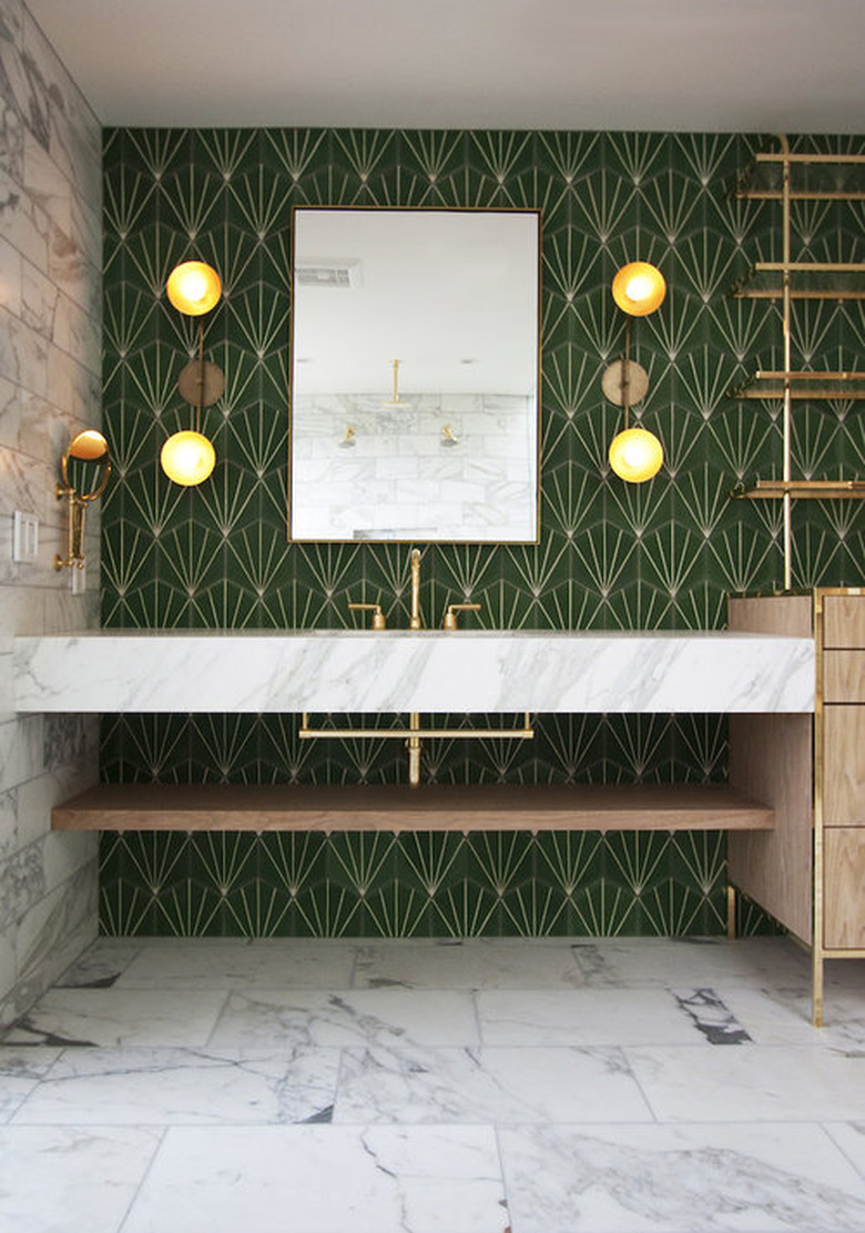
Much as it is today, brass was used quite frequently during the '50s and '60s and it's not hard to see why. The lustrous metal finish instantly warms up any space and adds a note of glamour. Bright Design Lab beautifully incorporated brass detailing throughout this entire modern bath. The end result is a sophisticated washroom sure to meet the approval of Mad Men's Don Draper.
8. Add pops of color with accessories.
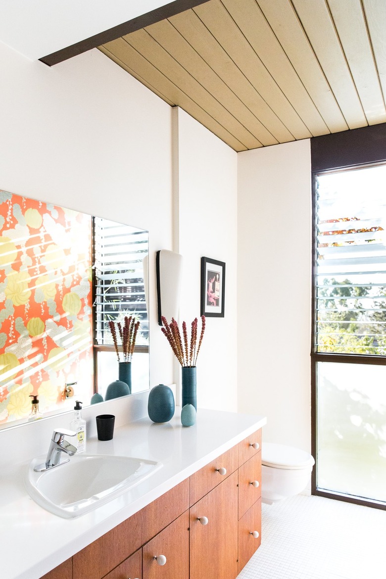
Punctuate a midcentury modern-inspired bathroom by including colorful home decor. Everything from graphic artwork to vibrant shower curtains to unique light fixtures are fair game. In this edited design, a trio of slender blue ceramic vases rest on top of the bathroom vanity cabinet, bringing both color and soft curves to a space full of clean lines.
9. Update the lighting.
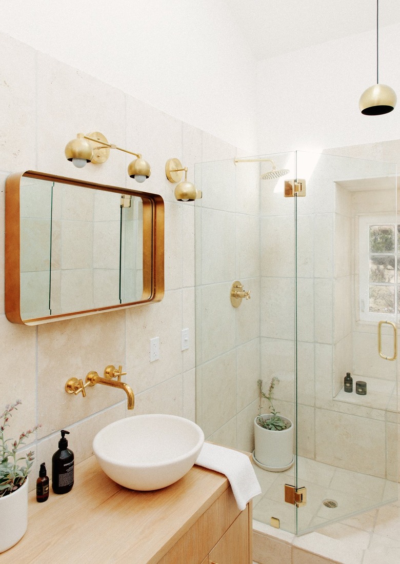
Updated lighting can go a long way at giving bathrooms a midcentury modern bent without an all-out remodel. For instance, the brass wall sconces and pendant spotted in this small bath add warmth and a little sparkle. Complete the look with a brass faucet and shower fixtures, too.
10. Amp up the drama with a bold accent wall.
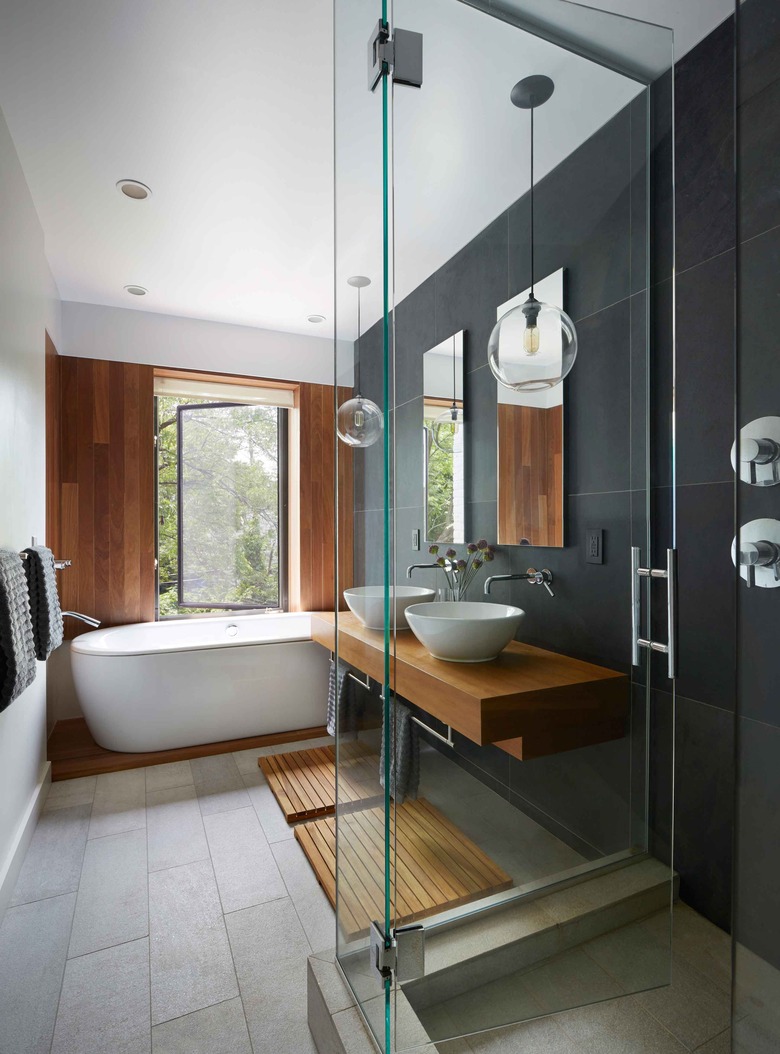
When it comes time to select your palette, you don't have to go with a color scheme that is characteristic of the era. Follow the lead of this bathroom design by Etelamaki Architecture, and try something a bit more modern. The black accent wall definitely draws the eye and evokes a sense of drama that pairs beautifully with the sleek lines used throughout the space.
11. Embrace a black and white color palette.
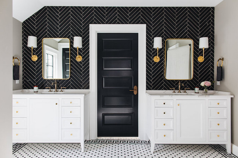
Like we said, you don't have to commit to a color palette that is characteristic of midcentury design. The team over at Build With Kenowa kept it classy in this bathroom remodel with a high-contrast black and white scheme. The design works because it is grounded in traditional elements — vanities with marble countertops, shaker front drawers, and classic sconces with linen shades.
12. Don't forget the ceiling.
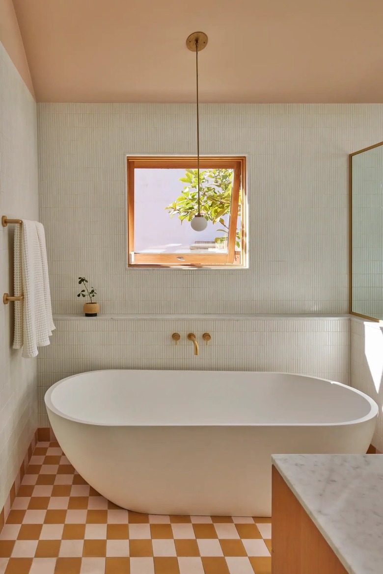
Bathroom decorating ideas tend to focus most the attention on the walls, floor, and vanity since those elements are usually the first thing you see. However, it might be worth saving a little bit of your time and budget to address the ceiling as well. And And And Studio painted the fifth wall in this setup a warm peachy-pink shade, and the result is fun, playful, and wonderfully cohesive.
13. Use plants as decor.
Plants are a cost-effective way to add color, texture, and personality. Use them to introduce a feeling of the outdoors even in small spaces like bathrooms. They can sit pretty on the vanity, fill empty corners, hang from the ceiling, or sit on a wall shelf. Pro tip: Opt for plants that will thrive in a humid environment.
14. Welcome terrazzo.
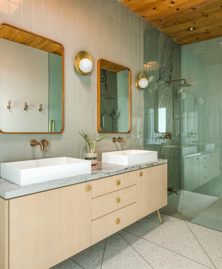
If you really want your bathroom to feel authentically midcentury, you can't go wrong with terrazzo. Although it was quite popular during the '50s and '60s, it has recently seen a resurgence on countertops, walls, and floors. Follow the lead of Michelle Boudreau Design and deck out the floor with large geometric terrazzo tile for even more visual interest. Complete the look with wall tile in a similar hue.
15. Bring in texture with all-over mosaic tile.
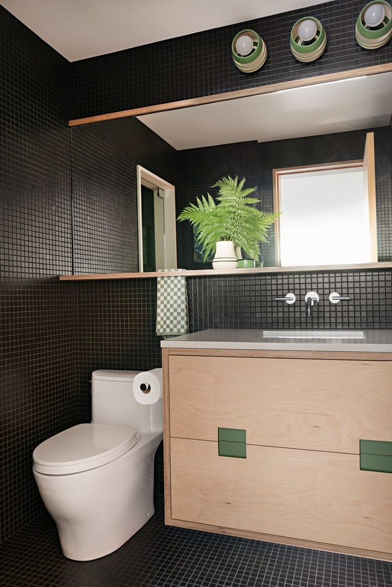
If you are looking for midcentury modern tile ideas, stick to straightforward shapes like rectangles, squares, and hexagons. Amplify the effect of tiny mosaic tiles and create allover texture by installing them on the walls, as well as the floor, as RailiCA Design did in this monochromatic bathroom. An expansive mirror and a light wood midcentury modern vanity keep the look bright and welcoming.
16. Install a skylight.
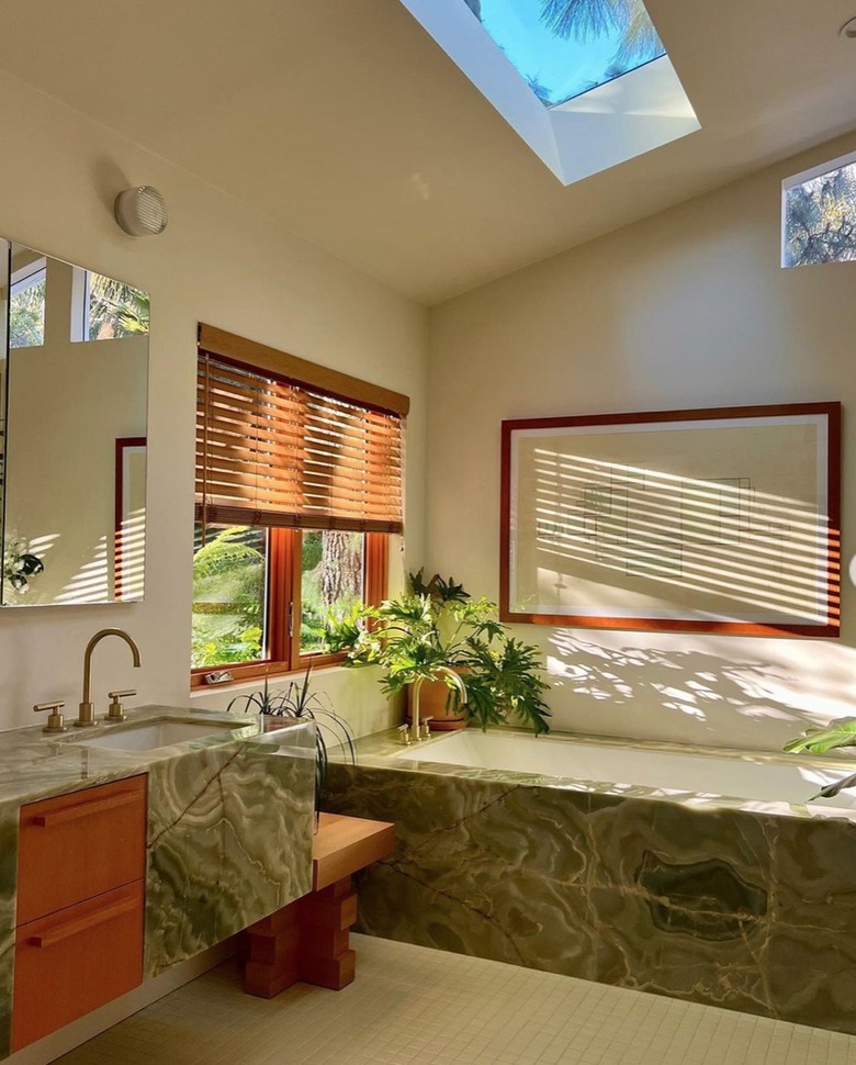
Let natural light flood your bathroom from above for an open and airy feel. In this setup by WILLETTSPACE, multiple windows (including a skylight) not only fill the space with light, but they really bring the outdoors in. The earthy color palette — made up of green and brown — echoes the hues found outside, resulting in a design that feels warm, welcoming, and one with nature.
17. Consider a floating vanity
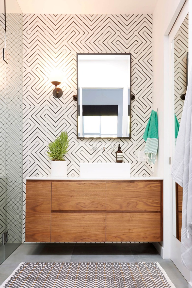
Wall-mounted or floating vanities are ideal for spatially challenged bathrooms because they let light circulate around them, giving the illusion of more square footage. Daleet Spector shows us how it's done with a wood cabinet that's mounted to a graphic tile backsplash. The sleek design — flaunting flat front drawers with integrated finger pulls — complements the midcentury modern aesthetic.
18. Make a statement with a graphic tile floor.
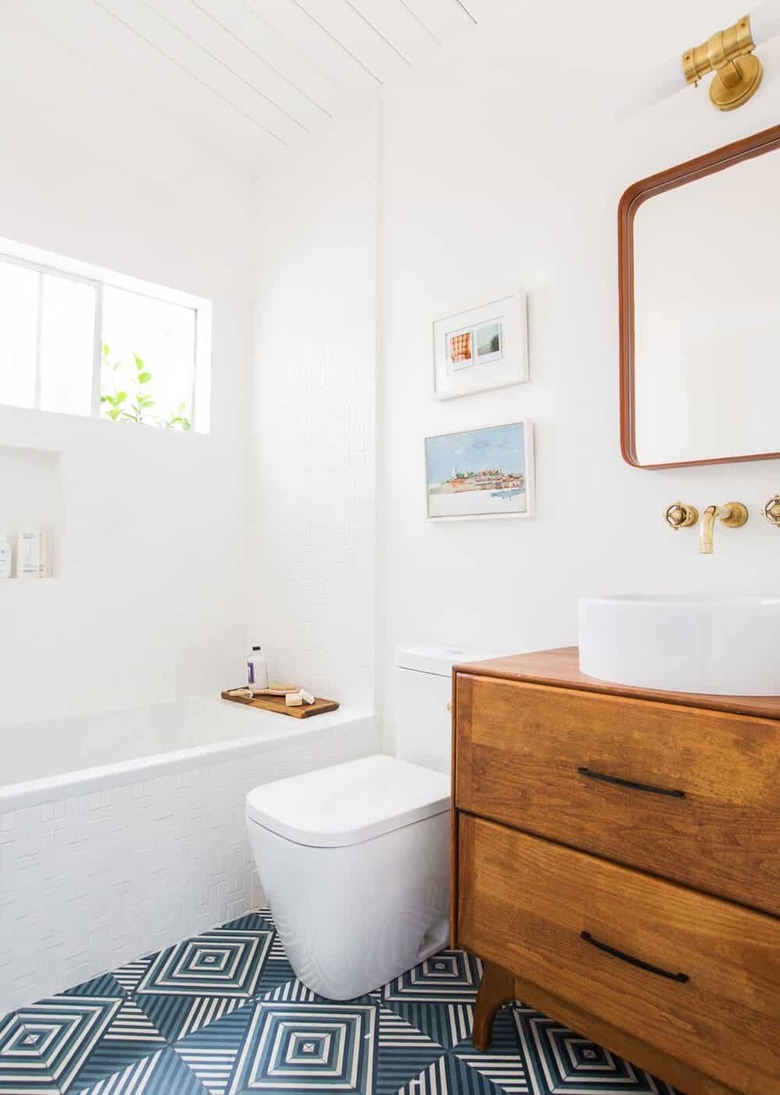
Bold patterns are a midcentury modern must. But rather than including them as an accent, make them a real focal point. For example in this small bathroom by Emily Henderson, high-contrast graphic floor tile in blue, white, and black makes a real visual impact, but still feels groovy and playful. Wallpaper or paint could also be used to accomplish the same goal.
19. Tile your countertops.
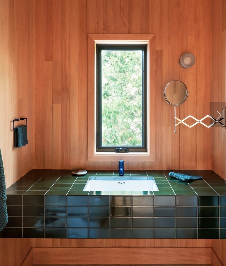
Although there's no disputing the beauty of slab stone countertops, they're one of the most costly line items in a bathroom. Perhaps that's one of the reasons that tile countertops are making a comeback. The stylish countertop alternative is more affordable and (when done right) it actually looks pretty good, too. Make the tile pop with contrasting grout or create a cohesive look with a grout color that matches, as Elizabeth Roberts did in this serene setup.
20. Welcome green paint.
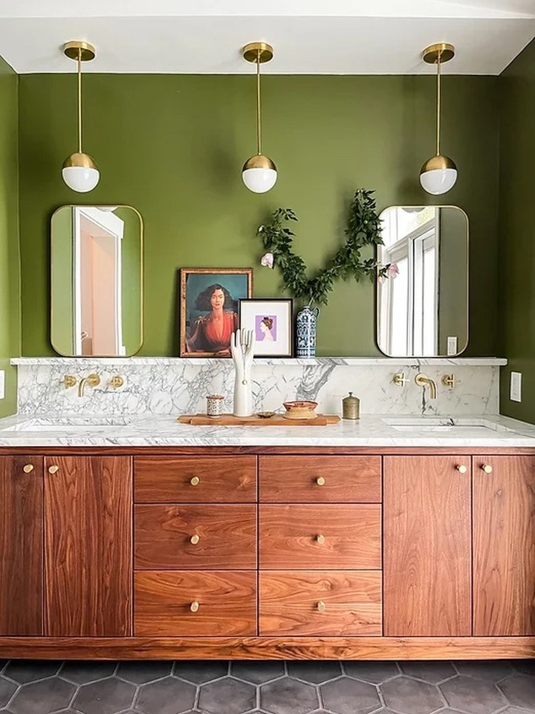
Go all in on midcentury style by embracing a retro hue that's characteristic of the era. For instance, we love the avocado green paint color that Jess from The Styled Domicile selected for this bathroom makeover. The bold shade pairs beautifully with the rich walnut vanity cabinet below topped with a marble counter, backsplash, and shelf. Brass fixtures, hardware, and lighting are the icing on the cake.
21. Let the rainbow inspire your stone selection.
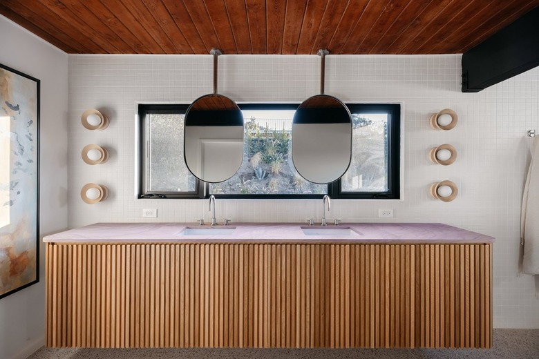
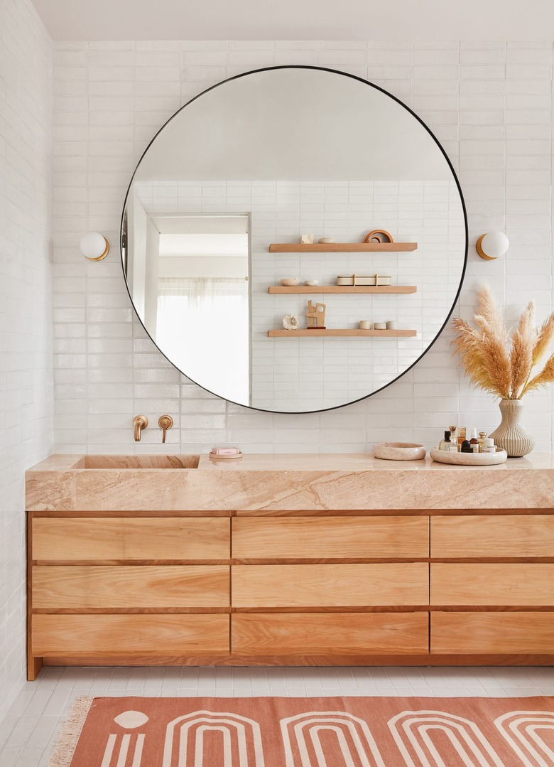
It's hard to beat the glamour and elegance of natural stone. Travertine, terrazzo, and slate were popular options for midcentury designers. Select something in a unique color with visible veining to add movement to your space. Sarah Sherman Samuel opted for a thick pink marble slab for this bathroom countertop and paired it with light wood cabinets, a graphic peach tasseled rug, and feathery fronds of pampas grass which work together to add bohemian flair.
22. Embrace an all-white space.
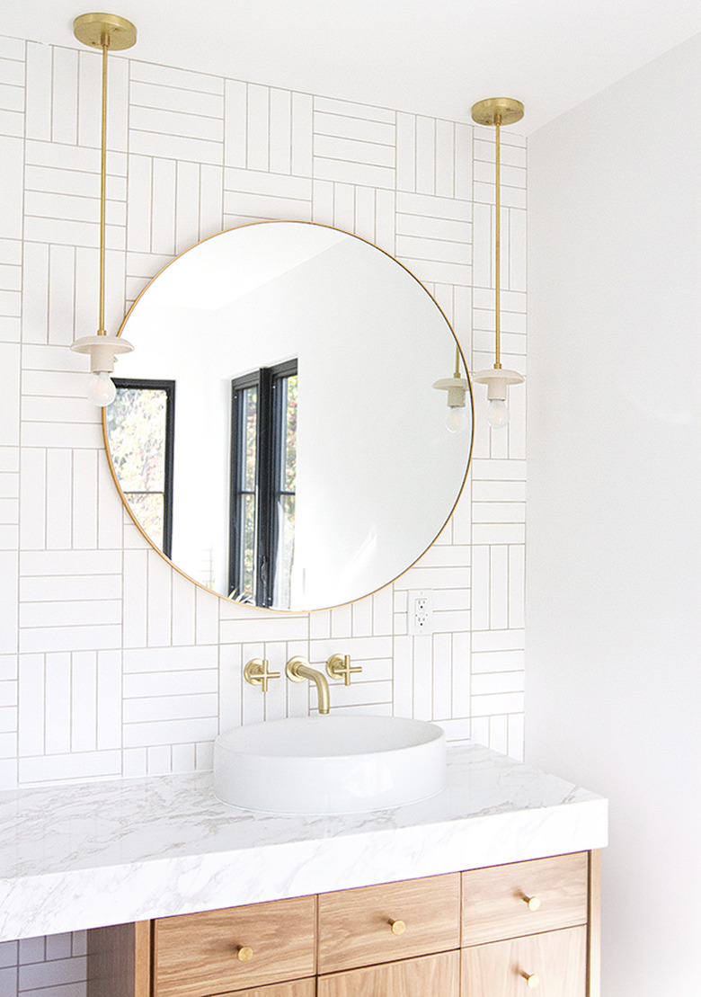
Even understated spaces, like this all-white bathroom by Sarah Sherman Samuel, can exude a midcentury modern aesthetic. In the absence of color, focus on clean lines and modern shapes, like the crosshatch tile pattern and the vanity seen here. This combination of materials and finishes give the space pared-back design plenty of visual interest.
23. Introduce softness with pastels.
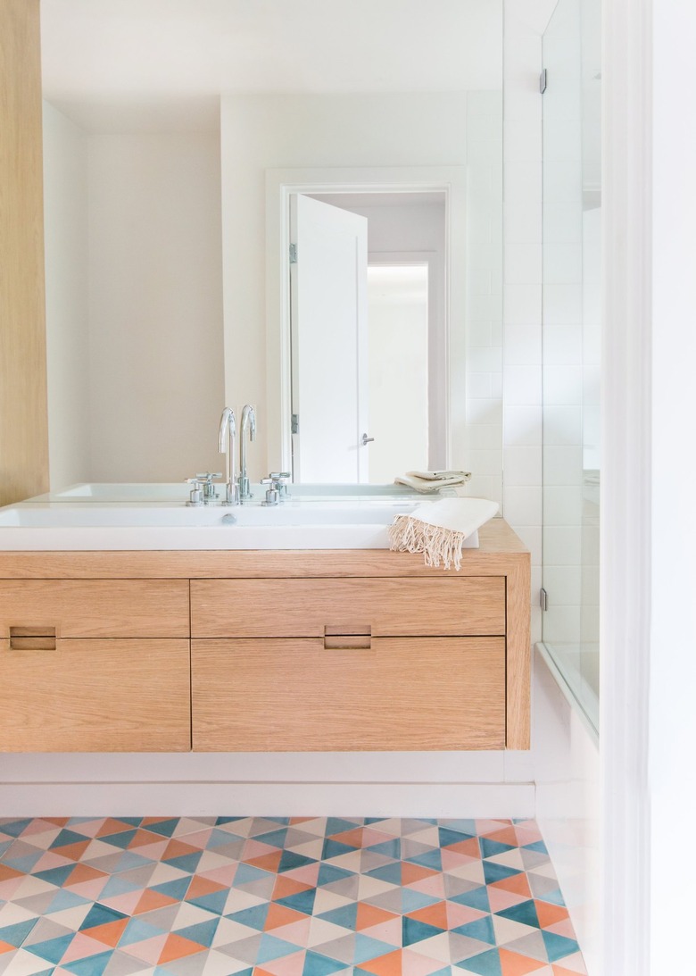
If you favor a more tranquil vibe, but don't want to forgo color altogether, look to pastels — a color palette that was extremely popular in the '50s and '60s. Combining a spectrum of muted shades, as Amber Lewis did with cement tiles in this crisp bathroom, introduces a measured dose of color that feels youthful without being juvenile or visually jarring. Bright white walls and a natural wood vanity keep the look up-to-date.

