This Modern Melbourne Abode Makes The Case For Layering Textures
Australian studio Northbourne Architecture + Design approaches every project holistically, and when they took on their first residential client (located in Toorak, an upscale Melbourne suburb), the priority was creating a home that would act as a fully balanced composition.
The first issue was creating more room, and while the client envisioned a second-floor extension, Northbourne instead got creative by proposing an internal reconfiguration that would actually provide more space. The rest of the residence draws inspiration from the client's art collection, and so the firm ran with the idea of mixing textures to create a running theme throughout.
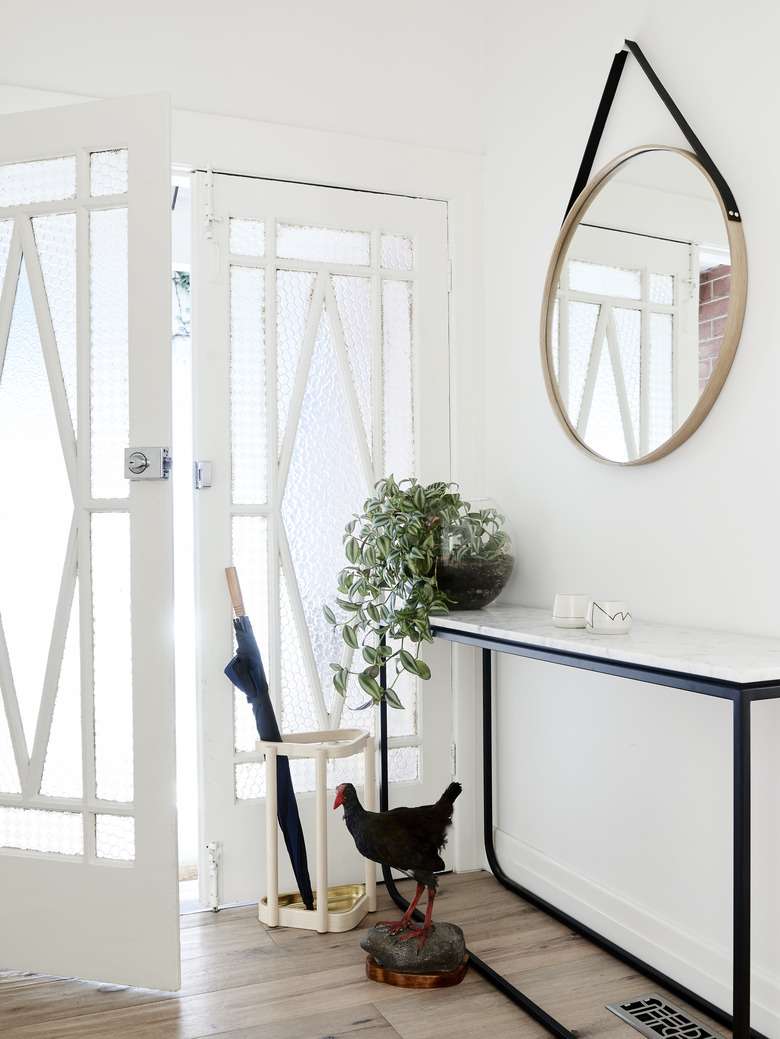
1. Entry
In the entryway, a Grazia & Co. console sets the tone by combining two heavy textures (a stone base and metal frame) in a manner that feels light and buoyant. A taxidermy bird makes the perfect welcome to a home that is both whimsical in design and serious about art.
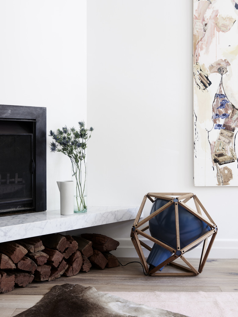
2. Living Room
Geometric angles, from the timber floor lamp (a design by Henry Pilcher) to the shapes created from a stack of chopped firewood, are featured throughout the home. The living room's Jetmaster fireplace displays a marble hearth that acts in harmony with the room's other minimal details.
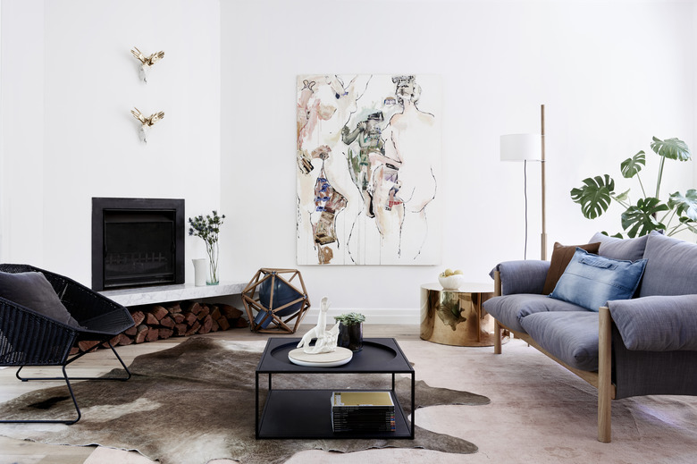
3. Living Room
In the living room, a Wilfred sofa by Jardan is paired with a steel coffee table from House of Orange. The home's interior design — from joinery design, selections of color, and choices of material — were all derived from the client's art collection.
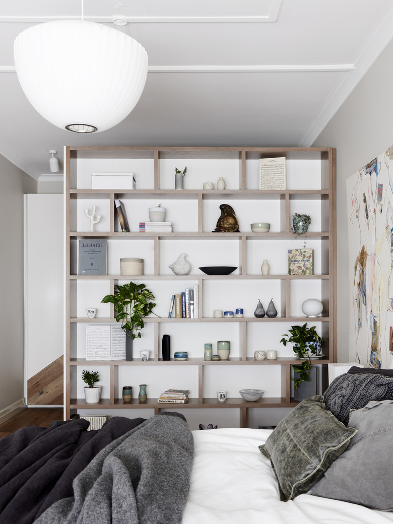
4. Bedroom
In the bedroom, a large shelving unit filled with Trent Griffiths Ceramics acts as a wall divider. The bed is flanked by tables from Grazia & Co.
5. Bedroom
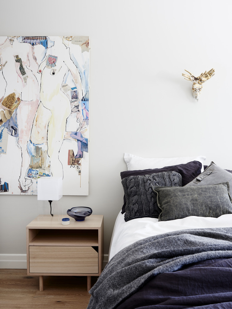
The bedroom might be the best example of how the house uses texture to create its ambiance: pillows of various materials create a bedscape (if you will) that plays off the movement in the painting.
6. Nursery
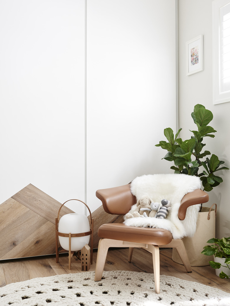
The nursery is a dream for the parent who wants their entire house to be a modern oasis. A brown leather chair by Classicon offers a comfortable spot for reading, while an opal-shaped lamp by Miguel Mila gives off a perfect, sleepy glow.
7. Nursery
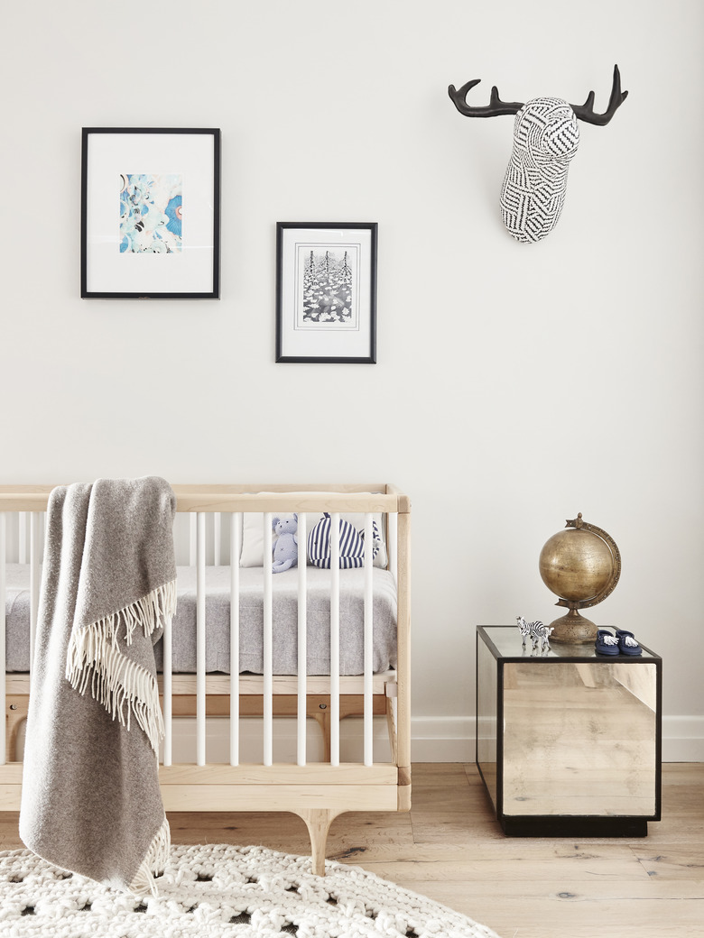
The gray color scheme in the nursery is anything but drab; thanks to a playful mix of art and objects in the room, the hue comes off as extremely serene. The modern crib is by Kalon Studios.
8. Home Office
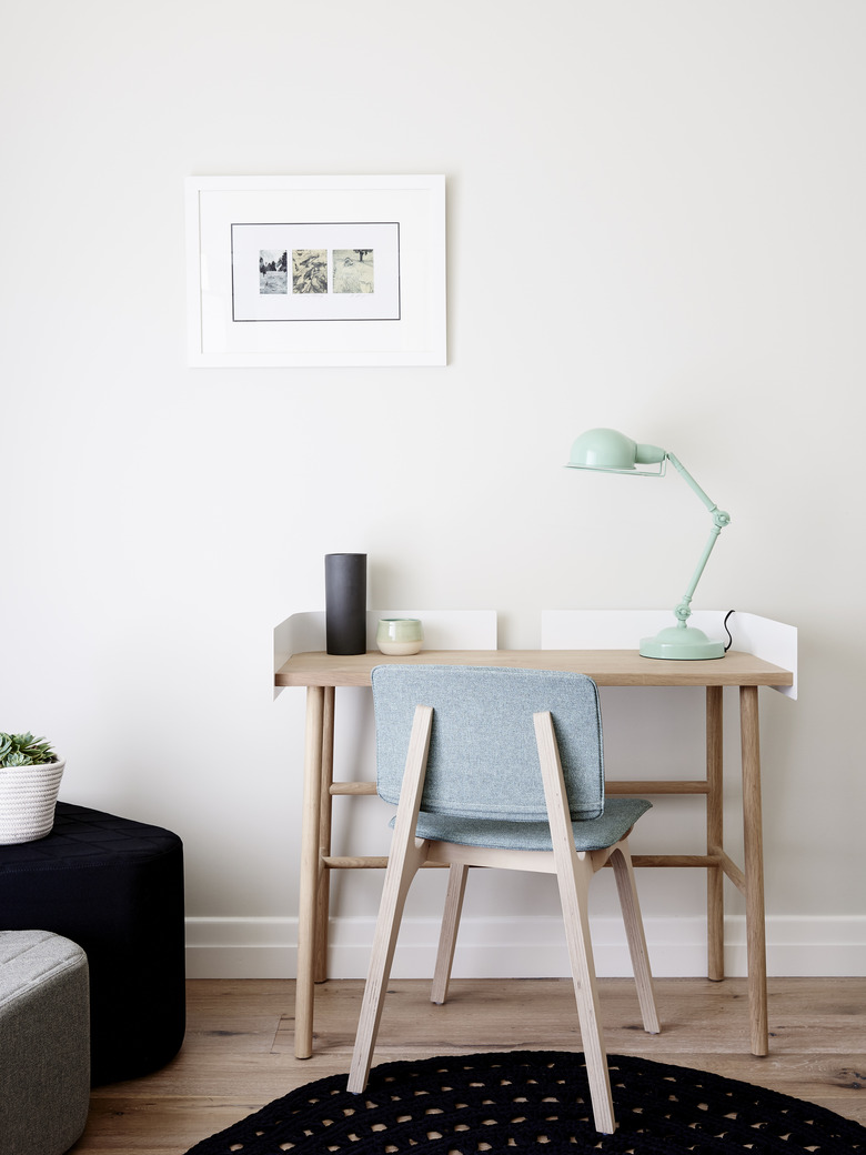
The study is one of the more minimalist areas, with a small but useful workspace. The few ceramic accents are also by Trent Griffiths.
9. Bathroom
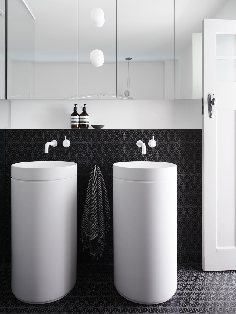
In the bathroom, experiments with textures and shapes create a design that almost creates an optical illusion.
10. Bathroom
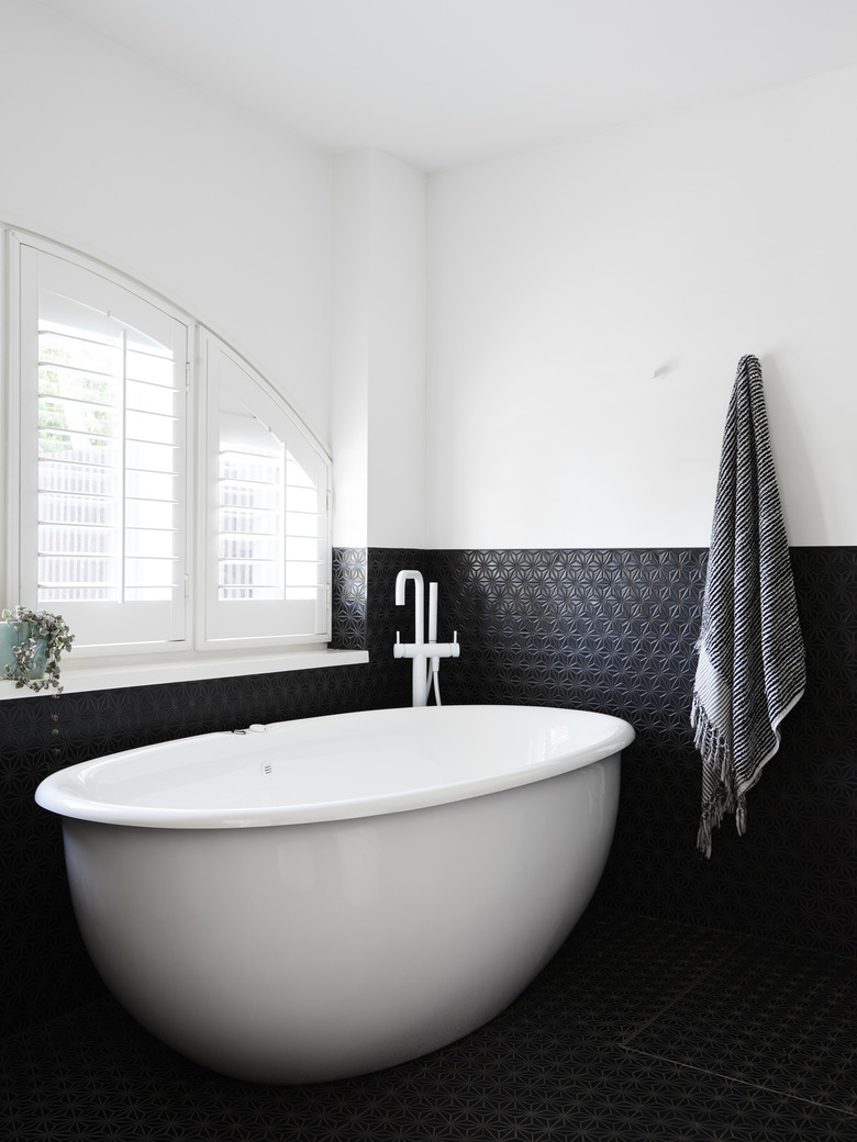
In the ensuite, the black-and-white theme continues and it's so effective that hardly any additional decor is necessary.

