A Lisbon Apartment Uses Minimalism To Maximize Space
Modernizing an apartment designed by by the internationally renowned Portuguese architect Alvaro Siza was a big responsibility for Lisbon-based architectural firm rar.studio. (The apartment, located in Lisbon's Chiado district, was part of Terraços de Bragança, is part of a set of buildings designed by Álvaro Siza Vieira that completed construction in the early 2000s.) According to architect Rita Aguiar Rodrigues, carefully considering what was necessary and adding to the design, rather than completely changing it, was paramount. "Working within the scope of a Siza Vieira project represents a difficult but desirable challenge. Weighing the responsibility of our intervention and searching for ways to make it useful, that was the biggest challenge," Rodrigues said.
The firm opted to revamp a few key elements while keeping the highly-respected architect's original layout largely untouched. "We made some strategic changes but kept its general layout," Rodrigues said. Instead of changing the layout, the firm worked to change four key elements. "It had four features that made it look substantially different: narrow and dark wood planks on the floor, shorter doors and all cabinets aligned by the same height, larger window/door frames and lower skirting boards," Rodrigues said. Changes included replacing the dark planks for lighter-toned ones, extending the height of the doors to match the windows, and a total overhaul in the bathroom and kitchen areas.
1. Living Room
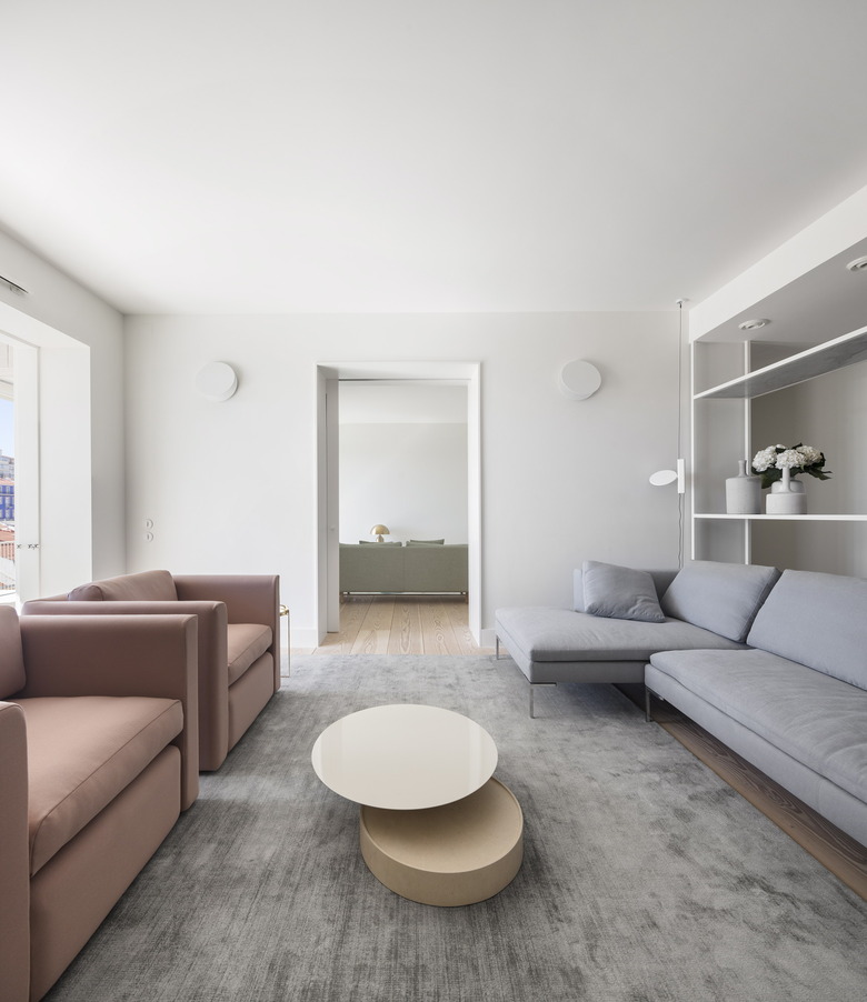
Maximizing space was the client's primary need. By initiating a redesign that focuses on the details, the firm was able to change the scale of the space.
2. Living Room
Restructuring the ventilation infrastructures throughout the apartment meant relocating the original cabinets — the result is an apartment with maximized space.
3. Living Room
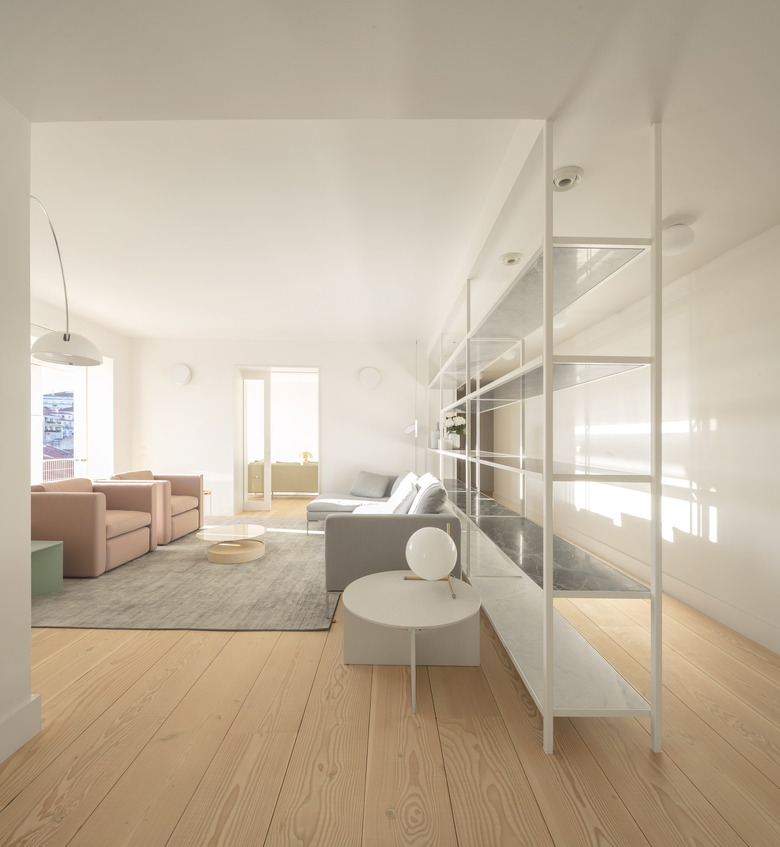
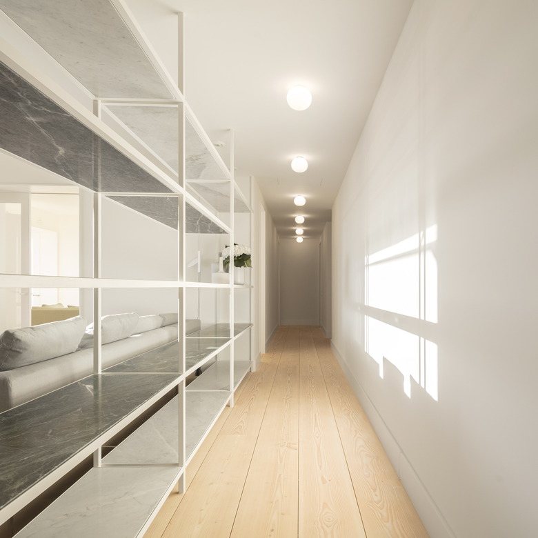
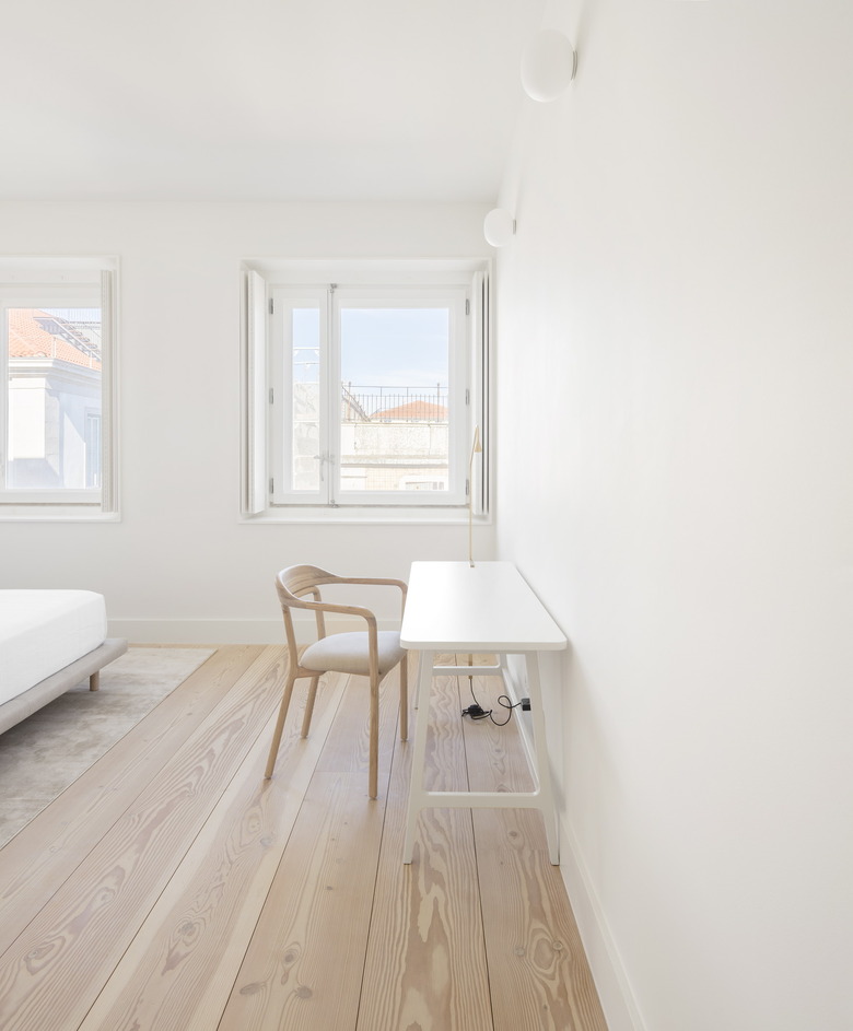
One way to make the space feel larger was by mixing up the color scheme. The firm changed the floor style by removing the dark narrow wooden planks and replacing them with wider, lighter-toned wood planks.
4. Dining Room
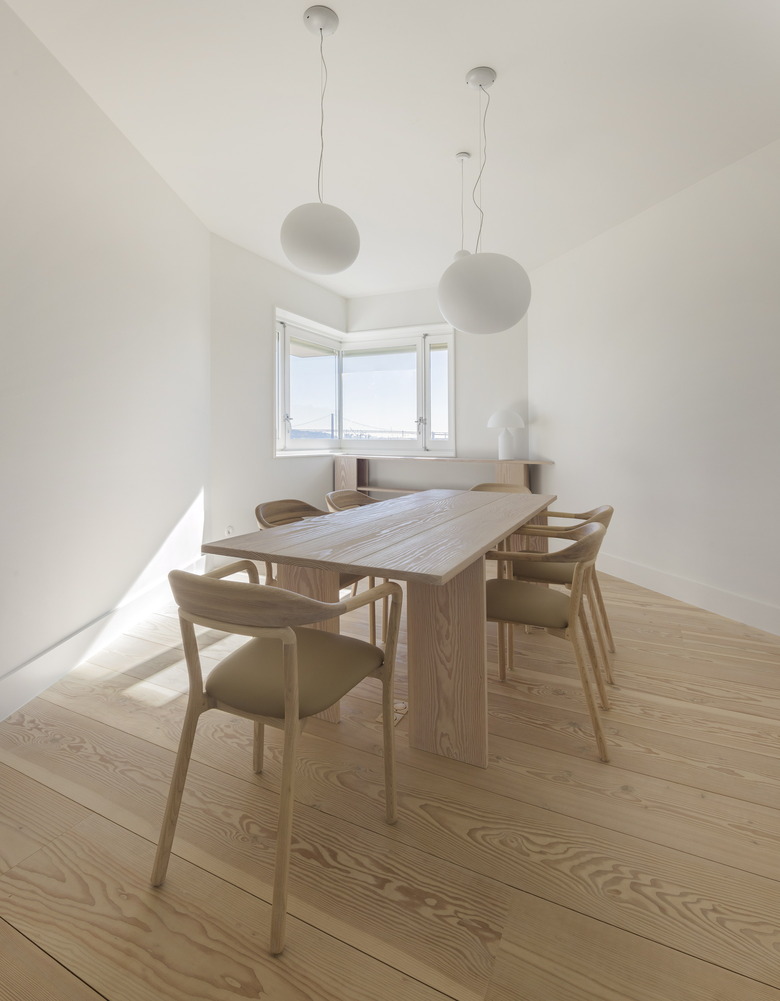
The dining table was custom-built for the space by the firm.
5. Hallway
The original built-in living room shelf, which doubles as a room divider, was replaced by a metallic structure shelf custom-designed by the firm. With no back panel, the new shelf allows light to come through, and doesn't disrupt the apartment's westward view.
6. Bedroom
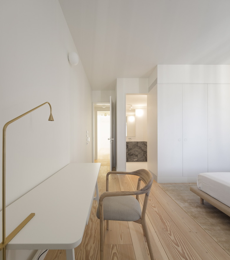
Opening up the apartment also meant changing the ceiling height. By changing the ventilation systems, the firm was able to raise the height of the ceiling, making the apartment feel more spacious.
7. Bedroom
The firm found it pointless to intervene within a framework that didn't require it. Instead, they opted to change details of the space. Bedroom cabinets were custom-designed for maximum storage without taking up too much room.
8. Bathroom
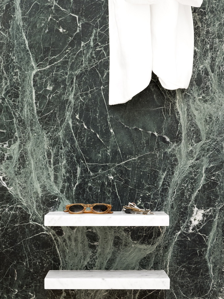
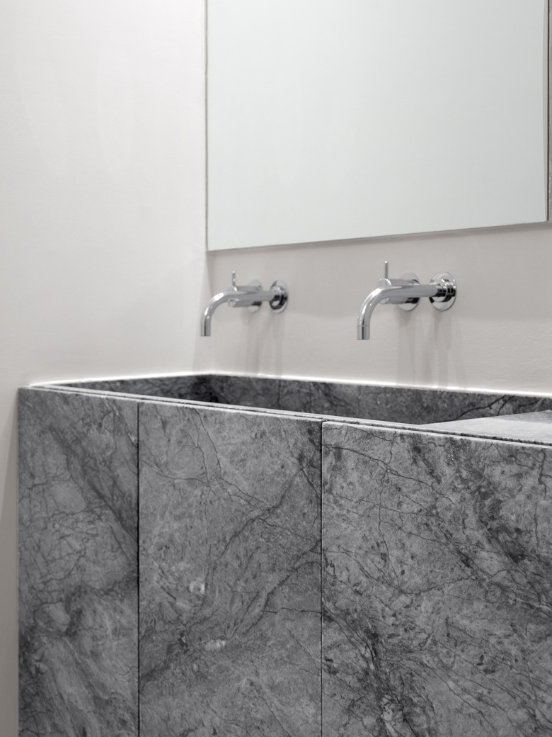
Marble countertops were custom designed for the bathroom and kitchen.
9. Bathroom
The firm was also inspired by the original architect's entire design for the block. The bathroom floor tiles and stone patterns stand out against smooth colored surfaces, in a similar manner to the colored blocks of Terraços de Bragança.
10. Exterior Patio
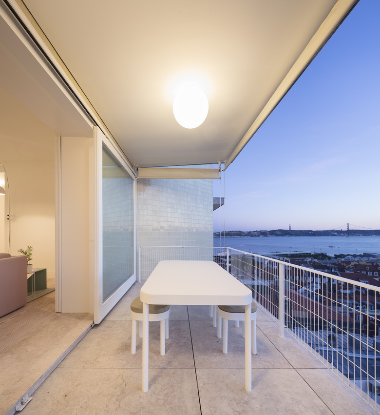
Kitchen and pantry cabinets were also custom-designed for the apartment. The firm even incorporated custom ventilation grids into new skirting boards. "It was a complex degree of detail," Rodrigues said.

