Top 20 Modern L-Shaped Kitchen Ideas
The kitchen is the heart of the home. It's where you come together with family and friends to prepare meals (and in many cases eat them, too), entertain, and hang out. Certainly, there are some design layouts that work better for the latter, such as an L-shaped kitchen. You might be asking yourself:What is an L-shaped kitchen? As the name suggests, it is when the shape of your cook space forms an "L." Typically, you will see the appliances on one side, while most of the storage is on the other, but that's not always the case. Which makes sense, because L-shaped kitchens are great when it comes to maximizing flexibility and functionality. In fact, the popular layout will work well in an open floor plan and it lends itself to small space living, too.
Intrigued? Scroll on for 20 modern and versatile ideas that are sure to inspire your kitchen remodel.
1. Opt for an inviting farmhouse feel.
1. Opt for an inviting farmhouse feel.
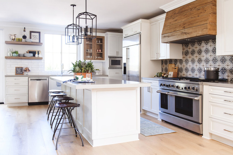
Dreaming of a country cook space, like this one crafted by the team at Savvy Interiors? Pair white kitchen cabinets with a patterned tile backsplash and earthy wood accents to create a modern rustic vibe. Add a couple of lantern-style pendants to infuse a little extra charm. And as for the L-shaped kitchen layout, if you have the room (and the budget) we suggest adding an island directly across from the stove as seen here for added convenience.
2. Inject some color.
2. Inject some color.
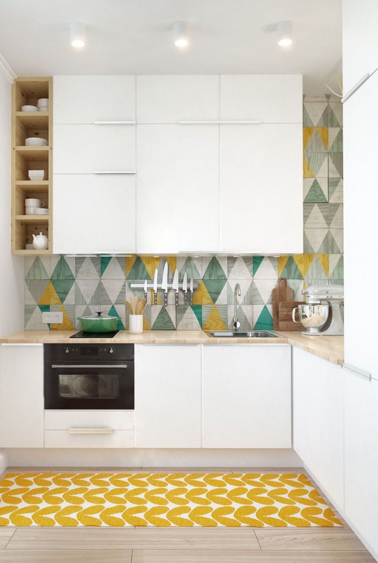
This small kitchen by INT2 Architecture is clean and contemporary with a major dose of color. A vibrant tile backsplash and cheerful accents, like a sunny area rug, really brighten things up. The spatially challenged design proves that an L-shaped layout doesn't need to take up a lot of room. In fact, you can streamline your space even more with flat-panel cabinets and downsized appliances. For a kitchen remodel that's practical and pretty, this setup sure is inspiring.
3. Say yes to seafoam green.
3. Say yes to seafoam green.
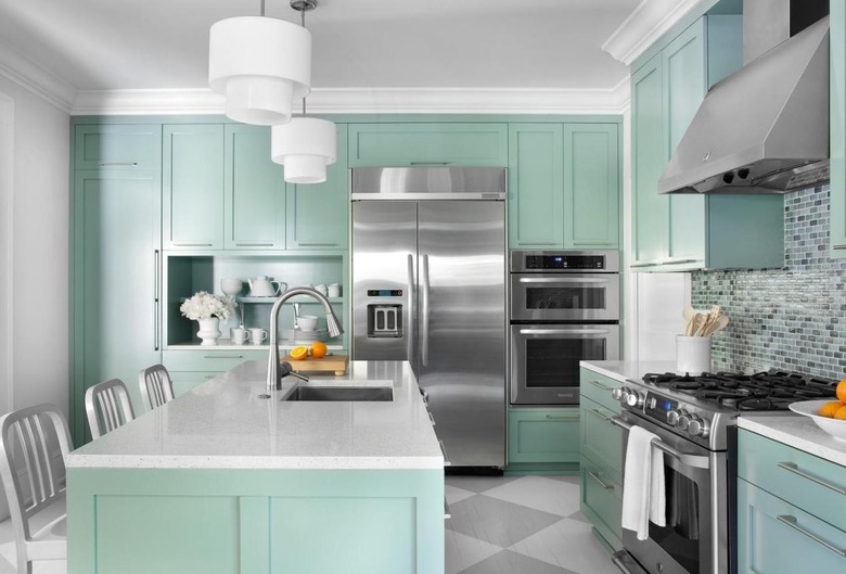
There's no shortage of coastal charm in this seafoam stunner. Mark Williams Design Associates employs stainless steel and lots of white to create a chic and balanced aesthetic. The sleek countertops anchor the white theme even further, while a smart L-shaped design creates the holy grail of kitchen triangles to make things easy. Top it off with optimal storage space, placing cabinets all around.
4. Get clever with the details.
4. Get clever with the details.
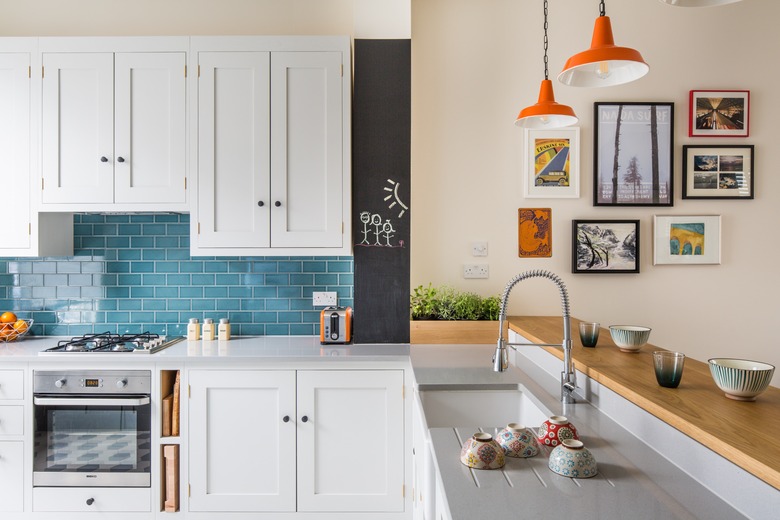
This quirky, retro-style kitchen created by the team at Sustainable Kitchens flaunts white shaker cabinets, turquoise backsplash tile, and orange pendant lights. A painted chalkboard and framed artwork round out the playful vibe. It's practical as well, with a drainboard included right on the countertop, plenty of storage space, and even a couple of clever cubbies to stash cutting boards. It's the perfect blend of convenience and color.
5. Marry modern and industrial.
5. Marry modern and industrial.
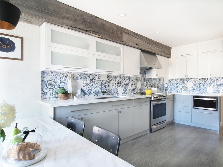
An alchemy of modern and industrial style, this L-shaped kitchen by Bobeche Interiors touts an exposed ceiling beam, a Lisboa patchwork tile backsplash, and horizontal, frosted-glass upper cabinets. But this culinary space isn't just another pretty design. The open floor plan flows right into the dining room, providing a seamless transition from cooking to serving.
6. Embrace eclecticism.
6. Embrace eclecticism.
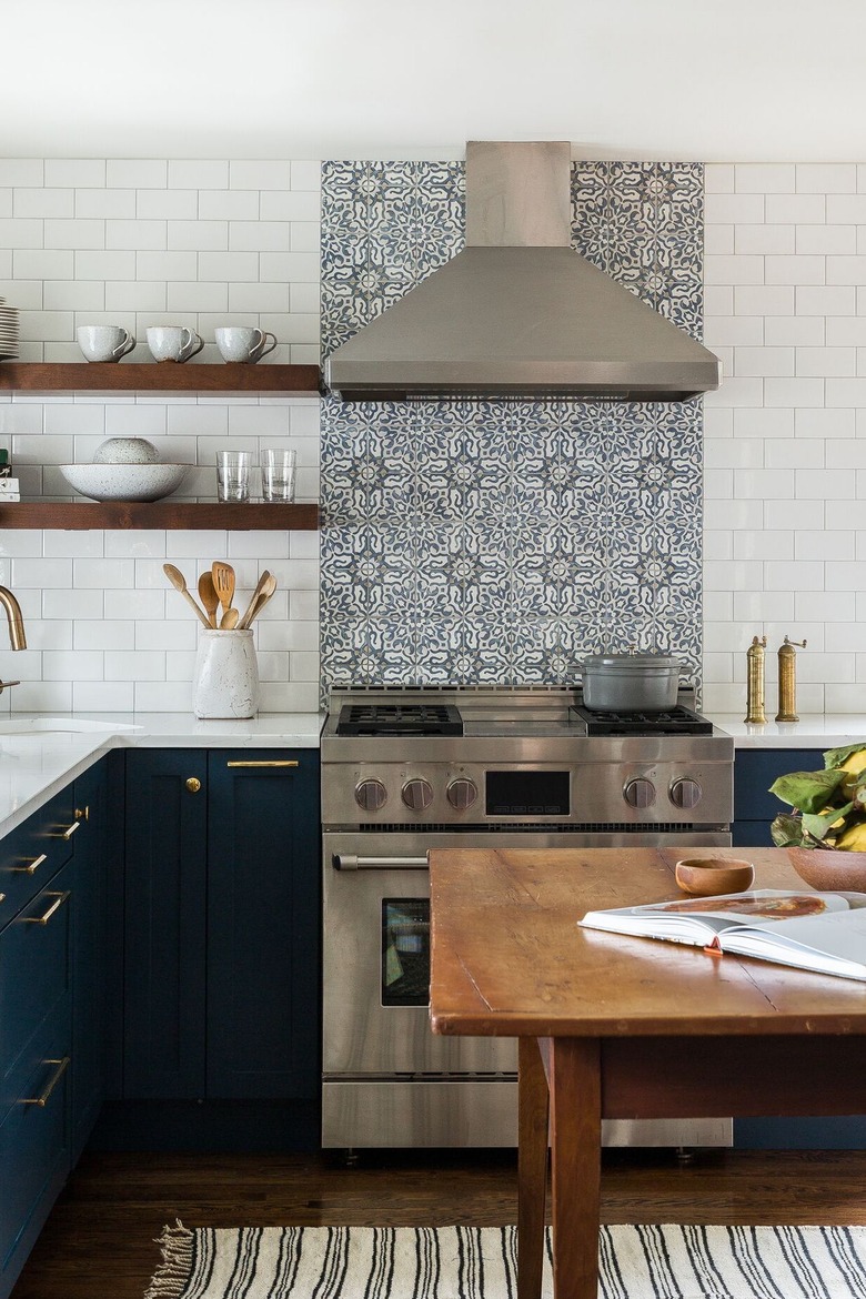
There are so many beautiful design ingredients that went into making this Beacon Hill abode. We love the way Heidi Caillier blends rich, navy blue cabinets, patterned tile, and rustic wood elements into a kitchen that epitomizes eclectic-farmhouse style. Beyond the stunning interior design touches, it's also a thoughtful cook space as well. Classic subway tile covers the adjacent walls while open shelving stylishly acts as bonus storage, displaying picture-perfect pieces of dishware.
7. Keep it cool.
7. Keep it cool.
A cool gray and white color palette and lots of natural light make this traditional L-shaped kitchen by Jean Stoffer Design feel au courant. Not to mention, the center island — with hidden compartments to store cookbooks and the like — is beyond clever. And a grand island with ample workspace doesn't hurt either.
8. Give black and white a try.
8. Give black and white a try.
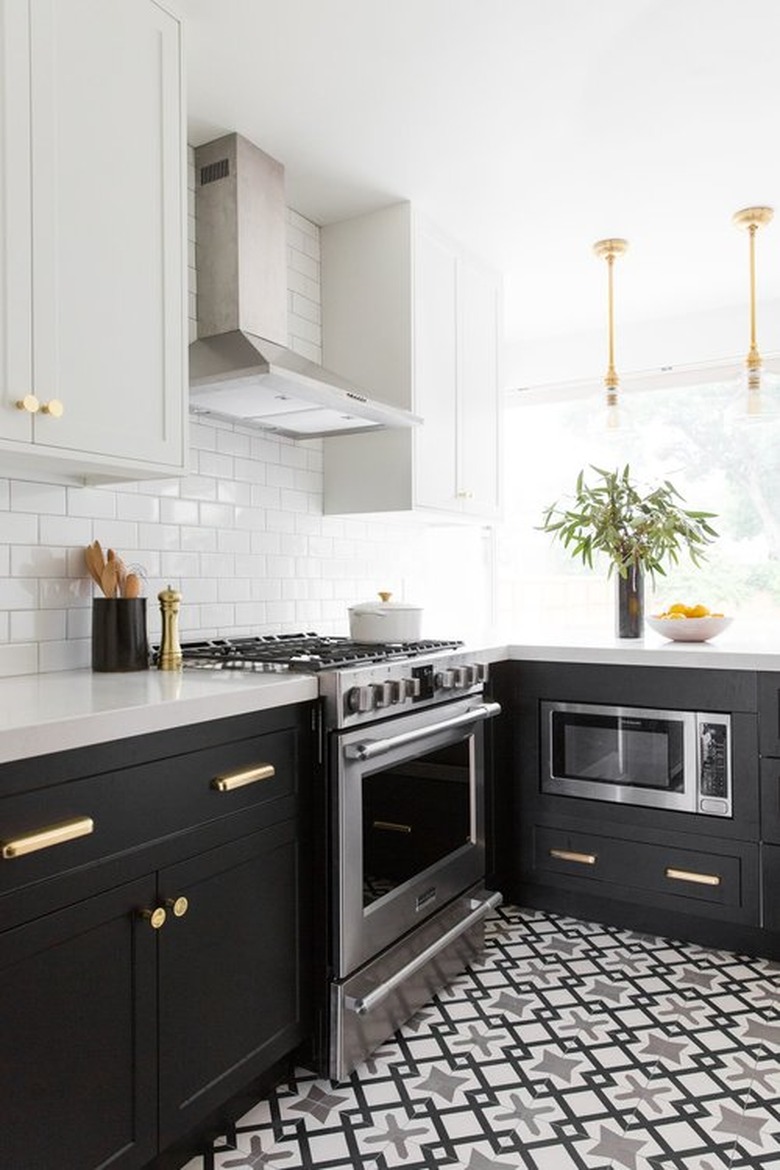
This sleek black-and-white kitchen remodel dreamed up by Shea of Studio McGee is a lesson in the right way to execute a popular trend. Featuring all of the essentials, and complemented by brass hardware and white subway tile, the black cabinetry really stands out. Although it's a palette that looks fab in an L-shaped kitchen, keep in mind that this color combo would work equally well in a U-shaped design, or frankly, any culinary layout.
9. Channel coastal minimalism.
9. Channel coastal minimalism.
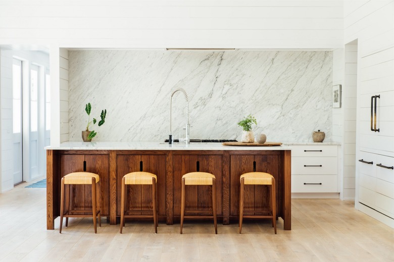
Feeling a bit like a galley kitchen, this light and airy and minimalist setup screams upscale beach house, as perfected by Cortney Bishop. The counter seating at the kitchen island is a laid-back alternative to a formal dining room and takes advantage of the enviable natural light pouring in. Also, check out the incredible marble backsplash and simple, yet beautiful, white shiplap on the walls. If you need us, we'll be cooking in this kitchen.
10. Create a casual dining area.
10. Create a casual dining area.
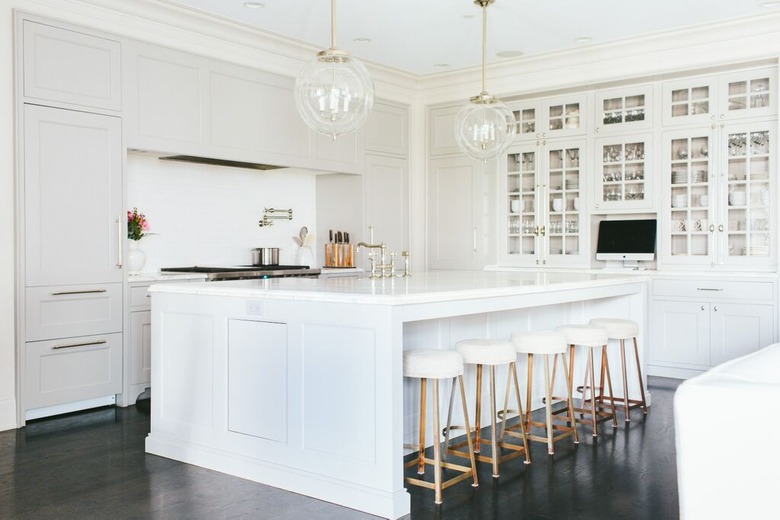
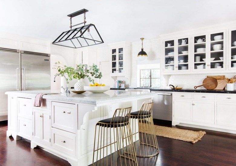
This swanky kitchen by Consort Design is redefining the phrase "casual dining area" with the help of two gorgeous brass counter stools, and we are taking notes. This space proves that an L-shaped kitchen layout doesn't need to be all business. It can also benefit from a big dose of luxe, opulent finishes, an eye-catching light fixture, and glass front cabinets where you can see all of your best servingware.
11. Mix and match materials and textures.
11. Mix and match materials and textures.
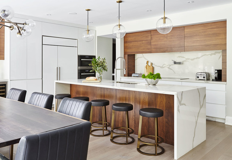
Rustic meets refined in this Leaside, Toronto kitchen created by Fohr Design Studio. The warm wood paneling beautifully contrasts with the stunning white marble, all complemented by the striking light fixtures above the dining table and the extra-large island framed by a waterfall countertop.
12. Inspire calm and tranquility.
12. Inspire calm and tranquility.
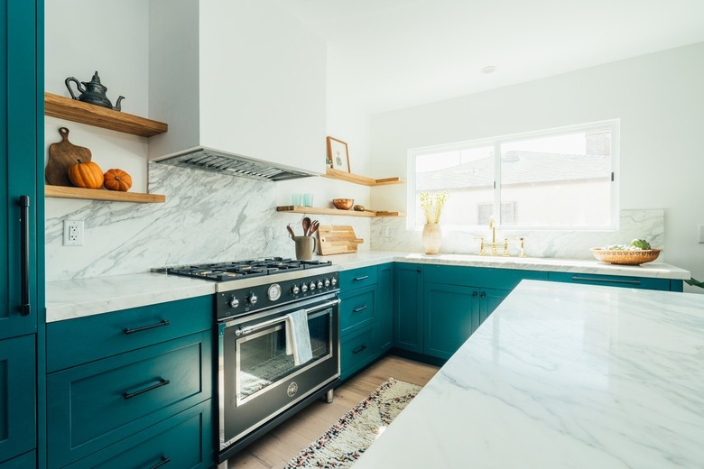
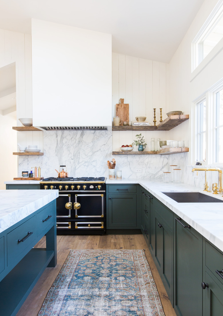
This L-shaped kitchen design by Amber Interiors is proof that California cool never goes out of style. The eye-catching marble backsplash and bold blue cabinets work together to give this space its undeniable wow factor. Not to mention, the retro-inspired stove and vintage runner make the overall design even more pleasing to the eye.
13. Set up zones.
13. Set up zones.
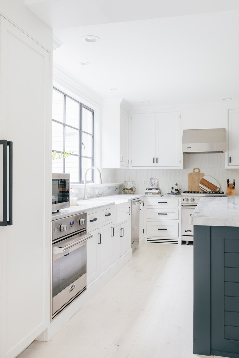
An L-shaped design is a perfect opportunity to create zones for yourself since there is typically a decent amount of counter space. Think about how you usually work and move in your kitchen and go from there. Crystal Ann Interior Design created an idyllic work zone setup in this midcentury-inspired space, with a gas cooktop adjacent to the sink and dishwasher.
14. Utilize the corner.
14. Utilize the corner.
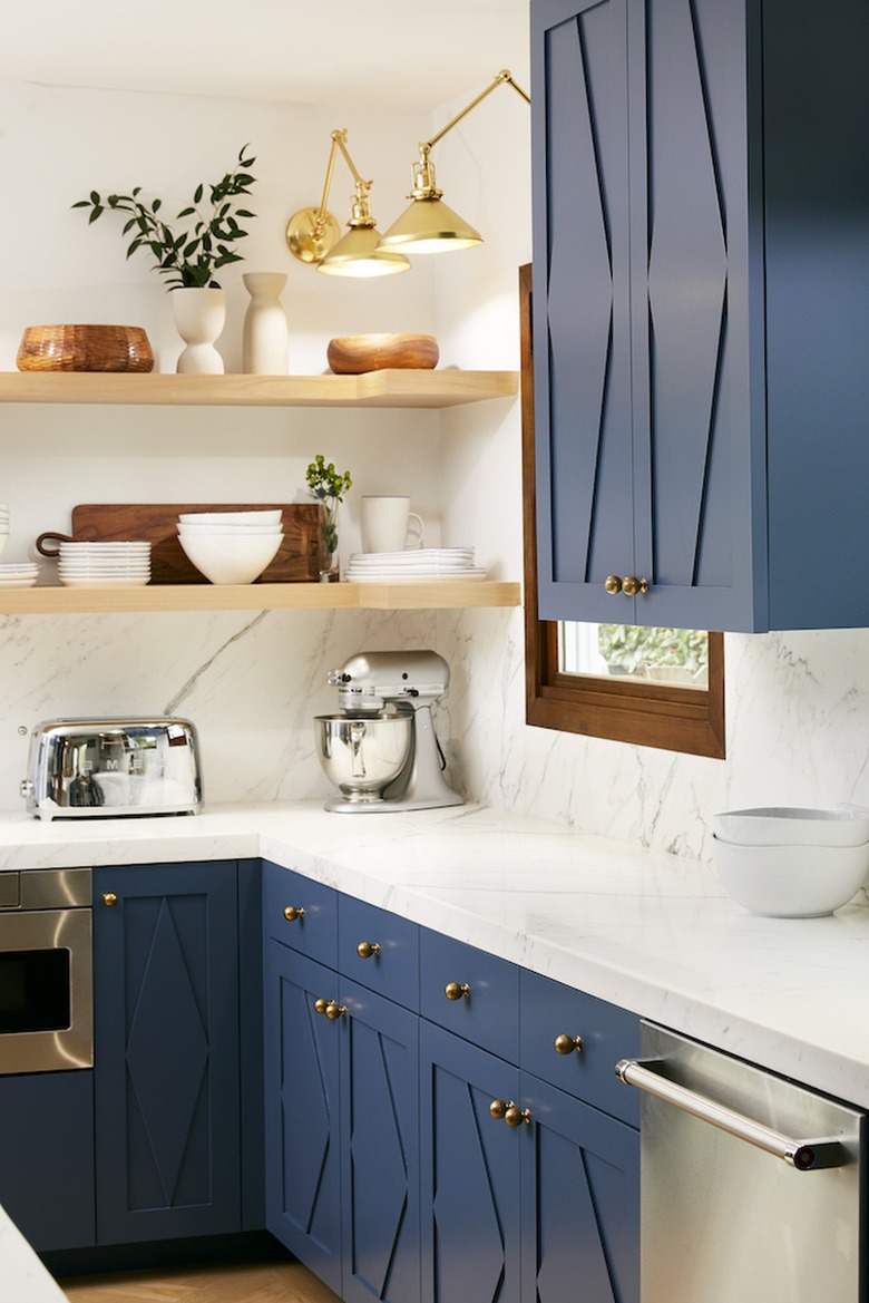
Another bonus of an L-shaped kitchen is that the layout automatically creates a corner that you can put to work. For instance, Alexis Manfer Interior Design used the opportunity to add corner shelving lit by articulated wall sconces. Additionally, it provides the perfect place to stash a small kitchen appliance, like a stand-up mixer.
15. Consider using wood ... lots of wood.
15. Consider using wood ... lots of wood.
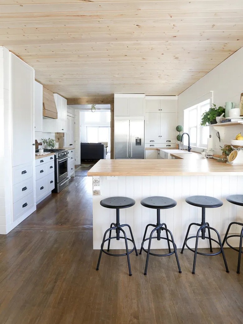
To create a look of true cohesion through your L-shaped kitchen, look to using the same wood finish throughout. That's what Ashlea of This Mamas Dance did in this rustic kitchen. She used a light wood countertop to bring polish to the L-shape and then continued the theme by using the same wood finish on the ceiling. She even opted fo a range hood in the same finish as well. The dark wood flooring grounds the light and airy space.
16. Think carefully about the lighting.
16. Think carefully about the lighting.
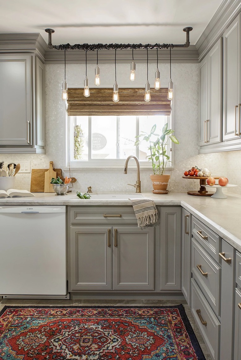
As with any kitchen design, it's important to illuminate all of the key zones throughout your space. In an L-shaped floor plan, pendant lights are often hung above the peninsula but don't forget other areas, like the adjacent countertop, the sink, and the open shelving. Danielle Interior Design and Decor turned to an industrial fixture to illuminate the sink in this cook space, and it turned out beautifully.
17. ... and the appliance layout.
17. ... and the appliance layout.
When laying out your L-shaped kitchen, think very carefully about where your appliances will be located. Envision how you'll work in the space and which appliances should ideally be placed near each other or across from one another. Eva of Happily Eva After has a great setup in her kitchen, with the microwave over the oven, the dishwasher near the sink, and the stove rounding out the "L."
18. Drop in a table.
18. Drop in a table.
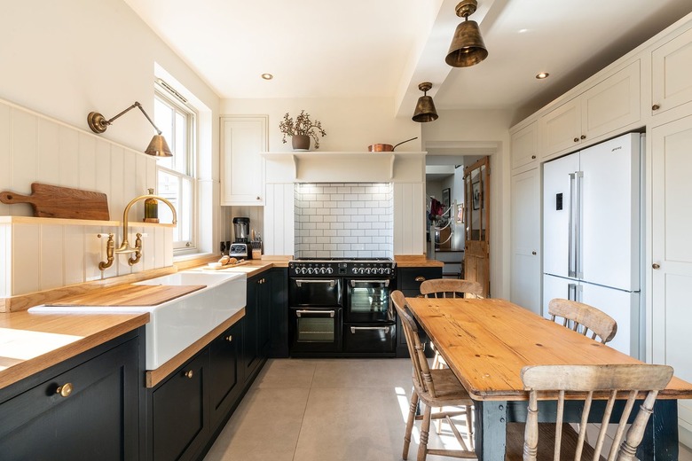
With an L-shaped layout, you'll naturally have an open space in the middle of your kitchen. What should you do with it? Well, if your setup is on the smaller side or you like to move around freely, perhaps leaving it open is the best course of action. However, you can also welcome the idea of an eat-in kitchen with the help of an island or a full-size dining table. Nicholas Bridger chose the latter in the form of a well-loved piece to set the scene for casual dinners enjoyed right in the heart of the home.
19. Make a small kitchen work.
19. Make a small kitchen work.
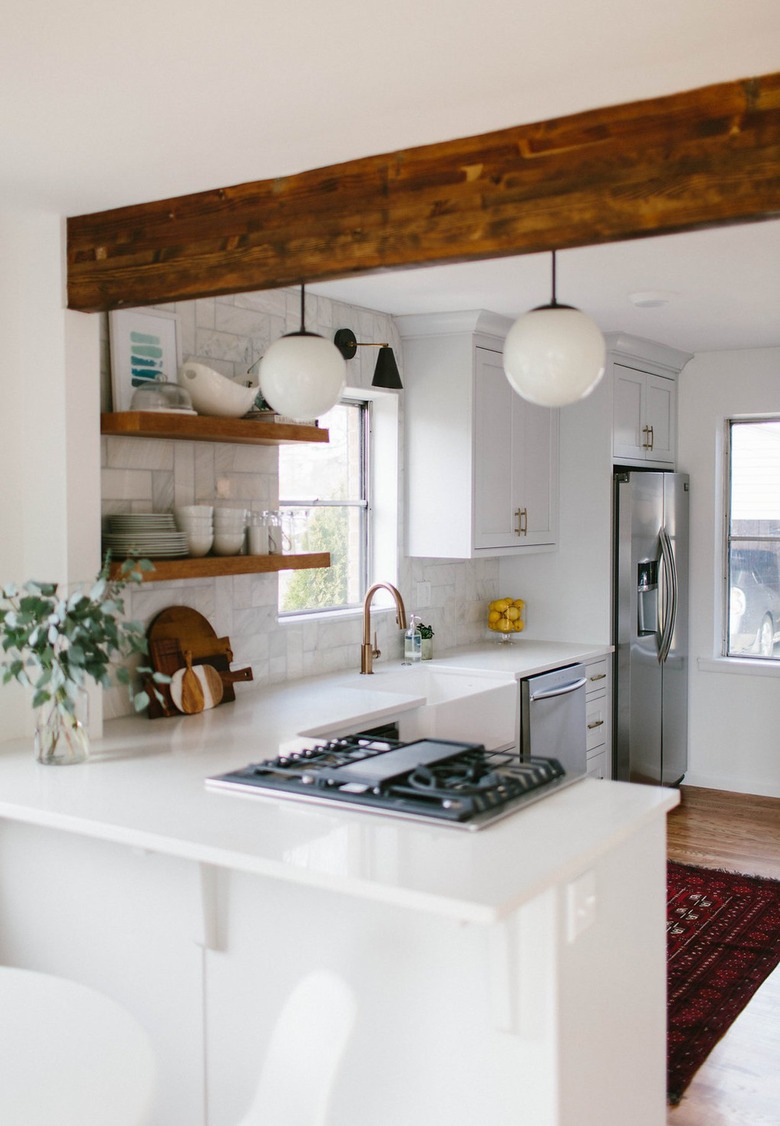
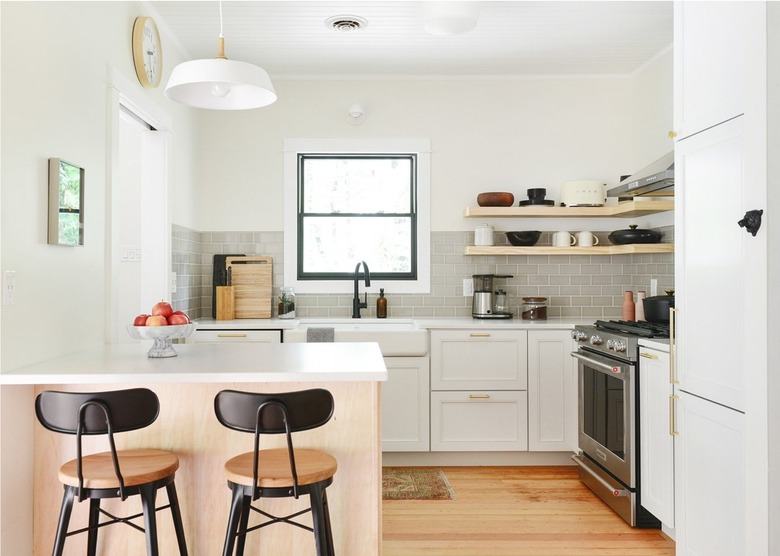
You don't need oodles of space to create an L-shaped kitchen in your home. In fact, the layout can actually work in the smallest of spaces, something that's proven by this design from Kim and Scott of Yellow Brick Home. It has plenty of cabinets, a handy, accompanying bar, and even an apron front sink. It just takes a bit of patience and planning to pull to successfully pull it off.
20. Get creative with storage.
20. Get creative with storage.
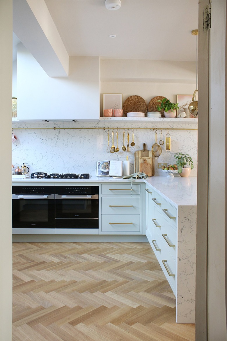
Although you can line your entire L-shaped kitchen with cabinets galore, it also affords opportunities to work your creativity when it comes to storage. Kimberly of Swoon Worthy mirrored the long side of the "L" in her kitchen with a lengthy open shelf and brass utensil rod, that's perfect for hanging essential tools. Stylish and oh-so-useful!
