What Is Minimalist Design?
Today the word 'minimalist' is often used to describe a wide range of topics from art, to fashion, to architecture, to interior design, to a way of life. So it's not hard to see how one might get confused as to the meaning of the frequently used buzzword. And what better way to define this stylish trend than to go back to the beginning? Minimalism began as an art movement in the 1960s. It was originally seen as a protest against the uncompromising art world and the increasingly consumerist society. The focus of minimalism was to break away from the excessive and overly decorative, and focus on raw materials and brutal simplicity.
It wasn't long before this new trend filtered into design and architecture, resulting in a pared down offshoot of the Bauhaus movement. Minimalist design pioneers such as Gerrit Rietveld, Tadao Ando, and Ludwig Mies van der Rohe paved the way for this influential style. And while it may seem simple at first blush, keeping things minimal requires much more than embracing Mies van der Rohe's 'less is more' philosophy. Luckily, we've got a few basic principles that will help make your next minimalist project a breeze.
1. A neutral base is key.
1. A neutral base is key.
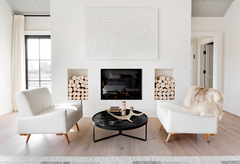
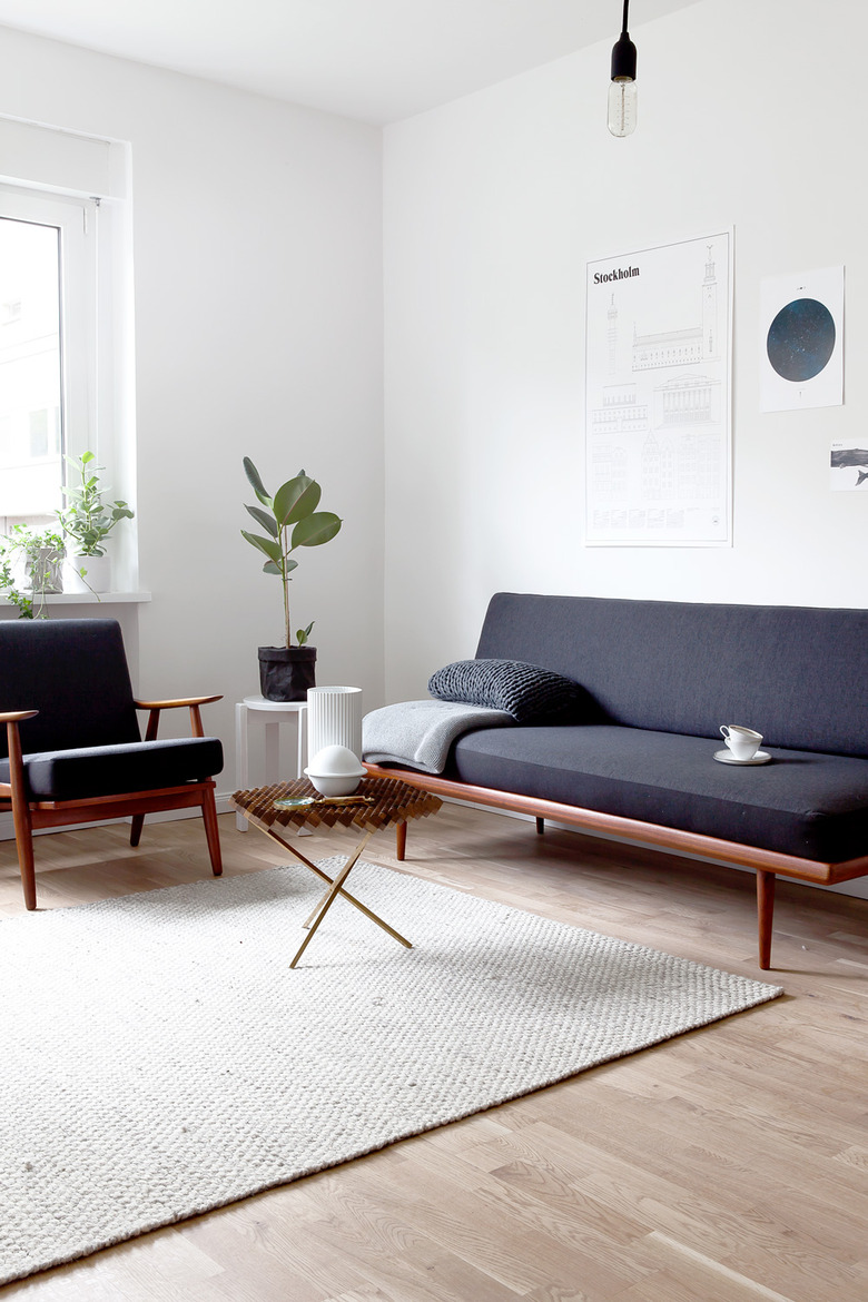
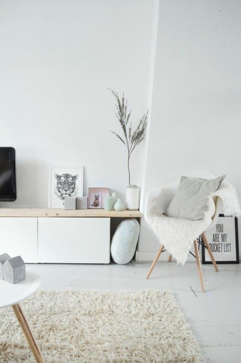
While a blank slate is obviously the ideal starting point for any minimalist design, you don't need to move or throw away all of your worldly possessions to get there. For starters, try painting your walls with a simple and light hue, such as ecru or ivory, and then add a neutral floor covering. Opt for natural materials — like sisal or seagrass area rugs, wood flooring, or stone tile. These simple changes will get you surprisingly close to blank-slate territory; what's more, they will make it easier for you to spot the visual clutter. With everything staged against a neutral backdrop, you can actually see what things are needed, and what things are just taking up space.
2. Embrace simplicity.
2. Embrace simplicity.
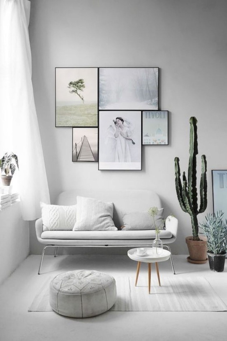
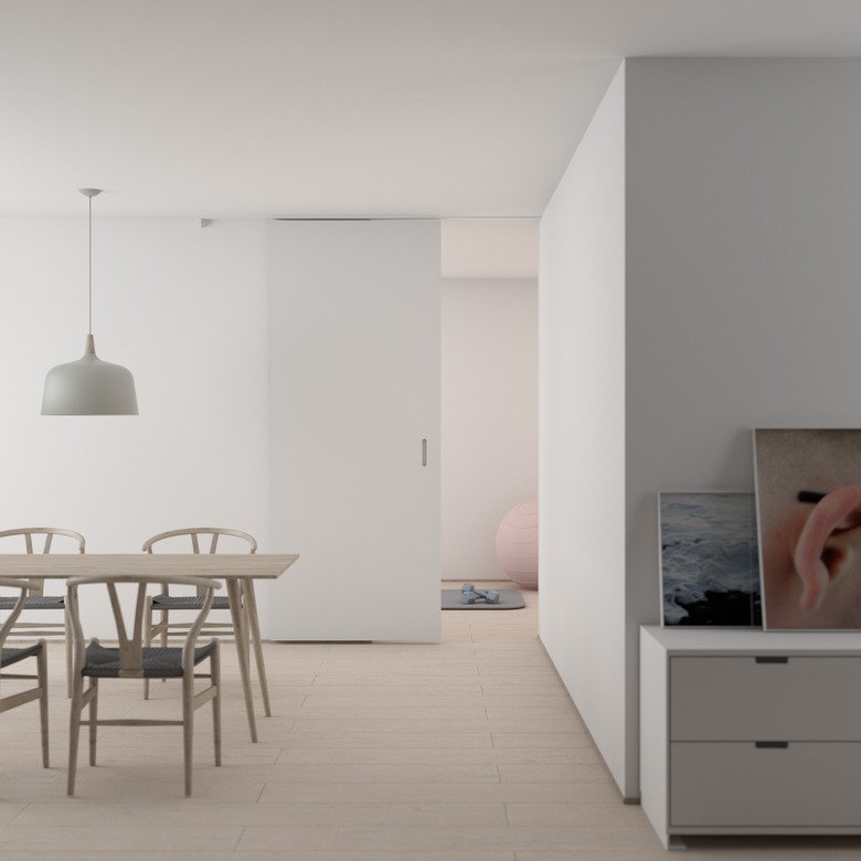
Minimalist design embraces simplicity on every level. From choice in furniture, to color scheme, to layout, eschewing frills is the minimalist's most primal instinct. There's no need to fret about boredom either. 'Simple' definitely does not have to mean 'basic.' In fact, plenty of the most unique and covetable innovations in design (and technology) have the clean lines and solid, neutral tones that form the brick and mortar of this pared down design philosophy. The minimalist's approach to simplicity is largely based on the logic of combining form and function, like making the most of double-duty furniture.
3. Let stand-out pieces stand out.
3. Let stand-out pieces stand out.
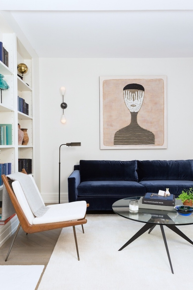
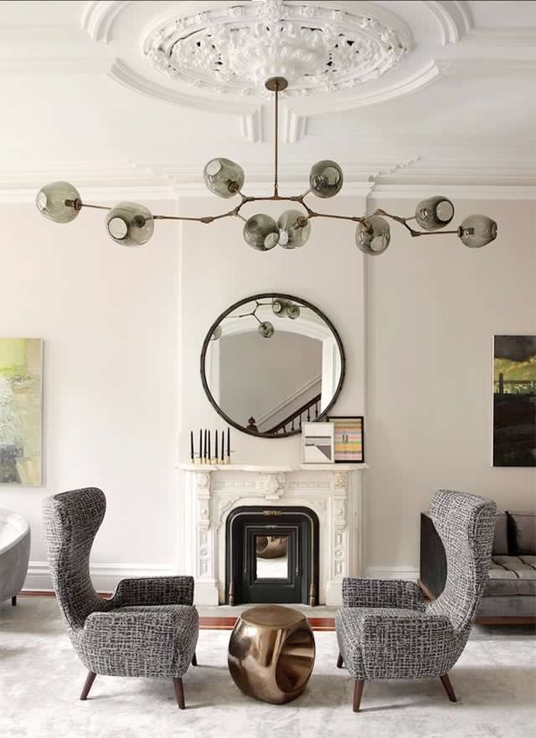
When done correctly, minimalist design is hardly plain; in fact, including at least one bold, show-stopping piece of furniture, art, or decor is practically a prerequisite. Though solid colors and neutral tones are staples of the style, minimalist design can still incorporate patterns, in moderation. Needless to say, applying this principle requires some downsizing.
4. Create visual balance.
4. Create visual balance.
Visual balance is a key component of minimalist design. And before you cringe at the thought of uniformity, there are many ways for you to make it your own. While symmetry primarily applies to the layout of furniture and decor, it can also apply to things like color scheme and light source. Radial balance radiates outwards in a circular pattern, from a central focal point (like a chandelier, skylight, round table, or centrally placed decorative tile). Vertical and horizontal visual balance create patterns arranged around a center line — right to left for horizontal, and up and down for vertical.
5. Leave breathing room.
5. Leave breathing room.
A close relative of visual balance, is breathing room. By paring down your furniture and decor to the best of the best, you will keep your interiors from feeling crowded and will ensure that every piece you select has a chance to shine. Apart from prioritizing quality over quantity, another way to prevent your home from looking cluttered is to get rid of one old item for every new piece that you add. Applying the principles of minimalist design is a great way to maximize your space.
6. Remember that “less is more.”
6. Remember that "less is more."
Mies van der Rohe's adage 'less is more' is at the heart of minimalism. When designing a minimalist home, this rule of thumb will be your guiding light through the labyrinth of decision-making and the endless options you are forced to consider. If you're ever in doubt, just default to this golden rule of minimalism to find your true north.
