This House Makes Us Want To Cover Everything In Blue And Green Tile
When Aussie design firm Perversi-Brooks Architects was approached to create a space that brought greens and blues together, a familiar style rule came to mind: "Blue and green should never be seen." So when architect Sam Perversi-Brooks took on the project, he wasn't especially thrilled. It's actually hilariously clear from the anecdote he proves on his site: "Blue and green. BLUE and GREEN! Oh god...I'm not a big fan of blue and green, especially together..."
The architect was stumped until, while trying to find inspiration for the project, something odd happened. Sitting at his computer one day, it struggled to start up and he found himself staring at a distorted image of the default Windows screen: a lush field under a bright blue sky. This layering of color informed the theme of the home, which features stacked blocks of different wood finishes, grays, and yes, blues and greens.
1. Living Room
By carving out new rooms in the existing framework of the home, the firm avoided having to move the home or add an extension. The team chose to re-line the walls and ceilings using Bradford Insulation in order to conserve energy within the home.
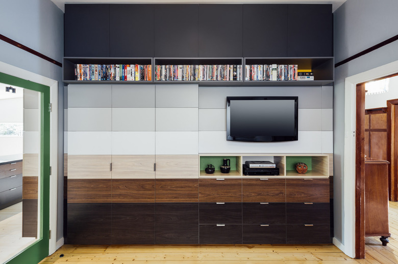
2. Living Room
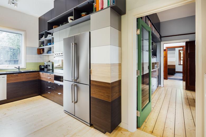
The firm created custom cabinets — found throughout the house — from laminated panels. All joinery was fabricated by Cantilever Interiors.
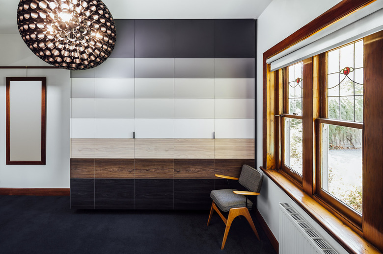
3. Living Room
Horizontal and vertical lines create a grid-like pattern throughout the home. The colors and shadows are emphasized with lights from Mondoluce, Curious Grace, and Lights Lights Lights.
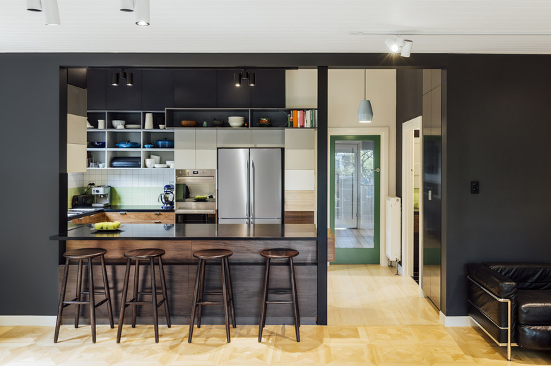
4. Kitchen
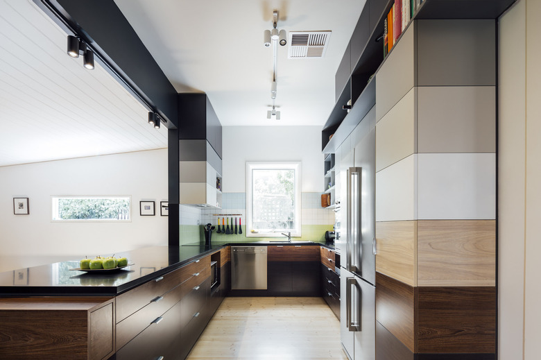
The kitchen was completely revamped, with an open countertop that defines the space.
5. Kitchen
Much of the interior needed an update. "The house was re-painted throughout, and old weatherboards were replaced," Perversi-Brooks said. "Cracking plaster walls and ceilings were demolished and re-lined with plasterboard for ease of ongoing maintenance."
6. Kitchen
A Loba oil finish was used on the timber floors. The kitchen features top-of-the-line Smeg appliances, from the fridge to the stove top.
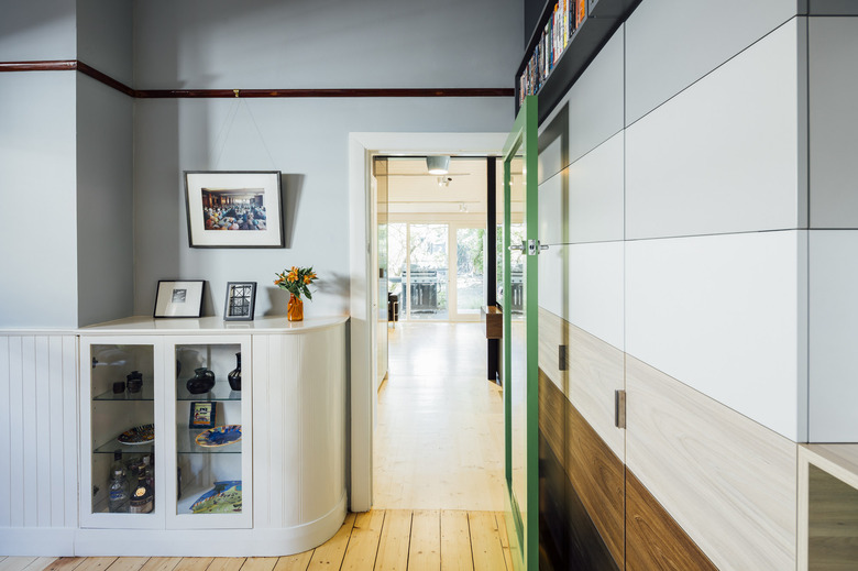
7. Hallway
Because the client was a family with two young kids, durability was also an issue. The firm chose to use long-lasting Dulux paints.
8. Bathroom
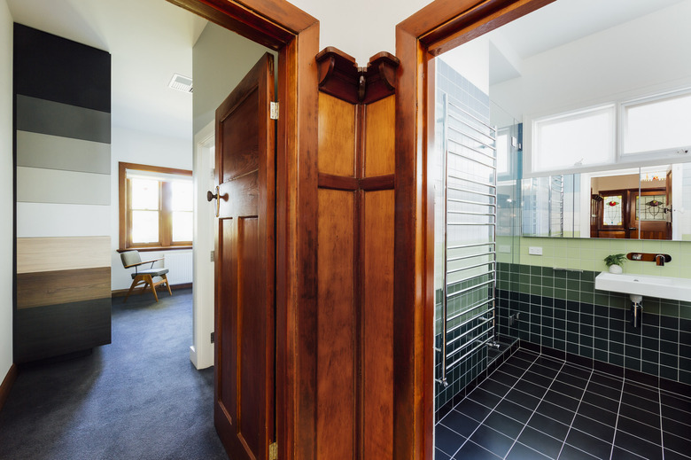
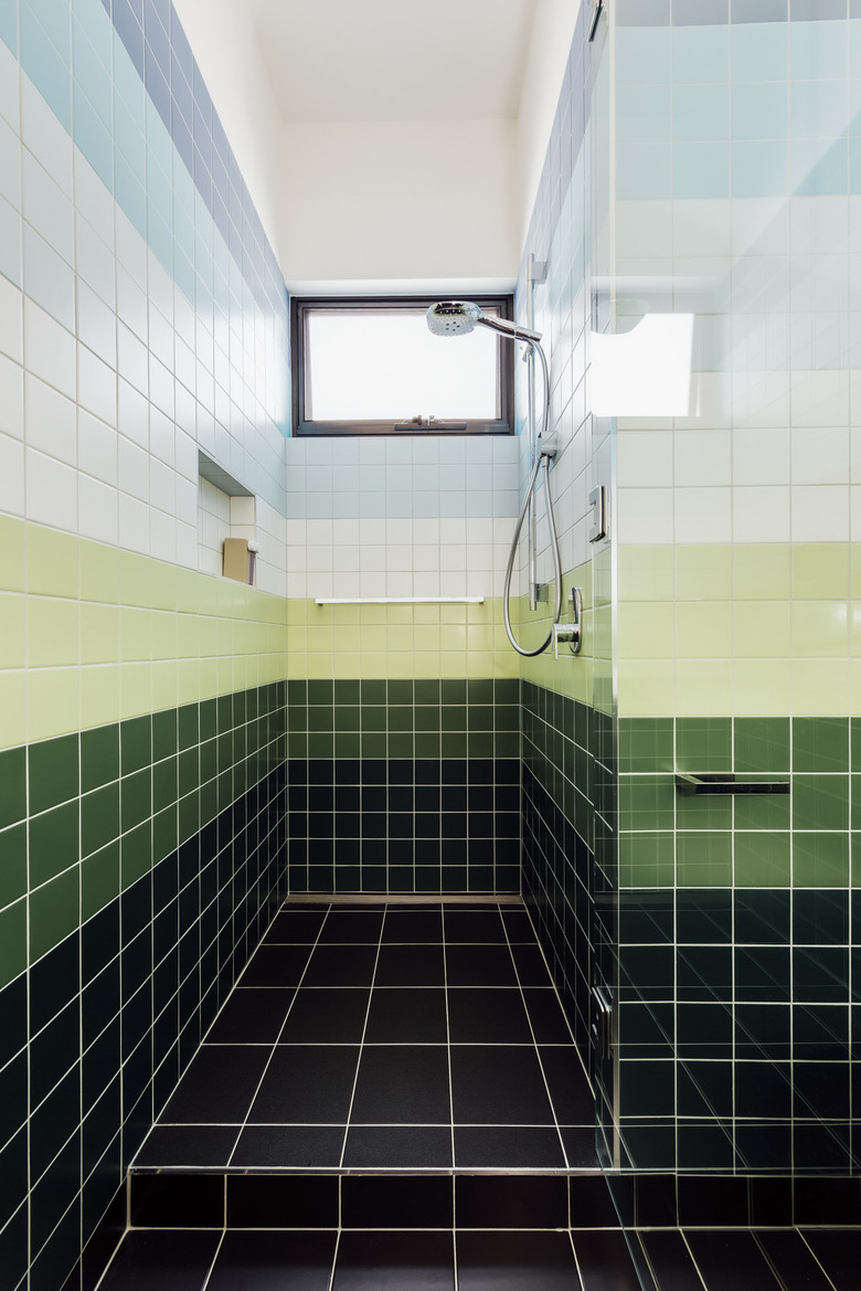
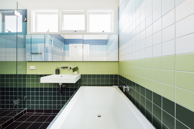
In the bathroom, Ceramica Vogue tiles actually make blue and green work, thanks to a clever color blocking technique.
9. Bathroom
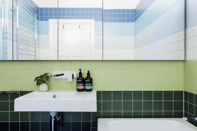
The mirror reinforces the theme of the bathroom, reflecting an array of blue tiles, as if to continue the lines of color.
10. Bathroom
Faucets with hard edges blend perfectly with the bathroom's geometric vibe.

