Don't Judge This Edwardian Home By Its Traditional Exterior
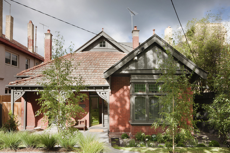
When interior design firm Made by Cohen and Robson Rak Architects & Interior Designers collaborated on overhauling an Edwardian home in a Melbourne suburb, their main goal was to modernize the structure while still preserving its historical significance.
The team maintained the original front facade, but made significant changes inside. Before the renovation, the interior was extremely dark, a common downside of old buildings. Rebuilding the home to maximize natural light turned out to be a challenge because the client — a family of four — wanted to maintain a level of privacy. To bring in more light, the team decided to frame the desirable garden views and install deep-sculptural windows. The new, delightfully unexpected interior is fresh, with its use of honest materials and clean lines, but is still neutral enough to feel timeless.
1. Exterior
"The biggest challenge for this project was creating a home for a growing, changing family, where the children are now young adults yet all have [their] own spaces to retreat, and joint family spaces to come together," Kathryn Robson of Robson Rak Architecture & Interiors said.
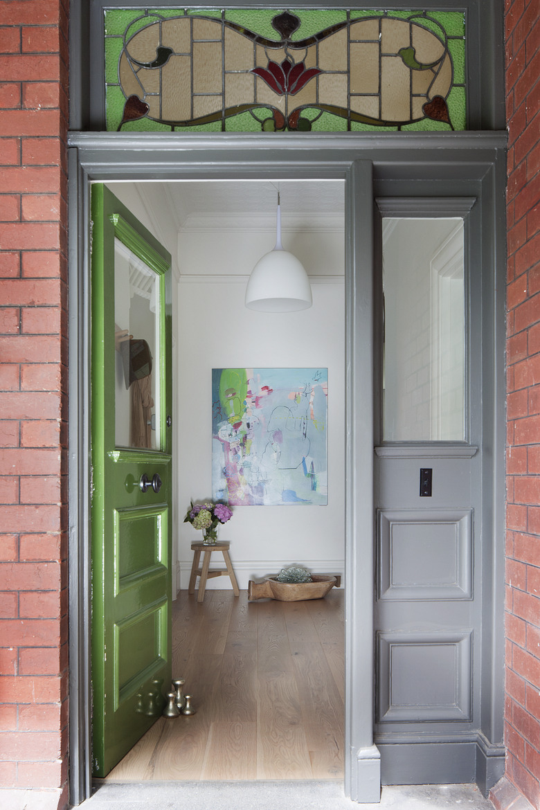
2. Entrance
A friendly collaboration between client, architect, interior designer, landscaper, and builder allowed the teams to devise a budget that indulged in some areas and practiced restraint in others. Since longevity was a priority, the budget did not limit the use of durable materials.
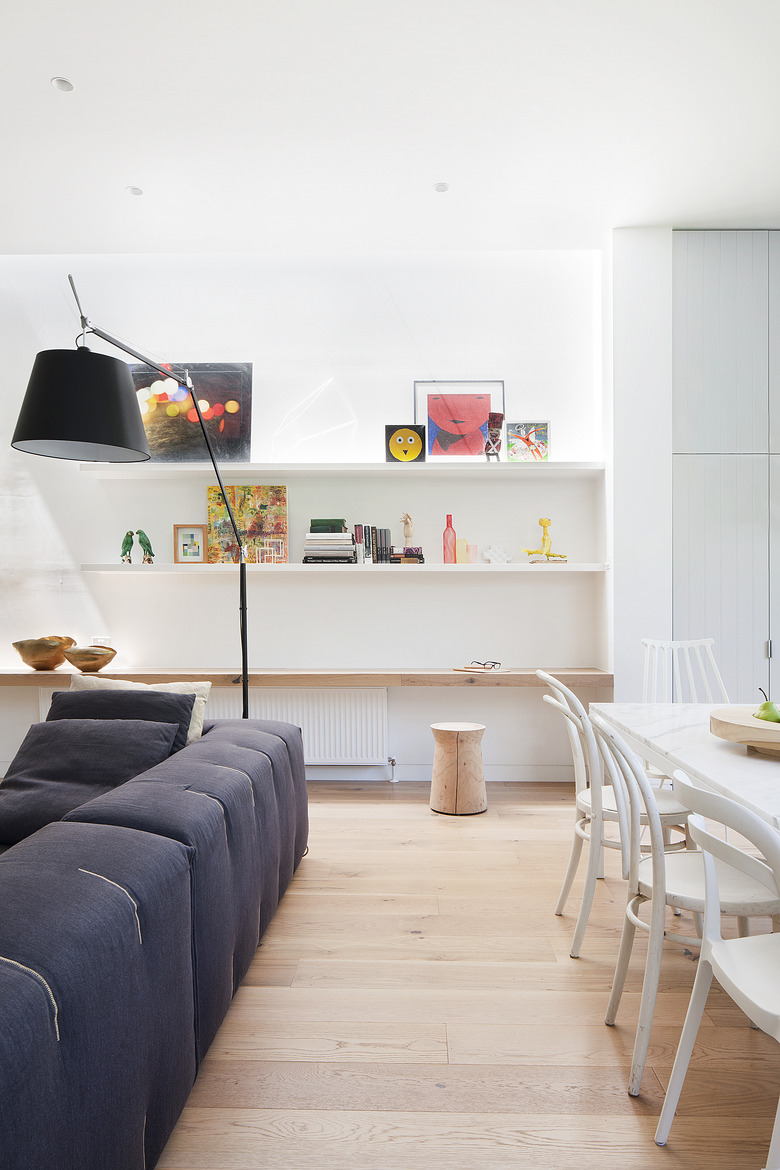
3. Living Room
One of the biggest differences between modern spaces and historical houses is the amount of natural light utilized in the interiors. Although many Edwardian designs are in contrast with the even-darker Victorian style homes, many historical interiors are considered dreary by today's standards. Distributed throughout the home, windows and skylights now allow natural light to flow through the once-dark space.
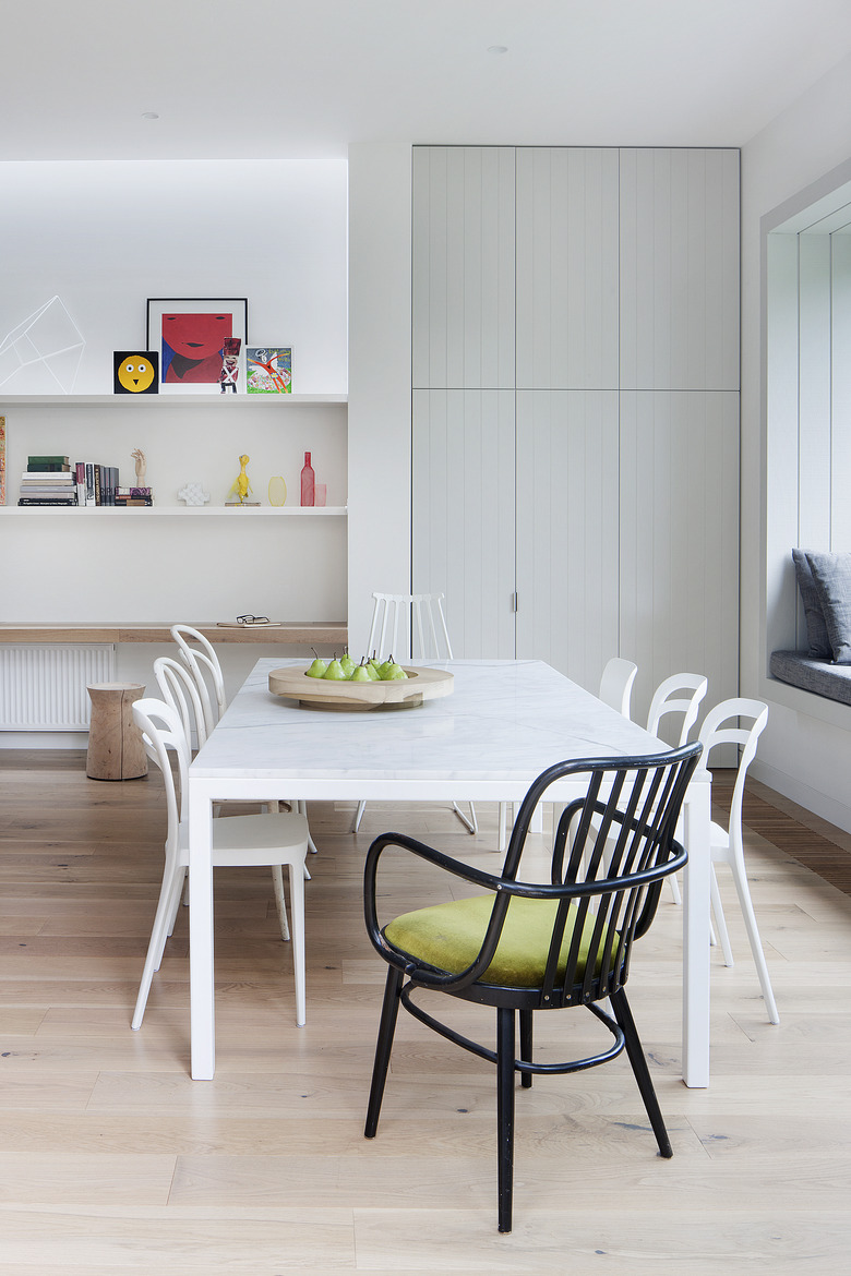
4. Dining Room
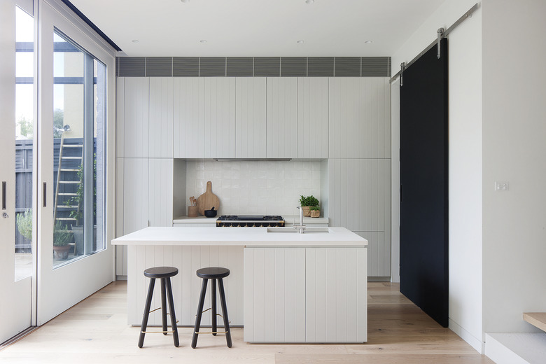
Color also played a big role in making the space feel brighter. White is used throughout, both on the walls and on furniture. Other main components, like light wood floors and pale gray cabinetry, help create a sense of openness.
5. Kitchen
The open kitchen feels extra-spacious thanks to impressive, nearly all-glass sliding doors that lead to a garden.
6. Kitchen
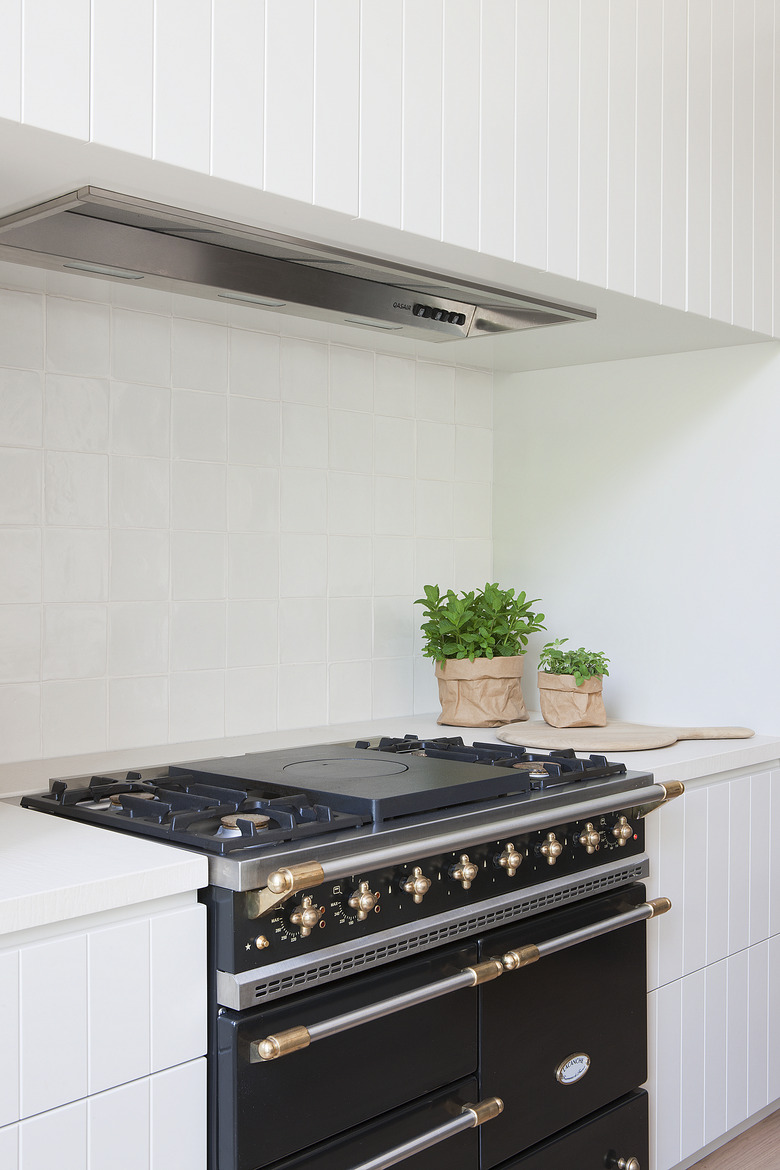
Popular right now in Australian design, the home sports a clean palette with selective black accents — like this classic stove.
7. Attic
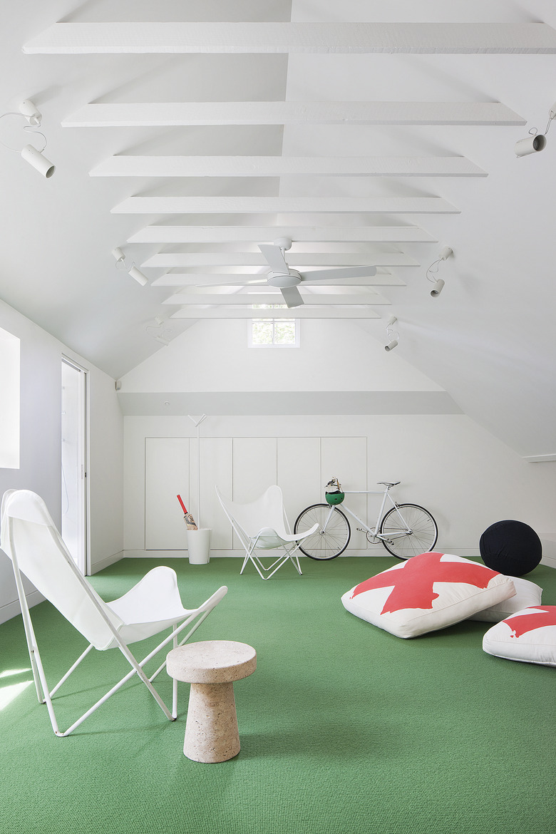
With an open floor plan and vaulted ceiling, the attic was also restored to provide the family with a modern hang-out space.
8. Study Area
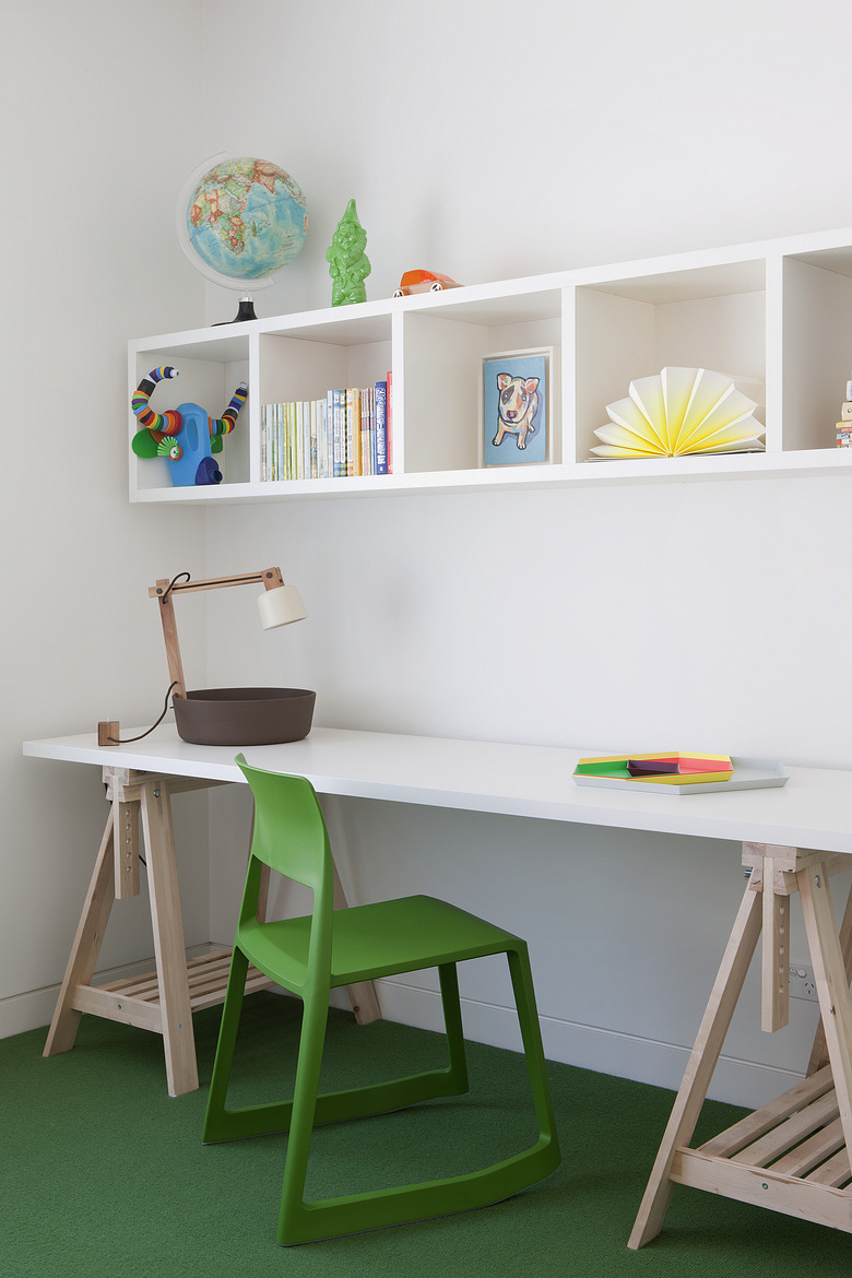
In one of the kid's rooms, modular storage offers space for colorful books and toys. Green pops up in unexpected places in the house — it's on the front door and echoed here.
9. Exterior (Back)
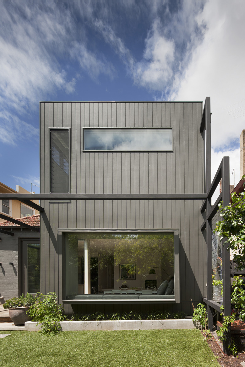
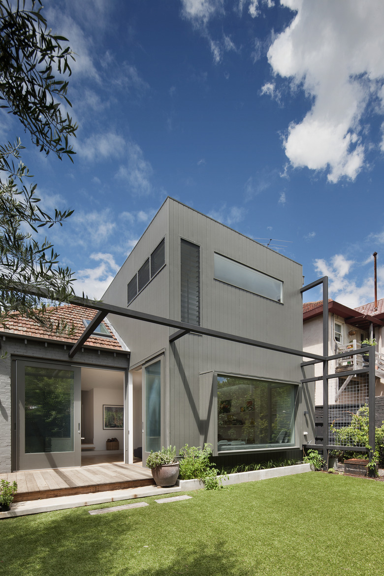
A modern addition in the back of the home uses an enormous picture window to bring light into the ground floor. Long windows on the second floor bring in light while still providing privacy.
10. Exterior (Back)
The designers also kept eco-friendliness in mind. With ceilings and walls insulated to the highest standard, the home keeps energy costs low.

