I Bought A Bookcase, Now How Do I Style It?
Curling up with a good book and a cup of tea (or glass of vino) is one of life's simple pleasures. But then comes the practical matter of what to do with all your precious tomes. Hardcovers are more than just coffee table decoration (although we do love 'em there), and your favorite paperbacks deserve better than being stashed in some long-forgotten corner. Show off your collection of literary classics. You can even take it a step further by adding a variety of accessories.
Whether it's a stand-alone unit adorned with novels and knick knacks or built-ins filled with first editions and travel-related trinkets, organization is key. Scroll on for 14 inspired ideas to style a #shelfie worthy bookcase.
1. Play with orientation.
1. Play with orientation.
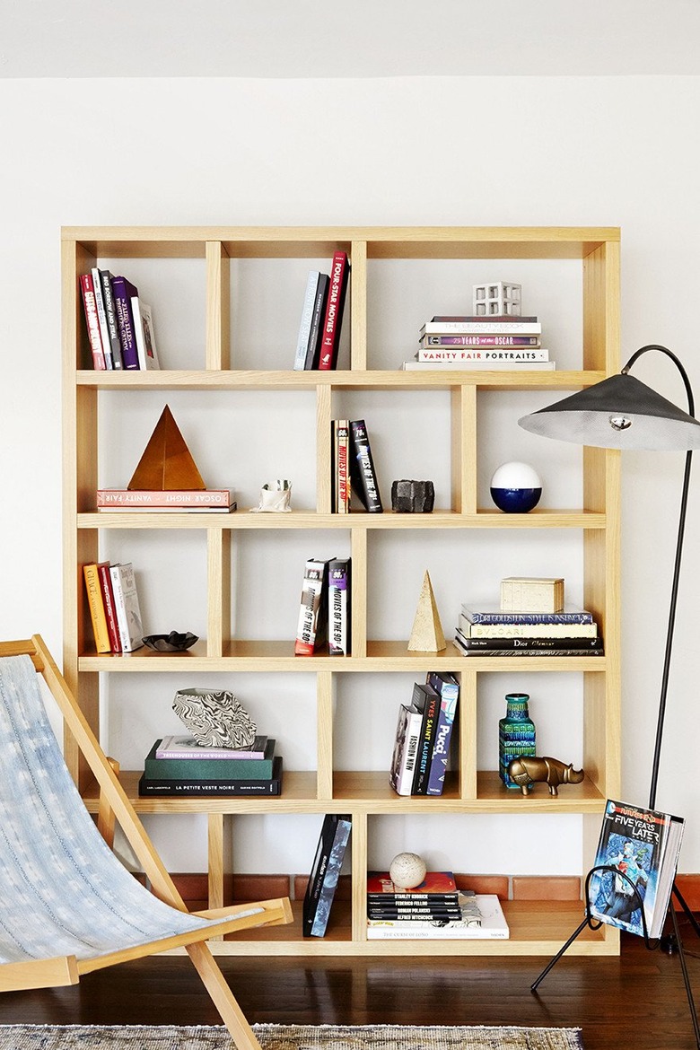
Who says all your titles have to be standing up? Batch covers by color and then play with horizontal versus vertical orientation until you find the right fit — aesthetically and organizationally speaking. Next, round out the allure with an assortment of decorative accents.
2. Arrange books backwards.
2. Arrange books backwards.
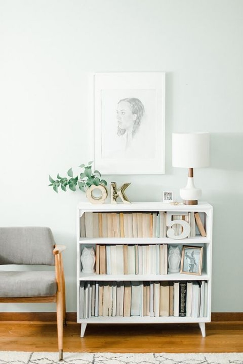
Neutral lovers rejoice! Try this clever trick to develop a cohesive, uniform display: Simply turn your texts around. Sure, it might take a couple of extra minutes to find your fave volumes, but the visual effect is oh-so-worth it.
3. Marry form and function.
3. Marry form and function.
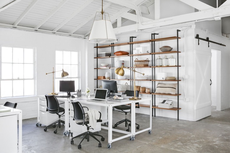
This former chicken coop was turned into a light, bright, streamlined, and serviceable office extension for Goop HQ! Designer Melanie Burstin festooned wall-mounted bookcases with offerings from the respective departments (in this case, gorgeous home goods) to distinguish each team's area.
4. Embrace maximalism.
4. Embrace maximalism.
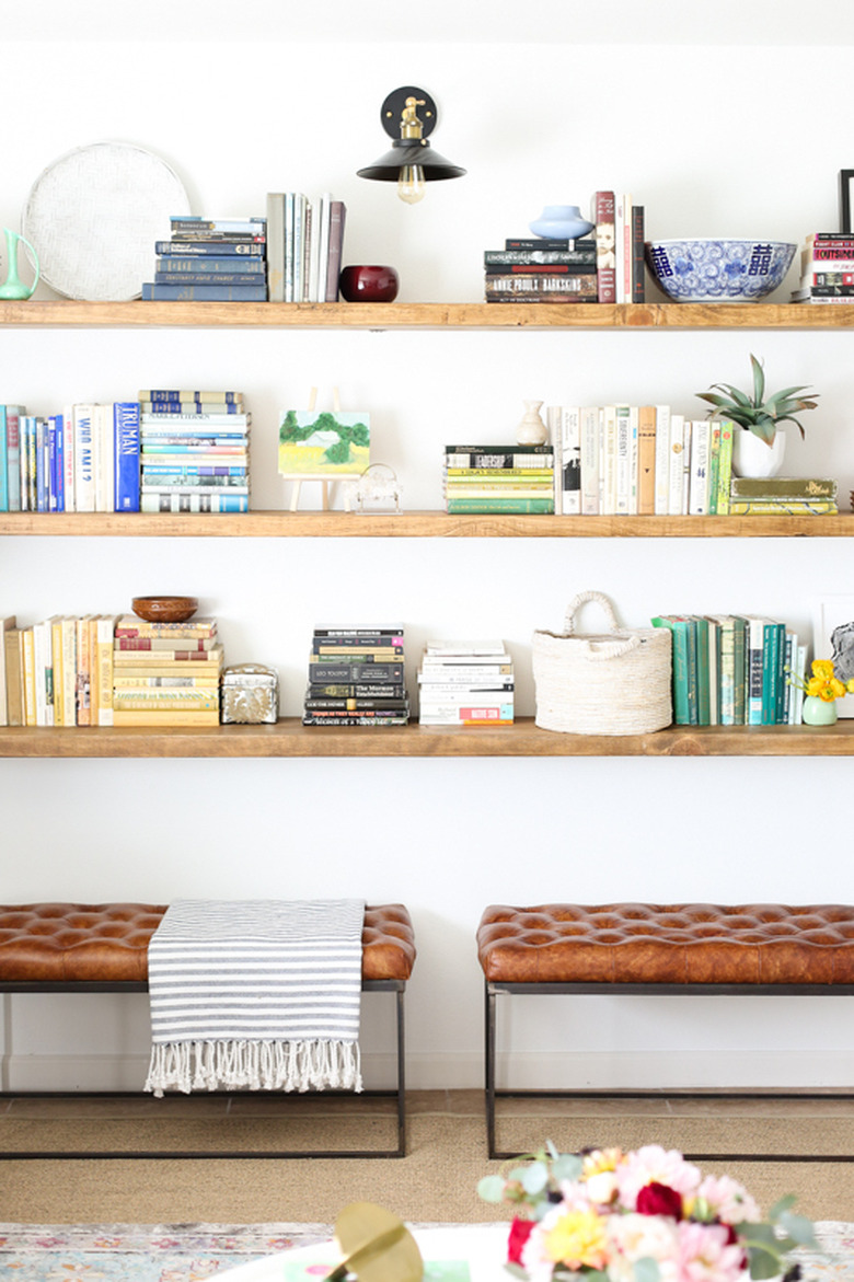
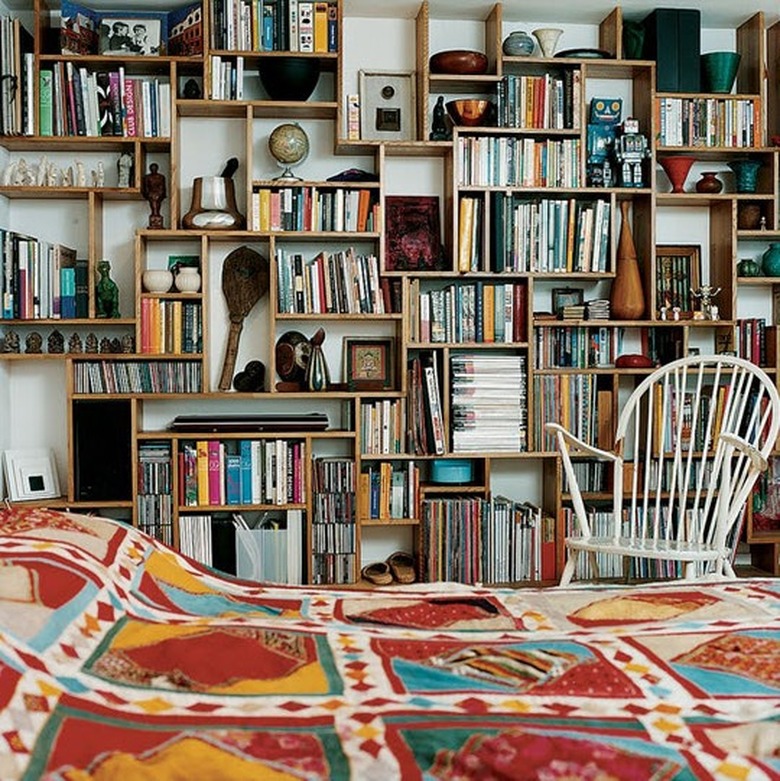
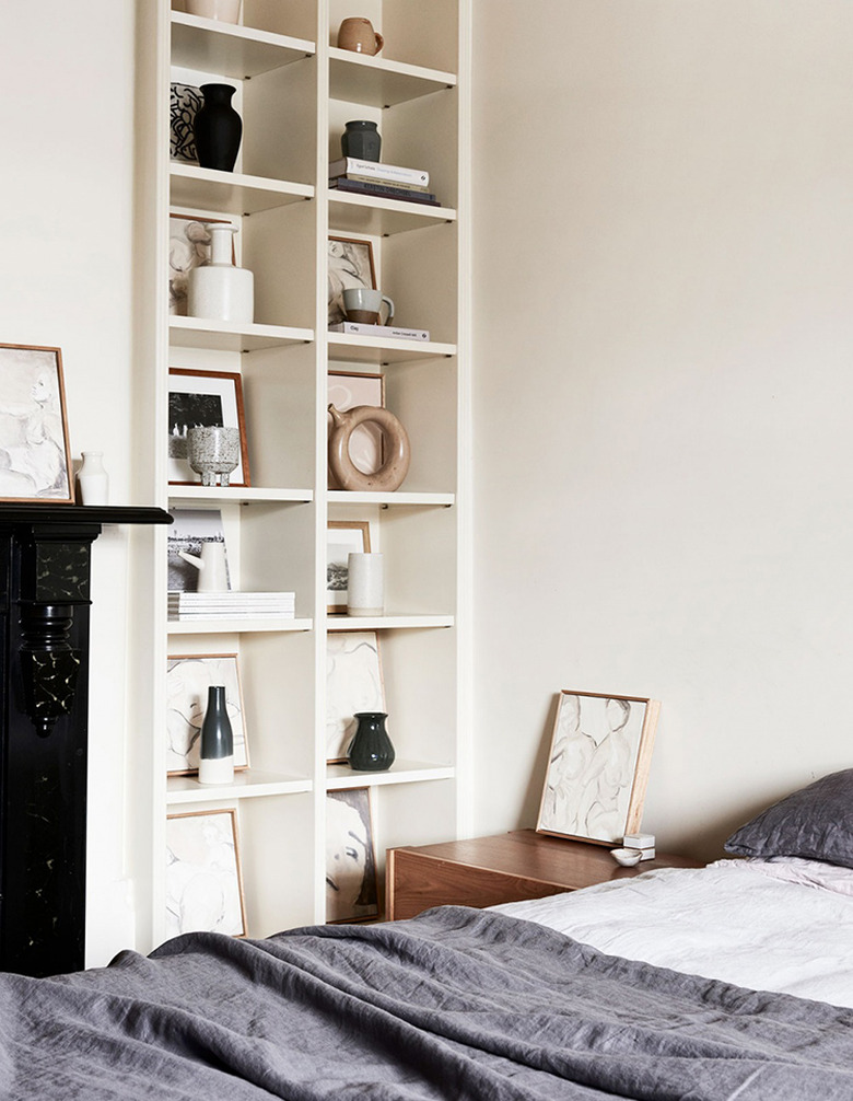
Is there anything sadder than a bare bookcase? Embrace maximalism! Have fun with flourishes (lamps, vases, frames, etc.) but avoid a cluttered look by grouping complementary items together.
5. Make it pop with color.
5. Make it pop with color.
Small space living? Take eye-catching to the next level without sacrificing square footage. This vibrant, color-coded presentation is proof that a tiny unit can posses big personality.
6. Or, say 'hello' to soft hues.
6. Or, say 'hello' to soft hues.
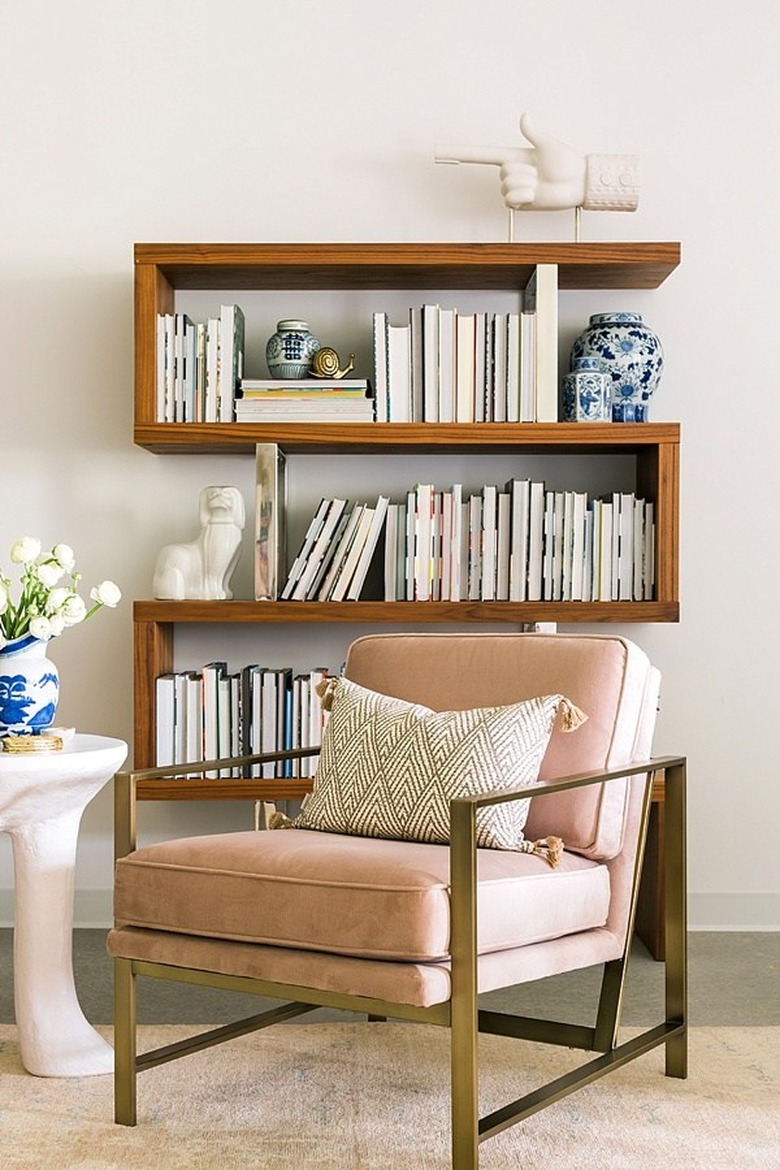
Empty corner? Transform it into a calm and cozy reading nook with soothing tones and inviting textures. Mandy from the blog Waiting on Martha, achieves this by pairing a modular shelving unit with a blush, velvet armchair and vintage rug. Flipping the novels, in favor of a page-front look, keeps the aesthetic soft.
7. Keep contrasts to a minimum.
7. Keep contrasts to a minimum.
In this living room by Cory Connor Designs, built-ins flank the window seat and disappear into the wall color, giving the appearance that the books are floating. This is ideal for bibliophiles who need lots of storage.
8. Infuse artistic flair.
8. Infuse artistic flair.
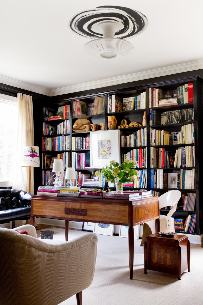
Dreaming of a workspace that encourages creativity? Take a cue from Virginia-based designer Raji Radhakrishnan. Her office merges contemporary and artistic touches like pop art prints, hand-carved wooden artifacts, and a slew of inspiring reads.
9. Use bookcases as a backdrop.
9. Use bookcases as a backdrop.
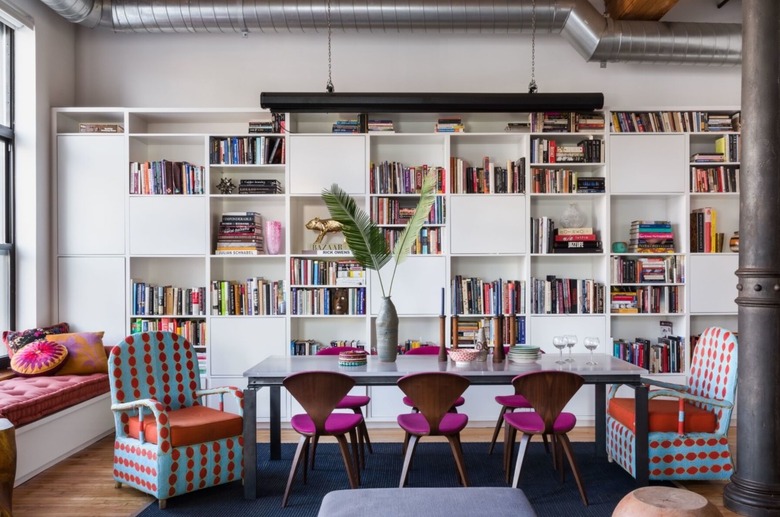
Bored of blank walls? Paint is expected, but built-ins (like those in this boho Brooklyn loft) are a clever way create a beautiful backdrop and add some much-needed organization for your beloved books and treasures from your travels.
10. Ease into eclecticism.
10. Ease into eclecticism.
Forget the rules and go with what feels good to you. Style volumes in vignettes and pepper in knick knacks, frames, and sculptures that reflect your personality.
11. Create a cozy home library.
11. Create a cozy home library.
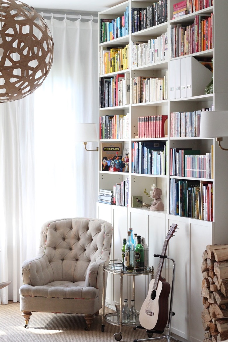
Ultimately, the success of a home library is measured by two things: Functionality and pleasurability (meaning it needs to be a pleasant place to flip through pages). This rustic sanctuary hits the mark on both counts. The comfy lounge chair, framed by a large window, invites you to have a seat next to the floor-to-ceiling bookcase filled with your favorites — what more can you ask for?
12. Up the glam factor.
12. Up the glam factor.
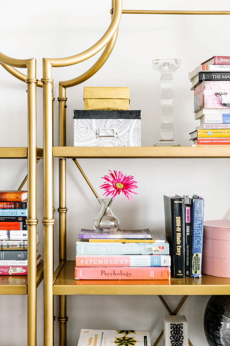
A gilded unit delivers a mega-dose of glamour without going over the top. Stacked tomes and a few sweet accessories are the perfect finishing touch.
13. Go vertical.
13. Go vertical.
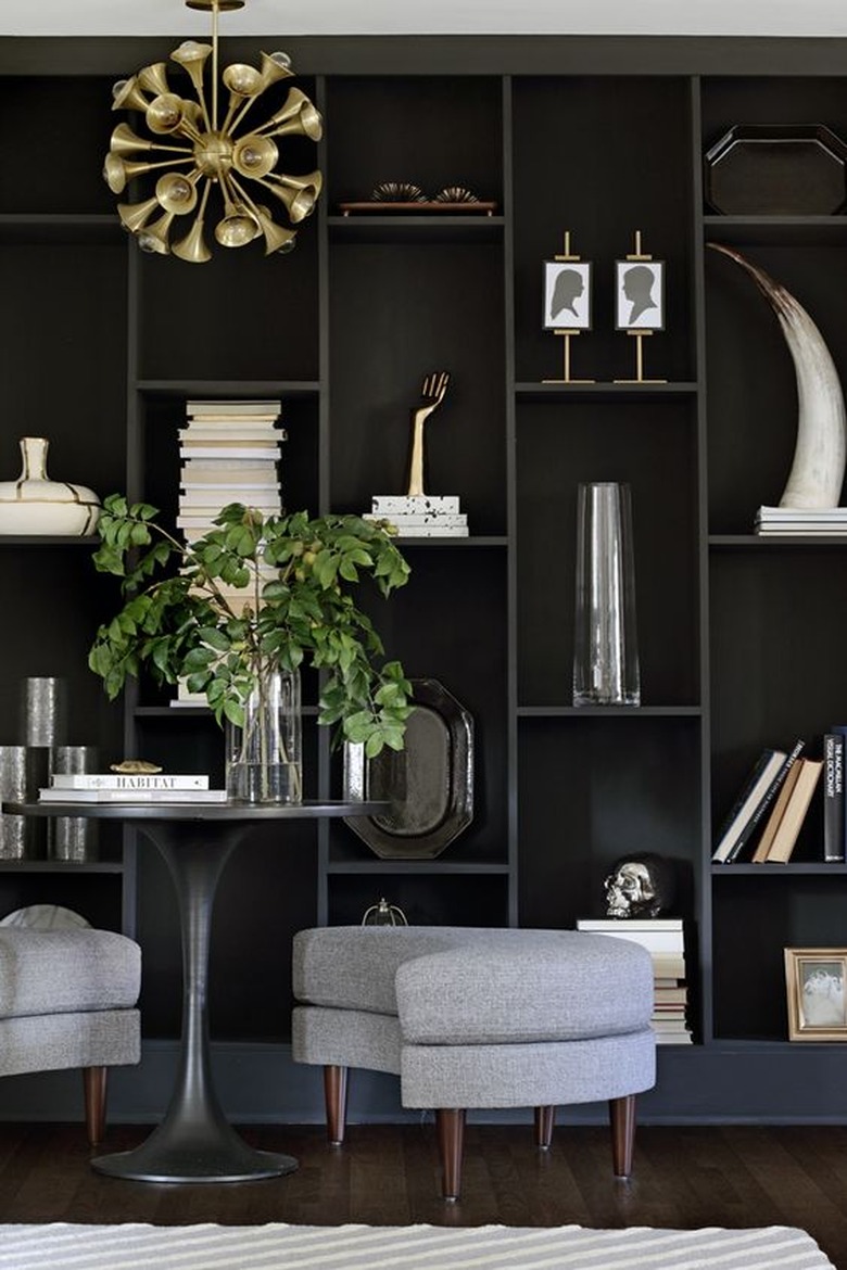
Take advantage of every square inch. Kristin Jackson of The Hunted Interior took it upon herself to make this black beauty. The built-in, floor-to-ceiling design displays a carefully curated selection of books and decorative objects.
14. Edit. Edit. Edit.
14. Edit. Edit. Edit.
Minimalism more your speed? Toss non-essential texts and embrace the beauty of empty space. Remember, culling down your collection is an accomplishment in and of itself.
