12 Oh-So-Dreamy Scandinavian Minimalist Interiors
What is it about Scandinavians that makes their style so effortless? These chilly countries have paved the way for modern interior design, teaching us all about blonde wood, Swiss crosses, globe-shaped paper lanterns, hygge, and — of course — Ikea. But no matter how they style it, the Scandinavians do minimalism best, and these 12 gorgeous spaces display the region's inspired take on pared-down decor.
1. Dreamlike ascension.
1. Dreamlike ascension.
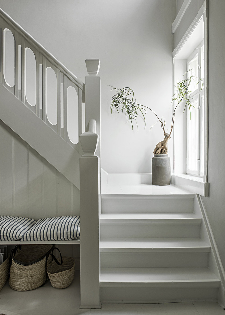
Is this the stairway to heaven? Natural light meets a natural element to create the perfect minimalist landing.
2. Crisp combination.
2. Crisp combination.
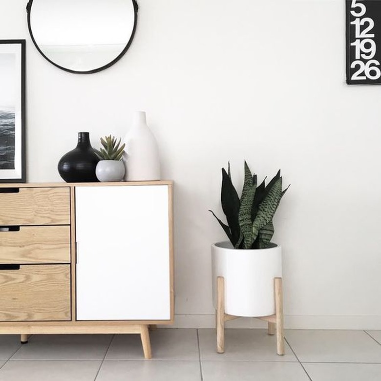
Light wood, bright whites, black lines, and bold typography — this room might be the perfect embodiment of Scandi style. Take one look at that streamlined planter and you'd be forgiven for thinking you've been transported to Copenhagen.
3. Minimal maximalism.
3. Minimal maximalism.
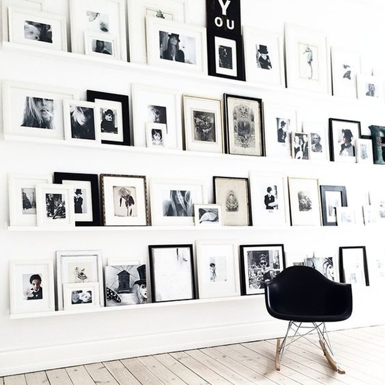
No need to pare down your art collection. Keep your colors within a single shade (in this case, black and white) to embody the essence of minimalism without donating all your trinkets.
4. Hints of blackness.
4. Hints of blackness.
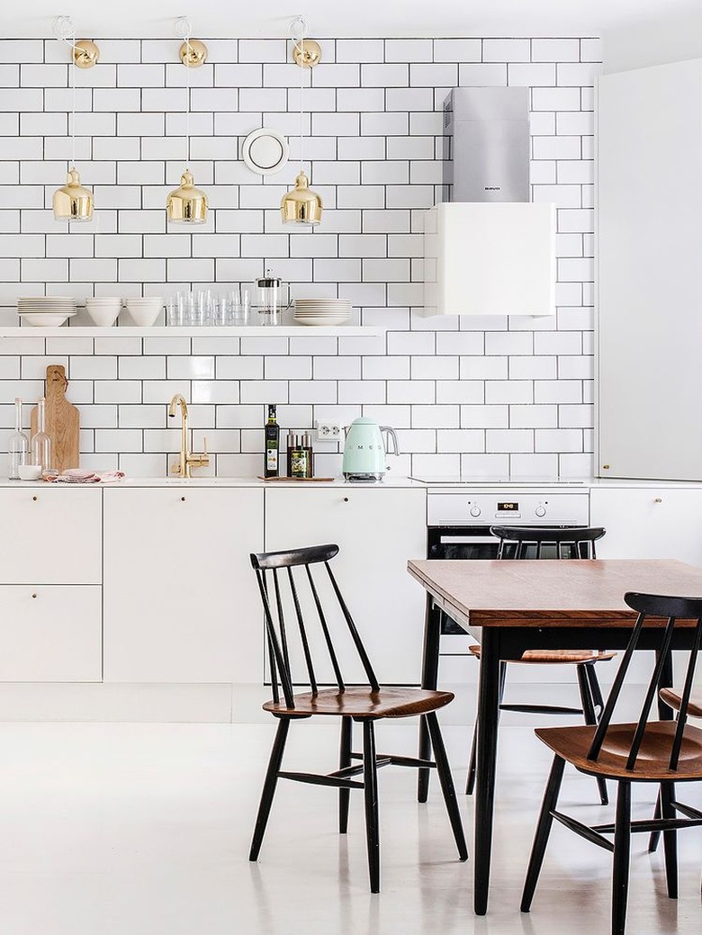
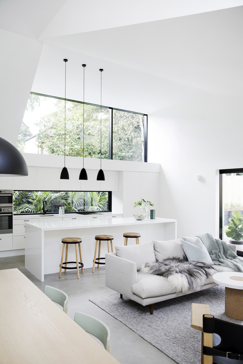
Black is always the new black for Scandinavians. Just a touch adds heart-stuttering drama to a plain palette, like the pendant lights, bar stool trim, and window frames in this light-filled room.
5. Comfy, cozy imperfection.
5. Comfy, cozy imperfection.
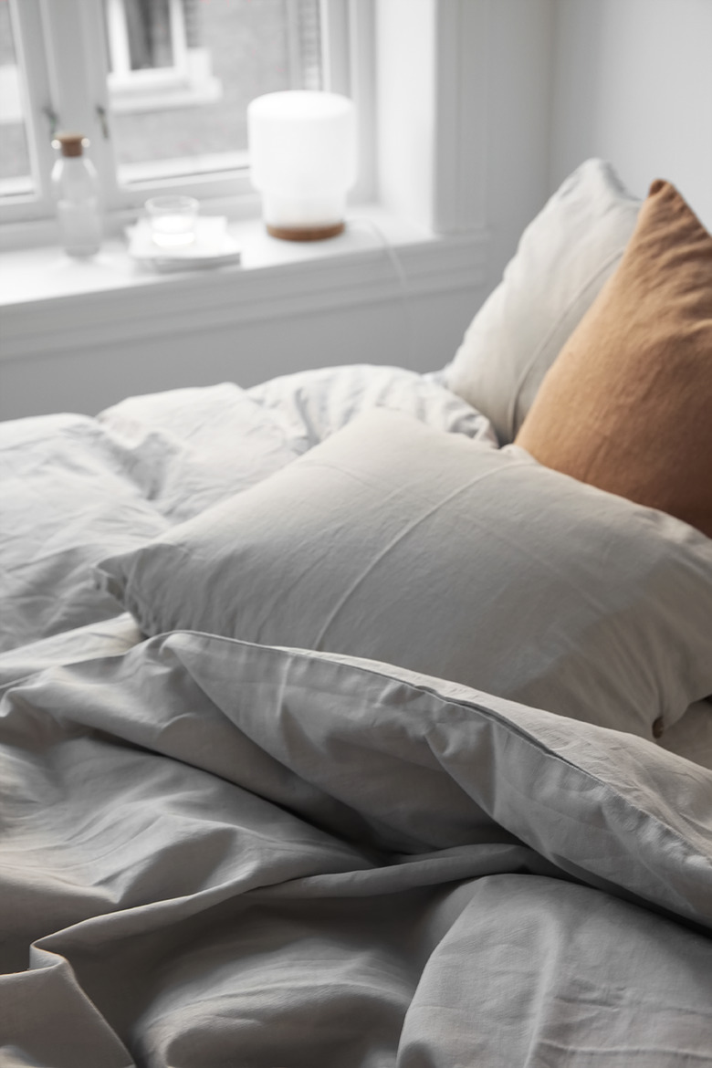
That hygge feeling and minimal decor are by no means at odds. This scene is full of seeming imperfections — a wrinkled duvet, a casually tossed pillow, a power cord that dares to be seen — but it all adds up to cozy.
6. Reaching new heights.
6. Reaching new heights.
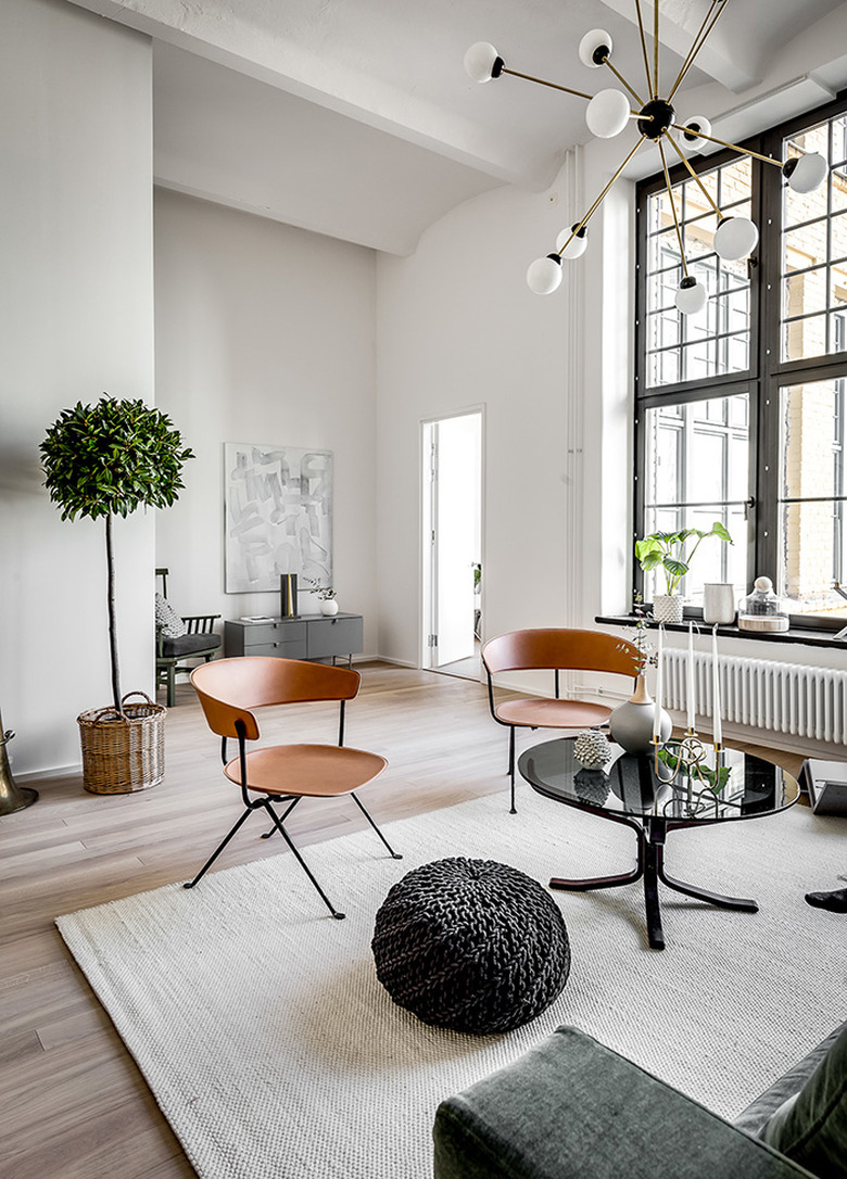
During the gorgeous summer months, Stockholm residents want to soak up all of the natural light they can get. This stately living room combines high ceilings and larger-than-life, black-framed windows to create a vidunderlig (wonderful, for all you non-Danes) interior.
7. Scaling up.
7. Scaling up.
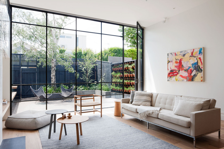
Make use of large rooms by carefully placing a few large-scale elements — like the floor-to-ceiling windows, oversize artwork, and tower of stacked wood next to the fireplace in this Australian home.
8. Dark dimensions
8. Dark dimensions
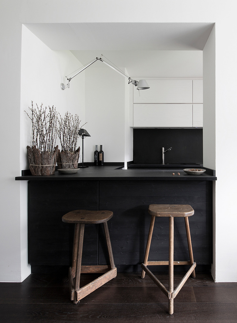
Sure, traditional Scandinavian minimalism evokes floaty white fabrics and gray furniture — but you don't have to go light to do Scandinavian right. Bright sunlight and dark colors match perfectly in this Swiss kitchen.
9. A touch of green.
9. A touch of green.
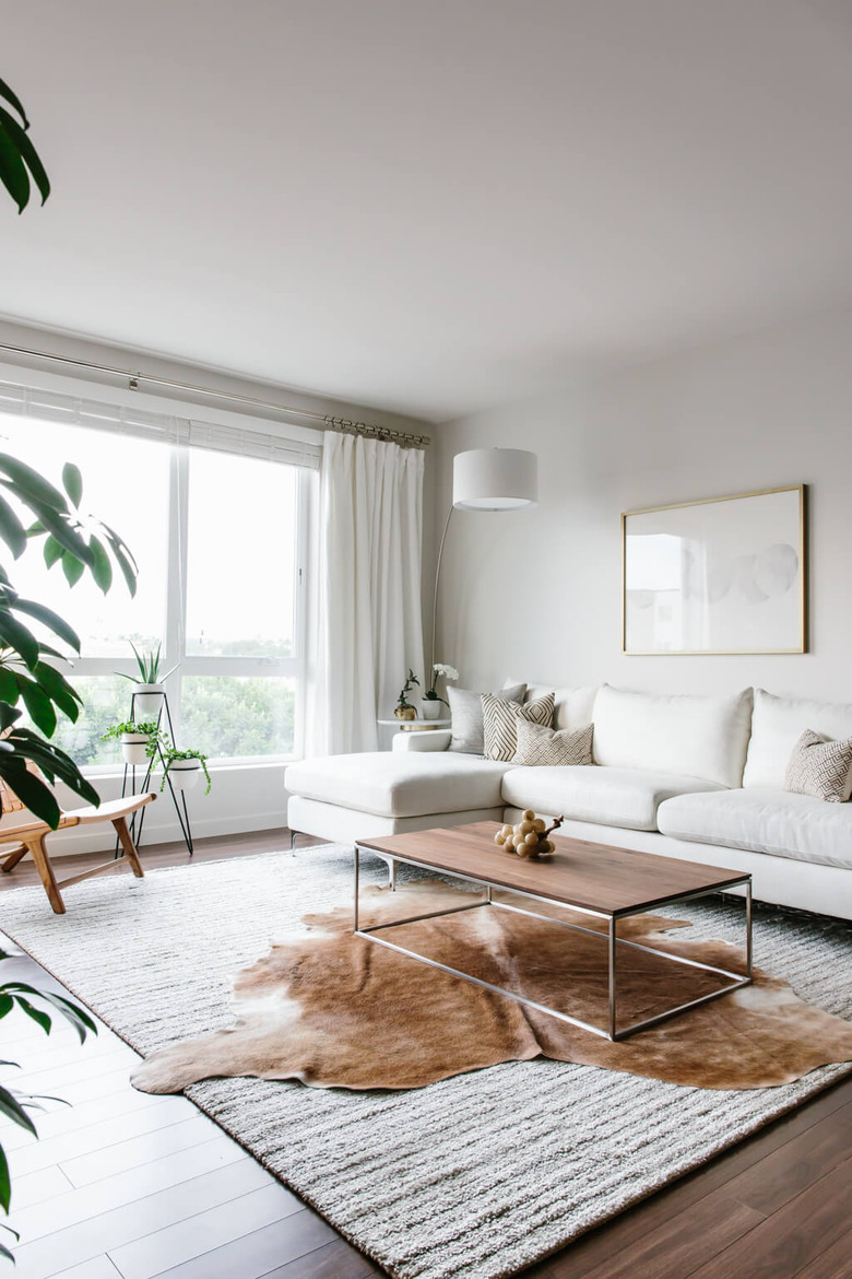
It's not that Scandinavian homes can't be colorful, but green is the most common accent shade — usually in the form of a large, artistic fern. Mirror the vivid green with smaller plants and mint accessories.
10. Subtle pinks.
10. Subtle pinks.
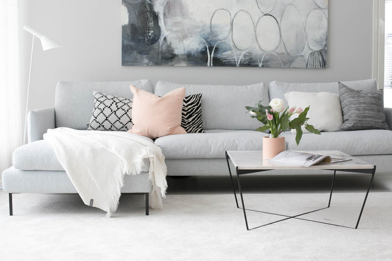
If Scandinavian homeowners aren't accenting their homes in green, chances are the secondary color is pink. But this is no eighties club-kid neon pink — minimalism requires a much subtler shade.
11. Shamelessly frameless.
11. Shamelessly frameless.
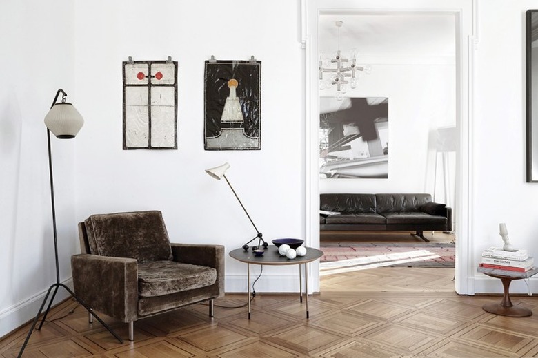
Framing art can cost a pretty penny — but your walls don't have to be ugly because you can't spare a dime. Go minimal by hanging your artwork with a metal clip or two.
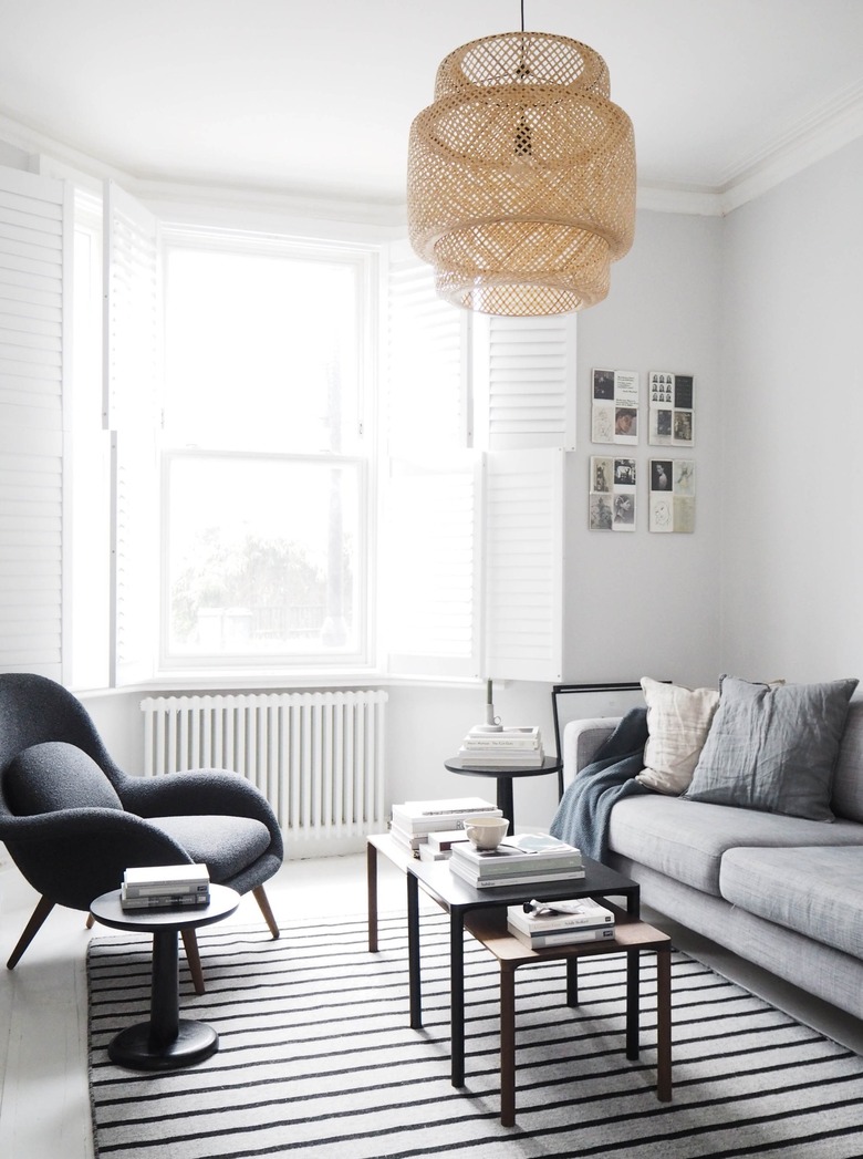
12. Gray on gray.
12. Gray on gray.
Just because gray is a Scandinavian stereotype that doesn't mean it can't be executed brilliantly. This living room combines light gray walls, gray furniture, and even decorative accents — and somehow the setup doesn't feel monotonous.
