An Interior Designer's Remodel Channels California Bohemianism
When Natalie Myers, owner of interior design firm Veneer Designs, embarked on a revamp of her own home, she looked to local California landscapes and textures to inform inspiration. Thanks to her keen eye, the house, a classic midcentury post-and-beam located in the hilly L.A. neighborhood of Ladera Heights, is now a love letter to west coast design — a mix of natural materials, curated midcentury pieces, and understated bohemian accents.
One of the biggest challenges of the renovation, Myers says, was staying in the house with her husband and kids during the remodel: "We lived through the construction zone with most of our furniture in the garage from Memorial Day through October," Myers said. "We framed it as indoor camping and made light of the temporary situation."
Built in 1962, the home had been neglected and practically untouched since its original construction, so there was much to be changed. Once her team began removing layers — drapes, screens, patio shades, and a backyard fence — they discovered the house had a view of the Santa Monica Mountains and the Pacific Ocean. "It further cemented the concept of bring[ing] the outdoors in with natural textures and earthy colors," Myers said.
1. Entrance
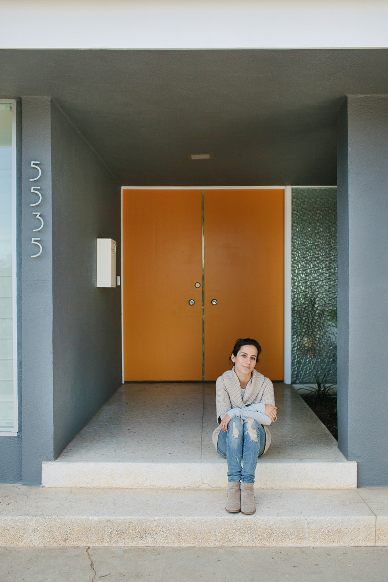
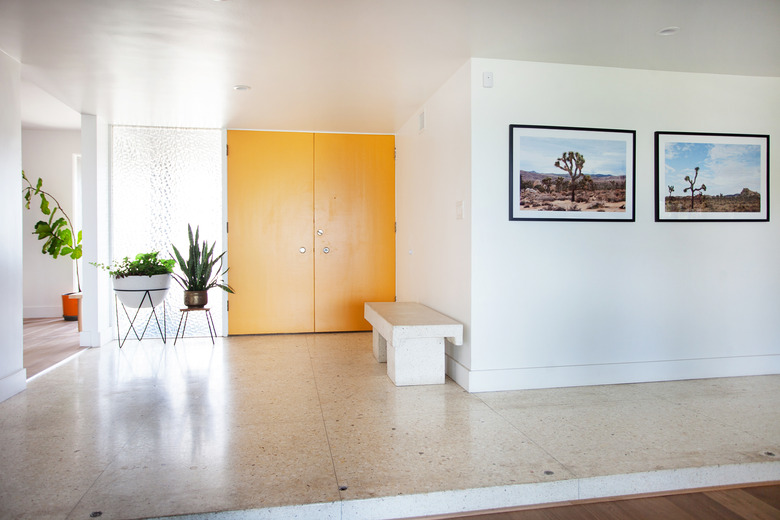
In the entryway, photos of Joshua Tree by artist Amy Bartlam make the home's inspiration immediately clear. The original terrazzo floors and orange door (painted in Pratt & Lambert's Goldenrod) welcome guests.
2. Living Room
The home's revitalization and new life is similar to the positive changes happening in other places nearby. "Currently the area is going through a bit of a revitalization with younger families moving in and renovating the older homes. There is an ... energy in the air of people excited about the architecture and wanting to be a part of the community," Myers said.
3. Living Room
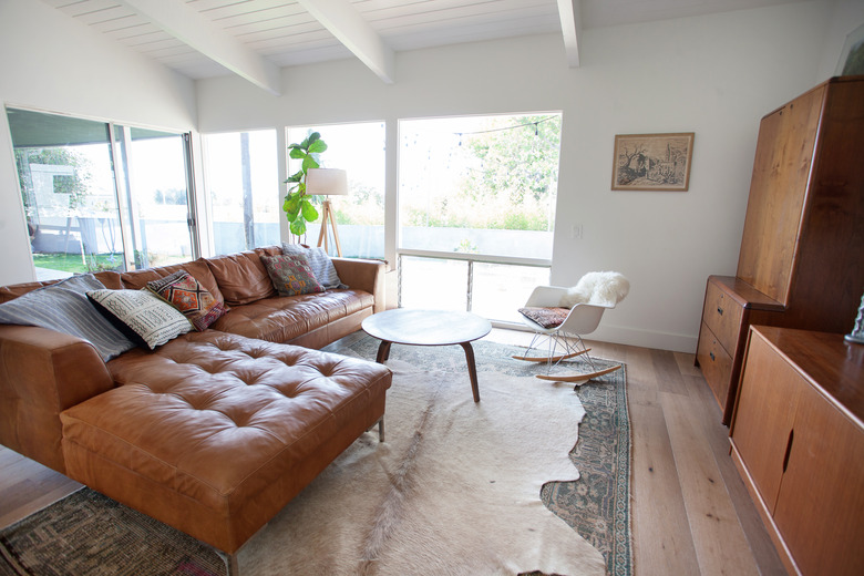
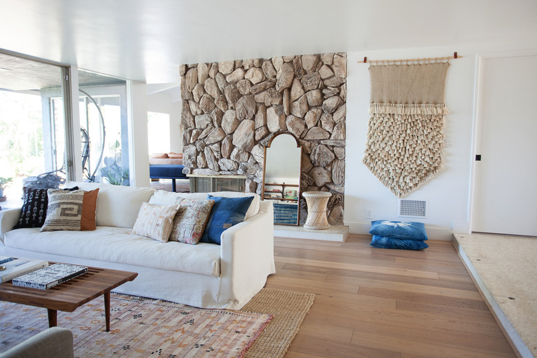
A custom-made Bertoia-inspired sofa situated near an Eames rocker gives the living room a chic, '60s California beach cabin feel. The original ceiling beams were painted white to brighten up the space and highlight the unique furniture.
4. Living Room
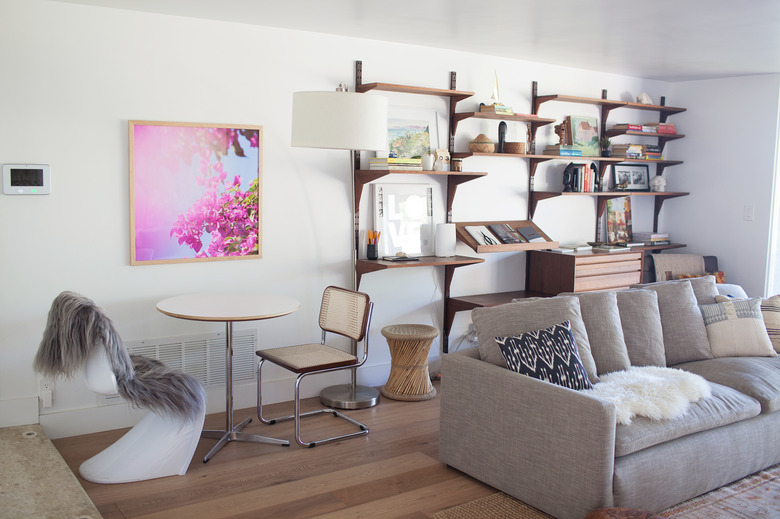
Veneer Designs specializes in bringing midcentury flair to interior modernizations. The built-in desk, original to the home, was modernized with a Pure White Ceasarstone countertop.
5. Living Room
Nestled among other midcentury ranch and post-and-beam architectural homes, it was important for Myers to preserve the structure's original character: "I wanted to brighten it up and celebrate its architectural integrity," Myers said.
6. Living Room
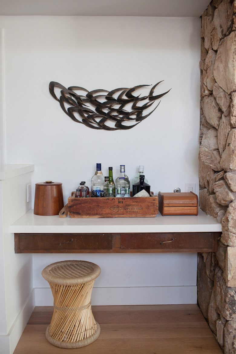
"The original stone fireplace was the starting off point for the design inspiration of the house," says Myers. "When we first bought the house, curious visitors kept asking me what I planned to do with it and the answer was not to touch it."
7. Dining Room
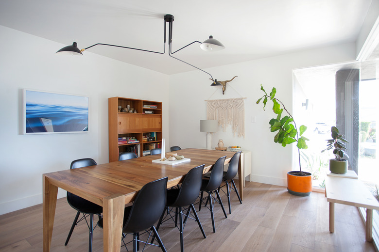
A dining table is surrounded by Eames molded plastic dowel leg chairs. Wall art from Printshop by Denise Crew ups the Cali vibes.
8. Bedroom
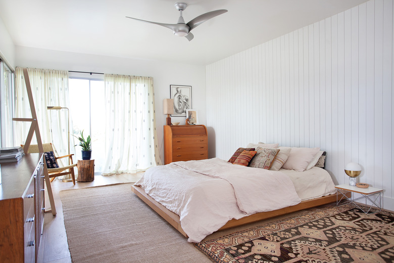
The bedroom mixes old and new with a West Elm platform bed and a printed vintage rug. Perfect for smoldering Los Angeles summer days, a Wisp fan pulls in more outside air from the large windows.
9. Bedroom
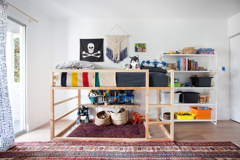
It the kids' room, Myers opted to try what she describes as the "laziest hack" of installing an Ikea Kura bed without the white melamine panels. The result is a bed with its exposed construction, lending the room a minimalist feel.
10. Bathroom
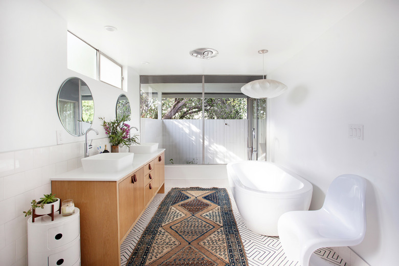
A vintage rug brings out the patterned design of the Zenith tiled floor from Cle Tile. Leather tabs on the cabinetry add extra texture to a bohemian-minimalist bathroom.
