You Really Need To See The Raw-Edge Wood Waterfall Counter In This Home
Who: Puja Vohra and Laxman Mandayam
Where: Brooklyn, NY
Style: Modern Eclectic
Location is everything in real estate, but that's particularly true in New York City. Which is why when Puja Vohra, EVP of Marketing at truTV, and her entrepreneur husband Laxman Mandayam, found a duplex in Brooklyn's Prospect Heights neighborhood that was also close to Prospect Park, the subway, and the Brooklyn Museum, they were willing to overlook the home's shortcomings — at least for a while.
The apartment is made up of two combined units, and unfortunately the prior renovations had been less than successful. The space needed work, and the couple, who share the space with their 9-year-old daughter, Mira, and rescue dog, Bailey, planned to hire a contractor and work off of their own ideas. But while flipping through the New York Times, Vohra came across an article about the home of Stefanie Brechbuehler and Robert Highsmith, partners in the Brooklyn design firm Workstead.
While the designers have a different aesthetic from the couple, Vohra found herself drawn to their work. "It's timeless," notes Vohra. Brechbuehler and Highsmith immediately got down to work streamlining the apartment and making the most of the 1,500 square-foot apartment.
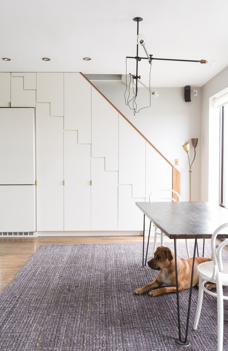
The apartment's unsightly staircase was transformed into a beautiful passage with a clever storage space built-in underneath. "It just gives it all these vertical lines, so it makes the apartment feel a lot bigger than it is," explains Vohra.
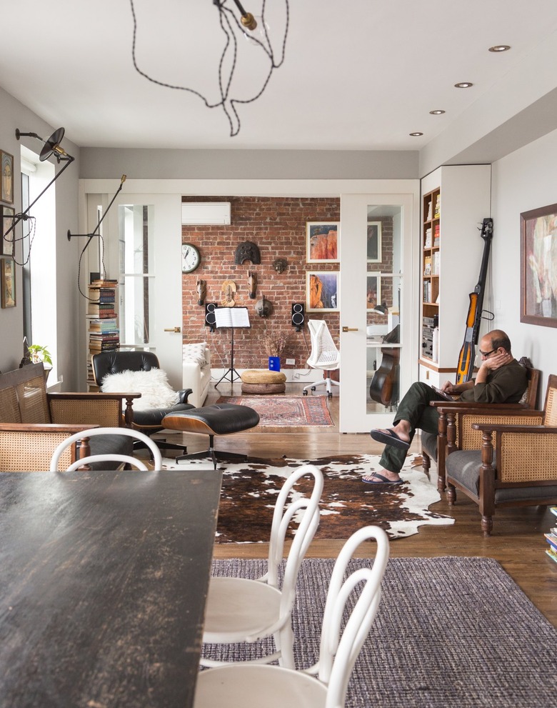
The kitchen flows into the dining and living areas. "We usually entertain a lot and so I think it's just nice to have the open space in the kitchen, because usually that's what we sit around all the time," says Vohra.
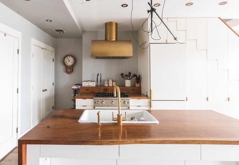
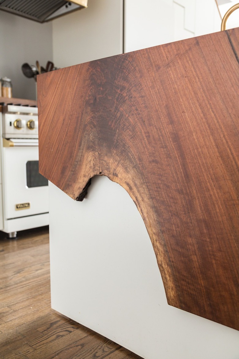
Workstead collaborated with local woodworker Markus Bartenschlager on the custom cabinetry, including the kitchen island, which is topped with an eye-catching raw-edge waterfall counter.
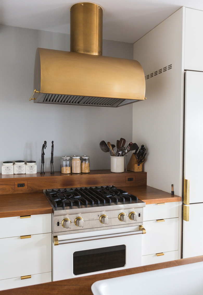
Brass was used as an accent throughout the open kitchen, from the range's custom hood to the faucet, which the designers had replated. "They bought the most amazing fixtures, just stuff that you want to touch every day," she adds. "Nothing felt cheap or felt tacky or throwaway."
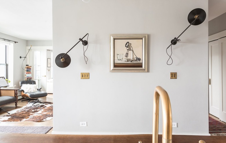
The firm is known for its lighting designs, and several were incorporated into the project, including the chandeliers above the kitchen island and dining table. Sconces on an adjacent wall surround artwork by realist painter John Morra.
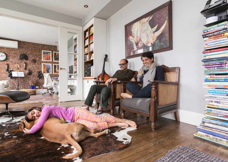
Vohra admits that her favorite spot is the living and dining area: "It's just very expansive and beautiful." The space is also a favorite of the couple's daughter, Mira, who has claimed the room's Eames chair. "She doesn't let anybody use it," says Vohra.
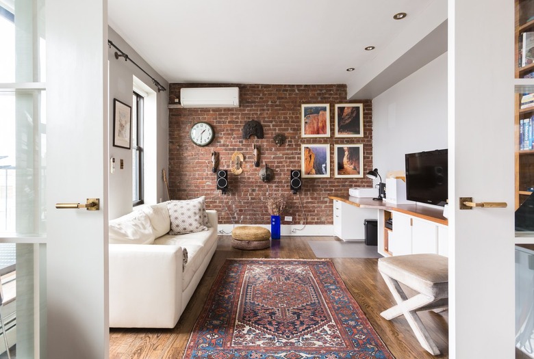
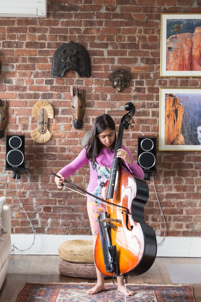
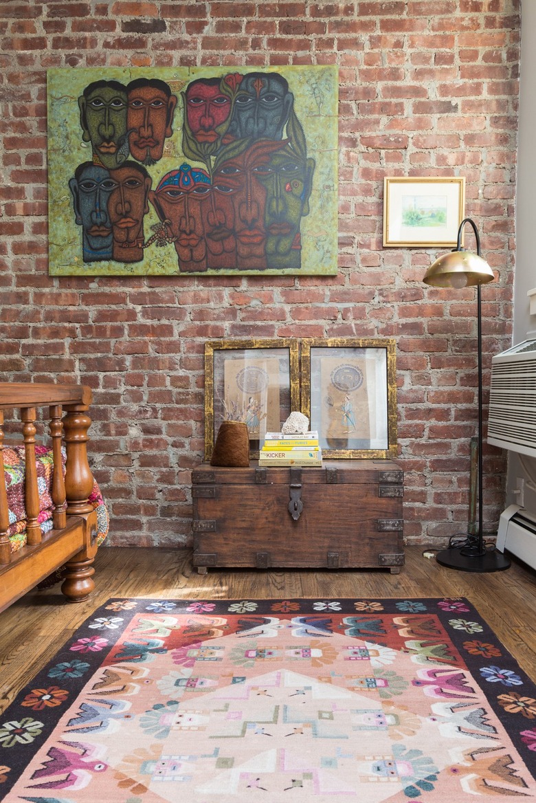
The apartment's subdued palette is a far cry from the couple's previous decor, which was filled with bright colors and pieces Vohra brought back from India. "When they came to our apartment the first time, they were horrified at the amount of color and all of the art that we had," jokes Vohra. But in the end, Vohra and Mandayam were easy clients: "We weren't trying to really impose any of our own constraints. It was so far and away superior to what we had ever thought of."
Vohra credits her mother with her interest in design: "She loved to keep a beautiful house. When we sat down to dinner, the table was always laid out."
Thanks to the open layout and ample storage, the apartment feels spacious, but not overwhelming. "I would be really uncomfortable in a very big space," Vohra explains. "It's small and cozy and not insanely massive with sprawling rooms. I think that kind of feels like us. Small and intimate."
Now a few years removed from the renovation, the family has settled in and made the space their own. "I think we've probably brought a lot more color back than [Workstead] would have liked, I think," says Vohra. "But by and large, it's really kind of what they wanted."
