The Unconventional Tile In This Apartment Is Just Too Good
An Italian family wanted their vacation home in Barcelona to be modern, but they also wanted to highlight the historical details of the apartment, which is housed in an art nouveau building in the city's Eixample district. Architects Andrea Serboli and Matteo Colombo of CaSA collaborated with architect Margherita Serboli on the project and the team's first priority was ditching the original layout, which was poorly oriented and wasted space. The architects organized the new plan around the apartment's three bearing walls, creating a trio of distinct areas: an open kitchen attached to a living and dining area, a pair of bedrooms, and the master suite.
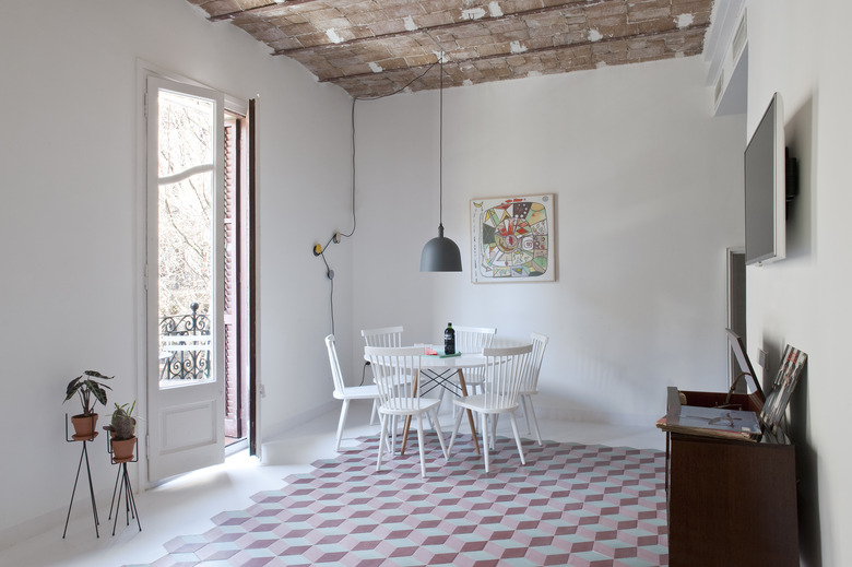
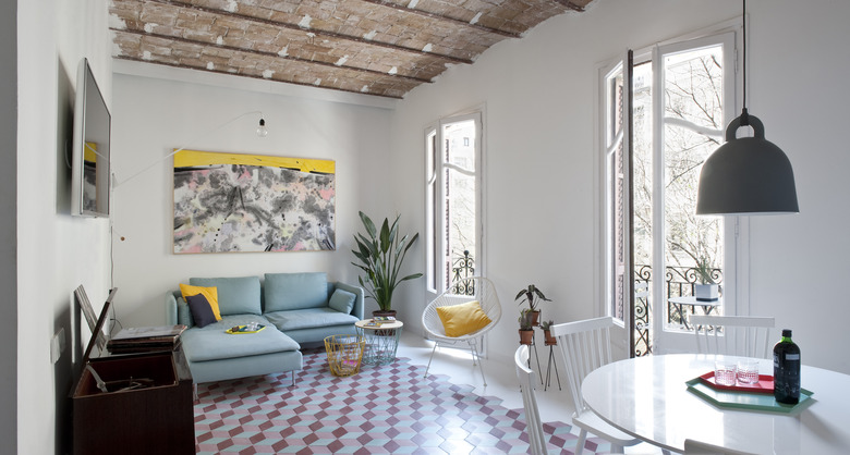
The team also exposed the space's Catalan vaults, which had been concealed by drop ceilings, and restored the original woodwork on the windows. They installed colorful tiles in the living and dining areas as a nod to the traditional cement tiles found in buildings of the period. The palette includes bursts of of leafy green, sunny yellow, rosy pink, and plenty of crisp white. The end result is a relaxing yet fun home away from home.
1. Living Room
The living and dining areas open onto the apartment's balcony. A painting by Piero Serboli hangs above the sofa in the living area, and a television is mounted above a vintage record player and radio.
2. Dining Area
A Bell light by Normann Copenhagen hangs above the Eames table and Woood chairs in the dining area. The floor tiles were made by Zelart and designed by the architects, who chose a contemporary color palette and hexagonal shape.
3. Kitchen
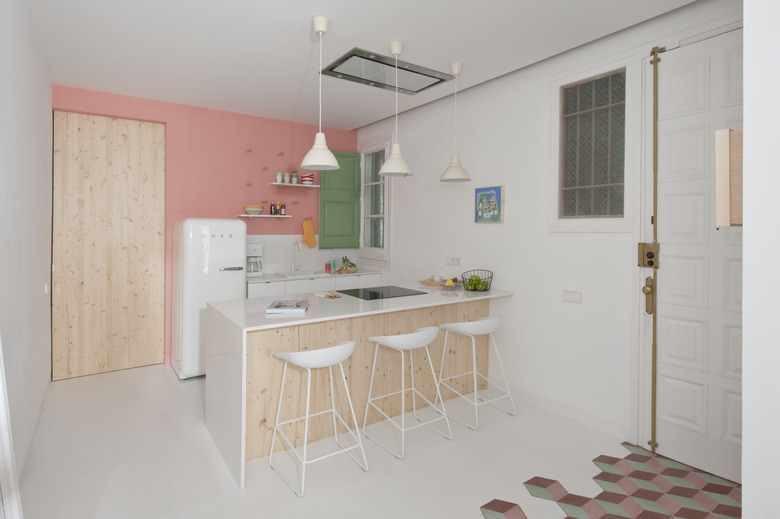
The architects customized Ikea kitchen components and installed a Smeg fridge. They eliminated the need for a bulky range hood by using an industrial extractor that sits flush with the ceiling.
4. Kitchen
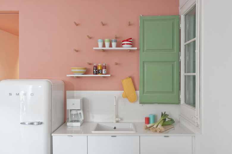
Wood pegs on the kitchen's pink wall create flexible shelving.
5. Master Bedroom
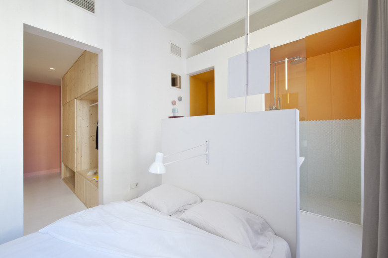
The bed's headboard serves as a room divider, separating the sleeping area from the bathroom.
6. Closet
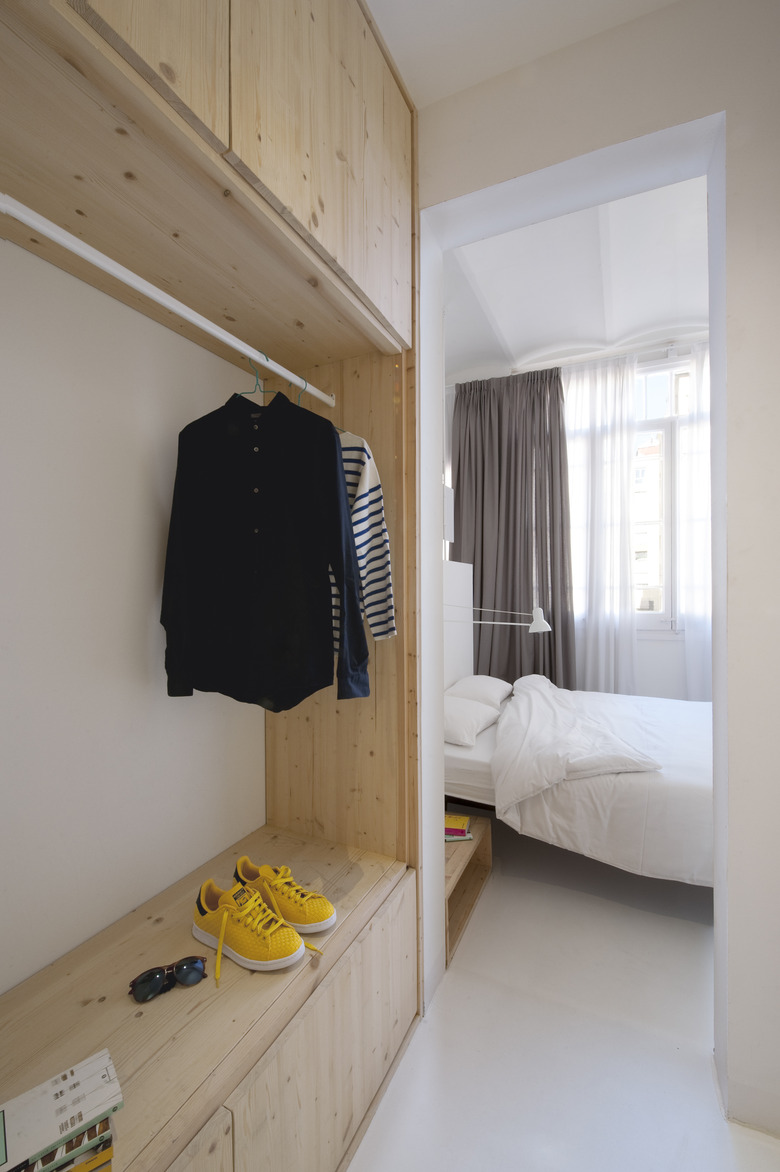
The walk-in closet is clad in pine and leads into the master suite.
7. Bathroom
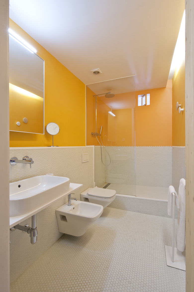
The second bathroom is painted a bright yellow and lined with small hexagonal tile.
8. Bedroom
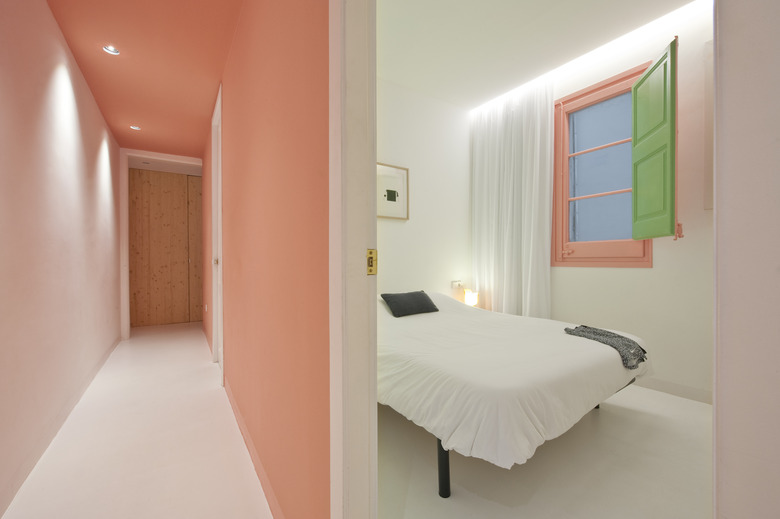
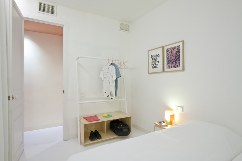
While the halls and rooms sport pops of bold color, a white floor throughout the apartment unifies the spaces.
9. Kid's Room
White tubular furniture was used throughout the space, from the clothing rack in this bedroom to the stools in the kitchen.
