It Might Take You A Second To Realize That This Is Actually A Studio Apartment
At first glance, you'd never guess that this São Paulo apartment is in fact a tiny 400-square-foot studio. That's all thanks to the clever workings of architectural firm Estúdio BRA Arquitetura, which transformed the space by creating barriers and strategically placing large furniture items.
"The biggest challenge was getting the living room, dining room, office, and bedroom to blend," architect Rodrigo Maçonilio says. So, he explains, "We created pieces that serve for more than one use." One large design for the living room includes an entertainment area, bar, and bench — all in a single item of furniture. The wardrobe and the bathroom are also intertwined, optimizing space and storage. The result? A studio apartment that feels far from cramped.
1. Living Room
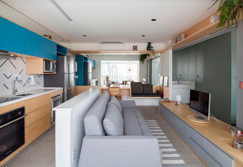
A partial wall behind the sofa emphasizes the divide between the living room and kitchen spaces.
2. Living Room
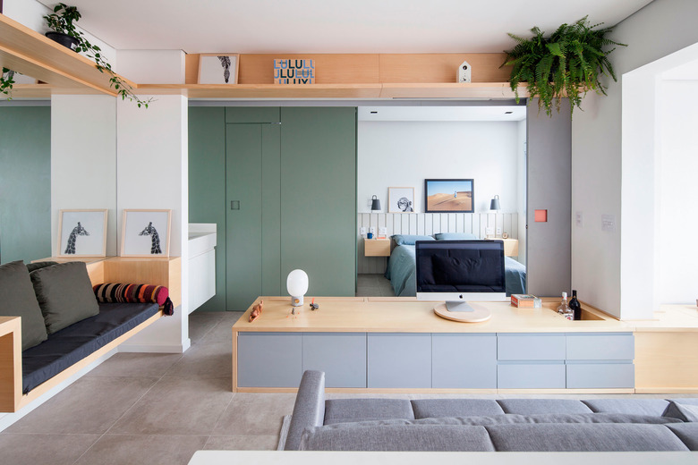
Gray tones serve as the main color theme — the hues are neutral without feeling drab, and bring uniformity to the design so it doesn't appear cluttered. A mirror on a back wall also creates the illusion of more space.
3. Living Room
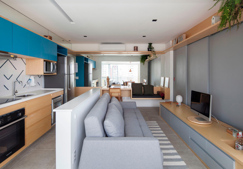
The gray walls behind the television can be opened or closed, depending on what level of privacy the residents desire.
4. Living Room
Pinho, a pine wood popular in Brazil, was used for the built-ins and custom multipurpose furniture pieces. In the living room, the firm used the material to create a shelf near the ceiling, providing extra storage while also drawing the eye up. Another trick: Social areas feature low-to-the-ground furniture, making the ceilings feel far-reaching.
5. Living Room/Kitchen
The kitchen goes more playful with cabinets coated in an industrialized, high-strength laminate blue paint and fun printed tiles on the backsplash.
6. Kitchen
The kitchen's design mirrors the streamlined motif found throughout the home; Maçonilio and the team arranged the furniture along a line, so that each end of the apartment can be viewed from the other side, creating a feeling of spaciousness.
7. Bedroom
Bookending the bed are two built-in floating side tables, custom-designed in the style of the rest of the home. The accompanying side lights are from Reka.
8. Bedroom
The firm created a sage green enclosure next to the bedroom, which includes both the bathroom and wardrobe.
9. Dining Room
Despite having such little room to work with, the clients still desired a space for socializing, so the firm managed to create a small dining corner with built-in seating on one side, and a slim table to reduce bulk.


