The Before-And-After Pics Of This Seattle Midcentury Are Unreal
When a couple with two small children found a charming hillside midcentury home in central Seattle, they knew they wanted to bring it up to date while restoring it to its original beauty. Working with the architects at Shed and interior designer Jennie Gruss, the couple got to work transforming the home, which was designed in 1957 by architect Arnold Gangnes. The team tried to salvage as many original details as possible, including the hardwood floors in the living and dining rooms and entry's slate tile. They avoided any major structural changes and focused on opening up and combining spaces to better fit the family's lifestyle. Two bedrooms were joined to create a spacious master suite and an open air-storage space became the indoor pool, which was one of the family's must-haves for the redesign.
Shed kept the palette of materials neutral to complement the floors, but added maroon cabinets in the kitchen for a bit of color. Black beams and woodwork highlight the architecture and create contrast with the warm wood ceilings. Gruss added furnishings that combine a midcentury vibe with comfort. The end result is a space with '50s style that's just right for a modern family.
1. Exterior
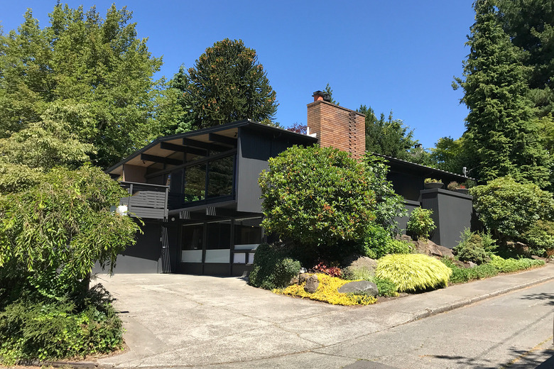
The home's hillside site made the project more challenging, particularly when it came to finding a spot for the pool and bringing light into the lower level.
2. Entry
The team was able to keep the entry's original slate tile floor. Pendant lights by Rich Brilliant Willing were added to illuminate the staircase.
3. Living room
The living room's Restoration Hardware sectional sofa is bordered by custom shelving designed by Gruss and fabricated by 16th Workshop. The wood paneling was painted in a soft gray and the brick fireplace is original.
4. Dining Room
In the dining room. Gruss complimented the owner's maple table with Eames chairs and a Moooi light fixture.
5. Kitchen: Before
Before the renovation, the kitchen and dining room felt separated, and a partial wall interrupted the flow.
6. Kitchen: After
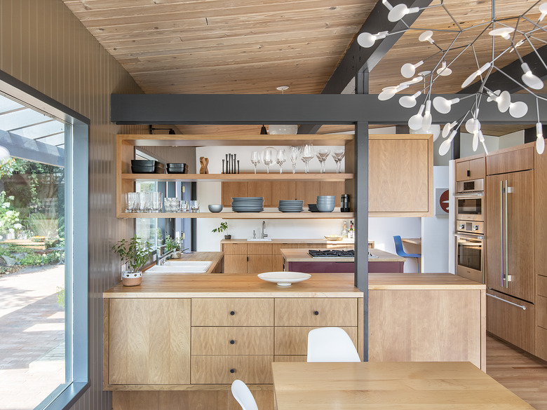
The partial wall between the kitchen and dining area was removed to completely open up the space. Beech Tree Woodworks designed the custom cherry cabinets that separate and provide storage for both areas.
7. Kitchen: Before
Pre-renovation, the kitchen featured dated wood cabinets and conspicuous appliances.
8. Kitchen: Before
The closed shelving also blocked the flow of light between the spaces.
9. Kitchen: After
The clients requested a pop of color in the kitchen, so the team selected maroon laminate fronts for the lower cabinets.
10. Family Room
A modular sofa by PB Teen is the centerpiece of the family room on the lower level. The ceiling fixture is vintage and the sconces are by Brendan Ravenhill.
11. Bedroom
The master bedroom is decorated with an array of vintage pieces, including the headboard and bedside tables. The ceiling fan is from Rejuvenation and the rattan ottoman was designed by Franco Albini.
12. Bathroom: Before
The family decided to nix this bland office space and turn it into an extra bathroom.
13. Bathroom: After
The shower area of the master bathroom is lined in white penny tile by Daltile, which contrasts with the matte black fittings.
14. Pool
Adding a pool was a top priority for the family and Shed was able to transform former carport into an indoor pool.


