11 Kitchen Paint Colors Designers Swear By
With so many choices, how does one go about picking new paint for a kitchen? The key is to be thoughtful, but not too too careful.
"The big mistake is to let fear dictate your decision making," says Daleet Spector, a Santa Monica-based interior designer. When clients get scared, she says, they default to earth tones. "There's no contrast, no interest. It's one note—and that can be boring."
So, forget the fifty shades of beige, the heavy wood of the 90s, and whatever you've heard about colors that stimulate appetite (or that don't). Let these 11 designer favorites be your guide—from the most versatile white to the bluest black.
1. Simply White, Benjamin Moore
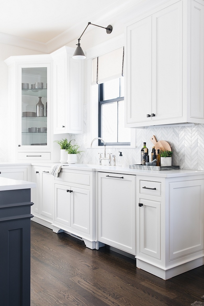
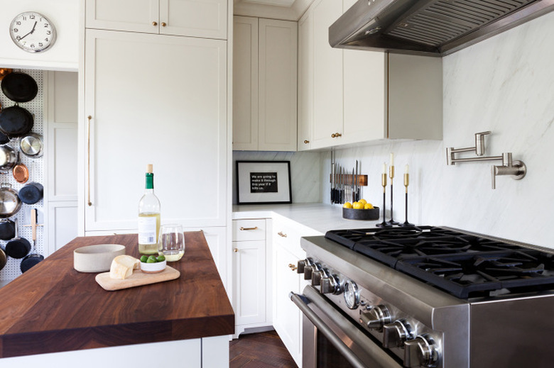
"Simply White is the Switzerland of white paint," says Amy Sklar, a Los Angeles designer based in Silver Lake. "It plays well with everyone. The shade is neither too warm nor too cool. It's a true neutral white, which is actually hard to find."
As seen on the upper and lower cabinets
2. Cornforth White, Farrow & Ball
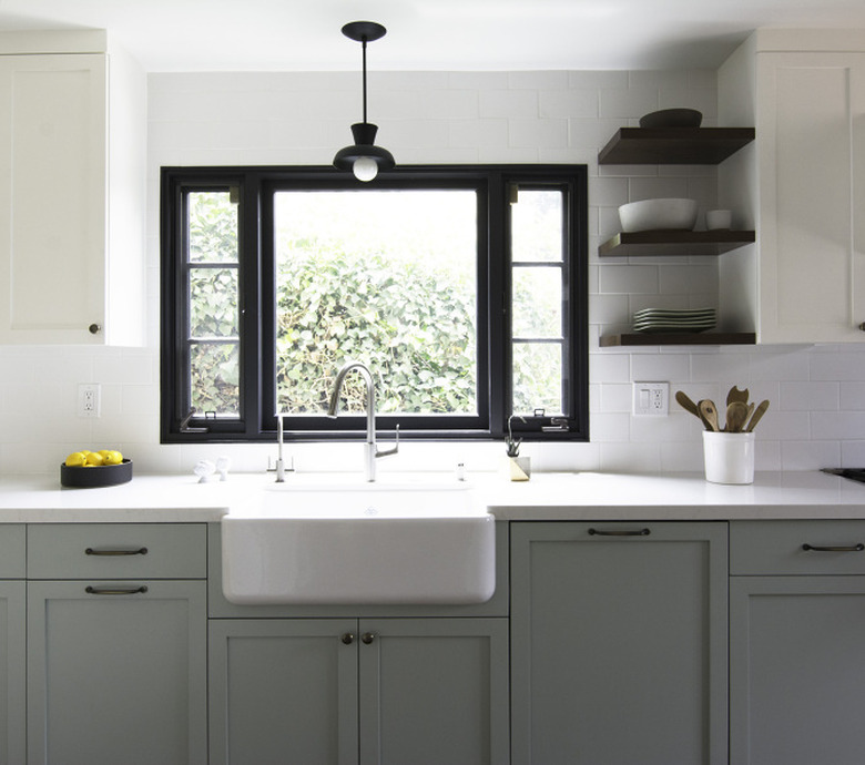
"It's such an easy neutral," says Spector. "It's not too warm and not too cool, and it works well with a lot of color environments. It seems to change throughout the day depending on the light conditions. It's one I never get tired of."
As seen on the upper and lower cabinets.
3. Feather Down, Benjamin Moore
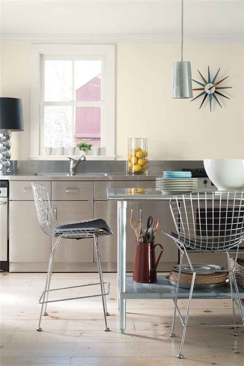
"This is another good neutral, great for cabinets, millwork and molding," says Spector. "For a white, it's a little bit warmer."
As seen on the wall.
"One of my favorites for a colored kitchen," says Sklar. "It's a timeless color that goes in any kind of different direction."
As seen on the lower cabinets.
"I love a white kitchen, but I have found that white is not very forgiving in terms of kids, pets, splashes ... you know, life. There's a lot of maintenance that goes into white," say Sklar.
Pale Oak, which she chose for her own kitchen, is a more durable, yet refined, alternative. "It pulls in the warmer tones of the marble and the backsplash."
As seen on the upper cabinets.
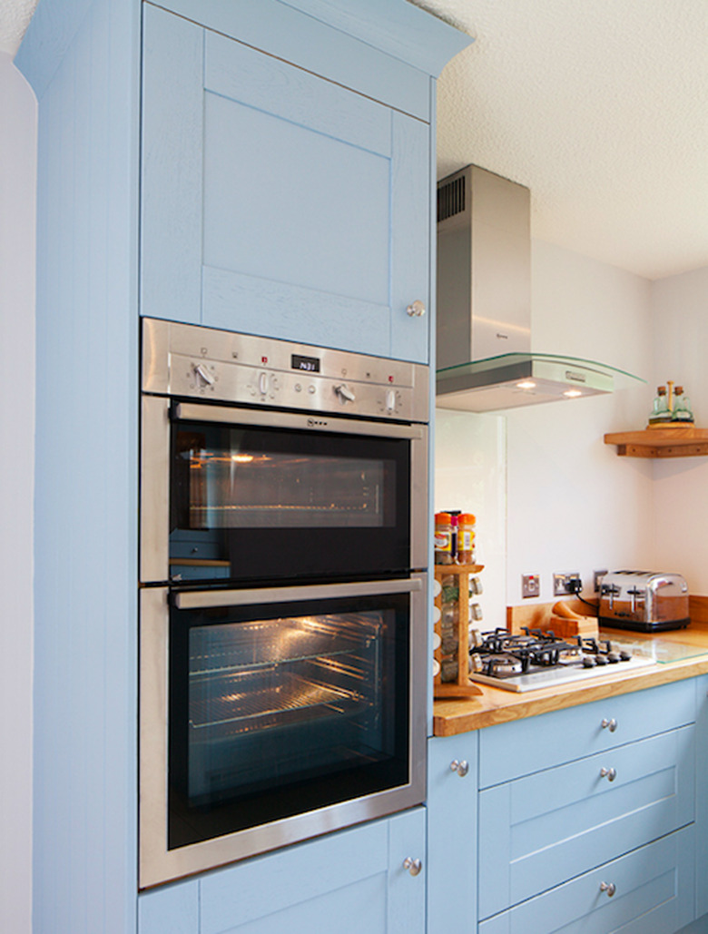
6. Lulworth Blue, Farrow & Ball
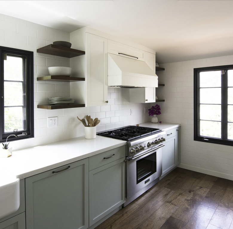
"Even when I am gravitating more toward color, I keep it on the pale side," explains Sklar. "If I could do a kitchen in a color that I haven't done yet, it would be a Farrow and Ball blue that I love, Lulworth Blue. It's like a delphinium blue. It feels not too sweet, not too little boy blue, but a nice gray blue. With brass hardware and with white marble, even soapstone, it could function like a neutral."
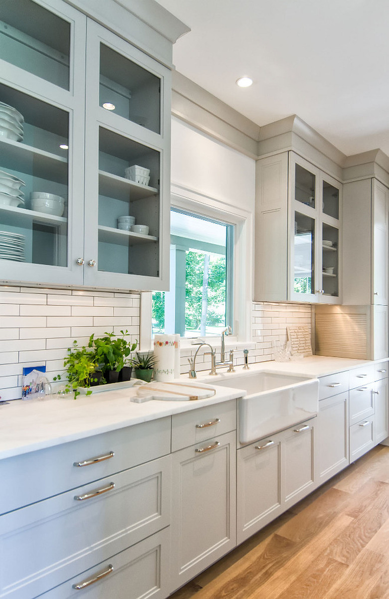
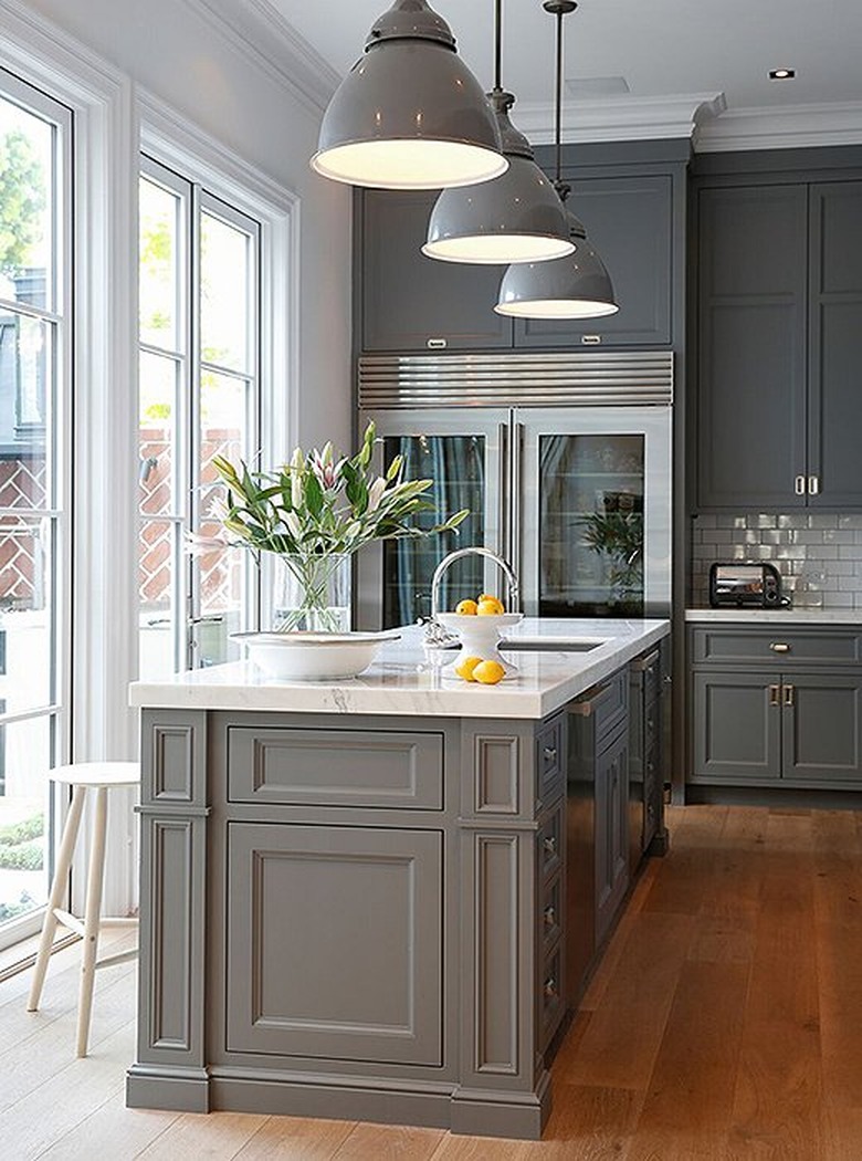
"Gray always provides a classic, sophisticated, and clean base against which art, textiles, wood, and metal look fantastic," designer Susan Greenleaf, of San Francisco, told One Kings Lane. "Regardless of whether a home is modern, traditional, or somewhere in between, gray is a fantastic choice."
As seen on all cabinetry.
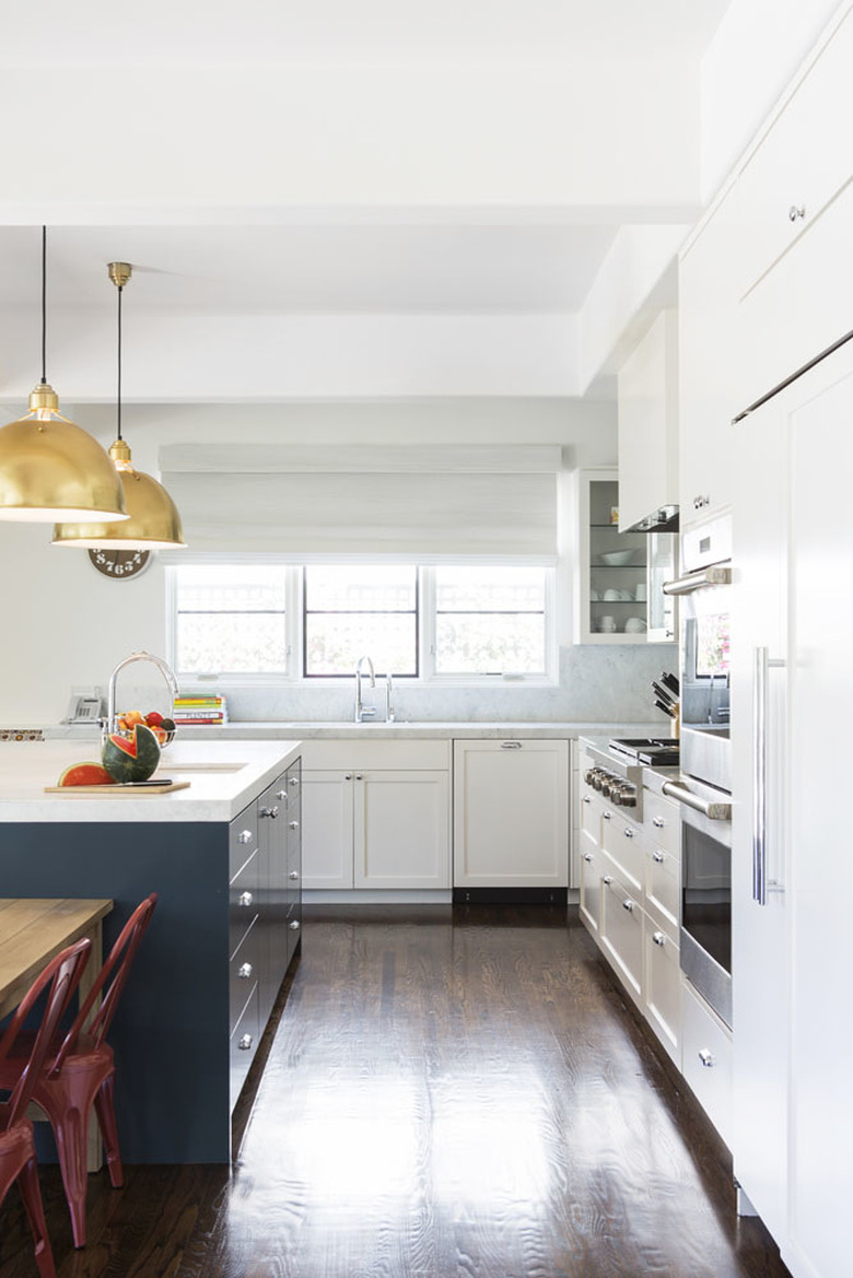
"It has a nice, beefy body to it", says Sklar. "Blue is a tricky color. It can go to sports team blue or baby blue. It has to have enough gravitas to do what it needs to do."
As seen on the kitchen island.
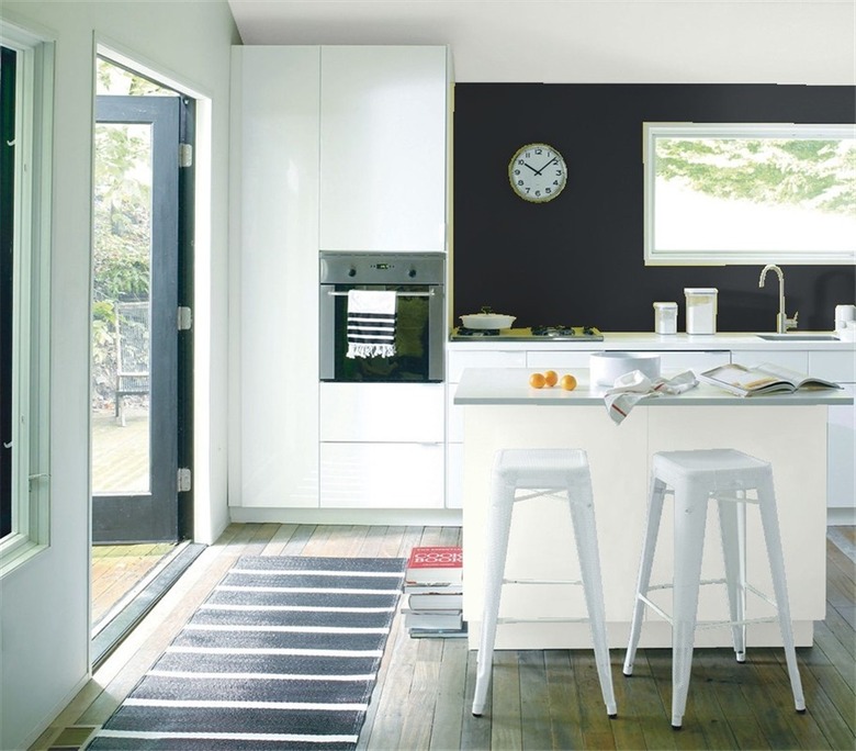
9. Midnight Dream, Benjamin Moore
"A very saturated, deep color that is great to use when you want to go almost black," says Spector.
As seen on the accent wall.
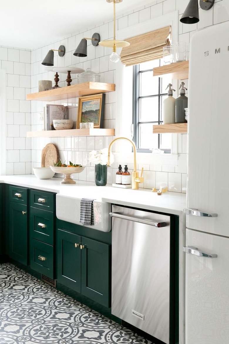
10. Regent Green, Benjamin Moore
This is a darker green, says Spector, and you kind of have to be brave to use it. "It's dark and it's green and it's not a bright color, but it has a very elegant, rich feeling."
As seen on the lower cabinets.
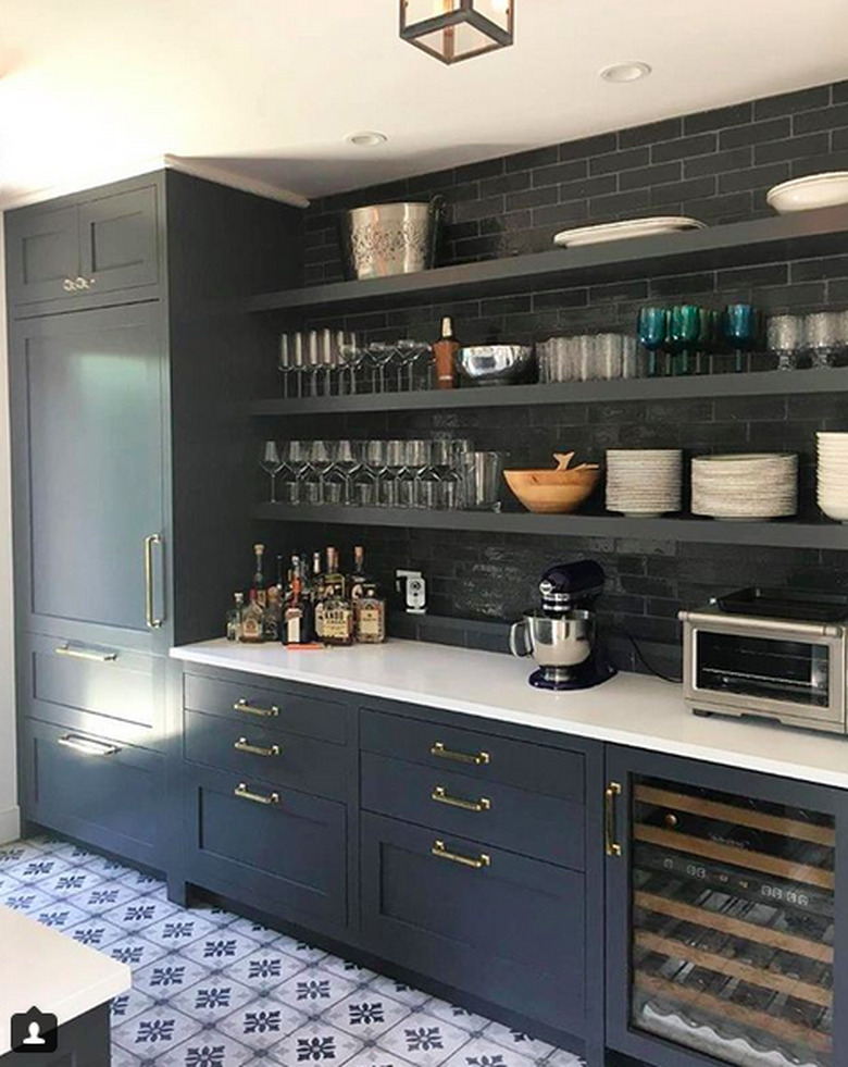
Spector uses this color all the time, and it works well on lower cabinets. "It's a blue black, with a softer feel to it. It's almost the color of night, but still in the blue family."
As seen on all cabinetry.
