20 Brown Kitchen Cabinet Ideas For A Refined Cook Space
While they were all the rage in the '90s and early 2000s, brown kitchen cabinets fell out of favor in lieu of bright white cabinets, and the rest, as they say, is history. Until now. While it's not quite making a comeback, wood cabinetry is again being embraced for its warmth, versatility, and surprisingly neutral backdrop. Gone are the formerly popular dark cherry and espresso tones. Today's brown cabinets showcase rich finishes that accentuate the material's imperfections and allow the grain to come through and serve as a decorative detail.
Brown cabinets are surprisingly versatile, and while they're particularly fitting in midcentury-inspired and contemporary homes, they work in a variety of aesthetics from traditional to farmhouse to modern depending on the finish, door style, and accompanying hardware.
White is an obvious choice to pair with brown cabinets, but colors on the opposite end of the color wheel (such as blue, green, teal, and light gray) also work well. If the cabinets are cherry wood or have a slight red tint, a shade of true green would make a fitting wall color choice.
Need proof that brown cabinets could be right for your culinary space? Here are 20 kitchen design ideas that will undoubtedly convince you.
1. Add warmth to a stark white kitchen.
1. Add warmth to a stark white kitchen.
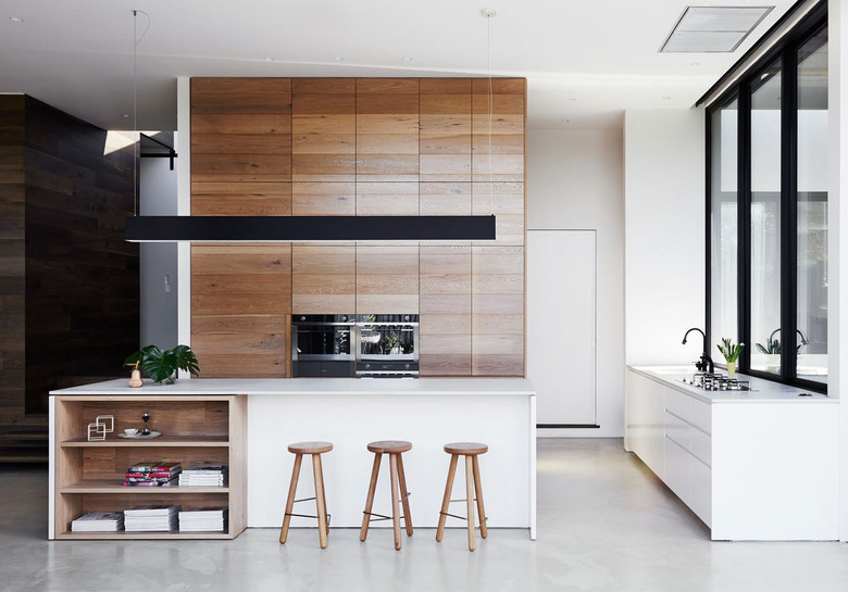
The bold, wood accent wall in this modern kitchen in Melbourne, Australia by Robson Rak is equal parts functional and decorative, bringing character and warmth into the sleek white space while hiding an abundance of storage. The bookcase and stools add additional warmth to the minimalist scene.
2. Welcome two-tone cabinetry.
2. Welcome two-tone cabinetry.
If all-wood feels too heavy (and it can), consider using it on just the top or bottom cabinets as VAE Design Group did in this pared-down yet welcoming cook space. The two-tone design idea — featuring a dark color on the lower half — and tile backsplash introduce a measured amount of color and pattern that adds interest and character. They also provide the added benefit of breaking up all of the wood features, from the ceiling to the cabinets to the hardwood flooring.
3. Highlight the natural wood grain.
3. Highlight the natural wood grain.
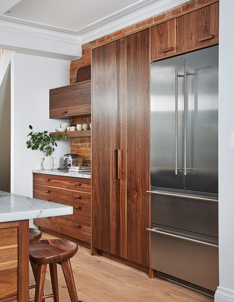
Wondering how to make brown cabinets look less modern in your new kitchen? Follow the lead of Sam Sacks Design and pair them with earthy extras like a brick backsplash, Calacatta marble countertops, and coordinating wood hardware. A large stainless steel refrigerator introduces a modern note that keeps the scheme from reading overly rustic.
4. Embrace updated oak.
4. Embrace updated oak.
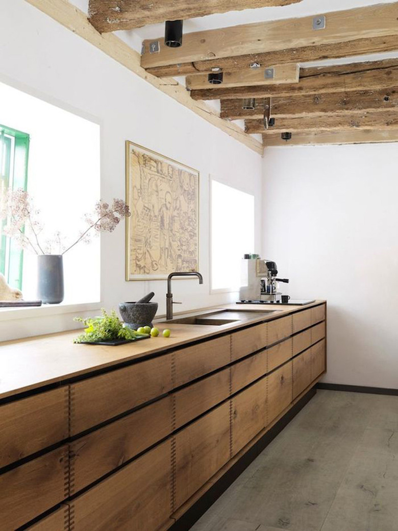
After a long hiatus, oak cabinets are reappearing in the kitchen again thanks to more natural wood stains and countertop alternatives. Traditionally, granite countertops were used, which didn't work well with darker oak finishes (which were oh-so-popular back in the day). This sophisticated yet approachable cook space spotted on Style Files demonstrates how a minimal kitchen can be inviting with the strategic use of thoughtful details, such as rough-hewn beams and bespoke cabinetry with visible joinery.
5. Skip the ornate details.
5. Skip the ornate details.
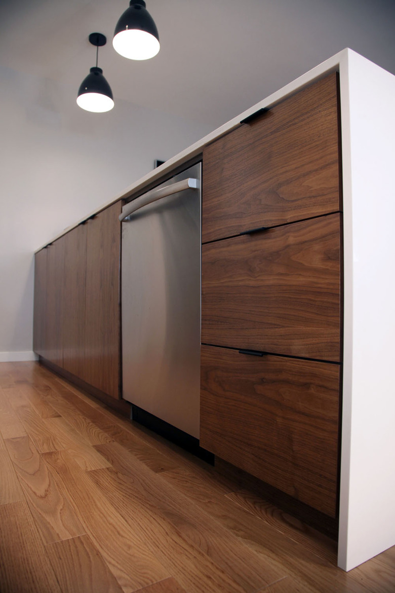
Aside from dark cherry wood, other hallmarks of dated '90s kitchen design include ornate carvings and fussy details that are meant to look more expensive. This modern culinary space by Amy Sklar is proof that dark finishes can still work if you opt for flat front cabinetry and barely-there hardware.
6. Add an industrial component.
6. Add an industrial component.
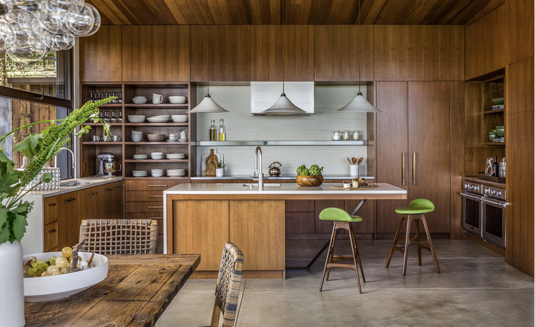
Wall-to-wall wood paneling takes an industrial edge in the kitchen of this California Wine Country home by Adeeni Design Group, with the addition of concrete floors and countertops and stainless steel appliances and accessories. There may be a lot of brown wood featured here, but ample windows and complementary materials provide a welcome counterpoint.
7. Consider reclaimed wood.
7. Consider reclaimed wood.
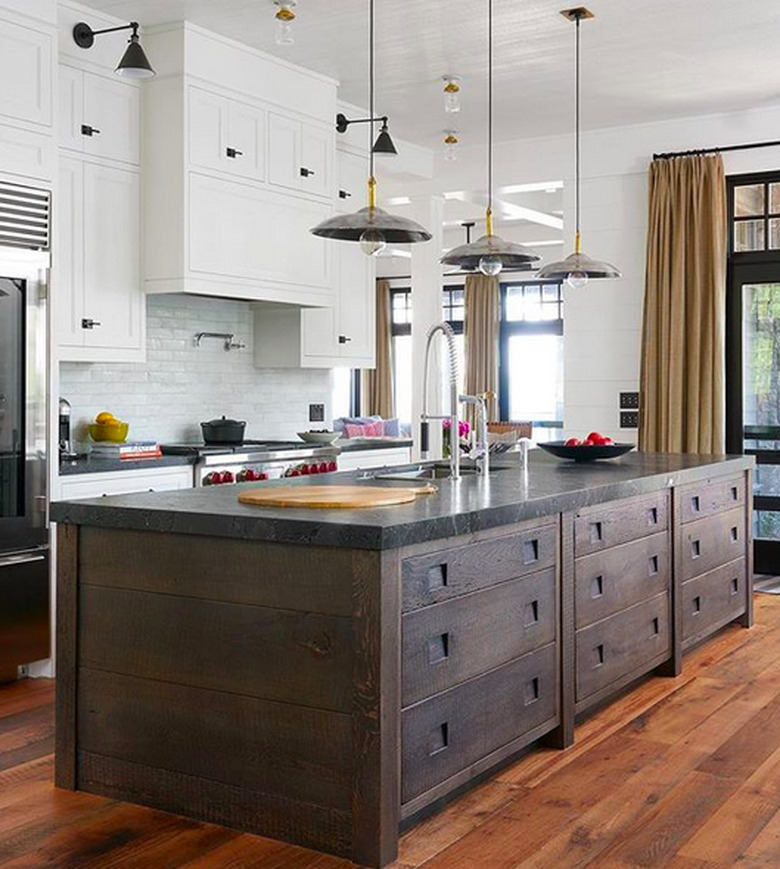
Reclaimed wood infuses cabinetry with an organic look and a storied feeling that's hard to replicate with other types of wood. Take notes from this Muskoka cottage setup by Studio McGee that showcases the weathered material on a custom kitchen island. The black marble countertop and barn-style pendant lights are a nice finishing touch.
8. Use complementary materials.
8. Use complementary materials.
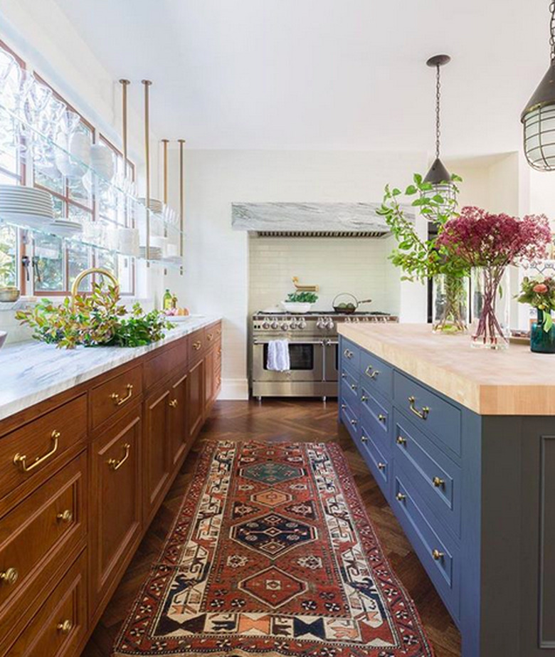
Katie Leclercq called upon a mix of materials — marble counters, a butcher block-topped island, white subway tiles, and brass hardware — to add a rich and timeless quality to this modern brownstone. All of these elements work together and keep the wood cabinets from feeling dated.
9. Include rustic charm.
9. Include rustic charm.
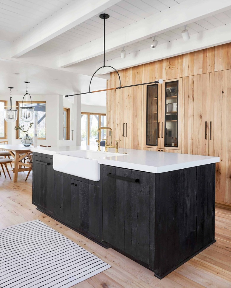
Lean into the rustic appeal of brown cabinets by selecting reclaimed wood in its most natural state. Emily Henderson used it to mask ample storage, as well as the refrigerator and freezer, in her mountain home with beautiful results. The cabinetry transitions seamlessly to the light wood flooring.
10. Embrace original details.
10. Embrace original details.
There's beauty in preserving original details, such as the brown cabinets in this cook space, which read more charming than outdated thanks to the addition of a vintage stove. The white components — walls, appliances, and tile countertop — keep the look crisp and clean.
11. Don't stop at wood cabinets.
11. Don't stop at wood cabinets.
Impart warmth and an organic quality to your kitchen remodel by pairing brown cabinets with tonal floors, walls, and ceilings. White countertops and stainless appliances lend this cozy cabin-inspired cookery a modern note.
12. Go for moody vibes with a black stove.
12. Go for moody vibes with a black stove.
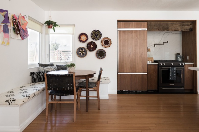
Upgrade utilitarian appliances from a purely functional buy to a design consideration by selecting one in a unique color or finish. The black stove in this streamlined kitchen adds depth and contrast to dark brown cabinetry and a marble backsplash. The edgy color choice is a welcome alternative to ubiquitous stainless steel or white.
13. Add interest with tile.
13. Add interest with tile.
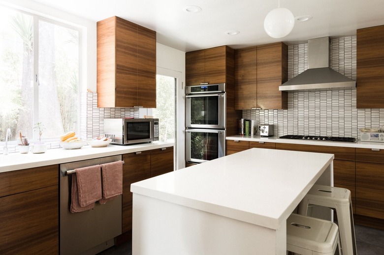
The visible grain in brown wood injects personality and interest to interiors. Keep the look from being visually cluttered by downplaying other elements. For example, the backsplash in this contemporary kitchen has a linear pattern that mimics the wood grain, adding a layer of detail that enhances, rather than detracts, from the cabinetry.
14. Include subtle color.
14. Include subtle color.
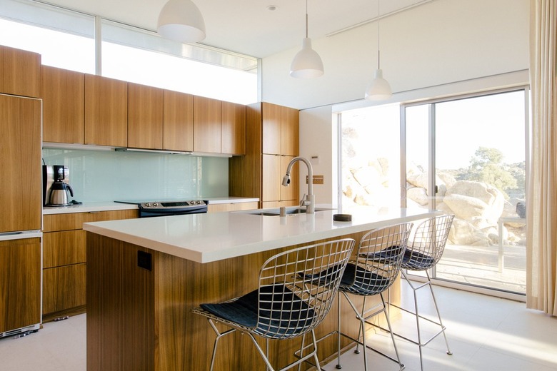
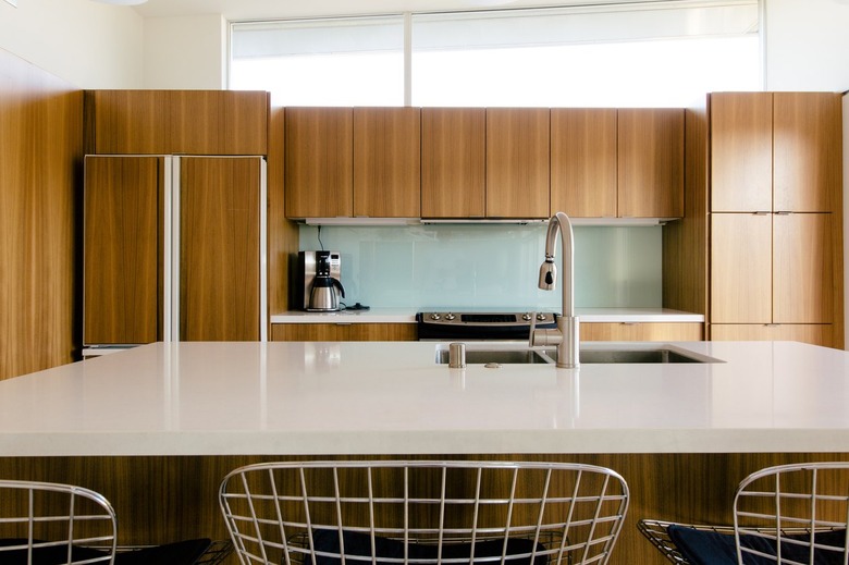
Pair brown cabinets with muted colors to temper their inherent severity. A barely-there, sea-green glass backsplash injects a subtle dose of color into this sleek cook space, giving it a soothing quality that's further complemented by white countertops and natural light.
15. Opt for high contrast.
15. Opt for high contrast.
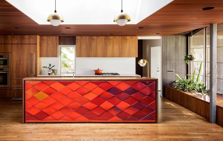
Despite the dominance of brown wood, an island clad in eye-catching red ombre tile becomes the focal point in this midcentury modern home refurbished by Jessica Helgerson. Plants, greenery, and plenty of natural light keep the look bright and welcoming without distracting from the pièce de résistance.
16. Highlight a special feature.
16. Highlight a special feature.
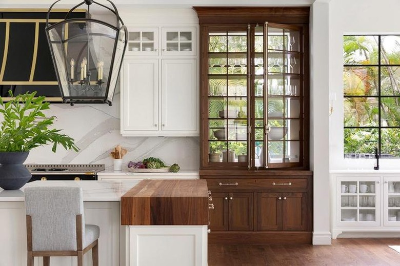
Break up the monotony of an all-white cook space by focusing on a singular design feature, like the elegant custom hutch in this kitchen by Bria Hammel. Among a sea of white cabinets, the lone wood cabinet adds depth and a welcome dose of contrast.
17. Coordinate with ceiling beams.
17. Coordinate with ceiling beams.
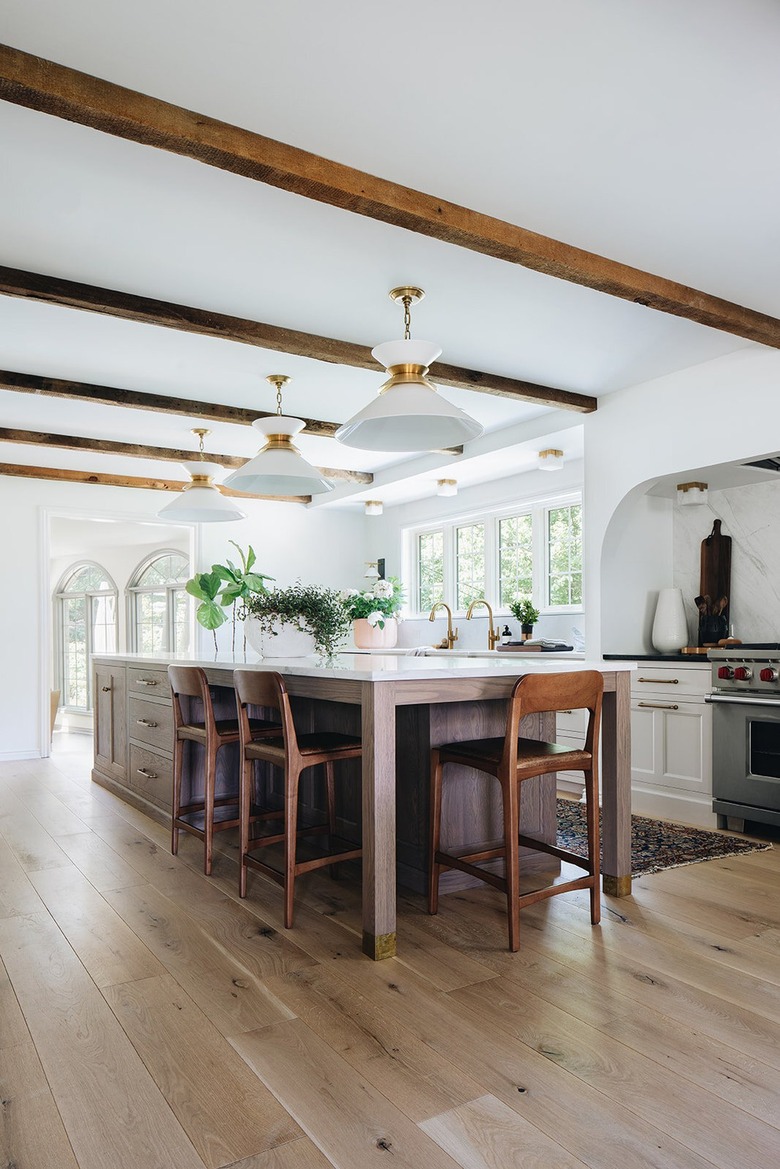
Cabinets stained the same tone as exposed beams ground a kitchen makeover from above and below. This elegant space by Jean Stoffer is anchored by a series of wood ceiling beams, as well as a brown island — both of which add dimension and balance to an otherwise neutral space.
18. Update a traditional farmhouse scheme.
18. Update a traditional farmhouse scheme.
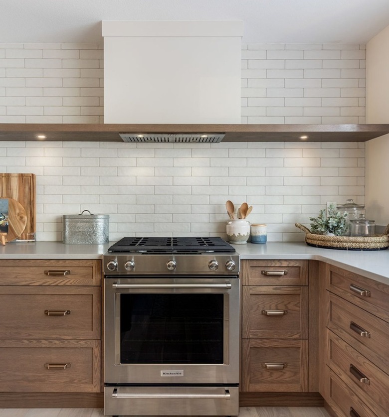
More often than not, farmhouse kitchens feature bright white cabinets. While there is nothing wrong with that approach, we say live life on the edge and opt for brown cabinets instead — like the shaker style that Helm Design Co. used in this light-filled culinary space. The elongated subway tile, absence of upper cabinets, and an abundance of drawers are refreshing and modern alternatives that complete the country-inspired scene.
19. Employ a specialized paint finish.
19. Employ a specialized paint finish.
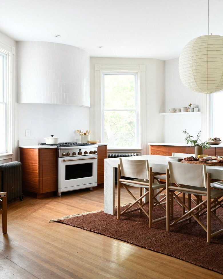
Balance the heaviness of dark brown wood cabinets with the ethereal quality of limewashed walls. The plaster finish adds texture and reflects light, as beautifully demonstrated in this calming kitchen by Leanne Ford. A rounded hood and a rice paper pendant soften the dominant angular lines.
20. Highlight the hood.
20. Highlight the hood.
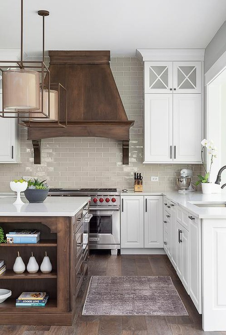
For the more is more type, dark brown wood makes quite the statement in a traditional kitchen when it's used to clad a range hood, too. For example, the French-inspired number in this cook space by LC Interiors adds visual weight, is a striking counterpoint to the muted color scheme, and coordinates with the expansive island and wood flooring.
