Pin This Kitchen Reno For When You're Ready To Re-Do Your Own
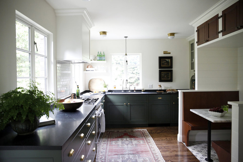
Renovating a kitchen can be a massive headache — you know, the kind that tears families apart? That's why you call in the pros. Case in point: When a young family was looking to transform the dated kitchen in their Seattle home, they turned to architectural designer Katie Hackworth to create a space that would be intimate and cozy — the spot in the home that would bring everyone together. So Hackworth worked to open up the room and bring in elements of warmth. She omitted upper cabinets and instead installed windows to give the kitchen a new feeling of spaciousness; custom booth seating and clever hunter green accents create a homey vibe.
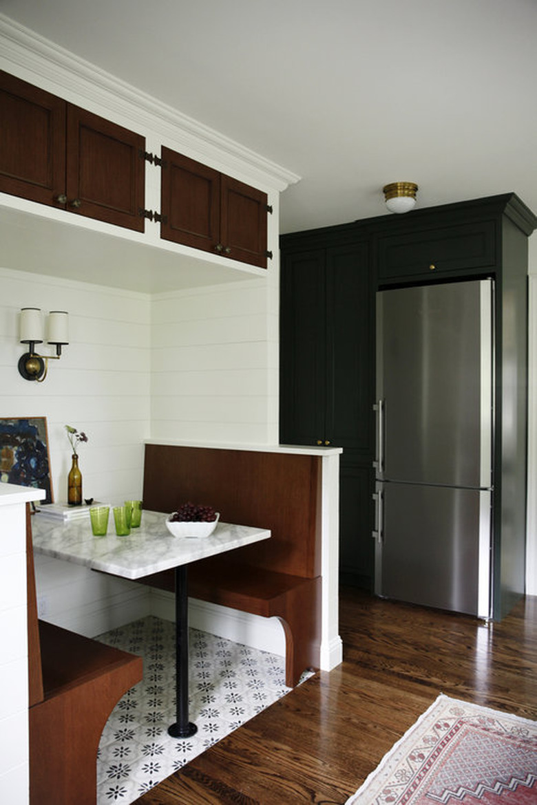
What we love most, however, is the amazing amount of storage in a kitchen that, while not teeny, isn't huge, either. Note the built-in surrounding the fridge, which manages to provide extra space while naturally integrating a bulky appliance. The result is a place where you can cook, socialize, and comfortably dine as a family.
1. Kitchen
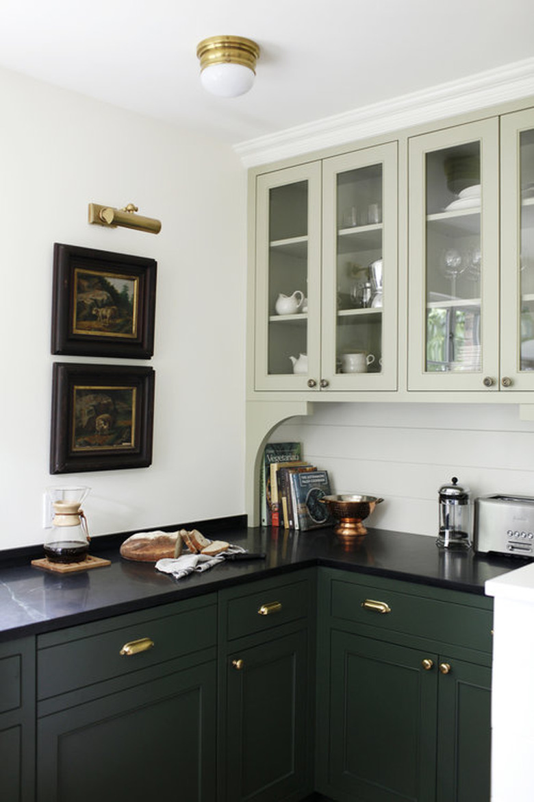
Custom glass and wood cabinets were designed by Hackworth and painted in Crisp Linen White by Benjamin Moore. A mix of dark and light tones are accentuated by gold details.
2. Kitchen
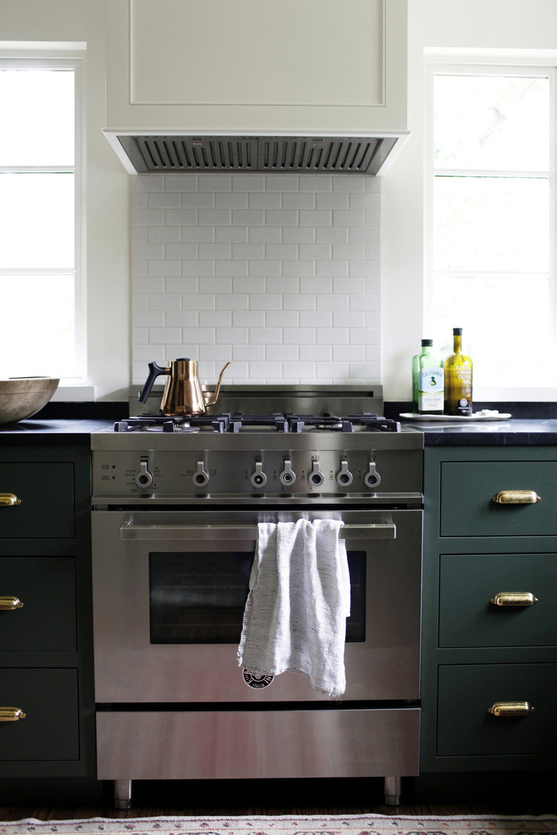
In order to fit more items in the kitchen, Hackworth and the clients had to get creative. "The client wasn't afraid to scale down their appliances, opting for a 36-inch range (Bertazzoni oven), and 30-inch (Leibherr) fridge and freezer," Hackworth said.
3. Kitchen
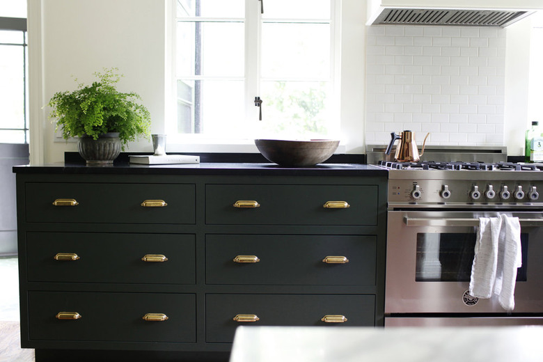
Cabinets were custom designed by Hackworth and fabricated locally. The dark green paint used for the cabinets is Chimichurri by Benjamin Moore. The hardware's gold finish matches the gold finish of the lighting throughout the kitchen.
4. Kitchen
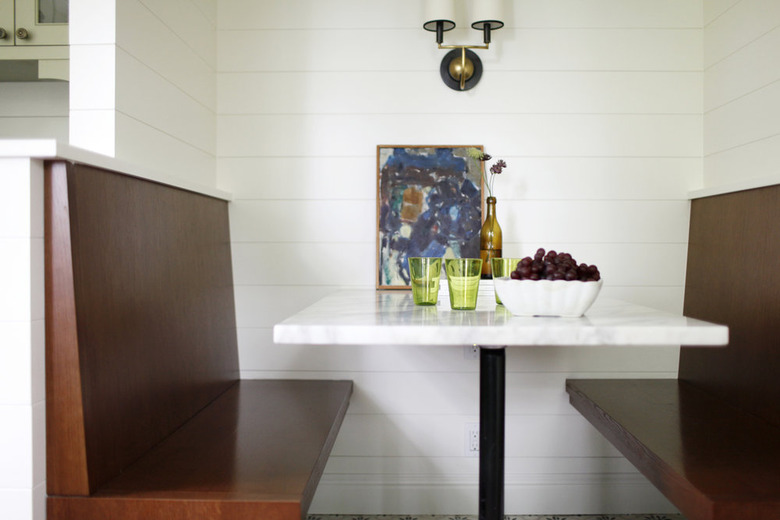
"We needed to pack a lot into a little space: full kitchen, pantry, and casual dining area," Hackworth said. The dining booth was a custom design by the interior design firm and was fabricated locally.
5. Kitchen
A honed marble table top and stained white oak bench provide the perfect place for the family of four to unwind before dinner. While the dark green makes the kitchen area feel more intimate, the white wall paint in Benjamin Moore's Crisp Linen White reacts to the light to make the room feel more spacious.
6. Dining Area
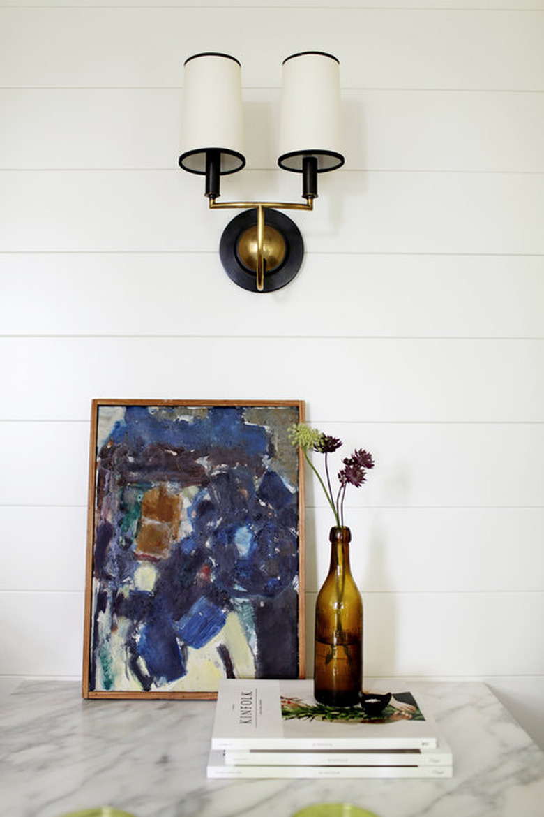
With a great mix of vintage and contemporary, the design has a timeless appeal.
7. Kitchen Nook
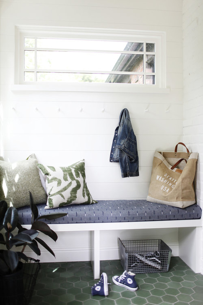
Hackworth designed many of the furniture pieces, including a comfy bench where people can drop off shoes, coats, or grocery bags.
8. Kitchen Nook
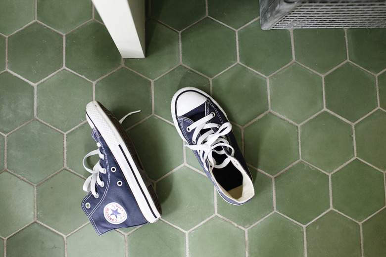
In the kitchen alcove, Hackworth used green floor tiles by the New York tile company, Mosaic House.
