A Live/Work Space For Two Graphic Designers Where Everything Is Placed Just-So
For Howard Yu and William Sun of Taiwan-based architectural firm Studio In2, creating a live/work space for a couple working in graphic design meant starting at a point close to the clients' interests — their careers. So their approach to renovating the New Taipei City apartment relied on a grid system, using blocks and lines as guides for arrangement of furniture and design elements. The second step was adding color, shadow, and texture to give the design dimension and depth.
The result is an 820-square-foot minimalist home built around angles, where every placement feels intentional.
1. Entrance
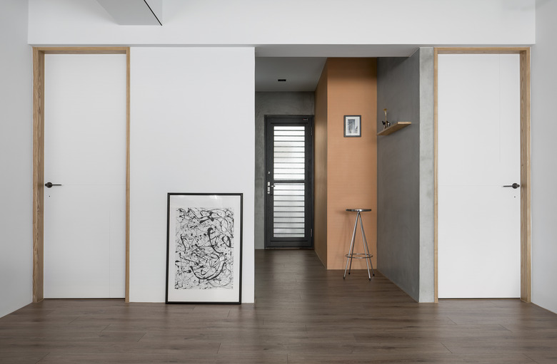
The high-concept space uses many materials that feel like the product of exacting manufacturing — like the laminate flooring used throughout the house to achieve a linear and cohesive smoothness.
2. Living Room
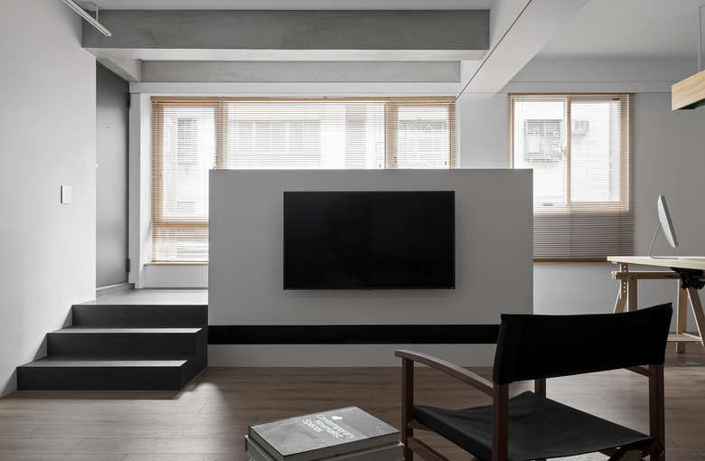
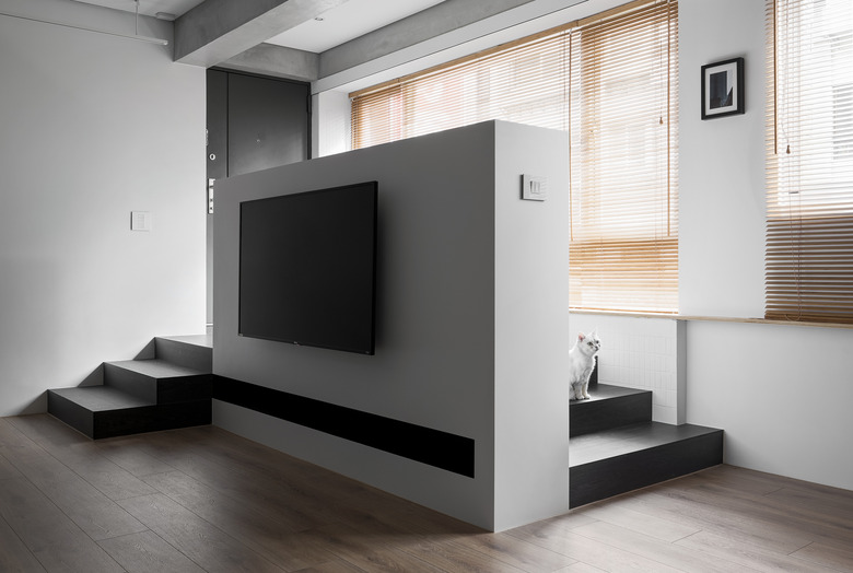
A play on symmetry, the half-wall is a successful experiment in dimension and light.
3. Living Room
The home relies on a mostly minimalist color palette, however hues were chosen and placed intentionally, creating an almost Tetris-like feel.
4. Living Room
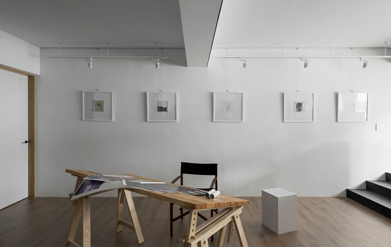
The flat is also decorated in graphic art. A collection of framed works, created by graphic design firm Herethere Studio, hangs in a row on the white wall.
5. Living Room
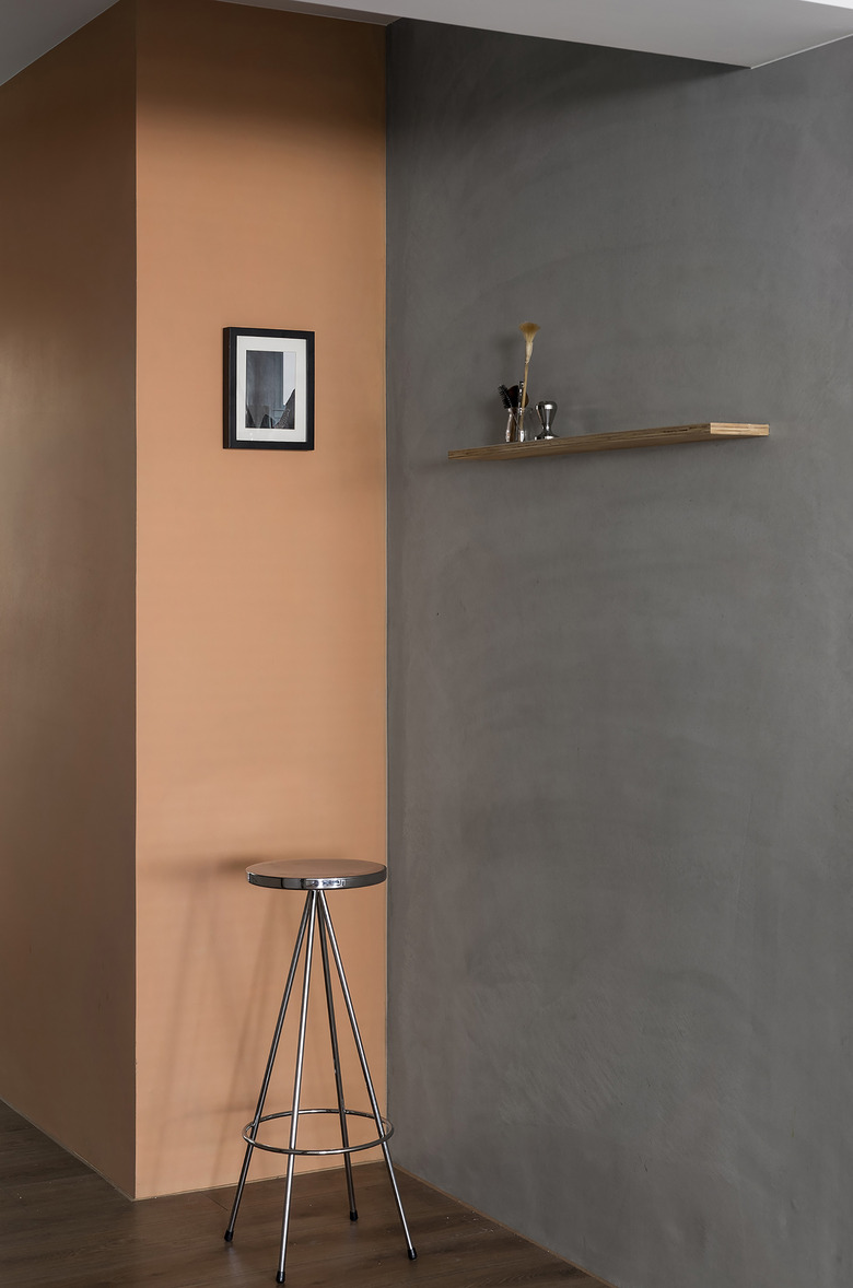
A wall section painted in a peachy tone by Dulux adds a pop of color to the space while an adjacent concrete wall mixes up the composition.
6. Home Office
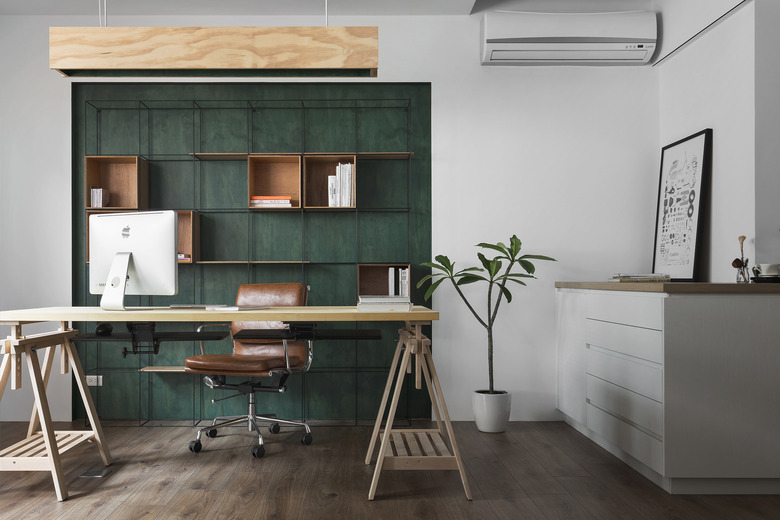
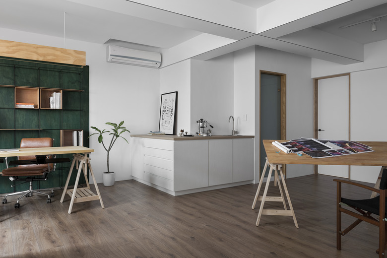
The furnishings are a high/low mix. While the office chair was purchased from Ikea, the unique desks were custom-designed.
7. Home Office
This corner of the office brings in more natural elements with a plywood light fixture, plant life, and a custom bookcase painted in a rich green that feels forest-like.
8. Kitchen
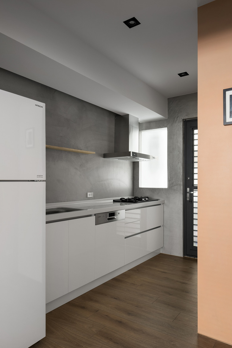
The kitchen feels more secluded from the rest of the apartment. This gives the couple time to cook alone or together, without interruption. The coffee station is nearest to the home office space. Perfect for the caffeine-inclined worker.
9. Bedroom
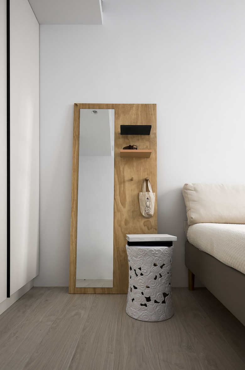
Stealing this idea: A simple plywood board acts as a vanity meets bookshelf.
10. Bathroom
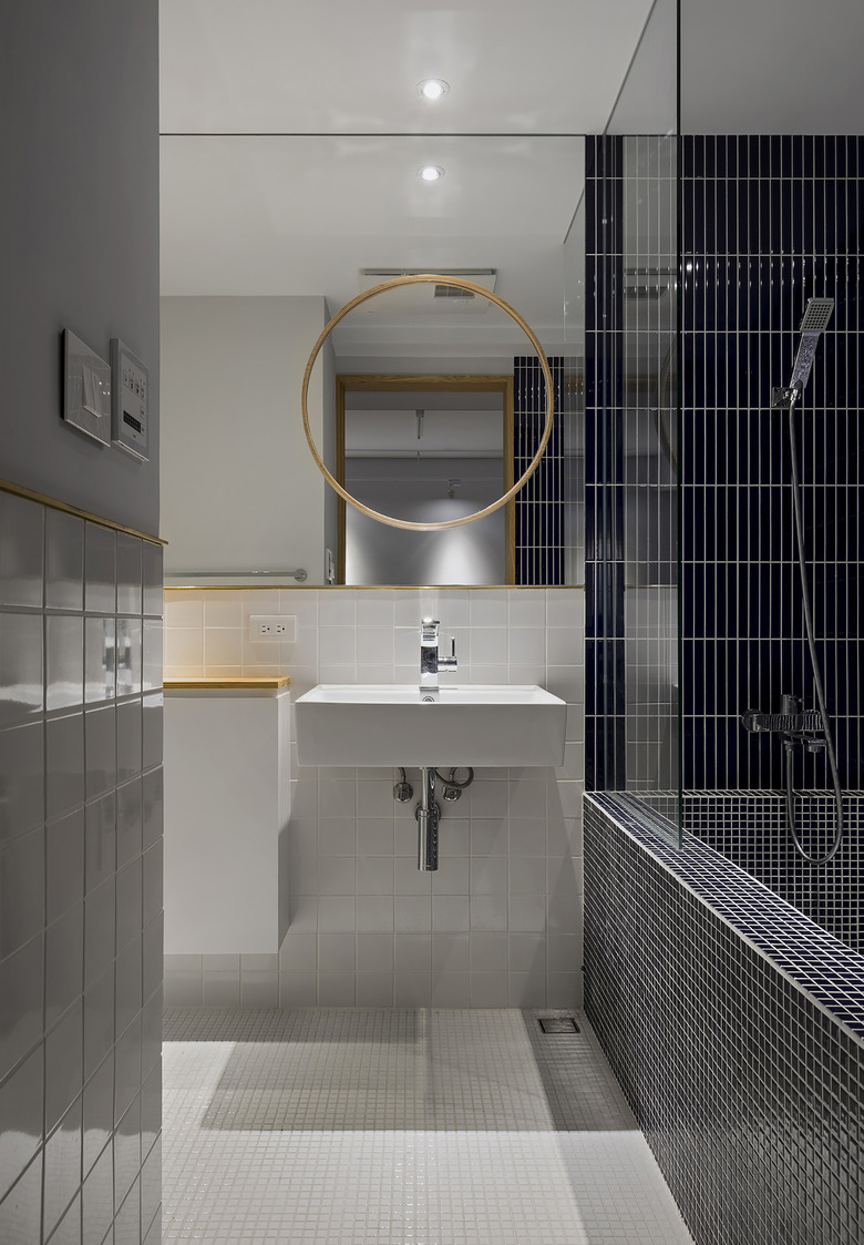
In the bathroom, groupings of tile in different square and rectangular shapes drive home the designers' concept.
