You Won't Believe How Much Fits Into This 225-Square-Foot Micro Studio Apartment
Moving into a tight studio apartment doesn't mean having to sacrifice style and clean lines. Space-saving guru and architect Michael K. Chen and team members at his firm MKCA confirmed this by redesigning a client's 225-square-foot apartment unit in New York City's West Village into a beautiful and multifunctional space.
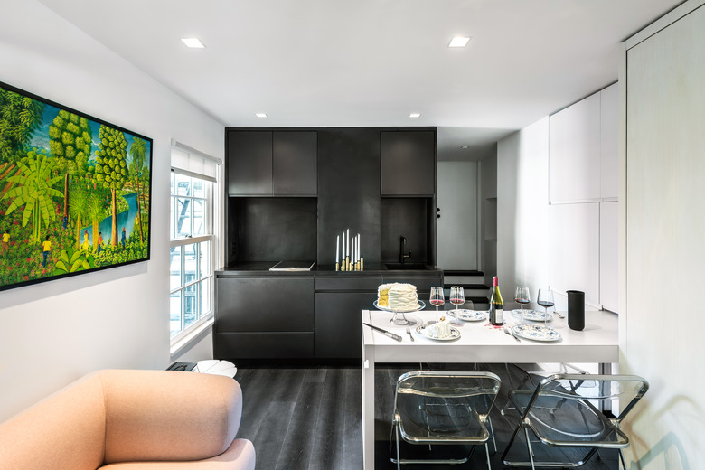
Before Chen and his team members Braden Caldwell and Julian Anderson embarked on the renovation, the unit barely had enough room to fit a bed. So they decided to use an attic space that was only five feet tall as a place to install fold-out elements. The nucleus of the room became a six-foot dining table that folds out from the wall and functions as a desk, counter space, and place to eat.
"Our approach is always based on measuring and modeling a space carefully, and being extremely sensitive to the body, and thinking about how people move in a space," Chen told Hunker. "When we design multifunctional spaces, we think about as many different scenarios for use as we can, and map out how they will take place in a space."
But making the best use of the tiny space wasn't the only challenge faced by Chen and team. The unit is located in an 1840s landmarked apartment building. In order to modernize a unit that has seen close to two centuries, the team had to rebuild the inside to make the unit safer, more economical, and more sustainable. They had the space gutted to the studs and rebuilt using new thermal and waterproofing systems. The team also made extensive upgrades to the wood structure. The result is a home that feels modern and spacious, and is an example of the future of urban living.
1. Living Area
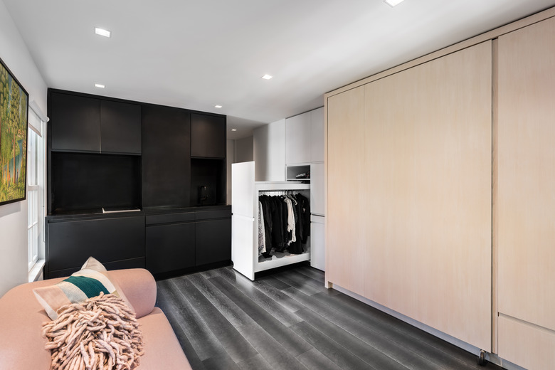
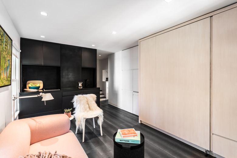
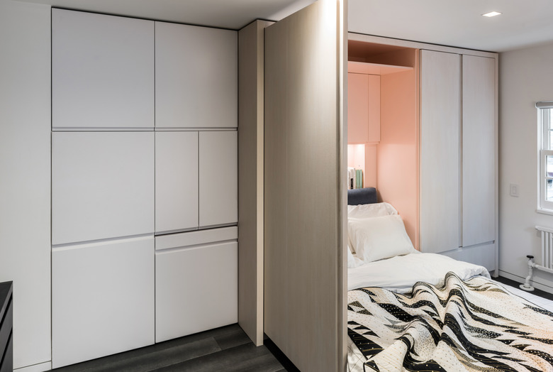
The space's entire back wall is covered in a bleached-ash and custom lacquered millwork storage unit with fold-out elements installed by contractors at Think Construction and fabricated by JH Works.
2. Living Area
A white, midcentury Arne Jacobsen Grand Prix chair is an element of the space's mix of old and new. And a small side table from Blu Dot functions a coffee table when the dining space is folded away.
3. Living Area
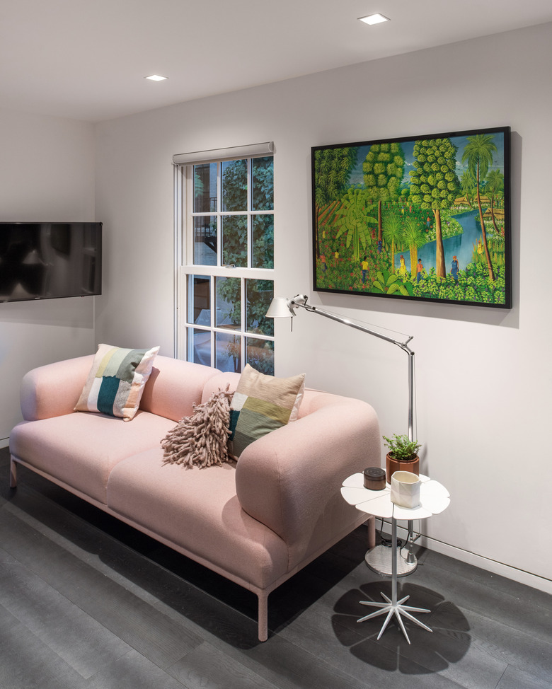
An understated Bjørn sofa from Hay covered in blush Maharam Divina fabric offers a pop of color.
4. Living and Dining Area
The majority of the unit is gray scale, with ebonized white oak flooring from PID Flooring setting the tone for the color direction.
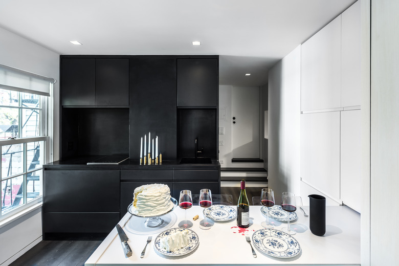
The key to transforming the apartment into a multifunctional space, the firm believed, was finding a way to incorporate the largest table possible. So they designed a retractable six foot-long table that seats five when folded out. Vintage Plia chairs by Giancarlo Piretti function as chic yet foldable dining seats.
5. Dining Area
Custom windows from Marvin are matched to the specifications of the original landmarked windows. Units in centuries-old apartment buildings can sometimes take on a dark, Victorian appeal, and a gold candle set by Lindsey Adelman helps the space straddle the line between modern and gothic flawlessly.
6. Bedroom Area
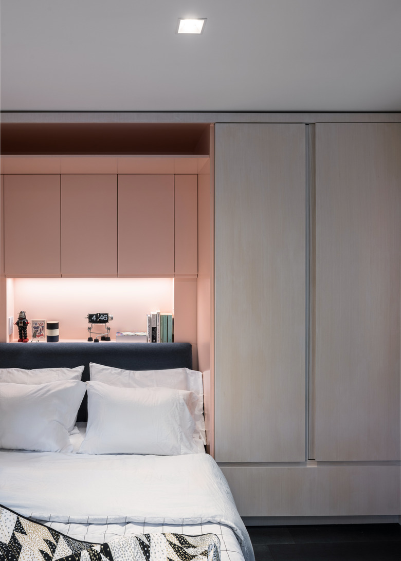
Above the pull-out bed, a pink-y paint from Benjamin Moore called Precocious is a perfect complement to the gray colors found throughout the rest of the unit.
7. Bedroom Area
The bed has a headboard made from mohair, and down-lights from Element Lighting are installed in the ceiling.
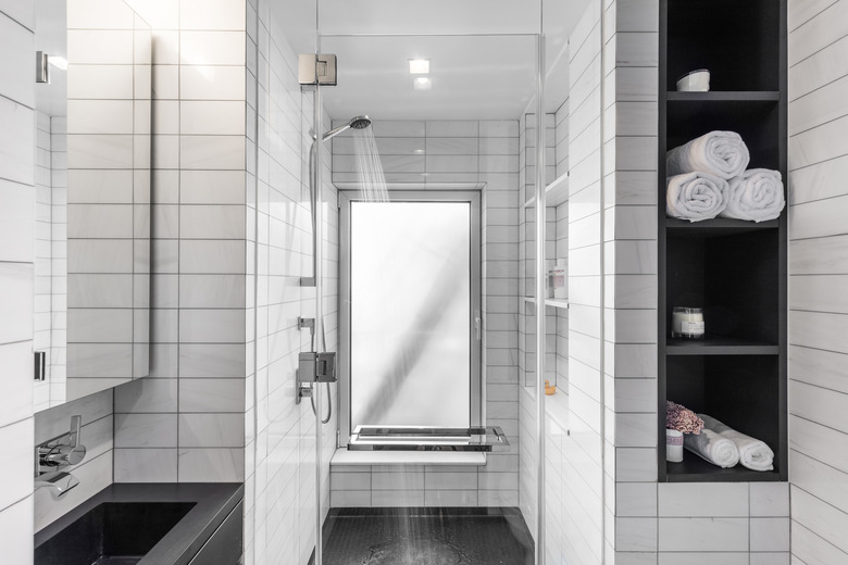
8. Bathroom
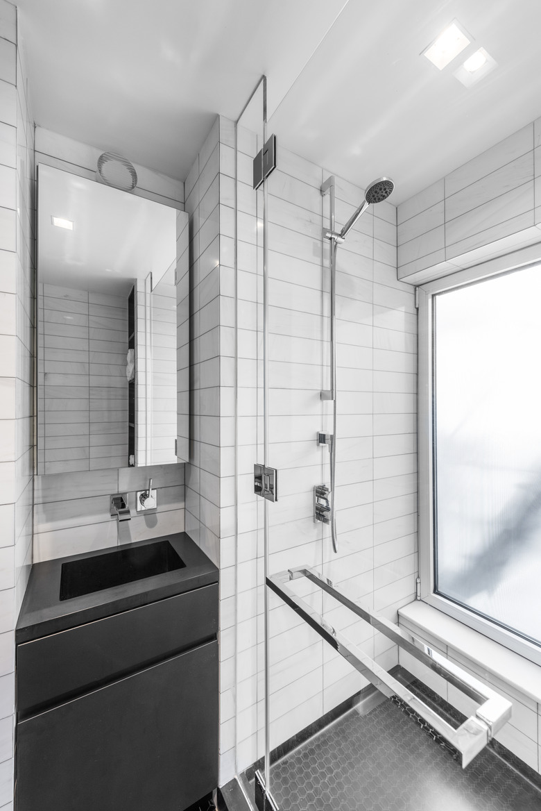
Benjamin Moore Super White paint is used in the high-design bathroom. The shower basin is made of a custom black Corian material and the shower tiles are Bianco Dolomite marble.
9. Bathroom
The shower fittings and faucets are by Dornbracht. The bathroom is surprisingly well equipped, considering the tiny square footage of the apartment unit.
