We Can't Stop Looking At The Before/After Pics Of This Midcentury Reno
L.A.'s gothic-style Shakespeare Bridge is one of those things locals and tourists alike have on their to-do lists. Located in Los Feliz, the 1926 bridge is emblematic of a golden time in Hollywood — meaning properties around there are highly coveted.
So when a creative director purchased a tired, midcentury house close to the landmark, it quickly became clear that the home wasn't reaching its full potential. Architect Robert Sweet of Ras-a Studio and interior designer Martha Mulholland were brought in to revive the structure, adding windows to provide a better view of the bridge, and establishing an aesthetic that's masculine and minimal with pops of color.
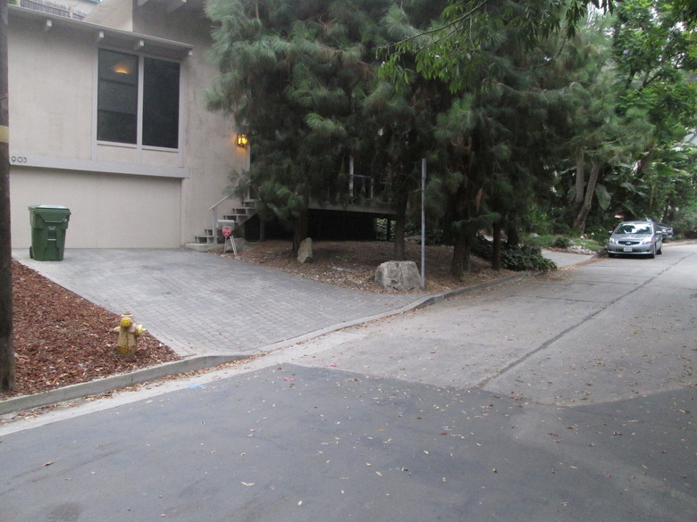
1. Exterior: Before
The midcentury house had great bones, but it had not been maintained and was in need of a full renovation.
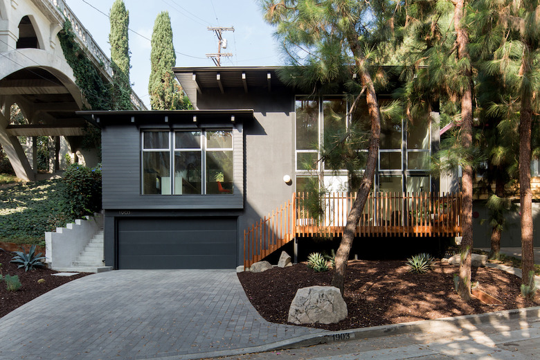
2. Exterior: After
Sweet refreshed the exterior and retrofitted the existing post-and-beam roof with insulation and a reflective coating. New low emission windows help eliminate the need for artificial light during the day.
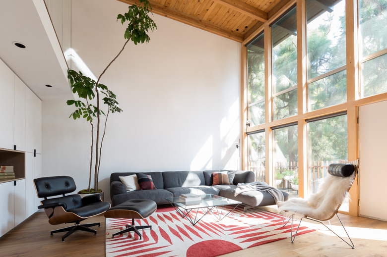
3. Living Room
The light-filled living room's modern furniture is balanced by touches of color and texture. The Tufenkian rug is a fun contrast to the classic Eames chair and Paolo Piva coffee table.
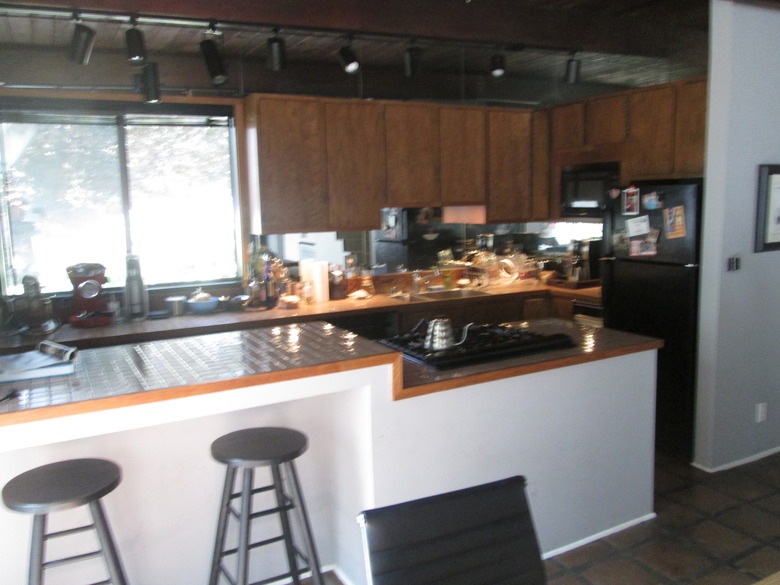
4. Kitchen: Before
The dated kitchen's bulky upper cabinets were removed to streamline the space.
5. Kitchen: After
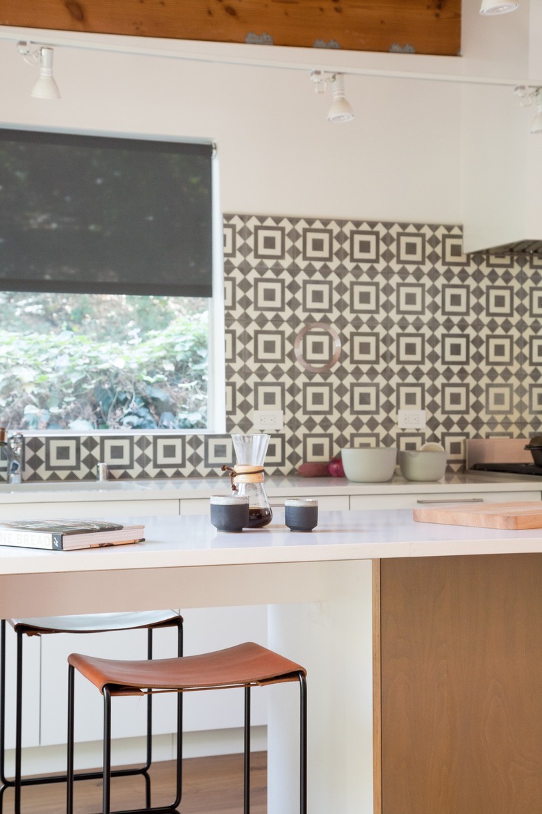
The Granada tile that Sweet installed in the kitchen informed the style of the rest of the interior. The white walls and countertops help brighten up the room. Ten10 barstools were added to create a casual dining spot.
6. Dining Room
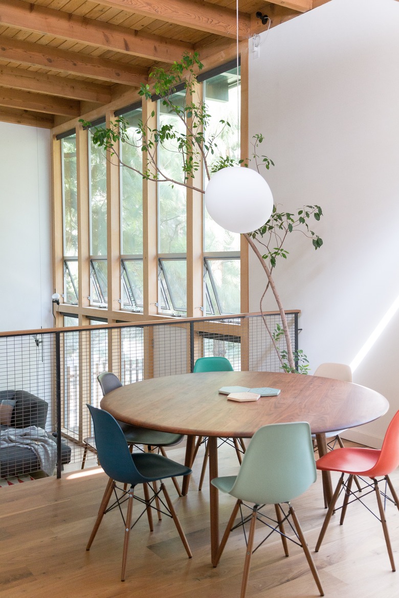
The dining chairs and table were already part of the homeowner's collection of midcentury modern furnishings. "The client gravitated towards iconic midcentury pieces that I tend to avoid in my work, so it was a fun challenge to integrate classic designs with more unexpected elements," says Mulholland.
7. Bedroom
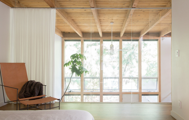
The glass partition between the master bedroom and the double-height living room lets the owner enjoy the scenic views from bed. The curtains can be drawn for privacy.
8. Bathroom
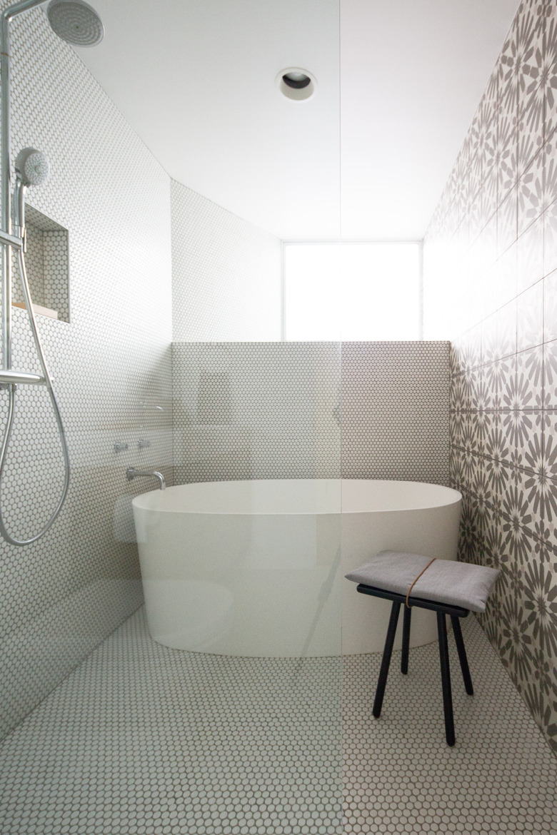
The shower and bath were arranged in the same space. The graphic tile echoes the design used in the kitchen.
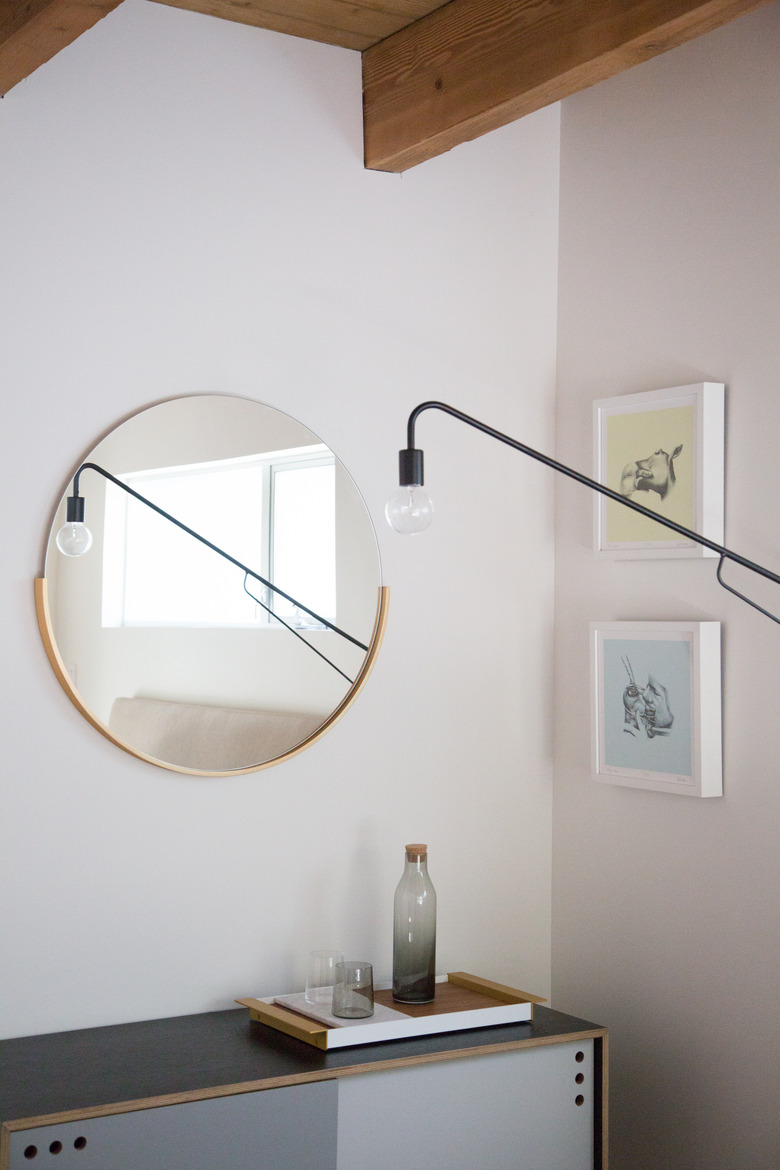
9. Guest Room
A Crate and Barrel mirror hangs above a Woud sideboard in the guest bedroom. The wall light is by Onefortythree.
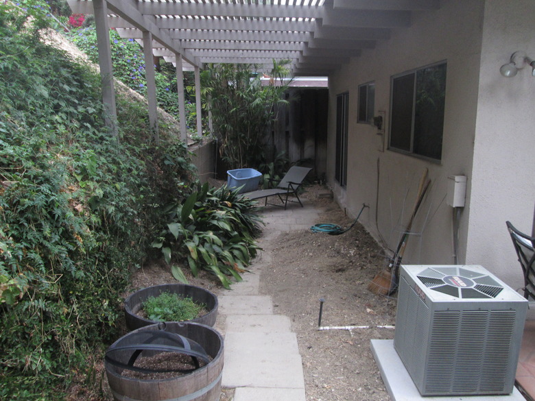
10. Terrace: Before
The untended area on the side of the house was revived into a functional terrace.
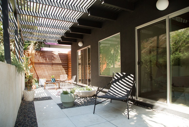
11. Terrace: After
New pavers, potted plants, and outdoor furniture were all that was needed to create a shady spot for entertaining.
