Before/After: An 1880s Row House Goes From Disaster To Farmhouse Fantasy
At first glance, this 1880s brick townhouse in Lancaster, Pennsylvania looked dark and dated. But Kate Hostetter of Brentwood Builders saw its full potential — starting with the back yard. "When we initially walked through the home it was somewhat of a disaster, but the backyard was such a gem," Hostetter says. "I immediately drew inspiration from that area of the house and wanted to carry that feeling through the interior." To make the 1,000-square-foot home feel bigger, Hostetter and the rest of the team, including her husband, Brent, worked with fellow local firm Renovations by Dienner to optimize the layout by removing walls and changing the orientation of the staircase. The first floor ceiling beams were exposed and painted white to make the space feel less claustrophobic.
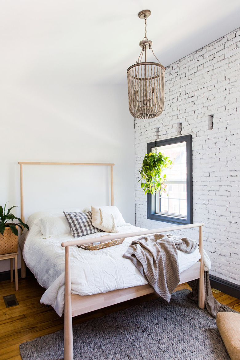
The second floor was also overhauled. The ceiling of the master bedroom was raised to the roofline and a brick wall was exposed and painted. They also added a second full bath upstairs so each bedroom would have its own bathroom. The finished project bears little resemblance to the old house — the sign of a successful gut renovation.
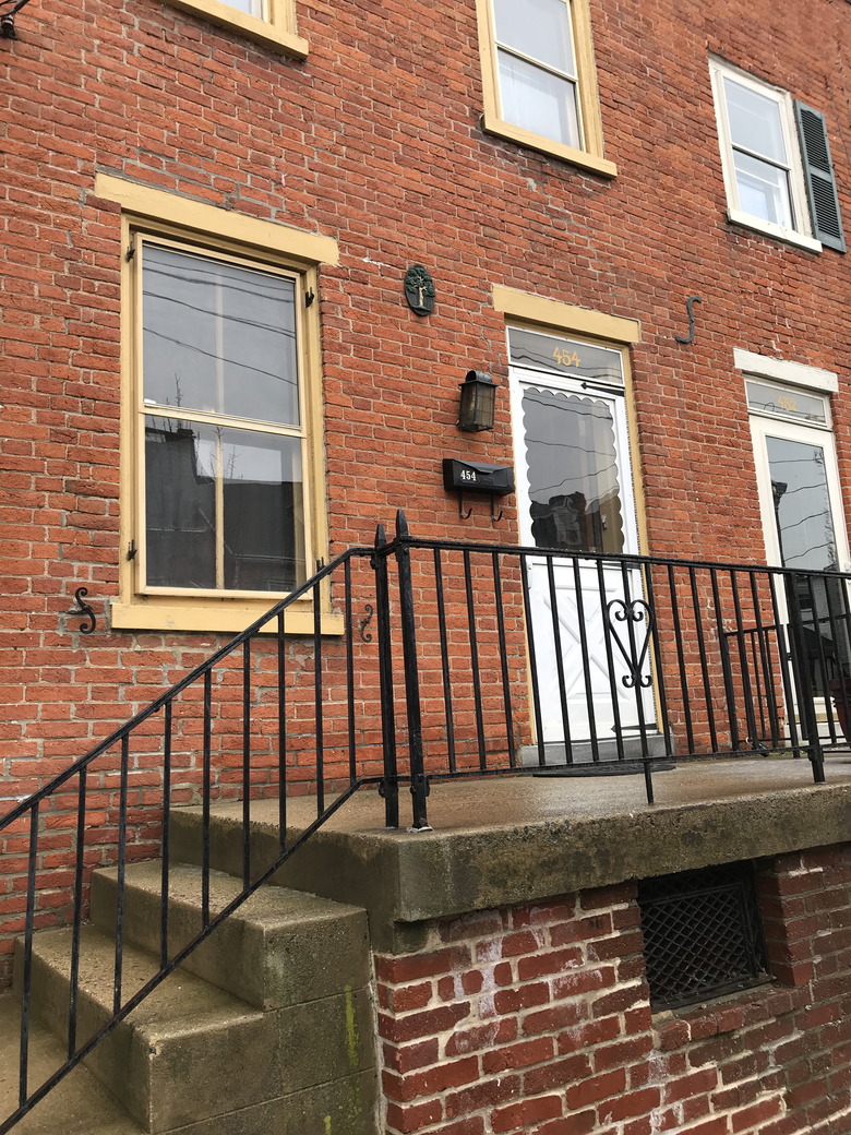
1. Before: Exterior
The townhouse lacked curb appeal and needed a refresh.
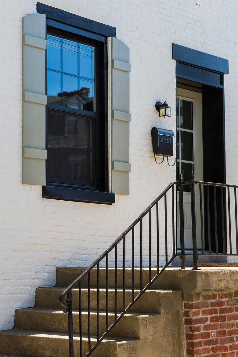
2. After: Exterior
The facade was painted in Benjamin Moore's White Dove and the trim and window frames sport Charcoal Slate. Brent built the new curved shutters, which are painted in Oil Cloth.
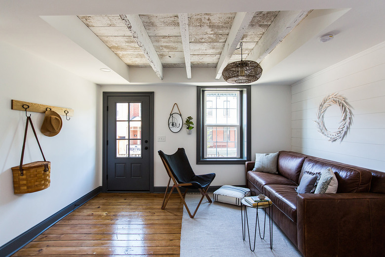
3. Living Room
Shiplap was installed along one wall of the living room. A light fixture from World Market illuminates the newly exposed ceiling beams. The yellow pine flooring is original to the house.
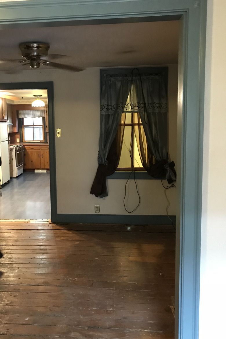
4. Before: Dining Room
A dark dining space separated the living area from the kitchen.
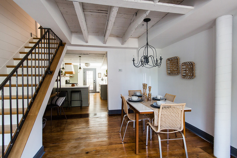
5. After: Dining Area
The dining area is now bright and open. The staircase, which previously was enclosed and in the kitchen, was flipped. A chandelier from World Market hangs above a West Elm table.
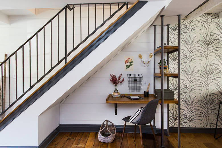
6. Dining Area
TrueNorth Metalworks designed the railing for the staircase and the metal shelving in the new built-in office space beside the dining area.
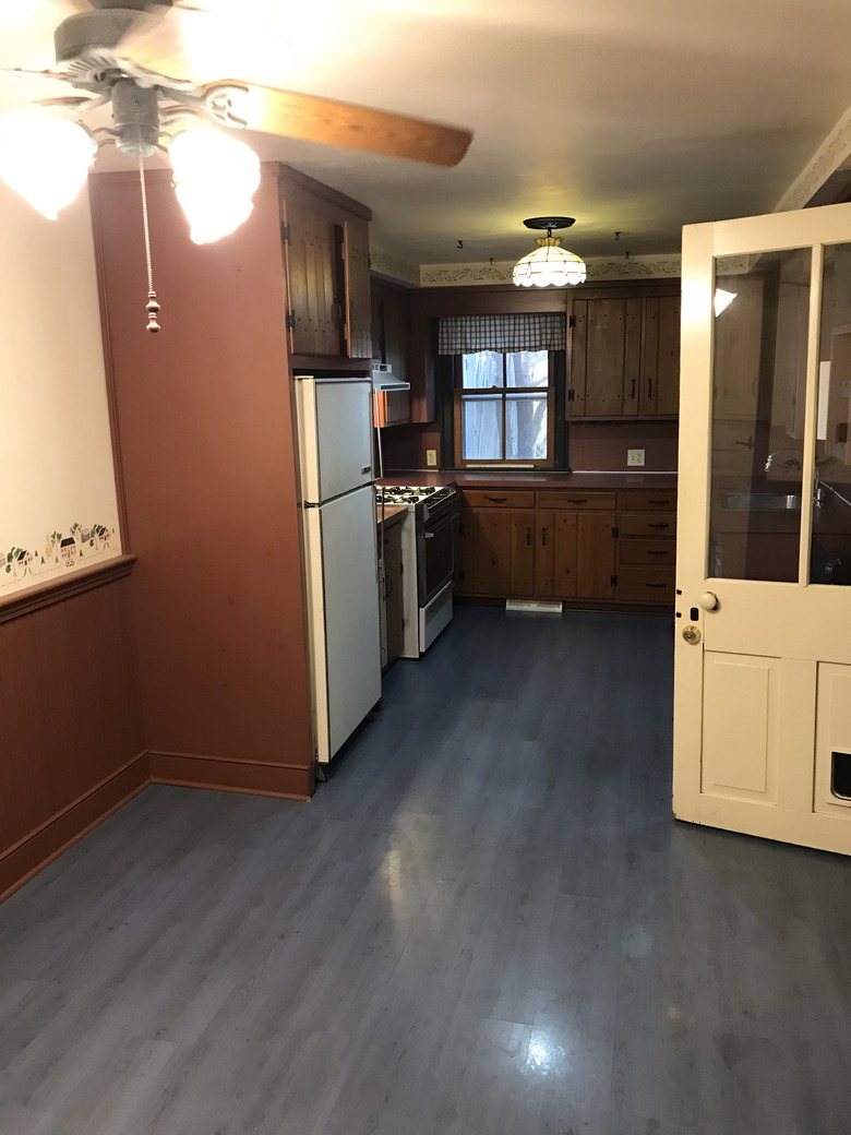
7. Before: Kitchen
Dark wood cabinets and a small window made the kitchen feel cramped.
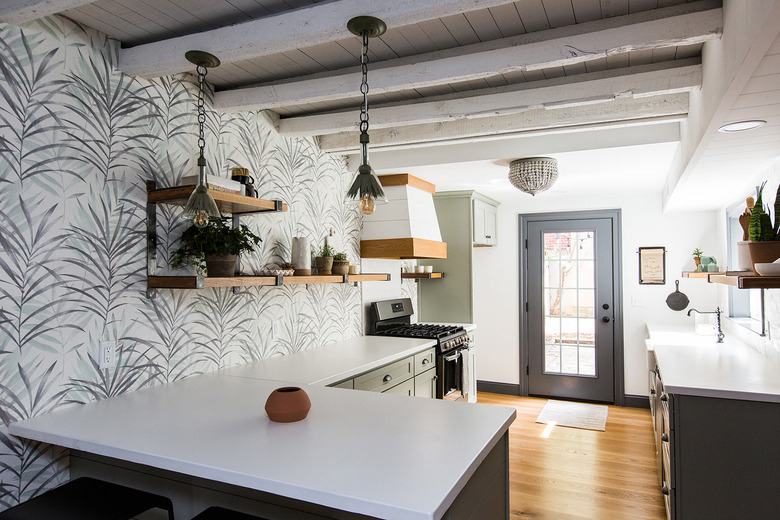
8. After: Kitchen
The kitchen brings the outdoors in with wallpaper by Wallquest and cabinets painted in Benjamin Moore's Oil Cloth. The white concrete countertops are by Tyler Martin Concrete Countertops & Design and the pendant lights are from Anthropologie.
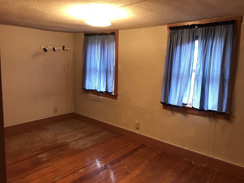
9. Before: Bedroom
The master bedroom's low ceilings had to go. The plaster was removed from one of the walls to expose the brick underneath.
10. After: Bedroom
Benjamin Moore's Super White brightens up the master bedroom. A light fixture from Cocalico Creek Country Store hangs above the Ikea bed.
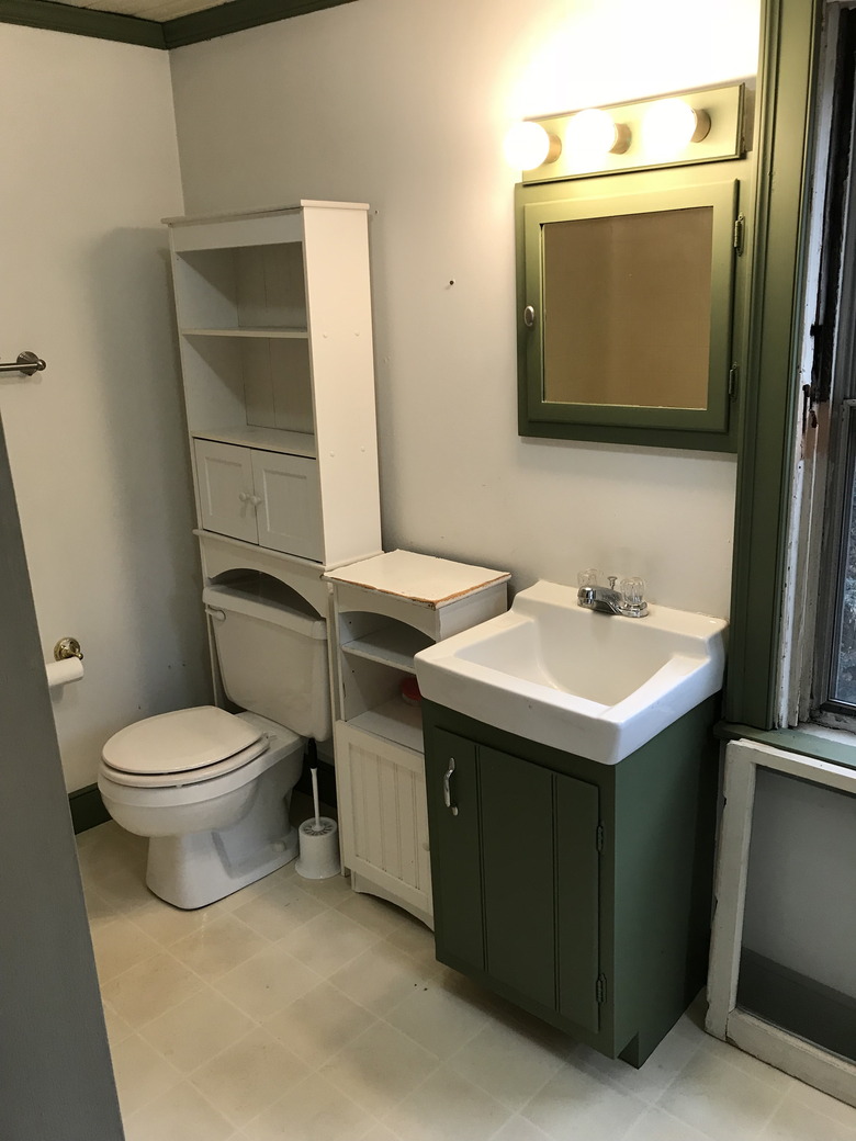
11. Before: Bathroom
Adding a second bathroom was a priority for the renovation.
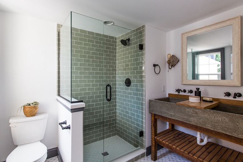
12. After: Bathroom
The centerpiece of the master bathroom is a handmade concrete sink by Tyler Martin.
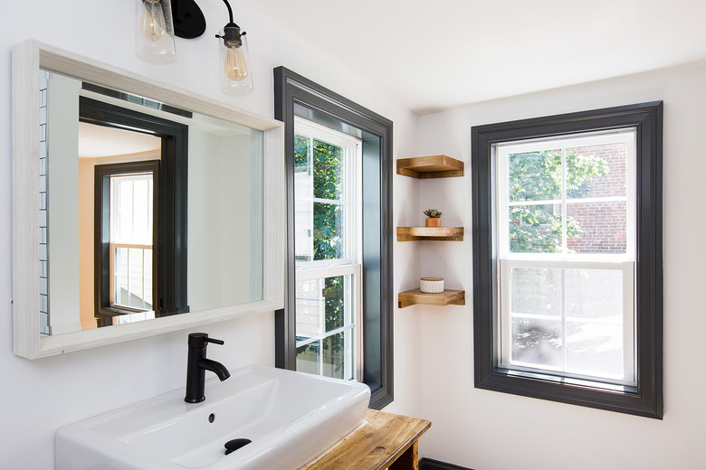
13. Second Bathroom
The second bathroom is outfitted with wood accents, including the corner shelves and sink vanity.
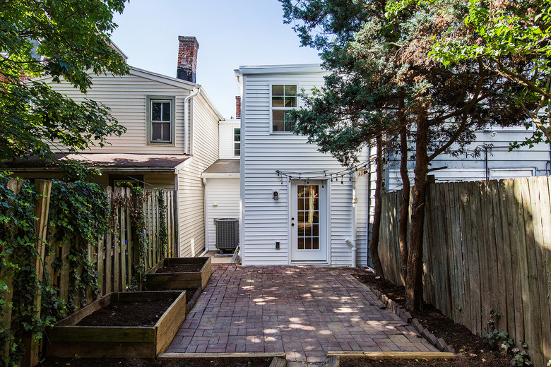
14. Back patio
Ample outdoor space allowed the couple to build self-contained vegetable gardens.

