This Minimalist Italian Villa Pays Tribute To Its Nautical Roots
There's the easy way to do nautical: knot accessories, blue stripes, anchors everywhere. Then there's the way that's more subtle, but far more committed: Make your home actually feel like a boat. That's how architect Nunzio Gabriele Sciveres approached a two-level apartment in the idyllic Italian portside village of Portofino. With dark wood and curved walls throughout, Sciveres created a space that feels woven into the landscape rather than a reflection of it.
But like a sailboat, a home can't just look pretty, it must also be highly functional, so the architect was motivated to cater to the clients' needs. "The biggest challenge for this project was to create a flexible and transformable space," said Sciveres. The solution? Panels that fold to change spaces, fold-down desks, and custom bookcases and storage.
1. Entrance
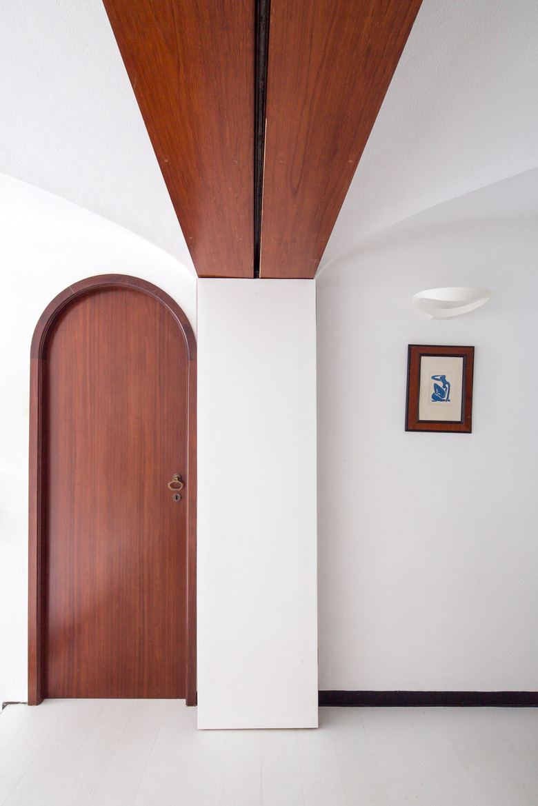
A custom mahogany door was inspired by the boats that drift along the harbor. An Artemide Mesmeri Halo White lamp is such a minimal addition that you may miss it on first glance.
2. Living Room
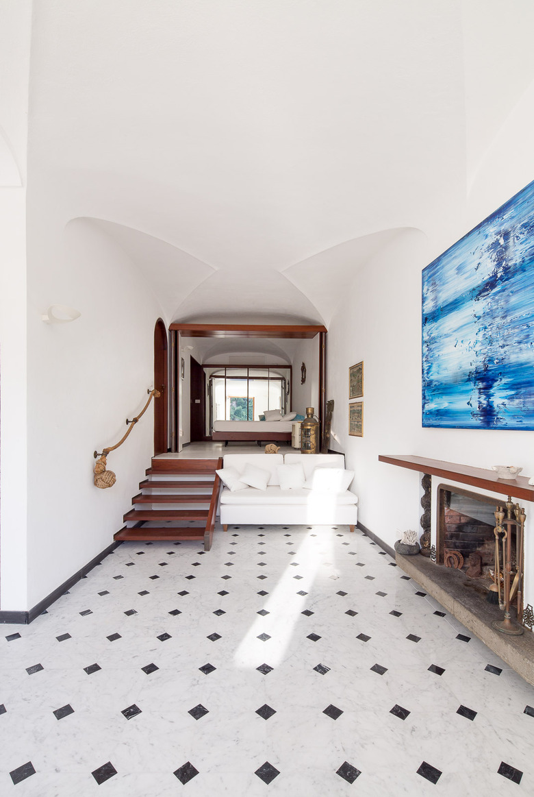
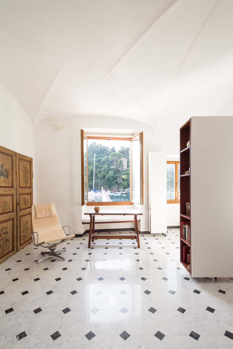
In contrast to the colorful buildings on the Italian Riviera, the interior of the apartment is as crisp as a naval uniform with walls painted in Dulux Traffic White. The floors are made of white Carrara marble and black Belgian marble inserts.
3. Living Room
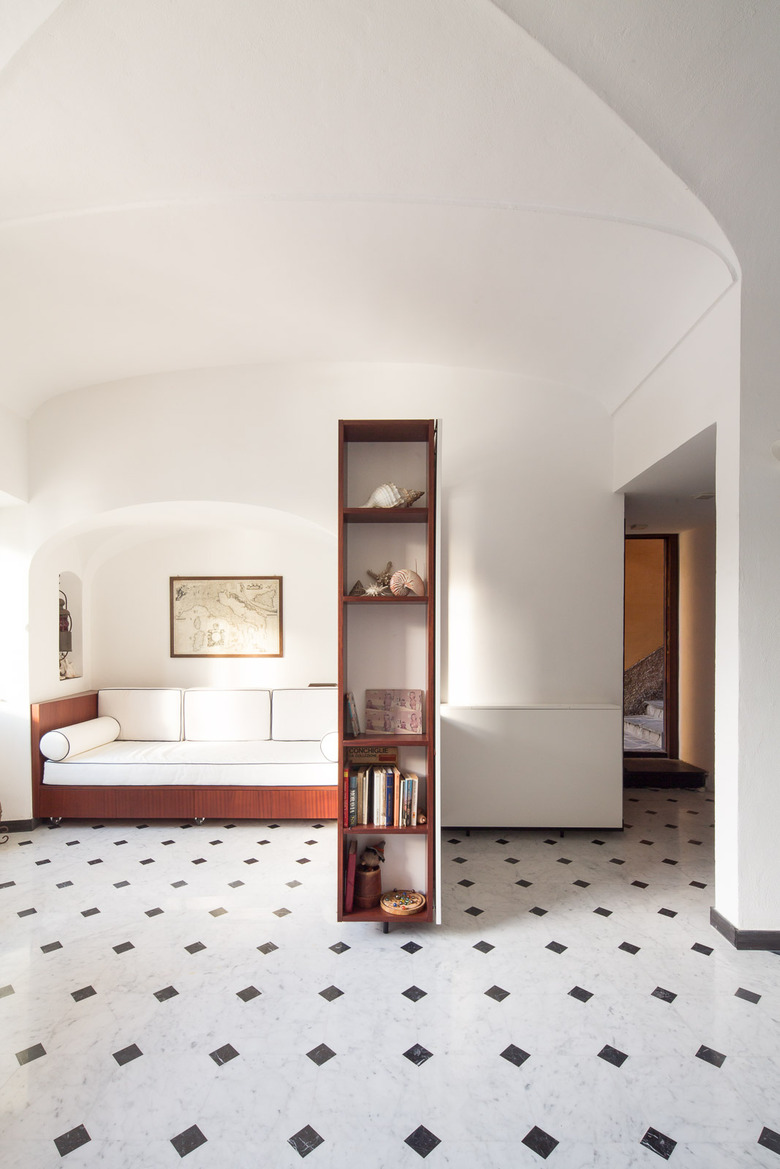
Shelves made from white lacquered MDF and mahogany offer a handsome spot for storage.
4. Living Room
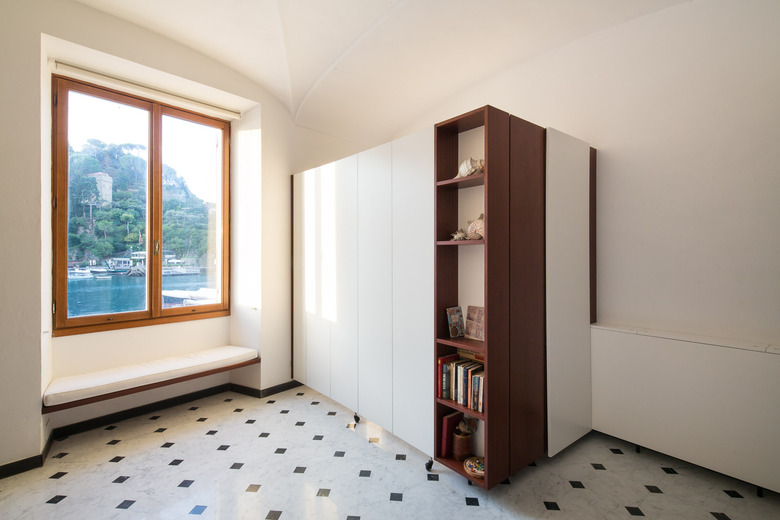
Foldable panels retract to reveal a bedroom space. A sunny window seat was made from the same materials as the bookcase.
5. Living Room
Curved walls and shapely ceilings evoke a ship's interior.
6. Living Room
Mahogany stairs lead to a large door that connects the living room to the bedroom. Original to the home, the fireplace adds a layer of coziness to the open living room.
7. Living Room
Mahogany panels retract to reveal the bedroom. A painting with ocean-inspired colors by Stanley Casselman sits above the mantel.
8. Bedroom
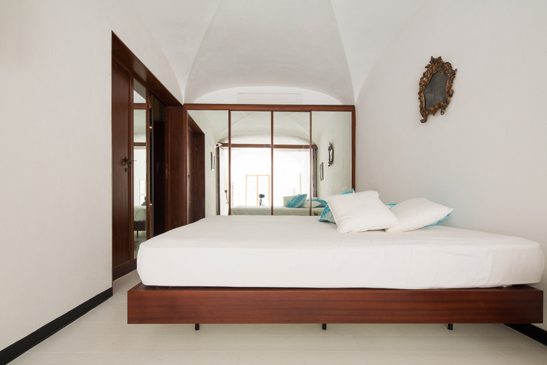
A wall of mirrors in the main bedroom reflects the living room, creating the illusion of more space and inviting in more light.
9. Bedroom
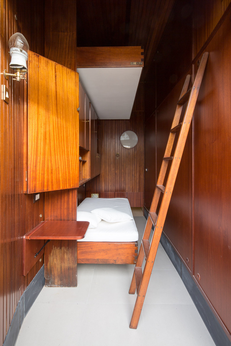
In another bedroom, a lower bunk bed folds out from the wall. Although the space was present before the renovation, a wood restoration was done by Sciveres. Restored lamps were added to the walls.
10. Bathroom
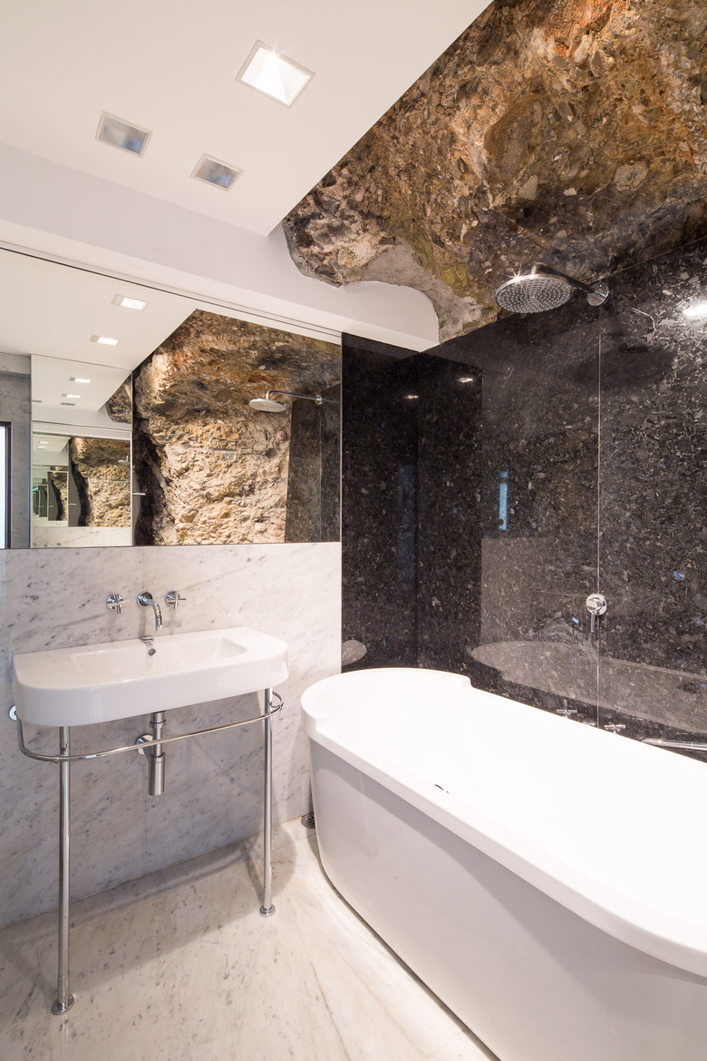
While the rest of the apartment is inspired by a nautical atmosphere, the bathroom is more celestial in style. Animated marble patterns seemingly evoke the night skies.
