12 Ceramic Tile Backsplash Ideas You Should Seriously See
These days, ceramic tile is killing it in the kitchen backsplash game. The colors! The patterns! The styles! Whether you are into classic subway tile, the boho look, or are hoping to find something handmade, these 12 inspo pics have something for everyone. Which ceramic tile backsplash idea might be right for you?
1. Choose blue and white for a classic look.
1. Choose blue and white for a classic look.
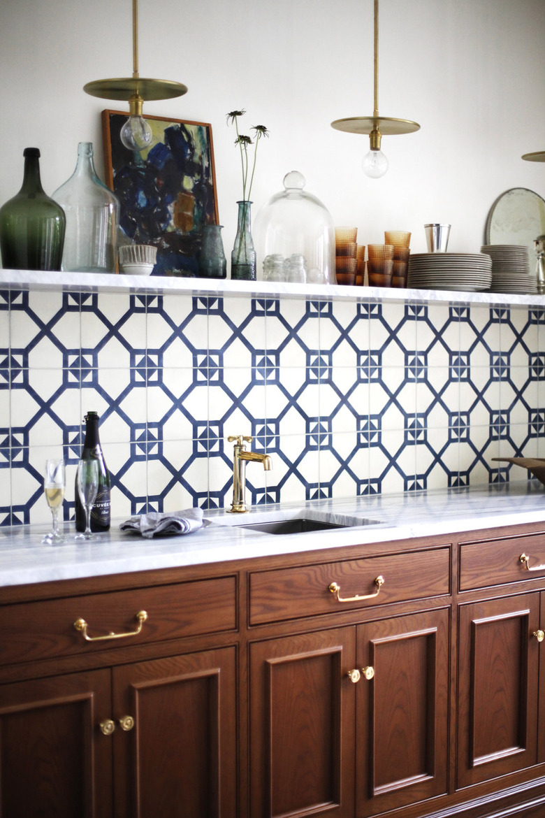
This timeless wet bar by Katie Hackworth has so much going for it — rich wood cabinets, a marble countertop, brass hardware, and flawless styling — it's impossible to choose our favorite element. But it's the navy and white backsplash that elevates an already envious situation.
2. Complement a muted palette with warm colors.
2. Complement a muted palette with warm colors.
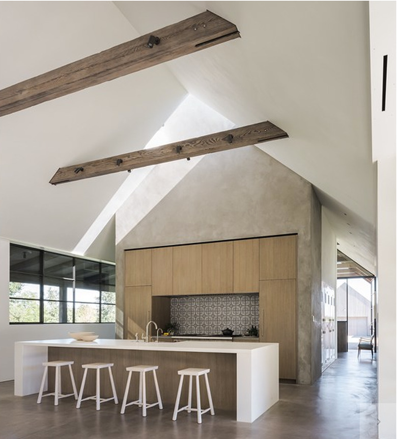
This gorgeous modern barn by Field Architecture is located in Napa Valley, and what we wouldn't give to have a glass (or two) of wine in this kitchen. The ceramic tile behind the stove adds just the right amount of warmth and pattern to the muted palette without distracting from the clean lines in the surrounding space.
3. Add texture with a raised pattern.
3. Add texture with a raised pattern.
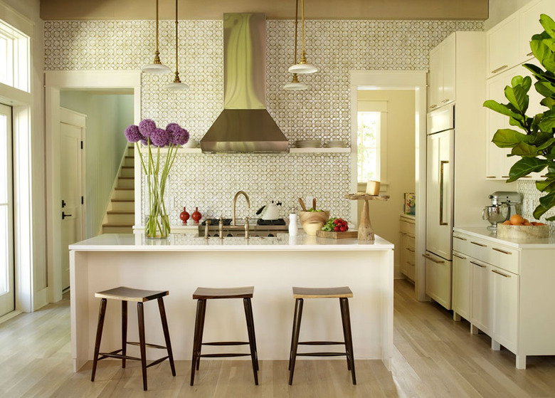
We are crazy for this Ann Sacks honeycomb tile that designer Angie Hranowsky chose for her client's kitchen. The raised pattern adds texture and makes an impact without being visually overwhelming — even when it is applied all the way to the ceiling. The milk-glass and brass pendant lights add old-world charm and balance to the more streamlined hood.
4. Be daring and try tiles in a unique shape.
4. Be daring and try tiles in a unique shape.
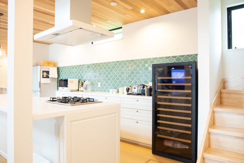
A scalloped Fireclay ceramic tile backsplash in sea foam creates a cheery aquatic vibe in this Tokyo kitchen. The wood paneled ceiling adds warmth to the monochromatic white cabinets and countertop.
5. Arrange tile into a piece of art.
5. Arrange tile into a piece of art.
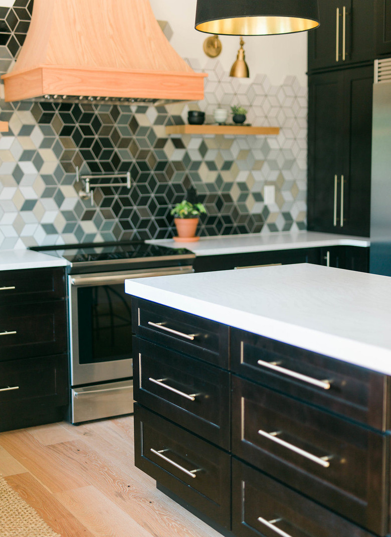
Think outside of the box and use ceramic tile to turn your backsplash into an unexpected and show-stopping mosaic, like the folks at Construction 2 Style did in this kitchen. The whimsical design, along with a wooden hood and mixed metal finishes, lighten up the darker cabinets.
6. Try a neutral color for depth without distraction.
6. Try a neutral color for depth without distraction.
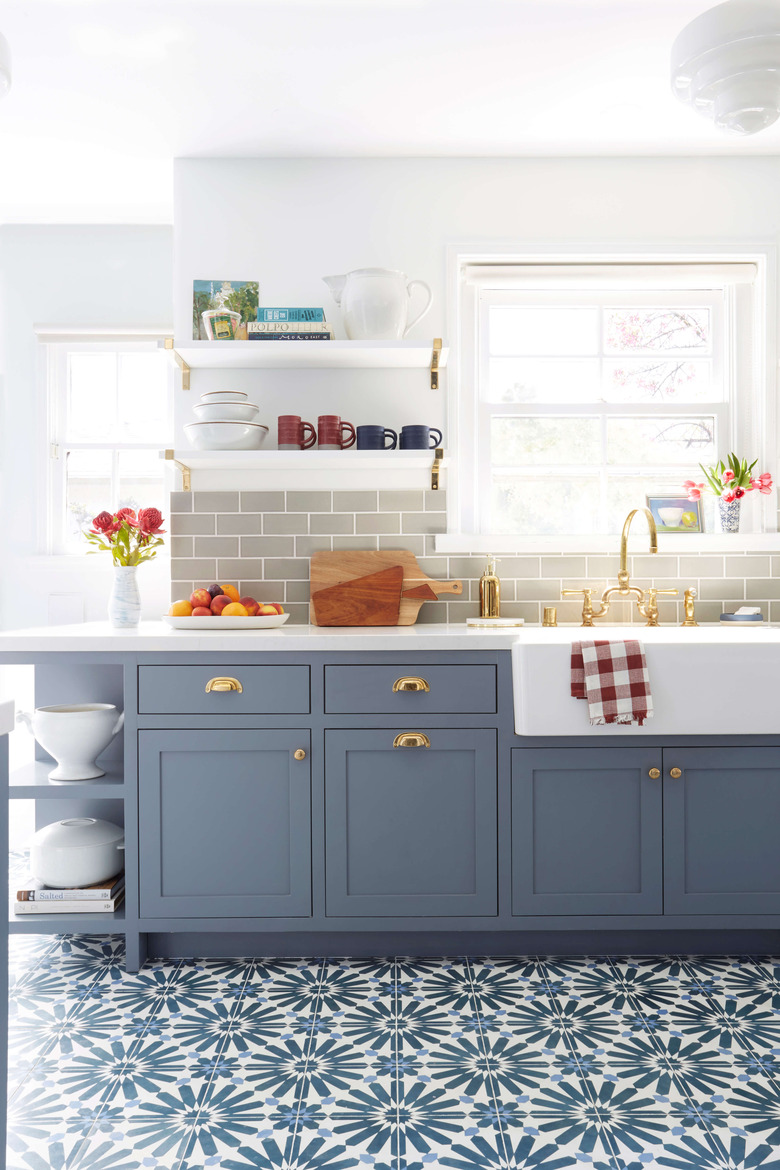
Here, Emily Henderson used subway tile in a neutral color (but not everyday white) to add depth and color to the walls without stealing anything away from the room's pièce de résistance: gorgeous cement tile flooring. Gold hardware, Moorish opaque glass pendants, and a large apron sink add function and beauty.
7. Pick something ornate for an exotic touch.
7. Pick something ornate for an exotic touch.
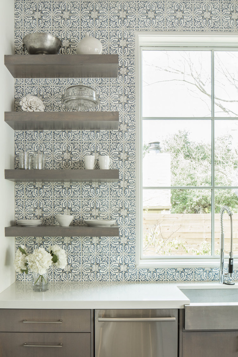
Field tile by Walker Zanger in faded blue and white are timeless and anything but basic. The ornate design adds an exotic touch to this kitchen by 3 Fold Design Studio. Flat front cabinets, an oversize sink and faucet, and metal shelves keep the look sophisticated.
8. Consider handmade designs for an earthy, artistic feel.
8. Consider handmade designs for an earthy, artistic feel.
You've heard of screen-printed fabric, but how about screen-printed tile? We can't get over these beautiful, one-of-a-kind designs from UK-based Smink Things. These contemporary tiles are handmade in Portugal and would be the centerpiece of any kitchen.
9. Only use it as an accent.
9. Only use it as an accent.
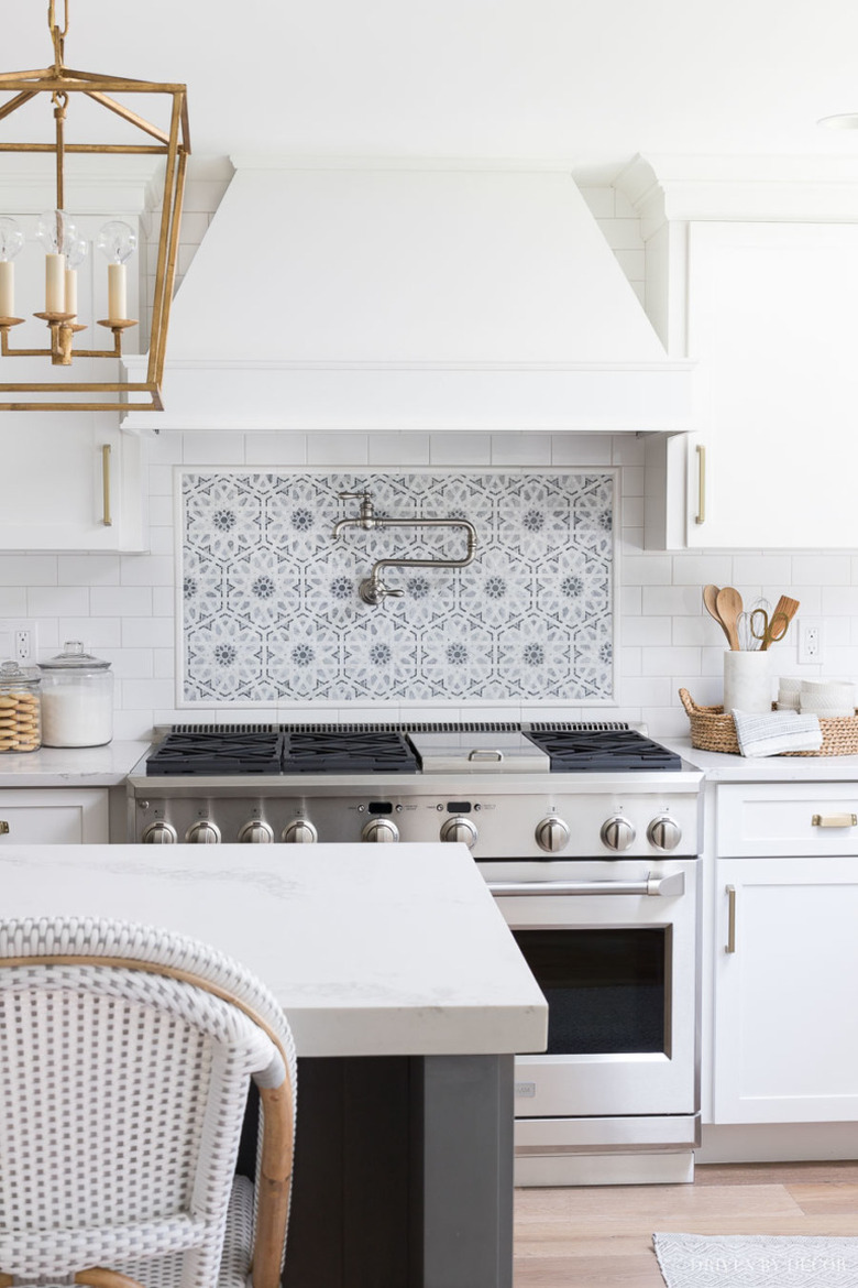
Create a focal point in your kitchen by using an accent ceramic tile on just one part of your backsplash — a typical place for this is behind a range, as seen in this gorgeous space by Driven by Decor. This can also be a great cost-saving option; you can splurge on a smaller amount of statement-making tile surrounding the stove, and then pair it with something more affordable, like Daltile, throughout the rest of the kitchen.
10. Go geometric to create some interest.
10. Go geometric to create some interest.
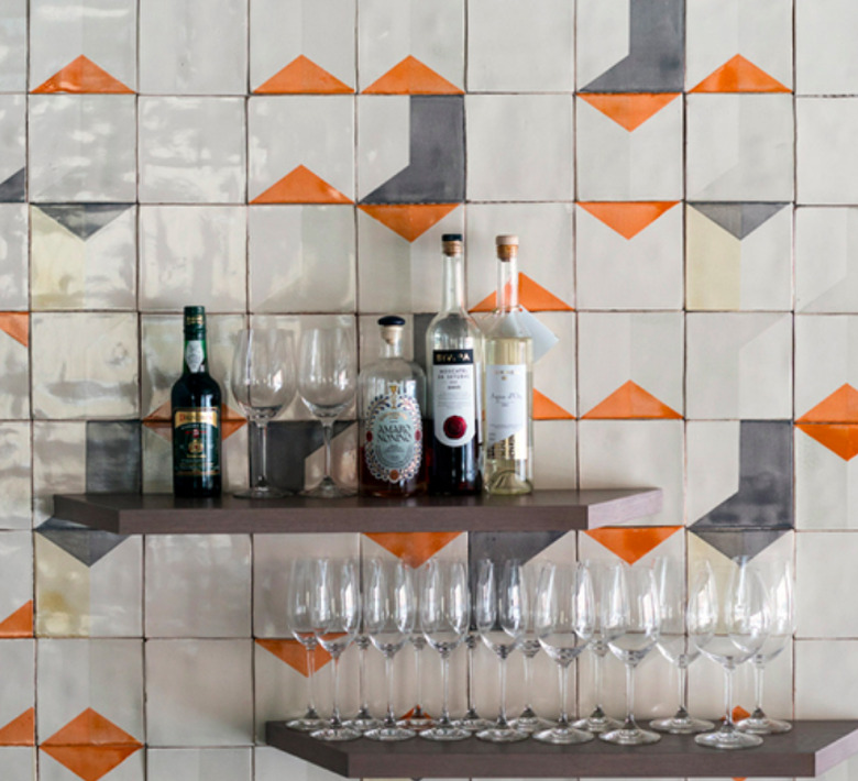
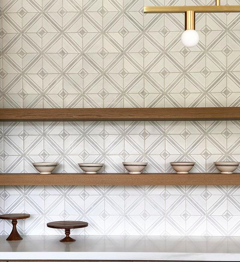
The geometric and symmetrical design of these tiles by Tabarka Studio make them a great option for both rustic and traditional kitchens. They come in a range of colors — here they are shown in pale grey and paired with thick wood shelves and styled with handmade pottery, channeling an earthy vibe. The gold hardware and light fixture adds a touch of glam.
11. Put a twist on something traditional.
11. Put a twist on something traditional.
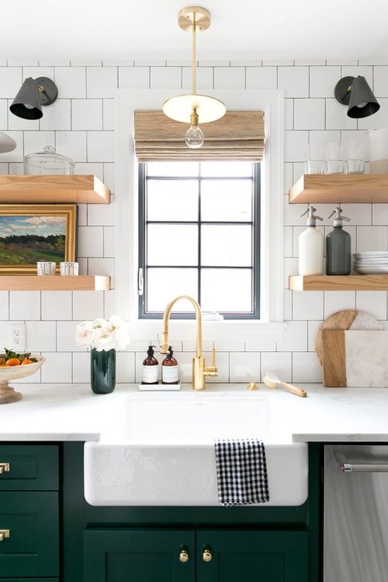
Square subway tile is more current than the ubiquitous (but still loved by us) traditional rectangular-shaped subway tiles. This kitchen by Studio McGee perfectly balances the more up-to-date shape with classic elements like a porcelain farmhouse sink, simple floating shelves, and matte black wall sconces, creating a modern, retro look.
12. Go with something unexpected.
12. Go with something unexpected.
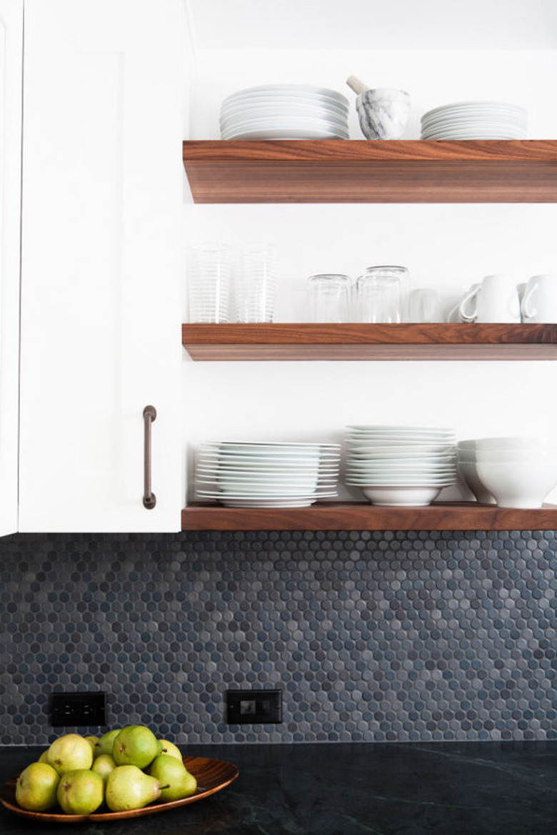
Penny round tile gets a lot of play in bathrooms, but we love their unexpected use as a backsplash in this kitchen designed by Regan Baker. The slight color variation gives it some movement, while the white cabinets and wood shelving keeps the look warm and clean.
