How The Interiors On "Forever" Got So Damn Good
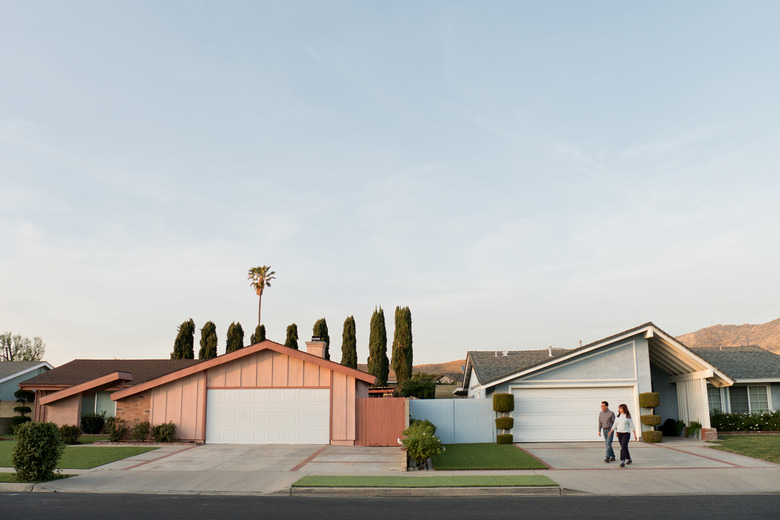
If you've seen Forever, the Maya Rudolph and Fred Armisen series for Amazon, you're probably dying to relocate to a certain mysterious street in a place called Riverside.
[SPOILER ALERT: Don't read this if you're planning — but haven't yet started — to watch Forever. Seriously. Just don't.]
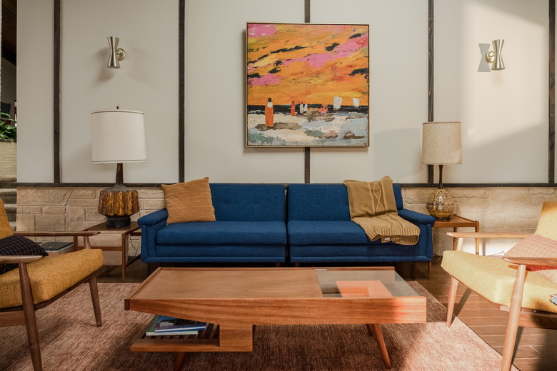
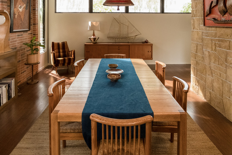
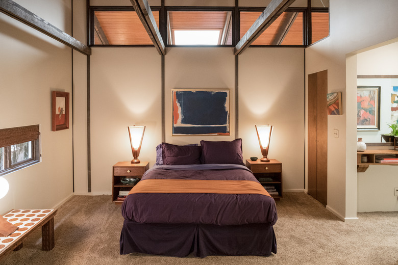
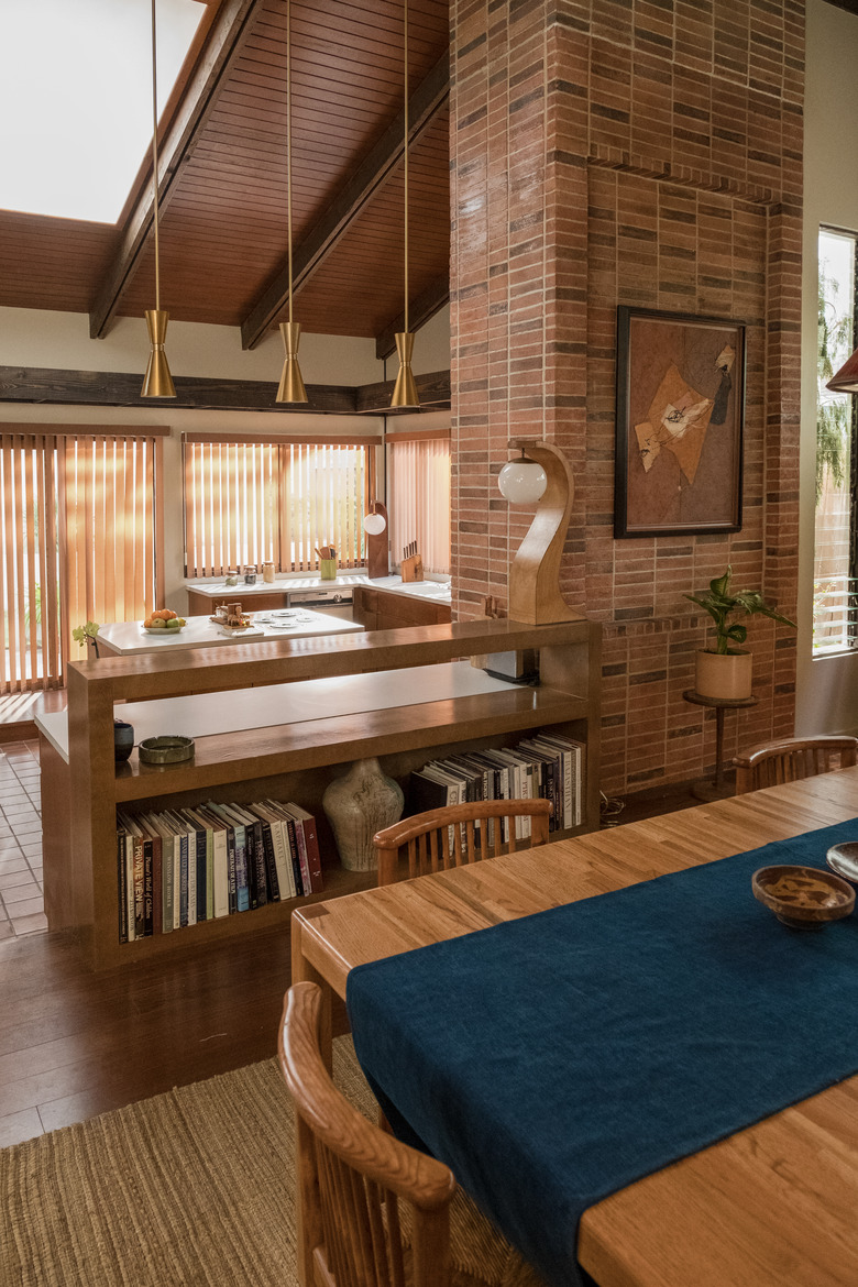
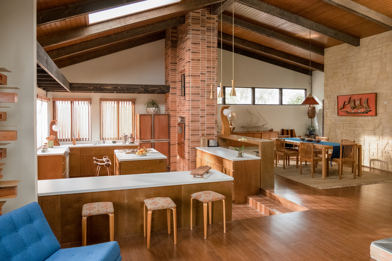
The home interiors on Forever are pristine midcentury modern, filled with finds by Eames, Gerrit Thomas Rietveld, and Sigurd Ressell — not to mention a credenza you either love or hate, fantastic pottery, and a lot of seating options. Here, production designer Amy Williams, co-star Fred Armisen, and co-creator Alan Yang tell us how they created interiors that are out of this world.
I laughed out loud when I saw that "formers" on the show end up in the California suburbs for eternity. How did this creative decision come about?
AMY: It was a collective decision with the creators, Alan Yang and Matt Hubbard. We were talking about what kind of environment these characters would be brought to, and we wanted them to go to a place that was uniform, but also provided enough aspiration — just enough — to be a place where you think, I could spend eternity there. A place where things are kind of perfect and ideal but they're a little bit off, too. Not quite as you dreamed they would be.
Alan, you grew up in Riverside, California. How did this influence you?
ALAN: There's something a little suffocating about the suburbs sometimes — not always, of course. I had a good time growing up in Riverside, and I would hate for the show to be interpreted as any kind of slam on it. My mom still lives there and teaches high school in Moreno Valley, and I made friends there that I'm still close to. But the idea of the suburbs as a holding pen after death just made a lot of intuitive sense, and we thought it would be really funny.
FRED: I think the suburbs can be a little bit spooky. I wonder if in the future all our horror movies will be set in the suburbs, the way some scary movies are on gothic sets now?
Well, something about the neighborhood seems strange, although it's hard to put a finger on what exactly it is.
AMY: We were so worried it was going to be silly, so the goal was to always be subtle with this show not be too creepy.
ALAN: Amy's designs informed the sense of airlessness and isolation in June's life. It was her idea to hide the mailboxes and get rid of all phones and clocks.
FRED: I knew they took all the cars out, which makes things look really stark, but I wish they had told me about the mailboxes, because I don't like to appear in anything that doesn't have them. It's kind of my calling card.
Did you guys use any visual inspiration to get the interiors right?
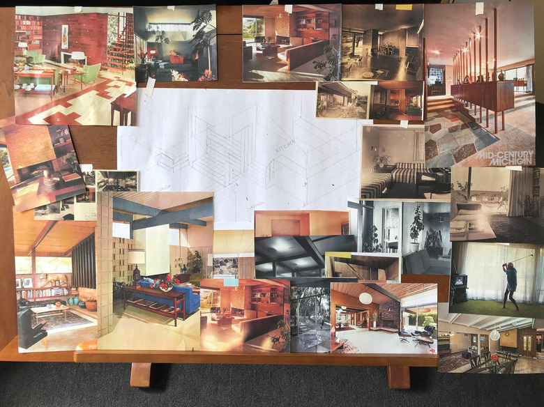
AMY: I was inspired by the Hong House, which was designed by Roger Hong with Conrad Buff and Donald Hensman; also, Joseph Eichler, Richard Neutra, and A. Quincy Jones, among others. And I love the midcentury architecture that's just ubiquitous around California. I'm from New York, so I was staying at friends' houses and at Airbnbs, and I was very inspired by their unchanged decor — that frozen-in-time kind of thing.
ALAN: Early on, I sent Amy a list of visual references: frames from films by Wim Wenders, David Lynch, Luis Buñuel, Krzysztof Kieślowski, Alejandro Jodorowsky, and more. I try to talk to everyone I'm working with about the feeling I'm trying to evoke with the final film. Then they can use their own talents to come up with ideas that complement anything I've come up with on my own. As far as the suburban setting, Matt and I thought it would be both funny and a little tragic if you woke up after dying and you were stuck in pretty much the same situation you had just departed.
Of course I noticed that each house in the show reflects something about the owner ...
AMY: Yeah, we built interiors what would reflect what each character would idealize. So, for example, Mark [a 17-year-old skateboarder played by Noah Robbins] lives in a '70s den. If you were a kid from the '70s, that would be your dream.
With a Farrah Fawcett poster, of course. But Oscar's house is the one people seem to drool over the most. Why is that the house he'd spend eternity in?
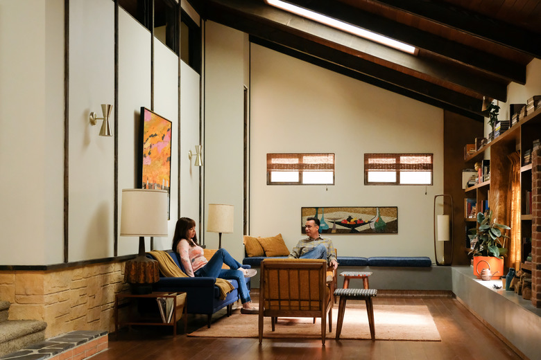
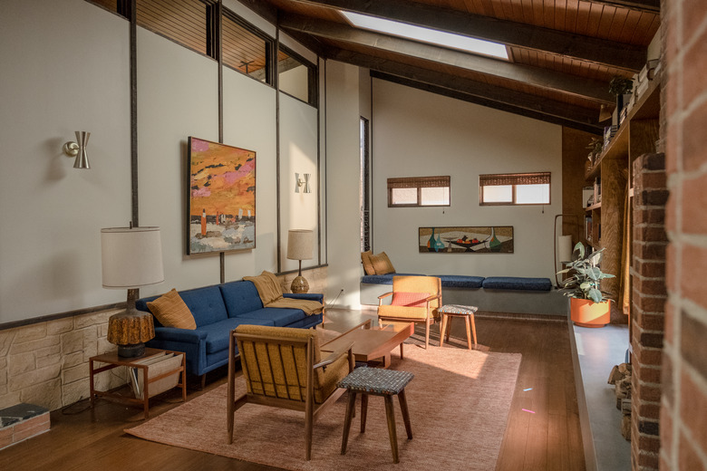
AMY: Oscar likes midcentury modern because it's balanced, beautiful, rigid and calming. It's not messy. And it's very safe in terms of choices. But the thing about midcentury stuff is that it's really beautiful to look at, but it's not that comfortable. Like, Is that the couch you want to sit on for eternity?
FRED: When I saw it, I was like, whoa, this is more Oscar than I could ever have imagined. And that's the best reaction, I think.
The details were just so spot-on. A lot of people get Southern California wrong, but I see intentional interiors like these on Zillow all the time.
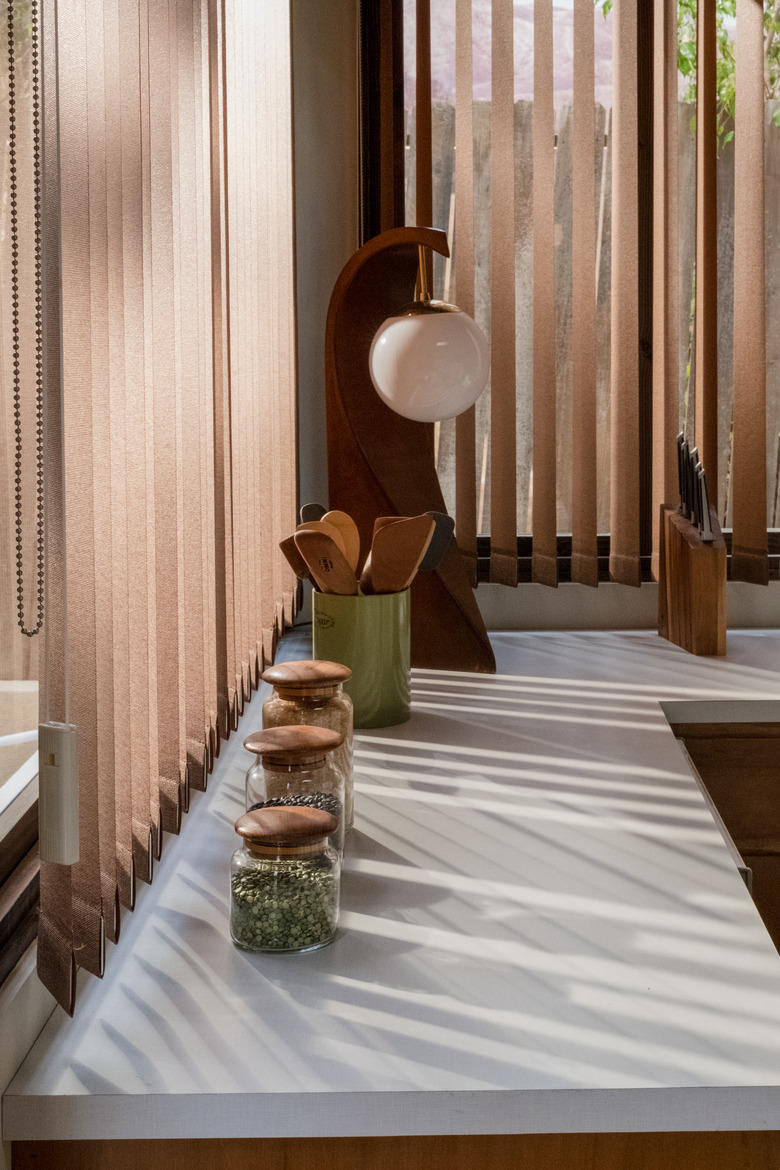
AMY: I'm obsessed with looking at houses online. And I embraced the "ugly beautiful" of the time period. The big slate floors, the shag carpet, and the tri-level architecture. As a production designer, you're always trying to support the characters and reflect them, so I try not to have it be about my taste and preferences, but Oscar and I are around the same age. I talked a lot with the writers about what they would want surrounding them when you died. And they said things like, I'll have time to read all the books on my shelves. Or I'll be able to do something solitary and calming and graceful, which is why, in June's case, she takes up pottery.
FRED: I've been living here for four years, and the first time I saw the sets I thought, this looks so much what like Southern California looks like to me. They really got it right. Oscar's house was very neat which I really like, but as much work as they put into it, it wasn't overdone. Sometimes I don't like it when sets try too hard to find the character. Where you're like, Okay, I get it. There's something scaled down enough here. Oscar's house was attractive, but they didn't go insane, and that kind of added to the mystery too.
What about the palette?
AMY: We wanted to have it be colorful, so I stuck with the turquoises, navies and jewel tones. It's one of my favorite palettes to play with, along with different textures of wood and brick. I like the harmonies.
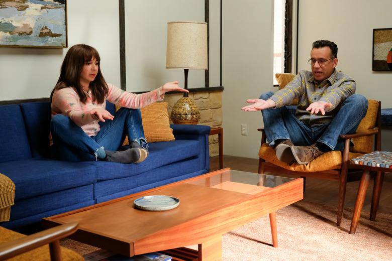
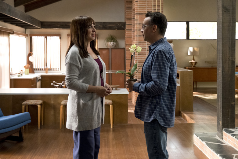
And, as Maya's character points out, there were a lot of places to sit.
AMY_:_ I built in a lot of seat benches; that was the style. I always romanticized it. Like, you have a seat bench where you can read! The scene where Fred and Maya talk about the seating options was improvised.
FRED: Yeah, because that's what anyone who's friends with each other or who are comedians in general want to do. There were chairs and couches and it's an invitation. Of course it's what I want to talk about. That's when you have a fun work day.
"I wish they had told me about the mailboxes, because I don't like to appear in anything that doesn't have them. It's kind of my calling card."
- Fred Armisen
Let's talk about the loathed credenza in Kase's [Catherine Keener's character] house. I loved the piece when I saw it, but I can also see why someone else would absolutely despise it.
AMY: I didn't hate it either. It's a Brutalist piece by Lane, and it's a personal preference. The style isn't for everybody. I wanted to find something that had some texture because we knew we were going to burn it so I wanted it too look cool on fire, with all those geometric designs. That was a hard one because we had to buy multiple pieces of it to have to destroy. We had probably five different ones, all the same, and we made one completely out of foam because Catherine and Maya had to carry it outside and we knew they'd have to do that over and over again. But the others we actually burned and charred up.
Oh, no! You really set those on fire?
AMY: It was really painful, but my justification is the piece will live forever on film. It will be famous now, so that's the sacrifice.
Well, some people would say being famous is more important than anything.
AMY: Exactly.
How did you find some of these pieces? You got great stuff, including a pair of Zig Zag chairs, a Taliesin floor lamp by Frank Lloyd Wright and Modeline of California lighting.
AMY: For Kase's credenza we scoured sites like 1st Dibs, Chairish, and Sunbeam Vintage. We also went to L.A. shops, including Midcentury LA, Amsterdam Modern, the Pasadena Rose Bowl Flea Market, The Hunt Vintage, Glass Horizons, Pasadena Antiques & Design, Danish Modern NoHo, and Hernandez Furniture. June's pottery was made by Heather Rosenman, a ceramic artist.
Do people come up to you and say, "I wish I could live in Oscar and June's house?"
AMY: A lot of people were really into that set. But I remind them that nothing works. It's a soundstage. And I've started to dip a little bit into helping friends decorate their homes. People are always like, Hey where can I get that couch? Where can I find this? What should I do here in my kitchen? But it's much easier to tell a story than to create something beautiful and practical for someone to live in. I've got to give somebody a story if they want me to help with their house.
So which house from Forever would you be dead in, if you could choose?
Alan: Gimme Kase's house. She had the best furniture, in my opinion.
Fred: In real life I would go to the Haunted House in Disneyland and live there. That's the first place I'd move to. The hallways are great. Even the wallpaper is great. But as far as the show goes, I am very partial to Oscar's for sure.
Amy: I'd live in Kase's or Oscar and June's house. Spoiler, they're actually the same house. We furnished and decorated them differently, then flipped the frames in post so they each have an opposite orientation. It might be the closest thing to my personal dream house that I've ever designed for a show.
1. Credits
Words: Deanna Kizis
Images: Amazon Studios
