This Wonky Guesthouse Is Like That For A Very Clever Reason
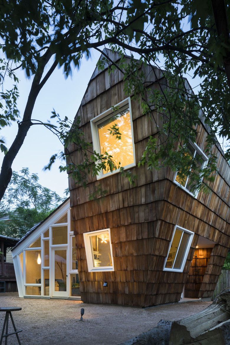
Many believe that placing limitations, rules, and guidelines on a project can promote creativity. For Studio 512's design for an Austin, Texas guesthouse, the biggest limitation on the design — a city-wide rule dictating the maximum square feet allowed — became the driving force behind the unusual architectural build.
The rule states that the footprint for any residential guesthouse has to be less than 320 square feet. In order to stay within those confines, architect and general contractor Nicole Blair drew inspiration from Dutch and Japanese designers, devising a sharply angled, asymmetrical building that follows the law, yet functions as a large one-bedroom house.
Dubbing the project "The Hive," Blair's final result is a home that expands upward and outward (without increasing square footage), providing extra room to accommodate the movements and activities of the inhabitants.
1. Living Room
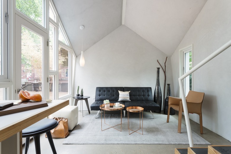
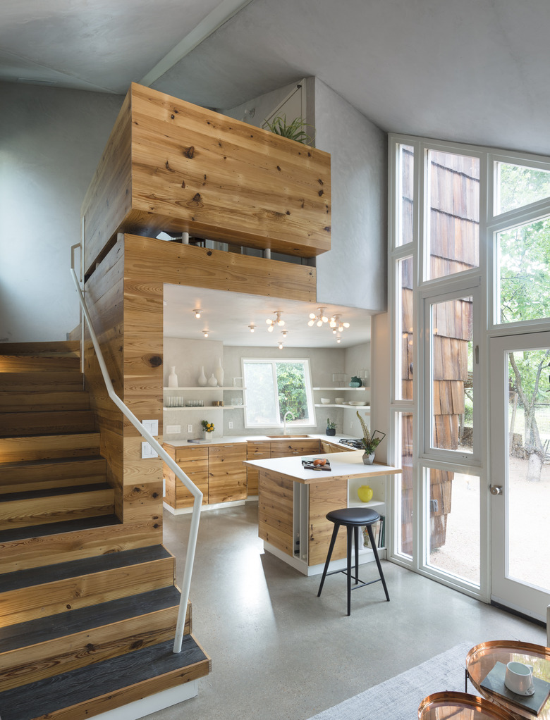
A large rug from West Elm creates a square footprint in the living room. The placement of a vintage pendant purchased from eBay adds to the asymmetrical design.
2. Kitchen
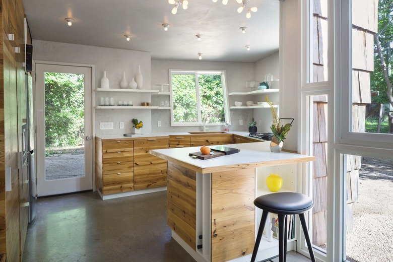
Much of the furniture in the house was provided by Scott + Cooner, including a black stool that accompanies the kitchen island.
3. Kitchen
In the kitchen, walls lean outward to increase counter space. Flooring materials were sourced by Delta Millworks.
4. Kitchen
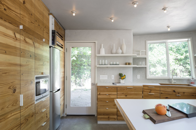
The cabinet fronts in the kitchen (built by Wishtree Carpentry) are constructed from reclaimed longleaf pine. The walls are painted in Frostine by Benjamin Moore, a white paint with icy blue-green undertones.
5. Bedroom
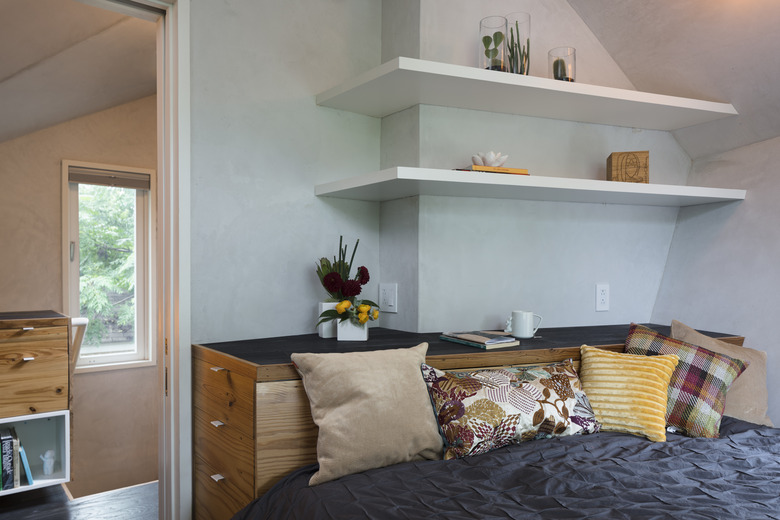
In the bedroom, painted wood shelving sits above a built-in bed outfitted in bedding from Target and a mix of pillows from Urbanspace Interiors. An IKEA planter holds a floral arrangement from Pollen Floral Art.
6. Home Office
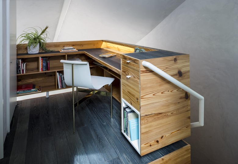
At the top of the stairs, a nook became a compact office, complete with a desk with custom built-ins and a charred wood top.
7. Bathroom
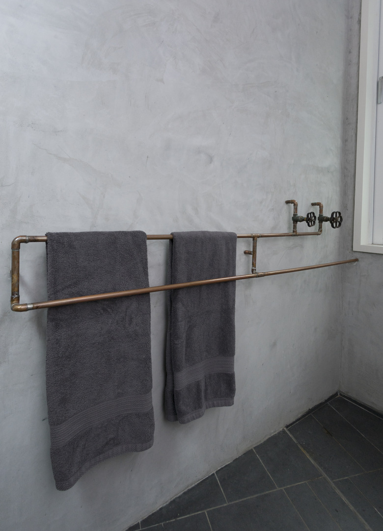
The exposed copper plumbing doubles as a towel rack. A three-coat traditional stucco wall delivers a grainy industrial-style texture.
8. Bathroom
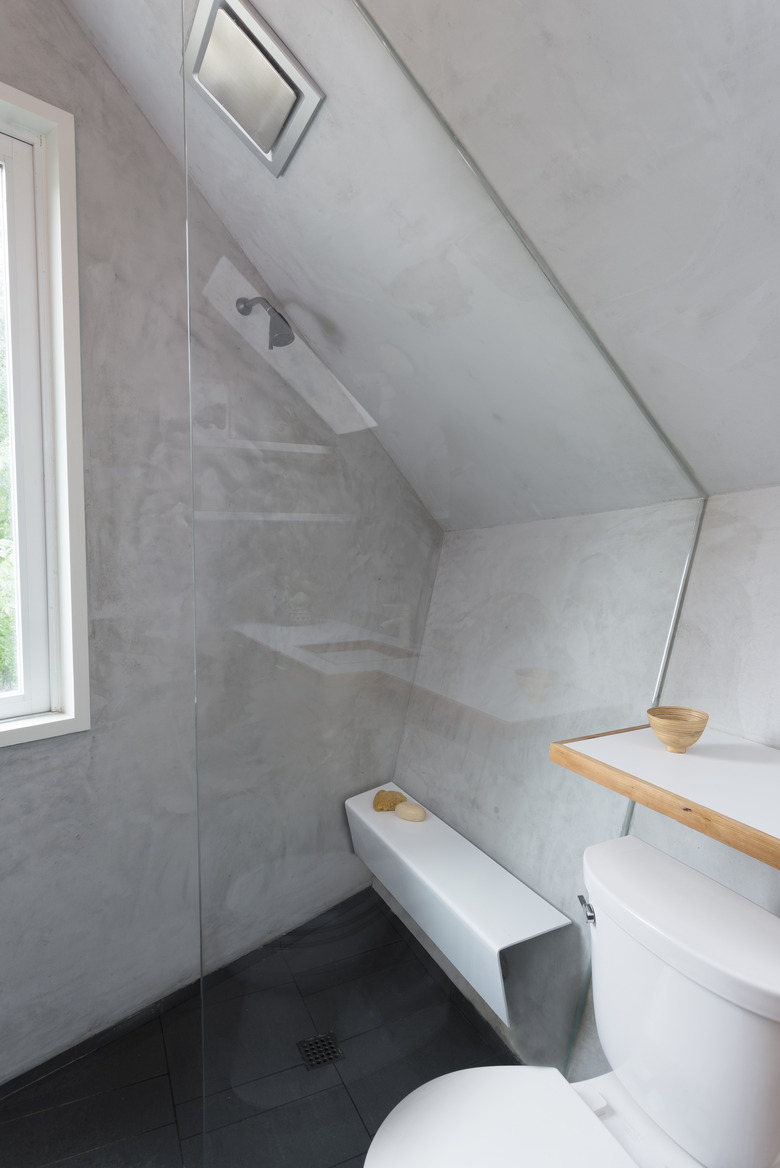
"The Hive" was created to follow the movement of the people who live in the house. In the shower, the walls grow narrow to allow for steam to rise.
9. Bathroom
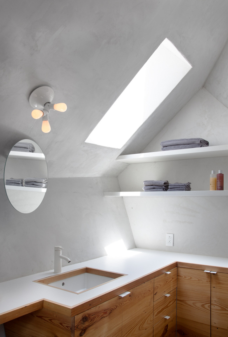
A Teti ceiling lamp by Vico Magistretti adorns the asymmetrical bathroom ceiling. A Kohler sink is outfitted in a faucet from IKEA.
